Web Design I
Class 08: Embedding TechnologiesTopics
- Week 08 Responsive Site (content) Lab
- Typography
- Embedded Technology
- Responsive Content
08 Responsive Site (content) Lab
08 Responsive Site (content) Lab:
Building on the lab from last week we will complete the homepage by entering the content.. The final content (text, images, embedded content, etc.) will be formatted to fit in the sections they are applied. CSS will be applied to control the color, text, and boxes of the site.
You will be graded on the following:
- File/Folder & Document Structure
- Master folder created with correct sub folders.
- All files named and placed correctly.
- Basic HTML and CSS structure produced.
- Code is formatted properly (indents, spacing, caps, etc.).
- Lab Specific Requirements
- Well-written Text.
- Formatted Images.
- Rich Media (embedded technologies).
-
Craftsmanship
-
Clean, professional quality work.
- Descriptive and well-written informative text.
- Properly formatted images incorporated.
-
-
Creativity
-
Appealing, interesting and novel.
- Text is captivating.
- Images draw attention.
-
Embeddable Technologies
Embeddable Technologies
Just like Bootstrap we may link to other sites to utilize their resources. This allows us to add a variety of elements that would be time-consuming and difficult to implement on our own. Below I outline some of the most widely used linked technologies.
Font Awesome
A font that acts more as a series of useful icons that have become standard in web design. Think wing dings but with purpose.
browser view
<!–place this in the head element section–>

<link rel="stylesheet" href="https://use.fontawesome.com/releases/v5.2.0/css/all.css" integrity="sha384-hWVjflwFxL6sNzntih27bfxkr27PmbbK/iSvJ+a4+0owXq79v+lsFkW54bOGbiDQ" crossorigin="anonymous">

<!–use this in the body where you would like it placed–>

<i class="far fa-clone"></i>
Youtube Videos
Youtube allows you to embed their videos.
youtube
browser view
<!–place this where you want it viewed–>

<iframe width="560" height="315" src="https://www.youtube.com/embed/dQw4w9WgXcQ" frameborder="0" allow="autoplay; encrypted-media" allowfullscreen></iframe>
Google Maps
Google allows you to embed their maps with a location specified.
google maps
browser view
<!–place this where you want it viewed–>

<iframe src="https://www.google.com/maps/embed?pb=!1m18!1m12!1m3!1d3072.386497485153!2d-75.9587388852204!3d39.6410154794628!2m3!1f0!2f0!3f0!3m2!1i 1024!2i768!4f13.1!3m3!1m2!1s0x89c7 b0f19cc33215%3 A0x36d4f10 a671a795e!2s Cecil+College !5e0!3m2!1sen!2sus!4v1534004723637" width="600" height="450" frameborder="0" style="border:0" allowfullscreen></iframe>
Google Fonts:
Google offers a service (for free) whereby you may utilize their library of fonts on your own sites.
google fonts
browser view
Google Font Example
<!–place this in the head element section–>

<link href="https://fonts.googleapis.com/css?family=Kirang+Haerang" rel="stylesheet">

<!–place this in the style sheet (example on a p element)–>

p {
	font-family: 'Kirang Haerang', cursive; }
Others
The internet was developed as a sharing platform. Therefore, you will find lots of other resources available online besides those above.
To the right you will see loads of options but there are many many more
- Google Material
- Google’s answer to Bootstrap. It is implemented in mobile apps as well. A bit more complicated but offers a lot of flexibility and power
- You can embed a Facebook profile into a site
- X (Twitter)
- You may embed a Twitter timeline
- Embed an Instagram profile
- Yelp Reviews
- Embedding actual customer reviews produces postive feelings about a brand and offers credibility
Inserting embedded elements
Instructions:
In this tutorial you will insert youtube videos, google maps, and awesome fonts icons.
<!DOCTYPE html>
<html>
<head>
<title>Teach Me Cone</title>
<meta charset="UTF-8" />
<meta name="viewport" content="width=device-width, initial=scale=1.0" />
<link href="https://cdn.jsdelivr.net/npm/bootstrap@5.3.3/dist/css/bootstrap.min.css" rel="stylesheet" integrity="sha384-QWTKZyjpPEjISv5WaRU9OFeRpok6YctnYmDr5pNlyT2bRjXh0JMhjY6hW+ALEwIH" crossorigin="anonymous">
<link rel="stylesheet" href="https://cdnjs.cloudflare.com/ajax/libs/font-awesome/4.7.0/css/font-awesome.min.css">
<style>
.block {
background-color: gray;
text-align: center;
border: solid black 1px;}
</style>
</head>
<body data-rsssl=1 data-rsssl=1 data-rsssl=1>
<header class="container-fluid">
<section class="row">
<article class="col">
<nav class="navbar navbar-expand-lg bg-body-tertiary">
<div class="container-fluid">
<a class="navbar-brand" href="#">Navbar</a>
<button class="navbar-toggler" type="button" data-bs-toggle="collapse" data-bs-target="#navbarSupportedContent" aria-controls="navbarSupportedContent" aria-expanded="false" aria-label="Toggle navigation">
<span class="navbar-toggler-icon"></span>
</button>
<div class="collapse navbar-collapse" id="navbarSupportedContent">
<ul class="navbar-nav me-auto mb-2 mb-lg-0">
<li class="nav-item">
<a class="nav-link active" aria-current="page" href="#">Home</a>
</li>
<li class="nav-item">
<a class="nav-link" href="#">Link</a>
</li>
<li class="nav-item dropdown">
<a class="nav-link dropdown-toggle" href="#" role="button" data-bs-toggle="dropdown" aria-expanded="false">
Dropdown
</a>
<ul class="dropdown-menu">
<li><a class="dropdown-item" href="#">Action</a></li>
<li><a class="dropdown-item" href="#">Another action</a></li>
<li><hr class="dropdown-divider"></li>
<li><a class="dropdown-item" href="#">Something else here</a></li>
</ul>
</li>
<li class="nav-item">
<a class="nav-link disabled" aria-disabled="true">Disabled</a>
</li>
</ul>
<form class="d-flex" role="search">
<input class="form-control me-2" type="search" placeholder="Search" aria-label="Search">
<button class="btn btn-outline-success" type="submit">Search</button>
</form>
</div>
</div>
</nav>
</article>
</section>
</header>
<main class="container">
<section class="row">
<article class="col-xl-8 offset-xl-2">
<div id="carouselExampleCaptions" class="carousel slide">
<div class="carousel-indicators">
<button type="button" data-bs-target="#carouselExampleCaptions" data-bs-slide-to="0" class="active" aria-current="true" aria-label="Slide 1"></button>
<button type="button" data-bs-target="#carouselExampleCaptions" data-bs-slide-to="1" aria-label="Slide 2"></button>
<button type="button" data-bs-target="#carouselExampleCaptions" data-bs-slide-to="2" aria-label="Slide 3"></button>
</div>
<div class="carousel-inner" style="height: 40vw;">
<div class="carousel-item active">
<img src="images/kevin-jarrett-rip5luxidKI-unsplash.jpg" class="d-block w-100" alt="...">
<div class="carousel-caption d-none d-md-block">
<h5>First slide label</h5>
<p>Some representative placeholder content for the first slide.</p>
</div>
</div>
<div class="carousel-item">
<img src="images/kevin-jarrett-rip5luxidKI-unsplash.jpg" class="d-block w-100" alt="...">
<div class="carousel-caption d-none d-md-block">
<h5>Second slide label</h5>
<p>Some representative placeholder content for the second slide.</p>
</div>
</div>
<div class="carousel-item">
<img src="images/kevin-jarrett-rip5luxidKI-unsplash.jpg" class="d-block w-100" alt="...">
<div class="carousel-caption d-none d-md-block">
<h5>Third slide label</h5>
<p>Some representative placeholder content for the third slide.</p>
</div>
</div>
</div>
<button class="carousel-control-prev" type="button" data-bs-target="#carouselExampleCaptions" data-bs-slide="prev">
<span class="carousel-control-prev-icon" aria-hidden="true"></span>
<span class="visually-hidden">Previous</span>
</button>
<button class="carousel-control-next" type="button" data-bs-target="#carouselExampleCaptions" data-bs-slide="next">
<span class="carousel-control-next-icon" aria-hidden="true"></span>
<span class="visually-hidden">Next</span>
</button>
</div>
</article>
</section>
<section class="row">
<article class="col-xl-3 col-md-6">
<div class="card" style="width: 18rem;">
<img src="images/kevin-jarrett-rip5luxidKI-unsplash.jpg" class="card-img-top" alt="...">
<div class="card-body">
<h5 class="card-title">Card title</h5>
<p class="card-text">Some quick example text to build on the card title and make up the bulk of the card's content.</p>
<a href="#" class="btn btn-primary">Go somewhere</a>
</div>
</div>
</article>
</section>
<section class="row">
<article class="col col-lg-6 col-sm-12">
<div class="row" style="height: 20em;">
<div class="col">
<figure>
<iframe src="https://www.youtube.com/embed/dQw4w9WgXcQ?si=nDrLk8K0Y8gWC9O6" title="YouTube video player" frameborder="0" allow="accelerometer; autoplay; clipboard-write; encrypted-media; gyroscope; picture-in-picture; web-share" referrerpolicy="strict-origin-when-cross-origin" allowfullscreen></iframe>
<figcaption>
<p>description</p>
</figcaption>
</figure>
</div>
<div class="col">
<p>Nullam eu urna at ligula iaculis congue. Duis fringilla finibus magna, at scelerisque velit congue eget. Nunc eu erat at arcu semper venenatis nec quis eros. Donec consectetur neque gravida, auctor odio sed, mollis diam. Quisque ut dignissim justo. Donec urna dolor, elementum id tempus vitae, porta eget purus. Proin accumsan congue feugiat. Nulla condimentum tincidunt aliquam.</p>
</div>
</div>
</article>
<article class="col col-lg-6 col-sm-12">
<div class="row" style="height: 20em;">
<div class="col">
<figure>
<iframe src="https://www.google.com/maps/embed?pb=!1m18!1m12!1m3!1d3072.3871508934863!2d-75.95910462337045!3d39.6410007715748!2m3!1f0!2f0!3f0!3m2!1i1024!2i768!4f13.1!3m3!1m2!1s0x89c7b0f19cc33215%3A0x36d4f10a671a795e!2sCecil%20College!5e0!3m2!1sen!2sus!4v1728062802650!5m2!1sen!2sus" style="border:0;" allowfullscreen="" loading="lazy" referrerpolicy="no-referrer-when-downgrade"></iframe>
<figcaption>
<p>description</p>
</figcaption>
</figure>
</div>
<div class="col">
<p>Nullam eu urna at ligula iaculis congue. Duis fringilla finibus magna, at scelerisque velit congue eget. Nunc eu erat at arcu semper venenatis nec quis eros. Donec consectetur neque gravida, auctor odio sed, mollis diam. Quisque ut dignissim justo. Donec urna dolor, elementum id tempus vitae, porta eget purus. Proin accumsan congue feugiat. Nulla condimentum tincidunt aliquam.</p>
</div>
</div>
</article>
</section>
</main>
<footer class="container-fluid">
<section class="row">
<article class="col">
<div class="row">
<div class="offset-4 col-1">
<i class="fa fa-facebook-square" style="font-size:3em"></i>
</div>
<div class="col-1">
<i class="fa fa-twitter-square" style="font-size:3em"></i>
</div>
<div class="col-1">
<i class="fa fa-linkedin-square" style="font-size:3em"></i>
</div>
<div class="col-1">
<i class="fa fa-instagram" style="font-size:3em"></i>
</div>
</div>
</article>
</section>
</footer>
<script src="https://cdn.jsdelivr.net/npm/bootstrap@5.3.3/dist/js/bootstrap.bundle.min.js" integrity="sha384-YvpcrYf0tY3lHB60NNkmXc5s9fDVZLESaAA55NDzOxhy9GkcIdslK1eN7N6jIeHz" crossorigin="anonymous"></script>
</body>
</html>browser view
Card title
Some quick example text to build on the card title and make up the bulk of the card’s content.

Card title
Some quick example text to build on the card title and make up the bulk of the card’s content.

Card title
Some quick example text to build on the card title and make up the bulk of the card’s content.

Card title
Some quick example text to build on the card title and make up the bulk of the card’s content.
Nullam eu urna at ligula iaculis congue. Duis fringilla finibus magna, at scelerisque velit congue eget. Nunc eu erat at arcu semper venenatis nec quis eros. Donec consectetur neque gravida, auctor odio sed, mollis diam. Quisque ut dignissim justo. Donec urna dolor, elementum id tempus vitae, porta eget purus. Proin accumsan congue feugiat. Nulla condimentum tincidunt aliquam.
Nullam eu urna at ligula iaculis congue. Duis fringilla finibus magna, at scelerisque velit congue eget. Nunc eu erat at arcu semper venenatis nec quis eros. Donec consectetur neque gravida, auctor odio sed, mollis diam. Quisque ut dignissim justo. Donec urna dolor, elementum id tempus vitae, porta eget purus. Proin accumsan congue feugiat. Nulla condimentum tincidunt aliquam.
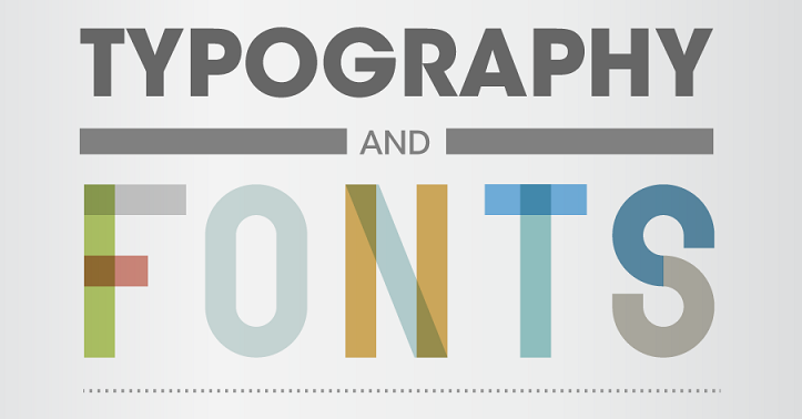
Typography
Typography
Typography is the description of type(fonts) aesthetically. It involves the creation and application of type.
browser view
You’re Invited
You‘re Invited
You’re Invited
When something is written those words have an explicit meaning. However, the font chosen can change the implicit mean.
When you look at the text to the right how does each make you feel? What do you think you are being invited too? It is the same text but the way it is written makes a huge difference.
Letterform
Letterform is the description of the glyph that represents the letters in a typeface. Type can be described by its anatomy. You might be surprised by how in depth it goes.
Type Classification:
Type can be broken down into major categories and then into smaller and smaller groups. There is some differing information here but this is how I would break it down.
Serif:
Serif fonts have extra bits on the end of its strokes. You often see this used on the printed page when large amounts of text are used.
Monospace:
Monospace was developed out of necessity. In the days of typewriters it was the only type available. Monospace fonts have all glyphs with the same width.
Display:
Display, or Decorative/Fantasy, fonts are the super interesting fonts with lots of bells and whistles. They are probably the most interesting to look at but generally the hardest to read. These are best used in small amounts.
Sans-Serif:
Probably the “cleanest” typefaces. These contain the most bare minimum of details which results in probably the best legibility. They are appropriate for small text.
Script:
Script, also described as Handwriting or Cursive, is meant to basically mimic text written by hand.
Type Spacing & Layout:
The way you place your text can have major ramifications.
Spacing:
You can control the distance between letters, words, and paragraphs.
- letterspacing:
- Letter spacing is the space between letters.
-
- Tracking:
- Tracking is application of spacing between all letters.
- Kerning:
- Kerning the is the application of spacing between specific letters.
- Wordspacing
- The space between words
- Leading
- This is the spacing between each line of text
- Alignment
- This is how the text is flush horizontally
- Center, Left, Right, Justified
- Rag
- This is the opposite edge of the alignment.
- Widow
- A widow is when you have few, most often one, word at the end of a paragraph on the last line
- Orphan
- Similar to the widow except you have few or a single word at the top of a paragraph.
browser view
tracking |tracking
AW | AW
This has a lot of wordspacing. | This has little wordspacing.
These lines have very little leading. As you can see here.
|
These lines have a decent amount of leading. As you can see here.
This text is obviously aligned to the left. |
This text is obviously center aligned.
| And this text has been aligned to the right.
Here is a longer paragraph. It is meant to be utilized as an example of justified alignment. You can see both the left and right have clean lines but there are gaps in-between called rivers. These are not desirable.
Here are two more paragraphs. They are meant to be utilized as an example of rag, widow, and orphan. The rag is the “ragged” edge at the right necessary to have a clean edge at the left. The widow is the small line at the end of the paragraph. This is an
orphan.
Layout:
You can control how you place your blocks of texts. It is best to develop a system.
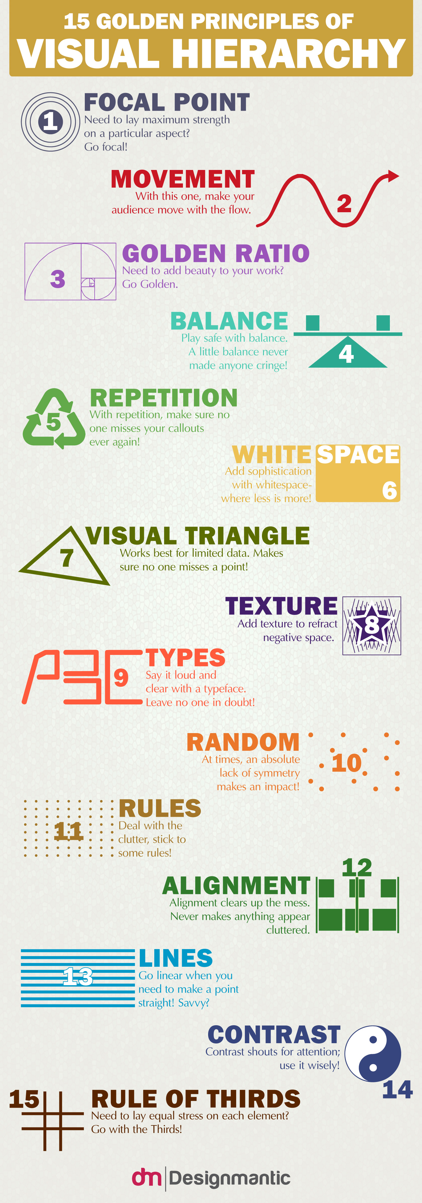
- Hierarchy
- When designing your text, like your document as a whole, you want to develop levels of importance.
-
- Size
- The most common thing to draw importance to text is to change it’s size. The heading is the largest. The paragraphs are the smallest.
- Weight
- Making text bolder draws more attention.
- Spacing
- Adding space around text give importance.
- Color
- Brighter more saturated colors ascend. Cooler desaturated colors recede.
- Grid
- The grid is a method in laying out text since it is most often define in blocks. It has particular popularity in web design.
-
- Column
- Grids are described mainly by their number of columns.
- Gutter
- The gutter is the space between each column.
- Row
- Each row is described by it’s height and how many columns it spans.
Choosing & Applying Type:
- Paragraphs
- When choosing text for paragraphs legibility and readability matter most.
-
- Similar Widths
- The characters of the font should not be monospace but you do want them to be similar in width.
- Not Thin or Fat
- Overly thin or fat characters are hard to read. A width to height ratio of 3/5 is preferred.
- Avoid Tall or Short Lowercase
- The x-height (height of lowercase letters) should be roughly half the size of uppercase letters.
- Not Round
- You do not want to use letters that have large holes in them.
- Symmetrical or Mirrors
- You do not want matching b’s and d’s, or p’s and q’s, etc.
- Uneven Stroke Thickness
- Varying line thickness of the characters makes them easier to read.
- Decorative Fonts
- Never use fancy fonts in large bodies of text.
- Spacing
- You want the space between your words and characters to not be overly large or small.
Generally speaking when dealing with large volumes of text serif is the preferred typeface.

Typefaces for body text should be clean clear and easily read.
- Headings
- Your headings should draw attention and since they are shorter you can pick more decorative.
-
- Target
- Who this is for is most important. Children want round bubbly characters. Older adults will expect more professional type.
- Message
- Depending on the context of what you are saying the font changes. A bank’s text should show strength. An ice cream truck should be colorful.
- Image
- You should take hints from an image if there is one. Break it down using the elements of art and principles of design. Then apply the same rules to your font choice.
When you produce short bursts of text you can really choose whatever typeface you like.

Here you can see an example of an appropriate heading font. It is interesting and draws you in but would not work for large amounts of text.
Applying typography
Instructions:
Now let’s attach some typefaces using Google Fonts.
<!DOCTYPE html>
<html>
    <head>
        <title>Teach Me Cone</title>
        <meta charset="UTF-8" />
        <meta name="viewport" content="width=device-width, initial=scale=1.0" />
        <link href="https://cdn.jsdelivr.net/npm/bootstrap@5.3.3/dist/css/bootstrap.min.css" rel="stylesheet" integrity="sha384-QWTKZyjpPEjISv5WaRU9OFeRpok6YctnYmDr5pNlyT2bRjXh0JMhjY6hW+ALEwIH" crossorigin="anonymous">
        <link rel="stylesheet" href="https://cdnjs.cloudflare.com/ajax/libs/font-awesome/4.7.0/css/font-awesome.min.css">
        <link rel="preconnect" href="https://fonts.googleapis.com">
        <link rel="preconnect" href="https://fonts.gstatic.com" crossorigin>
        <link href="https://fonts.googleapis.com/css2?family=Anton&family=Raleway:ital,wght@0,100..900;1,100..900&display=swap" rel="stylesheet">
        <style>
            h1, h2, h3, h4, h5, h6 {
                font-family: "Anton", sans-serif;
                font-weight: 400;
                font-style: normal;}

            body, p, q, li {
                font-family: "Raleway", sans-serif;
                font-optical-sizing: auto;
                font-weight: 400;
                font-style: normal;}

            .block {
                background-color: gray;
                text-align: center;
                border: solid black 1px;}
        </style>
    </head>
    <body data-rsssl=1 data-rsssl=1>
        <header class="container-fluid">
            <section class="row">
                <article class="col">
                    <nav class="navbar navbar-expand-lg bg-body-tertiary">
                        <div class="container-fluid">
                            <a class="navbar-brand" href="#">Navbar</a>
                            <button class="navbar-toggler" type="button" data-bs-toggle="collapse" data-bs-target="#navbarSupportedContent" aria-controls="navbarSupportedContent" aria-expanded="false" aria-label="Toggle navigation">
                            <span class="navbar-toggler-icon"></span>
                            </button>
                            <div class="collapse navbar-collapse" id="navbarSupportedContent">
                            <ul class="navbar-nav me-auto mb-2 mb-lg-0">
                                <li class="nav-item">
                                <a class="nav-link active" aria-current="page" href="#">Home</a>
                                </li>
                                <li class="nav-item">
                                <a class="nav-link" href="#">Link</a>
                                </li>
                                <li class="nav-item dropdown">
                                <a class="nav-link dropdown-toggle" href="#" role="button" data-bs-toggle="dropdown" aria-expanded="false">
                                    Dropdown
                                </a>
                                <ul class="dropdown-menu">
                                    <li><a class="dropdown-item" href="#">Action</a></li>
                                    <li><a class="dropdown-item" href="#">Another action</a></li>
                                    <li><hr class="dropdown-divider"></li>
                                    <li><a class="dropdown-item" href="#">Something else here</a></li>
                                </ul>
                                </li>
                                <li class="nav-item">
                                <a class="nav-link disabled" aria-disabled="true">Disabled</a>
                                </li>
                            </ul>
                            <form class="d-flex" role="search">
                                <input class="form-control me-2" type="search" placeholder="Search" aria-label="Search">
                                <button class="btn btn-outline-success" type="submit">Search</button>
                            </form>
                            </div>
                        </div>
                    </nav>
                </article>
            </section>
        </header>

        <main class="container">
            <section class="row">
                <article class="col-xl-8 offset-xl-2">
                    <div id="carouselExampleCaptions" class="carousel slide">
                        <div class="carousel-indicators">
                          <button type="button" data-bs-target="#carouselExampleCaptions" data-bs-slide-to="0" class="active" aria-current="true" aria-label="Slide 1"></button>
                          <button type="button" data-bs-target="#carouselExampleCaptions" data-bs-slide-to="1" aria-label="Slide 2"></button>
                          <button type="button" data-bs-target="#carouselExampleCaptions" data-bs-slide-to="2" aria-label="Slide 3"></button>
                        </div>
                        <div class="carousel-inner" style="height: 40vw;">
                          <div class="carousel-item active">
                            <img src="images/kevin-jarrett-rip5luxidKI-unsplash.jpg" class="d-block w-100" alt="...">
                            <div class="carousel-caption d-none d-md-block">
                              <h5>First slide label</h5>
                              <p>Some representative placeholder content for the first slide.</p>
                            </div>
                          </div>
                          <div class="carousel-item">
                            <img src="images/kevin-jarrett-rip5luxidKI-unsplash.jpg" class="d-block w-100" alt="...">
                            <div class="carousel-caption d-none d-md-block">
                              <h5>Second slide label</h5>
                              <p>Some representative placeholder content for the second slide.</p>
                            </div>
                          </div>
                          <div class="carousel-item">
                            <img src="images/kevin-jarrett-rip5luxidKI-unsplash.jpg" class="d-block w-100" alt="...">
                            <div class="carousel-caption d-none d-md-block">
                              <h5>Third slide label</h5>
                              <p>Some representative placeholder content for the third slide.</p>
                            </div>
                          </div>
                        </div>
                        <button class="carousel-control-prev" type="button" data-bs-target="#carouselExampleCaptions" data-bs-slide="prev">
                          <span class="carousel-control-prev-icon" aria-hidden="true"></span>
                          <span class="visually-hidden">Previous</span>
                        </button>
                        <button class="carousel-control-next" type="button" data-bs-target="#carouselExampleCaptions" data-bs-slide="next">
                          <span class="carousel-control-next-icon" aria-hidden="true"></span>
                          <span class="visually-hidden">Next</span>
                        </button>
                    </div>
                </article>
            </section>

            <section class="row">
                <article class="col-xl-3 col-md-6">
                    <div class="card" style="width: 18rem;">
                        <img src="images/kevin-jarrett-rip5luxidKI-unsplash.jpg" class="card-img-top" alt="...">
                        <div class="card-body">
                          <h5 class="card-title">Card title</h5>
                          <p class="card-text">Some quick example text to build on the card title and make up the bulk of the card's content.</p>
                          <a href="#" class="btn btn-primary">Go somewhere</a>
                        </div>
                    </div>
                </article>
                <article class="col-xl-3 col-md-6">
                    <div class="card" style="width: 18rem;">
                        <img src="images/kevin-jarrett-rip5luxidKI-unsplash.jpg" class="card-img-top" alt="...">
                        <div class="card-body">
                          <h5 class="card-title">Card title</h5>
                          <p class="card-text">Some quick example text to build on the card title and make up the bulk of the card's content.</p>
                          <a href="#" class="btn btn-primary">Go somewhere</a>
                        </div>
                    </div>
                </article>
                <article class="col-xl-3 col-md-6">
                    <div class="card" style="width: 18rem;">
                        <img src="images/kevin-jarrett-rip5luxidKI-unsplash.jpg" class="card-img-top" alt="...">
                        <div class="card-body">
                          <h5 class="card-title">Card title</h5>
                          <p class="card-text">Some quick example text to build on the card title and make up the bulk of the card's content.</p>
                          <a href="#" class="btn btn-primary">Go somewhere</a>
                        </div>
                    </div>
                </article>
                <article class="col-xl-3 col-md-6">
                    <div class="card" style="width: 18rem;">
                        <img src="images/kevin-jarrett-rip5luxidKI-unsplash.jpg" class="card-img-top" alt="...">
                        <div class="card-body">
                          <h5 class="card-title">Card title</h5>
                          <p class="card-text">Some quick example text to build on the card title and make up the bulk of the card's content.</p>
                          <a href="#" class="btn btn-primary">Go somewhere</a>
                        </div>
                    </div>
                </article>
            </section>

            <section class="row">

                <article class="col col-lg-6 col-sm-12">
                    <div class="row" style="height: 20em;">
                        <div class="col">
                            <figure>
                                <iframe src="https://www.youtube.com/embed/dQw4w9WgXcQ?si=nDrLk8K0Y8gWC9O6" title="YouTube video player" frameborder="0" allow="accelerometer; autoplay; clipboard-write; encrypted-media; gyroscope; picture-in-picture; web-share" referrerpolicy="strict-origin-when-cross-origin" allowfullscreen></iframe>
                                <figcaption>
                                    <p>description</p>
                                </figcaption>
                            </figure>
                        </div>
                        <div class="col">
                            <p>Nullam eu urna at ligula iaculis congue. Duis fringilla finibus magna, at scelerisque velit congue eget. Nunc eu erat at arcu semper venenatis nec quis eros. Donec consectetur neque gravida, auctor odio sed, mollis diam. Quisque ut dignissim justo. Donec urna dolor, elementum id tempus vitae, porta eget purus. Proin accumsan congue feugiat. Nulla condimentum tincidunt aliquam.</p>
                        </div>
                    </div>
                </article>

                <article class="col col-lg-6 col-sm-12">
                    <div class="row" style="height: 20em;">
                        <div class="col">
                            <figure>
                                <iframe src="https://www.google.com/maps/embed?pb=!1m18!1m12!1m3!1d3072.3871508934863!2d-75.95910462337045!3d39.6410007715748!2m3!1f0!2f0!3f0!3m2!1i1024!2i768!4f13.1!3m3!1m2!1s0x89c7b0f19cc33215%3A0x36d4f10a671a795e!2sCecil%20College!5e0!3m2!1sen!2sus!4v1728062802650!5m2!1sen!2sus" style="border:0;" allowfullscreen="" loading="lazy" referrerpolicy="no-referrer-when-downgrade"></iframe>
                                <figcaption>
                                    <p>description</p>
                                </figcaption>
                            </figure>
                        </div>
                        <div class="col">
                            <p>Nullam eu urna at ligula iaculis congue. Duis fringilla finibus magna, at scelerisque velit congue eget. Nunc eu erat at arcu semper venenatis nec quis eros. Donec consectetur neque gravida, auctor odio sed, mollis diam. Quisque ut dignissim justo. Donec urna dolor, elementum id tempus vitae, porta eget purus. Proin accumsan congue feugiat. Nulla condimentum tincidunt aliquam.</p>
                        </div>
                    </div>
                </article>
            </section>
        </main>

        <footer class="container-fluid">
            <section class="row">
                <article class="col-4 offset-4">
                    <p>© TeachMeCone. All Rights reserved. Privacy Policy</p>
                </article>
            </section>

            <section class="row">
                <article class="col">
                    <div class="row">
                        <div class="offset-4 col-1">
                            <i class="fa fa-facebook-square" style="font-size:3em"></i>
                        </div>
                        <div class="col-1">
                            <i class="fa fa-twitter-square" style="font-size:3em"></i>
                        </div>
                        <div class="col-1">
                            <i class="fa fa-linkedin-square" style="font-size:3em"></i>
                        </div>
                        <div class="col-1">
                            <i class="fa fa-instagram" style="font-size:3em"></i>
                        </div>
                    </div>
                </article>
            </section>
        </footer>

        <script src="https://cdn.jsdelivr.net/npm/bootstrap@5.3.3/dist/js/bootstrap.bundle.min.js" integrity="sha384-YvpcrYf0tY3lHB60NNkmXc5s9fDVZLESaAA55NDzOxhy9GkcIdslK1eN7N6jIeHz" crossorigin="anonymous"></script>
    </body>
</html>
browser view

Card title
Some quick example text to build on the card title and make up the bulk of the card’s content.

Card title
Some quick example text to build on the card title and make up the bulk of the card’s content.

Card title
Some quick example text to build on the card title and make up the bulk of the card’s content.

Card title
Some quick example text to build on the card title and make up the bulk of the card’s content.
Nullam eu urna at ligula iaculis congue. Duis fringilla finibus magna, at scelerisque velit congue eget. Nunc eu erat at arcu semper venenatis nec quis eros. Donec consectetur neque gravida, auctor odio sed, mollis diam. Quisque ut dignissim justo. Donec urna dolor, elementum id tempus vitae, porta eget purus. Proin accumsan congue feugiat. Nulla condimentum tincidunt aliquam.
Nullam eu urna at ligula iaculis congue. Duis fringilla finibus magna, at scelerisque velit congue eget. Nunc eu erat at arcu semper venenatis nec quis eros. Donec consectetur neque gravida, auctor odio sed, mollis diam. Quisque ut dignissim justo. Donec urna dolor, elementum id tempus vitae, porta eget purus. Proin accumsan congue feugiat. Nulla condimentum tincidunt aliquam.
© TeachMeCone. All Rights reserved. Privacy Policy
Responsive Content
Responsive Content
When producing printed or fixed-width layouts your content may be absolute sizes. When you are creating content within a responsive framework you may need to make some of it adjustable or scaleable.
browser view

Inserting content
Instructions:
Previously you converted your inline CSS to internal CSS. Now you will convert your internal CSS to external CSS.
First you will need to create a new text file. In Microsoft Visual Studio Code, select File>New Text File. A new tab with a blank document will be created. Save this file, File>Save. In the popup window navigate to the css folder in the root folder of your site. Name the file styles.css and choose css as the file type. Press Save.
Now you can paste your CSS rules from the index.html document into the style.css document. In the html document, select all CSS rules in between the <style> tags. Press ctrl + x (on PC) or cmd + x (on Mac) to cut the rules. Select the <style> opening and closing tags that remain and delete them. In the style.css document press ctrl + v (on PC) or cmd + v (on Mac) to paste the rules. Select File>Save on both documents to save what you have done.
<!DOCTYPE html>
<html>
<head>
<title>Teach Me Cone</title>
<meta charset="UTF-8" />
<meta name="viewport" content="width=device-width, initial=scale=1.0" />
<link href="https://cdn.jsdelivr.net/npm/bootstrap@5.3.3/dist/css/bootstrap.min.css" rel="stylesheet" integrity="sha384-QWTKZyjpPEjISv5WaRU9OFeRpok6YctnYmDr5pNlyT2bRjXh0JMhjY6hW+ALEwIH" crossorigin="anonymous">
<link rel="stylesheet" href="https://cdnjs.cloudflare.com/ajax/libs/font-awesome/4.7.0/css/font-awesome.min.css">
<link rel="preconnect" href="https://fonts.googleapis.com">
<link rel="preconnect" href="https://fonts.gstatic.com" crossorigin>
<link href="https://fonts.googleapis.com/css2?family=Anton&family=Raleway:ital,wght@0,100..900;1,100..900&display=swap" rel="stylesheet">
<style>
h1, h2, h3, h4, h5, h6 {
font-family: "Anton", sans-serif;
font-weight: 400;
font-style: normal;}
body, p, q, li {
font-family: "Raleway", sans-serif;
font-optical-sizing: auto;
font-weight: 400;
font-style: normal;}
footer {
text-align: center;}
iframe {
aspect-ratio: 16/9;
height: auto;
width: 100%;}
</style>
</head>
<body data-rsssl=1 data-rsssl=1>
<header class="container-fluid">
<section class="row">
<article class="col">
<nav class="navbar navbar-expand-lg bg-body-tertiary">
<div class="container-fluid">
<a class="navbar-brand" href="#">Navbar</a>
<button class="navbar-toggler" type="button" data-bs-toggle="collapse" data-bs-target="#navbarSupportedContent" aria-controls="navbarSupportedContent" aria-expanded="false" aria-label="Toggle navigation">
<span class="navbar-toggler-icon"></span>
</button>
<div class="collapse navbar-collapse" id="navbarSupportedContent">
<ul class="navbar-nav me-auto mb-2 mb-lg-0">
<li class="nav-item">
<a class="nav-link active" aria-current="page" href="#">Home</a>
</li>
<li class="nav-item">
<a class="nav-link" href="#">Link</a>
</li>
<li class="nav-item dropdown">
<a class="nav-link dropdown-toggle" href="#" role="button" data-bs-toggle="dropdown" aria-expanded="false">
Dropdown
</a>
<ul class="dropdown-menu">
<li><a class="dropdown-item" href="#">Action</a></li>
<li><a class="dropdown-item" href="#">Another action</a></li>
<li><hr class="dropdown-divider"></li>
<li><a class="dropdown-item" href="#">Something else here</a></li>
</ul>
</li>
<li class="nav-item">
<a class="nav-link disabled" aria-disabled="true">Disabled</a>
</li>
</ul>
<form class="d-flex" role="search">
<input class="form-control me-2" type="search" placeholder="Search" aria-label="Search">
<button class="btn btn-outline-success" type="submit">Search</button>
</form>
</div>
</div>
</nav>
</article>
</section>
</header>
<main class="container">
<section class="row">
<article class="col-xl-8 offset-xl-2">
<div id="carouselExampleCaptions" class="carousel slide">
<div class="carousel-indicators">
<button type="button" data-bs-target="#carouselExampleCaptions" data-bs-slide-to="0" class="active" aria-current="true" aria-label="Slide 1"></button>
<button type="button" data-bs-target="#carouselExampleCaptions" data-bs-slide-to="1" aria-label="Slide 2"></button>
<button type="button" data-bs-target="#carouselExampleCaptions" data-bs-slide-to="2" aria-label="Slide 3"></button>
</div>
<div class="carousel-inner">
<div class="carousel-item active">
<img src="images/kevin-jarrett-rip5luxidKI-unsplash.jpg" class="d-block w-100" alt="...">
<div class="carousel-caption d-none d-md-block">
<h5>First slide label</h5>
<p>Some representative placeholder content for the first slide.</p>
</div>
</div>
<div class="carousel-item">
<img src="images/kevin-jarrett-rip5luxidKI-unsplash.jpg" class="d-block w-100" alt="...">
<div class="carousel-caption d-none d-md-block">
<h5>Second slide label</h5>
<p>Some representative placeholder content for the second slide.</p>
</div>
</div>
<div class="carousel-item">
<img src="images/kevin-jarrett-rip5luxidKI-unsplash.jpg" class="d-block w-100" alt="...">
<div class="carousel-caption d-none d-md-block">
<h5>Third slide label</h5>
<p>Some representative placeholder content for the third slide.</p>
</div>
</div>
</div>
<button class="carousel-control-prev" type="button" data-bs-target="#carouselExampleCaptions" data-bs-slide="prev">
<span class="carousel-control-prev-icon" aria-hidden="true"></span>
<span class="visually-hidden">Previous</span>
</button>
<button class="carousel-control-next" type="button" data-bs-target="#carouselExampleCaptions" data-bs-slide="next">
<span class="carousel-control-next-icon" aria-hidden="true"></span>
<span class="visually-hidden">Next</span>
</button>
</div>
</article>
</section>
<section class="row">
<article class="col-xl-3 col-md-6">
<div class="card">
<img src="images/kevin-jarrett-rip5luxidKI-unsplash.jpg" class="card-img-top" alt="...">
<div class="card-body">
<h5 class="card-title">Card title</h5>
<p class="card-text">Some quick example text to build on the card title and make up the bulk of the card's content.</p>
<a href="#" class="btn btn-primary">Go somewhere</a>
</div>
</div>
</article>
</section>
<section class="row">
<article class="col col-lg-6 col-sm-12">
<div class="row">
<div class="col-xl-8">
<figure>
<iframe src="https://www.youtube.com/embed/dQw4w9WgXcQ?si=nDrLk8K0Y8gWC9O6" title="YouTube video player" frameborder="0" allow="accelerometer; autoplay; clipboard-write; encrypted-media; gyroscope; picture-in-picture; web-share" referrerpolicy="strict-origin-when-cross-origin" allowfullscreen></iframe>
<figcaption>
<p>description</p>
</figcaption>
</figure>
</div>
<div class="col-xl-4">
<p>Nullam eu urna at ligula iaculis congue. Duis fringilla finibus magna, at scelerisque velit congue eget.</p>
</div>
</div>
</article>
<article class="col col-lg-6 col-sm-12">
<div class="row">
<div class="col-xl-8">
<figure>
<iframe src="https://www.google.com/maps/embed?pb=!1m18!1m12!1m3!1d3072.3871508934863!2d-75.95910462337045!3d39.6410007715748!2m3!1f0!2f0!3f0!3m2!1i1024!2i768!4f13.1!3m3!1m2!1s0x89c7b0f19cc33215%3A0x36d4f10a671a795e!2sCecil%20College!5e0!3m2!1sen!2sus!4v1728062802650!5m2!1sen!2sus" style="border:0;" allowfullscreen="" loading="lazy" referrerpolicy="no-referrer-when-downgrade"></iframe>
<figcaption>
<p>description</p>
</figcaption>
</figure>
</div>
<div class="col-xl-4">
<p>Nullam eu urna at ligula iaculis congue. Duis fringilla finibus magna, at scelerisque velit congue eget.</p>
</div>
</div>
</article>
</section>
</main>
<footer class="container-fluid">
<section class="row">
<article class="col-4 offset-4">
<p>© TeachMeCone. All Rights reserved. Privacy Policy</p>
</article>
</section>
<section class="row">
<article class="col">
<div class="row">
<div class="offset-4 col-1">
<i class="fa fa-facebook-square" style="font-size:3em"></i>
</div>
<div class="col-1">
<i class="fa fa-twitter-square" style="font-size:3em"></i>
</div>
<div class="col-1">
<i class="fa fa-linkedin-square" style="font-size:3em"></i>
</div>
<div class="col-1">
<i class="fa fa-instagram" style="font-size:3em"></i>
</div>
</div>
</article>
</section>
</footer>
<script src="https://cdn.jsdelivr.net/npm/bootstrap@5.3.3/dist/js/bootstrap.bundle.min.js" integrity="sha384-YvpcrYf0tY3lHB60NNkmXc5s9fDVZLESaAA55NDzOxhy9GkcIdslK1eN7N6jIeHz" crossorigin="anonymous"></script>
</body>
</html>browser view

Card title
Some quick example text to build on the card title and make up the bulk of the card’s content.

Card title
Some quick example text to build on the card title and make up the bulk of the card’s content.

Card title
Some quick example text to build on the card title and make up the bulk of the card’s content.

Card title
Some quick example text to build on the card title and make up the bulk of the card’s content.
Nullam eu urna at ligula iaculis congue. Duis fringilla finibus magna, at scelerisque velit congue eget. Nunc eu erat at arcu semper venenatis nec quis eros. Donec consectetur neque gravida, auctor odio sed, mollis diam. Quisque ut dignissim justo. Donec urna dolor, elementum id tempus vitae, porta eget purus. Proin accumsan congue feugiat. Nulla condimentum tincidunt aliquam.
Nullam eu urna at ligula iaculis congue. Duis fringilla finibus magna, at scelerisque velit congue eget. Nunc eu erat at arcu semper venenatis nec quis eros. Donec consectetur neque gravida, auctor odio sed, mollis diam. Quisque ut dignissim justo. Donec urna dolor, elementum id tempus vitae, porta eget purus. Proin accumsan congue feugiat. Nulla condimentum tincidunt aliquam.
© TeachMeCone. All Rights reserved. Privacy Policy
Lab assignment submission
Instructions:
Before you submit you should review your code and Save your file (File > Save), navigate to your file on your Desktop, and double-click it to open
Look for any errors. If there are any, look through your code and fix them. When you are happy, proceed
Your site is not just the single HTML document you have created but the root folder and all contents therein. You MUST submit the ENTIRE folder
You cannot submit folders on Canvas. Instead we can zip the folder and submit that. Navigate to the location of your site folder. Right-click over top of it and select Compress to zip file on Windows and Compress on MacOS. A new zipped file will be created
Lastly, log into Canvas (Here) and click on this course. Inside the course, under module Week 08, select Week 08: Responsive Site (content) Lab, then upload the zipped file.
You’re Done
Did you remember to?
- Read through this webpage
- Complete and submit the 08 Responsive Site (content) Lab on Canvas
