
Web Design I
Class 08: Embedding TechnologiesTopics
- Bootstrap Components
- Embeddable Technologies
- Typography
- Week 08 Responsive Site (homepage content) Lab

Class 8 is coming for you!


Bootstrap Components
- carousel
- Basically a pre-built minimalist slideshow. Very easy to hook up but there is a lot of code.
browser view
image
image
image
- other classes
- There are many more classes included in Bootstrap. I suggest checking out the link below to take a quick survey of what is available.
- Bootstrap Components
- navs
- These create simple navigation elements with basic classes
browser view
- navbars
- Very robust and complicated navigation system that is responsive.
browser view
- cards
- Formatted element that has a recognizable look that is good for boxing a group of elements like an image with a caption.
browser view
image
Here is some text.
Embeddable Technologies
Font Awesome:
A font that acts more as a series of useful icons that have become standard in web design. Think wing dings but with purpose.
browser view
<!–place this in the head element section–>
<link rel=”stylesheet” href=”https://use.fontawesome.com/releases/v5.2.0/css/all.css” integrity=”sha384-hWVjflwFxL6sNzntih27bfxkr27PmbbK/iSvJ+a4+0owXq79v+lsFkW54bOGbiDQ” crossorigin=”anonymous”>
<!–use this in the body where you would like it placed–>
<i class=”far fa-clone”></i>
Google Fonts:
Google offers a service (for free) whereby you may utilize their library of fonts on your own sites.
google fonts
browser view
Google Font Example
<!–place this in the head element section–>
<link href=”https://fonts.googleapis.com/css?family=Kirang+Haerang” rel=”stylesheet”>
<!–place this in the style sheet (example on a p element)–>
p {
font-family: ‘Kirang Haerang’, cursive; }
Youtube Videos:
Youtube allows you to embed their videos.
youtube
browser view
<!–place this where you want it viewed–>
<iframe width=”560″ height=”315″ src=”https://www.youtube.com/embed/dQw4w9WgXcQ” frameborder=”0″ allow=”autoplay; encrypted-media” allowfullscreen></iframe>
Google Maps:
Google allows you to embed their maps with a location specified.
google maps
browser view
<!–place this where you want it viewed–>
<iframe src=”https://www.google.com/maps/embed?pb=!1m18!1m12!1m3!1d3072.386497485153!2d-75.9587388852204!3d39.6410154794628!2m3!1f0!2f0!3f0!3m2!1i 1024!2i768!4f13.1!3m3!1m2!1s0x89c7 b0f19cc33215%3 A0x36d4f10 a671a795e!2s Cecil+College !5e0!3m2!1sen!2sus!4v1534004723637″ width=”600″ height=”450″ frameborder=”0″ style=”border:0″ allowfullscreen></iframe>
Others:
The internet was developed as a sharing platform. Therefore, you will find lots of other resources available online besides those above.
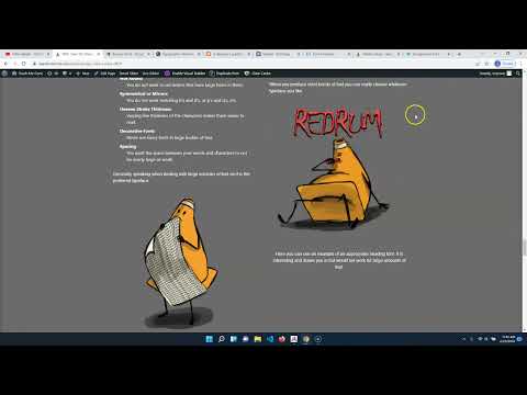
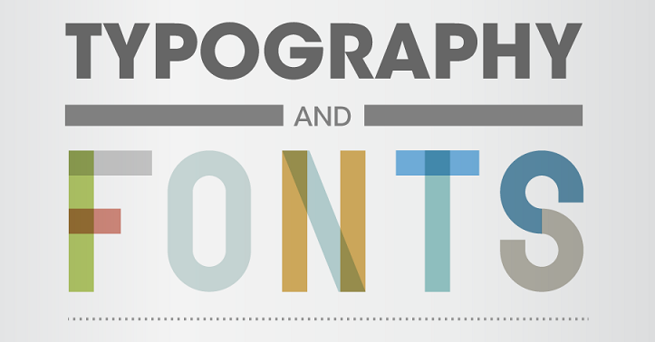
Typography
Typography:
Typography is the description of type(fonts) aesthetically. It involves the creation and application of type.
When something is written those words have an explicit meaning. However, the font chosen can change the implicit mean.
When you look at the text to the right how does each make you feel? What do you think you are being invited too? It is the same text but the way it is written makes a huge difference.
browser view
You’re Invited
You‘re Invited
You’re Invited
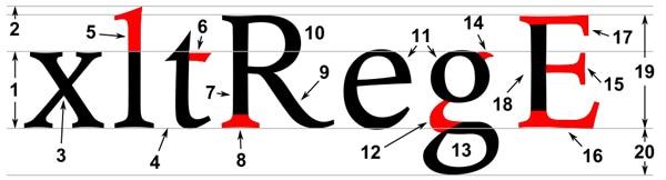
Letterform:
Letterform is the description of the glyph that represents the letters in a typeface. Type can be described by its anatomy. You might be surprised by how in depth it goes.
Type Classification:
Type can be broken down into major categories and then into smaller and smaller groups. There is some differing information here but this is how I would break it down.
Serif:
Serif fonts have extra bits on the end of its strokes. You often see this used on the printed page when large amounts of text are used.
Monospace:
Monospace was developed out of necessity. In the days of typewriters it was the only type available. Monospace fonts have all glyphs with the same width.
Display:
Display, or Decorative/Fantasy, fonts are the super interesting fonts with lots of bells and whistles. They are probably the most interesting to look at but generally the hardest to read. These are best used in small amounts.
Sans-Serif:
Probably the “cleanest” typefaces. These contain the most bare minimum of details which results in probably the best legibility. They are appropriate for small text.
Script:
Script, also described as Handwriting or Cursive, is meant to basically mimic text written by hand.
Type Spacing & Layout:
The way you place your text can have major ramifications.
Spacing:
You can control the distance between letters, words, and paragraphs.
- letterspacing:
- Letter spacing is the space between letters.
-
- Tracking:
- Tracking is application of spacing between all letters.
- Kerning:
- Kerning the is the application of spacing between specific letters.
- Wordspacing
- The space between words
- Leading
- This is the spacing between each line of text
- Alignment
- This is how the text is flush horizontally
- Center, Left, Right, Justified
- Rag
- This is the opposite edge of the alignment.
- Widow
- A widow is when you have few, most often one, word at the end of a paragraph on the last line
- Orphan
- Similar to the widow except you have few or a single word at the top of a paragraph.
browser view
tracking |tracking
AW | AW
This has a lot of wordspacing. | This has little wordspacing.
These lines have very little leading. As you can see here.
|
These lines have a decent amount of leading. As you can see here.
This text is obviously aligned to the left. |
This text is obviously center aligned.
| And this text has been aligned to the right.
Here is a longer paragraph. It is meant to be utilized as an example of justified alignment. You can see both the left and right have clean lines but there are gaps in-between called rivers. These are not desirable.
Here are two more paragraphs. They are meant to be utilized as an example of rag, widow, and orphan. The rag is the “ragged” edge at the right necessary to have a clean edge at the left. The widow is the small line at the end of the paragraph. This is an
orphan.
Layout:
You can control how you place your blocks of texts. It is best to develop a system.
- Hierarchy
- When designing your text, like your document as a whole, you want to develop levels of importance.
-
- Size
- The most common thing to draw importance to text is to change it’s size. The heading is the largest. The paragraphs are the smallest.
- Weight
- Making text bolder draws more attention.
- Spacing
- Adding space around text give importance.
- Color
- Brighter more saturated colors ascend. Cooler desaturated colors recede.
- Grid
- The grid is a method in laying out text since it is most often define in blocks. It has particular popularity in web design.
-
- Column
- Grids are described mainly by their number of columns.
- Gutter
- The gutter is the space between each column.
- Row
- Each row is described by it’s height and how many columns it spans.
Choosing & Applying Type:
- Paragraphs
- When choosing text for paragraphs legibility and readability matter most.
-
- Similar Widths
- The characters of the font should not be monospace but you do want them to be similar in width.
- Not Thin or Fat
- Overly thin or fat characters are hard to read. A width to height ratio of 3/5 is preferred.
- Avoid Tall or Short Lowercase
- The x-height (height of lowercase letters) should be roughly half the size of uppercase letters.
- Not Round
- You do not want to use letters that have large holes in them.
- Symmetrical or Mirrors
- You do not want matching b’s and d’s, or p’s and q’s, etc.
- Uneven Stroke Thickness
- Varying line thickness of the characters makes them easier to read.
- Decorative Fonts
- Never use fancy fonts in large bodies of text.
- Spacing
- You want the space between your words and characters to not be overly large or small.
Generally speaking when dealing with large volumes of text serif is the preferred typeface.

Typefaces for body text should be clean clear and easily read.
- Headings
- Your headings should draw attention and since they are shorter you can pick more decorative.
-
- Target
- Who this is for is most important. Children want round bubbly characters. Older adults will expect more professional type.
- Message
- Depending on the context of what you are saying the font changes. A bank’s text should show strength. An ice cream truck should be colorful.
- Image
- You should take hints from an image if there is one. Break it down using the elements of art and principles of design. Then apply the same rules to your font choice.
When you produce short bursts of text you can really choose whatever typeface you like.
Here you can see an example of an appropriate heading font. It is interesting and draws you in but would not work for large amounts of text.
Week 08 Responsive Site (homepage content) Lab
Responsive Site (homepage content) Lab
uilding on the lab from last week we will complete the homepage by entering the content.. The final content (text, images, embedded content, etc.) will be formatted to fit in the sections they are applied. CSS will be applied to control the color, text, and boxes of the site.
You will be graded on the following:
- Basic Document & File Structure:
- Master folder created with correct sub folders.
- All files named and placed correctly.
- Basic HTML and CSS structure produced.
- Basic Content:
- Well-written text with no grammar mistakes.
- Images scaled, and adjusted for the page.
- Rich Media:
- Video, audio, interactive components linked appropriately.
- Embeddable technologies such as google fonts and youtube videos are utilized.
- Aesthetic:
- Strong use of CSS to produce a cohesive color scheme, appropriate typography, and composition.
- Appealing design with professional craftsmanship throughout.
Resources:
- Assignment Video Tutorials
- You may watch the video tutorials below
- Assignment Lab Materials
- You may download the lab materials here: wd1_wk08_labMat.
Assignment Tutorials
This tutorial will guide you through lab. You may download the lab materials used: here

Now that the layout of the homepage is complete it needs content. In this lab we will apply the content of the site. Text, images, Bootstrap components, and embedded technologies will be utilized.
Click on the > to start
There are no lab materials necessary to complete this week's lab.


Notice that the images are all scaled the same and adjusted to be more cohesive in color and style.
- Images are the first thing the user sees and the elements that draw the viewer in. As such they must be properly formatted. You may use any photo editor you'd like but I will use Photopea in this tutorial since it is free. You can download the images used here.
- Images in slideshows or that are in a row should be the same width and height. This can be done with code but should really be done to the images themselves.
- Open all images that are either in the same carousel or row. Find the lowest common denominator (the smallest image width or height). Scale and crop the other images to the same resolution.
- You will also want your images to match aesthetically. This means they should share common characteristics. This can be color, effect, style (graphic, flat, texture, etc.), common elements (patterns, logo, white background), or anything really that helps produce unity between them. Apply a similar process to each of the photos to make them cohesive.

<!DOCTYPE html>
<html>
<head>
<title>Homepage Layout Lab</title>
<meta charset="utf-8">
<meta name="viewport" content="width=device-width, initial-scale=1">
<link href="https://cdn.jsdelivr.net/npm/bootstrap@5.0.0-beta2/dist/css/bootstrap.min.css" rel="stylesheet" integrity="sha384-BmbxuPwQa2lc/FVzBcNJ7UAyJxM6wuqIj61tLrc4wSX0szH/Ev+nYRRuWlolflfl" crossorigin="anonymous">
<link type="text/css" rel="stylesheet" href="css/style.css"/>
</head>
<body>
<div class="container-fluid">
  <div class="row">
    <div class="col-12">

      <nav class="navbar navbar-expand-lg navbar-light bg-light">
        <div class="container-fluid">
          <a class="navbar-brand" href="#">Navbar</a>
          <button class="navbar-toggler" type="button" data-bs-toggle="collapse" data-bs-target="#navbarNavDropdown" aria-controls="navbarNavDropdown" aria-expanded="false" aria-label="Toggle navigation">
            <span class="navbar-toggler-icon"></span>
          </button>
          <div class="collapse navbar-collapse" id="navbarNavDropdown">
            <ul class="navbar-nav">
              <li class="nav-item">
                <a class="nav-link active" aria-current="page" href="#">Home</a>
              </li>
              <li class="nav-item">
                <a class="nav-link" href="#">Features</a>
              </li>
              <li class="nav-item">
                <a class="nav-link" href="#">Pricing</a>
              </li>
              <li class="nav-item dropdown">
                <a class="nav-link dropdown-toggle" href="#" id="navbarDropdownMenuLink" role="button" data-bs-toggle="dropdown" aria-expanded="false">
                  Dropdown link
                </a>
                <ul class="dropdown-menu" aria-labelledby="navbarDropdownMenuLink">
                  <li><a class="dropdown-item" href="#">Action</a></li>
                  <li><a class="dropdown-item" href="#">Another action</a></li>
                  <li><a class="dropdown-item" href="#">Something else here</a></li>
                </ul>
              </li>
            </ul>
          </div>
        </div>
      </nav>

    </div>
  </div>

  <div class="row">
    <div class="offset-lg-2 col-lg-8 ">

      <div id="carouselExampleCaptions" class="carousel slide" data-bs-ride="carousel">
        <div class="carousel-indicators">
          <button type="button" data-bs-target="#carouselExampleCaptions" data-bs-slide-to="0" class="active" aria-current="true" aria-label="Slide 1"></button>
          <button type="button" data-bs-target="#carouselExampleCaptions" data-bs-slide-to="1" aria-label="Slide 2"></button>
          <button type="button" data-bs-target="#carouselExampleCaptions" data-bs-slide-to="2" aria-label="Slide 3"></button>
        </div>
        <div class="carousel-inner">
          <div class="carousel-item active">
            <img class="img-fluid d-block w-100" src="https://teachmecone.com/wp-content/uploads/2021/02/coneLandscape.jpg" />
            <div class="carousel-caption d-none d-md-block">
              <h5>First slide label</h5>
              <p>Some representative placeholder content for the first slide.</p>
            </div>
          </div>
          <div class="carousel-item">
            <img class="img-fluid d-block w-100" src="https://teachmecone.com/wp-content/uploads/2021/02/coneLandscape.jpg" />
            <div class="carousel-caption d-none d-md-block">
              <h5>Second slide label</h5>
              <p>Some representative placeholder content for the second slide.</p>
            </div>
          </div>
          <div class="carousel-item">
            <img class="img-fluid d-block w-100" src="https://teachmecone.com/wp-content/uploads/2021/02/coneLandscape.jpg" />
            <div class="carousel-caption d-none d-md-block">
              <h5>Third slide label</h5>
              <p>Some representative placeholder content for the third slide.</p>
            </div>
          </div>
        </div>
        <button class="carousel-control-prev" type="button" data-bs-target="#carouselExampleCaptions"  data-bs-slide="prev">
          <span class="carousel-control-prev-icon" aria-hidden="true"></span>
          <span class="visually-hidden">Previous</span>
        </button>
        <button class="carousel-control-next" type="button" data-bs-target="#carouselExampleCaptions"  data-bs-slide="next">
          <span class="carousel-control-next-icon" aria-hidden="true"></span>
          <span class="visually-hidden">Next</span>
        </button>
      </div>

    </div>
  </div>
</div>

<div class="container">
  <div class="row rowImagesFix">
    <div class="col-sm-6 col-lg-3 ">
      <div class="card" style="width: 18rem;">
        <img src="https://teachmecone.com/wp-content/uploads/2021/03/coneHat.png"  class="card-img-top" alt="...">
        <div class="card-body">
          <h5 class="card-title">Cone Heads</h5>
          <p class="card-text">Some quick example text to build on the card title and make up the bulk of the card's content.</p>
          <a href="#" class="btn btn-primary">Let's Go</a>
        </div>
      </div>
    </div>
    <div class="col-sm-6 col-lg-3 ">
      <div class="card" style="width: 18rem;">
        <img src="https://teachmecone.com/wp-content/uploads/2021/03/iceCreamCone.jpg"  class="card-img-top" alt="...">
        <div class="card-body">
          <h5 class="card-title">Ice Cream Cones</h5>
          <p class="card-text">Some quick example text to build on the card title and make up the bulk of the card's content.</p>
          <a href="#" class="btn btn-primary">Let's Go</a>
        </div>
      </div>
    </div>
    <div class="col-sm-6 col-lg-3 ">
      <div class="card" style="width: 18rem;">
        <img src="https://teachmecone.com/wp-content/uploads/2021/03/pineCone.jpg"  class="card-img-top" alt="...">
        <div class="card-body">
          <h5 class="card-title">Pine Cones</h5>
          <p class="card-text">Some quick example text to build on the card title and make up the bulk of the card's content.</p>
          <a href="#" class="btn btn-primary">Let's Go</a>
        </div>
      </div>
    </div>
    <div class="col-sm-6 col-lg-3 ">
      <div class="card" style="width: 18rem;">
        <img src="https://teachmecone.com/wp-content/uploads/2021/03/maintenanceCone.jpg"  class="card-img-top" alt="...">
        <div class="card-body">
          <h5 class="card-title">Maintenance Cones</h5>
          <p class="card-text">Some quick example text to build on the card title and make up the bulk of the card's content.</p>
          <a href="#" class="btn btn-primary">Let's Go</a>
        </div>
      </div>
    </div>
  </div>

  <div class="row">
    <div class="col-md-6 ">
      <h3>Hello There!</h3>
      <p>Lorem ipsum dolor sit amet, consectetur adipisicing elit, sed do eiusmod tempor incididunt ut labore et dolore magna aliqua. Ut enim ad minim veniam, quis nostrud exercitation ullamco laboris nisi ut aliquip ex ea commodo consequat. Duis aute irure dolor in reprehenderit in voluptate velit esse cillum dolore eu fugiat nulla pariatur. Excepteur sint occaecat cupidatat non proident, sunt in culpa qui officia deserunt mollit anim id est laborum.</p>
    </div>
    <div class="col-md-6 ">
      <h3>News</h3>
      <p>Lorem ipsum dolor sit amet, consectetur adipisicing elit, sed do eiusmod tempor incididunt ut labore et dolore magna aliqua. Ut enim ad minim veniam, quis nostrud exercitation ullamco laboris nisi ut aliquip ex ea commodo consequat. Duis aute irure dolor in reprehenderit in voluptate velit esse cillum dolore eu fugiat nulla pariatur. Excepteur sint occaecat cupidatat non proident, sunt in culpa qui officia deserunt mollit anim id est laborum.</p>
    </div>
  </div>
</div>

<script src="https://cdn.jsdelivr.net/npm/bootstrap@5.0.0-beta2/dist/js/bootstrap.bundle.min.js" integrity="sha384-b5kHyXgcpbZJO/tY9Ul7kGkf1S0CWuKcCD38l8YkeH8z8QjE0GmW1gYU5S9FOnJ0" crossorigin="anonymous"></script>
<script type="text/javascript" src="js/script.js"></script>
</body>
</html>- The Bootsrap navbar and carousel have already been included but some other components may be included. We will make some minor adjustments and apply some new components. You may use what you created last week or download it here.
- Visit GetBootstrap.com to locate the code you need to insert.
- First let's change the upper area of the page (navbar and carousel) to a fluid-container by wrapping them in:
<div class="container-fluid"> </div>
This will stretch the content to the very edge of the browser window. Be sure the remaining elements are wrapped in the <div class="container"> </div>. - The four images below the carousel would be better served as Bootstrap cards. Remove the images and text and replace each with:
<div class="card" style="width: 18rem;"> <img src="..." class="card-img-top" alt="...">
<div class="card-body">
<h5 class="card-title">Card title</h5>
<p class="card-text">Some quick example text to build on the card title and make up the bulk of the card's content.</p>
<a href="#" class="btn btn-primary">Go somewhere</a>
</div>
</div> - Replace the conent with the appropriate text and images.
- Remove the internal CSS we wrote to create boxes for each section (<style></style> code) as well as the classes on the elements(wireBlock).

<!DOCTYPE html>
<html>
<head>
<title>Homepage Layout Lab</title>
<meta charset="utf-8">
<meta name="viewport" content="width=device-width, initial-scale=1">
<link href="https://cdn.jsdelivr.net/npm/bootstrap@5.0.0-beta2/dist/css/bootstrap.min.css" rel="stylesheet" integrity="sha384-BmbxuPwQa2lc/FVzBcNJ7UAyJxM6wuqIj61tLrc4wSX0szH/Ev+nYRRuWlolflfl" crossorigin="anonymous">
<link type="text/css" rel="stylesheet" href="css/style.css"/>
<link rel="preconnect" href="https://fonts.gstatic.com">
<link href="https://fonts.googleapis.com/css2?family=McLaren&family=Source+Sans+Pro&display=swap" rel="stylesheet">
</head>
<body>
<div class="container-fluid">
  <div class="row">
    <div class="col-12 wireBlock">

      <nav class="navbar navbar-expand-lg navbar-light bg-light">
        <div class="container-fluid">
          <a class="navbar-brand" href="#">Navbar</a>
          <button class="navbar-toggler" type="button" data-bs-toggle="collapse" data-bs-target="#navbarNavDropdown" aria-controls="navbarNavDropdown" aria-expanded="false" aria-label="Toggle navigation">
            <span class="navbar-toggler-icon"></span>
          </button>
          <div class="collapse navbar-collapse" id="navbarNavDropdown">
            <ul class="navbar-nav">
              <li class="nav-item">
                <a class="nav-link active" aria-current="page" href="#">Home</a>
              </li>
              <li class="nav-item">
                <a class="nav-link" href="#">Features</a>
              </li>
              <li class="nav-item">
                <a class="nav-link" href="#">Pricing</a>
              </li>
              <li class="nav-item dropdown">
                <a class="nav-link dropdown-toggle" href="#" id="navbarDropdownMenuLink" role="button" data-bs-toggle="dropdown" aria-expanded="false">
                  Dropdown link
                </a>
                <ul class="dropdown-menu" aria-labelledby="navbarDropdownMenuLink">
                  <li><a class="dropdown-item" href="#">Action</a></li>
                  <li><a class="dropdown-item" href="#">Another action</a></li>
                  <li><a class="dropdown-item" href="#">Something else here</a></li>
                </ul>
              </li>
            </ul>
          </div>
        </div>
      </nav>

    </div>
  </div>

  <div class="row">
    <div class="offset-lg-2 col-lg-8">

      <div id="carouselExampleCaptions" class="carousel slide" data-bs-ride="carousel">
        <div class="carousel-indicators">
          <button type="button" data-bs-target="#carouselExampleCaptions" data-bs-slide-to="0" class="active" aria-current="true" aria-label="Slide 1"></button>
          <button type="button" data-bs-target="#carouselExampleCaptions" data-bs-slide-to="1" aria-label="Slide 2"></button>
          <button type="button" data-bs-target="#carouselExampleCaptions" data-bs-slide-to="2" aria-label="Slide 3"></button>
        </div>
        <div class="carousel-inner">
          <div class="carousel-item active">
            <img class="img-fluid d-block w-100" src="https://teachmecone.com/wp-content/uploads/2021/02/coneLandscape.jpg" />
            <div class="carousel-caption d-none d-md-block">
              <h5>First slide label</h5>
              <p>Some representative placeholder content for the first slide.</p>
            </div>
          </div>
          <div class="carousel-item">
            <img class="img-fluid d-block w-100" src="https://teachmecone.com/wp-content/uploads/2021/02/coneLandscape.jpg" />
            <div class="carousel-caption d-none d-md-block">
              <h5>Second slide label</h5>
              <p>Some representative placeholder content for the second slide.</p>
            </div>
          </div>
          <div class="carousel-item">
            <img class="img-fluid d-block w-100" src="https://teachmecone.com/wp-content/uploads/2021/02/coneLandscape.jpg" />
            <div class="carousel-caption d-none d-md-block">
              <h5>Third slide label</h5>
              <p>Some representative placeholder content for the third slide.</p>
            </div>
          </div>
        </div>
        <button class="carousel-control-prev" type="button" data-bs-target="#carouselExampleCaptions"  data-bs-slide="prev">
          <span class="carousel-control-prev-icon" aria-hidden="true"></span>
          <span class="visually-hidden">Previous</span>
        </button>
        <button class="carousel-control-next" type="button" data-bs-target="#carouselExampleCaptions"  data-bs-slide="next">
          <span class="carousel-control-next-icon" aria-hidden="true"></span>
          <span class="visually-hidden">Next</span>
        </button>
      </div>

    </div>
  </div>
</div>

<div class="container">
  <div class="row ">
    <div class="col-sm-6 col-lg-3">
      <div class="card" style="width: 18rem;">
        <img src="https://teachmecone.com/wp-content/uploads/2021/03/coneHat.png"  class="card-img-top" alt="...">
        <div class="card-body">
          <h5 class="card-title">Cone Heads</h5>
          <p class="card-text">Some quick example text to build on the card title and make up the bulk of the card's content.</p>
          <a href="#" class="btn btn-primary">Let's Go</a>
        </div>
      </div>
    </div>
    <div class="col-sm-6 col-lg-3">
      <div class="card" style="width: 18rem;">
        <img src="https://teachmecone.com/wp-content/uploads/2021/03/iceCreamCone.jpg"  class="card-img-top" alt="...">
        <div class="card-body">
          <h5 class="card-title">Ice Cream Cones</h5>
          <p class="card-text">Some quick example text to build on the card title and make up the bulk of the card's content.</p>
          <a href="#" class="btn btn-primary">Let's Go</a>
        </div>
      </div>
    </div>
    <div class="col-sm-6 col-lg-3">
      <div class="card" style="width: 18rem;">
        <img src="https://teachmecone.com/wp-content/uploads/2021/03/pineCone.jpg"  class="card-img-top" alt="...">
        <div class="card-body">
          <h5 class="card-title">Pine Cones</h5>
          <p class="card-text">Some quick example text to build on the card title and make up the bulk of the card's content.</p>
          <a href="#" class="btn btn-primary">Let's Go</a>
        </div>
      </div>
    </div>
    <div class="col-sm-6 col-lg-3">
      <div class="card" style="width: 18rem;">
        <img src="https://teachmecone.com/wp-content/uploads/2021/03/maintenanceCone.jpg"  class="card-img-top" alt="...">
        <div class="card-body">
          <h5 class="card-title">Maintenance Cones</h5>
          <p class="card-text">Some quick example text to build on the card title and make up the bulk of the card's content.</p>
          <a href="#" class="btn btn-primary">Let's Go</a>
        </div>
      </div>
    </div>
  </div>

  <div class="row">
    <div class="col-md-6">
      <h3>Hello There!</h3>
      <p>Lorem ipsum dolor sit amet, consectetur adipisicing elit, sed do eiusmod tempor incididunt ut labore et dolore magna aliqua. Ut enim ad minim veniam, quis nostrud exercitation ullamco laboris nisi ut aliquip ex ea commodo consequat. Duis aute irure dolor in reprehenderit in voluptate velit esse cillum dolore eu fugiat nulla pariatur. Excepteur sint occaecat cupidatat non proident, sunt in culpa qui officia deserunt mollit anim id est laborum.</p>
    </div>
    <div class="col-md-6">
      <h3>News</h3>
      <p>Lorem ipsum dolor sit amet, consectetur adipisicing elit, sed do eiusmod tempor incididunt ut labore et dolore magna aliqua. Ut enim ad minim veniam, quis nostrud exercitation ullamco laboris nisi ut aliquip ex ea commodo consequat. Duis aute irure dolor in reprehenderit in voluptate velit esse cillum dolore eu fugiat nulla pariatur. Excepteur sint occaecat cupidatat non proident, sunt in culpa qui officia deserunt mollit anim id est laborum.</p>
    </div>
  </div>
</div>

<script src="https://cdn.jsdelivr.net/npm/bootstrap@5.0.0-beta2/dist/js/bootstrap.bundle.min.js" integrity="sha384-b5kHyXgcpbZJO/tY9Ul7kGkf1S0CWuKcCD38l8YkeH8z8QjE0GmW1gYU5S9FOnJ0" crossorigin="anonymous"></script>
<script type="text/javascript" src="js/script.js"></script>
</body>
</html>- Bootstrap comes with a default styling which includes a typeface. There are multiple ways to include other typefaces. Most are either limiting or have legal issues. Lucky us there is Google Fonts. This will allow us to attach their fonts to our pages via a CSS link.
- Visit Fonts.Google.com to gain access to Google's typeface resource.
- Generally speaking you want two typefaces for your design. One for the heading or headings that is appealing and draws the viewer it. Then you should choose a body text that is easy to read and matches the design of your page. I like to use the Categories option to turn off undesired font-families (most of the time you want just Display) to find my heading font.
- Select a font from the options for your heading and click on it. Click on Select this style from the resulting page. You should see a panel popup to the right with linking information.
- You may scroll down while on the font you selected page and you will find matching fonts. Select a font by pressing the + next to it.
- In the panel on the right copy the code in the <link>. Paste the first code block in the heading of your page. Paste the second code pieces to and target them with CSS. It should looks something like the code examples.
h1, h2, h3, h4, h5, h6 {
   font-family: 'McLaren', cursive;}
body, p, q {
   font-family: 'Source Sans Pro', sans-serif;}
<!DOCTYPE html>
<html>
<head>
<title>Homepage Layout Lab</title>
<meta charset="utf-8">
<meta name="viewport" content="width=device-width, initial-scale=1">
<link href="https://cdn.jsdelivr.net/npm/bootstrap@5.0.0-beta2/dist/css/bootstrap.min.css" rel="stylesheet" integrity="sha384-BmbxuPwQa2lc/FVzBcNJ7UAyJxM6wuqIj61tLrc4wSX0szH/Ev+nYRRuWlolflfl" crossorigin="anonymous">
<link type="text/css" rel="stylesheet" href="css/style.css"/>
<link rel="preconnect" href="https://fonts.gstatic.com">
<link href="https://fonts.googleapis.com/css2?family=McLaren&family=Source+Sans+Pro&display=swap" rel="stylesheet">
<link rel="stylesheet" href="https://cdnjs.cloudflare.com/ajax/libs/font-awesome/4.7.0/css/font-awesome.min.css">
</head>
<body>
<div class="container-fluid">
  <div class="row">
    <div class="col-12">

      <nav class="navbar navbar-expand-lg navbar-light bg-light">
        <div class="container-fluid">
          <a class="navbar-brand" href="#"><i class="fa fa-home fa-2x"></i></a>
          <button class="navbar-toggler" type="button" data-bs-toggle="collapse" data-bs-target="#navbarNavDropdown" aria-controls="navbarNavDropdown" aria-expanded="false" aria-label="Toggle navigation">
            <span class="navbar-toggler-icon"></span>
          </button>
          <div class="collapse navbar-collapse" id="navbarNavDropdown">
            <ul class="navbar-nav">
              <li class="nav-item">
                <a class="nav-link active" aria-current="page" href="#">Home</a>
              </li>
              <li class="nav-item">
                <a class="nav-link" href="#">Features</a>
              </li>
              <li class="nav-item">
                <a class="nav-link" href="#">Pricing</a>
              </li>
              <li class="nav-item dropdown">
                <a class="nav-link dropdown-toggle" href="#" id="navbarDropdownMenuLink" role="button" data-bs-toggle="dropdown" aria-expanded="false">
                  Dropdown link
                </a>
                <ul class="dropdown-menu" aria-labelledby="navbarDropdownMenuLink">
                  <li><a class="dropdown-item" href="#">Action</a></li>
                  <li><a class="dropdown-item" href="#">Another action</a></li>
                  <li><a class="dropdown-item" href="#">Something else here</a></li>
                </ul>
              </li>
            </ul>
          </div>
        </div>
      </nav>

    </div>
  </div>

  <div class="row">
    <div class="offset-lg-2 col-lg-8">

      <div id="carouselExampleCaptions" class="carousel slide" data-bs-ride="carousel">
        <div class="carousel-indicators">
          <button type="button" data-bs-target="#carouselExampleCaptions" data-bs-slide-to="0" class="active" aria-current="true" aria-label="Slide 1"></button>
          <button type="button" data-bs-target="#carouselExampleCaptions" data-bs-slide-to="1" aria-label="Slide 2"></button>
          <button type="button" data-bs-target="#carouselExampleCaptions" data-bs-slide-to="2" aria-label="Slide 3"></button>
        </div>
        <div class="carousel-inner">
          <div class="carousel-item active">
            <img class="img-fluid d-block w-100" src="https://teachmecone.com/wp-content/uploads/2021/02/coneLandscape.jpg" />
            <div class="carousel-caption d-none d-md-block">
              <h5>First slide label</h5>
              <p>Some representative placeholder content for the first slide.</p>
            </div>
          </div>
          <div class="carousel-item">
            <img class="img-fluid d-block w-100" src="https://teachmecone.com/wp-content/uploads/2021/02/coneLandscape.jpg" />
            <div class="carousel-caption d-none d-md-block">
              <h5>Second slide label</h5>
              <p>Some representative placeholder content for the second slide.</p>
            </div>
          </div>
          <div class="carousel-item">
            <img class="img-fluid d-block w-100" src="https://teachmecone.com/wp-content/uploads/2021/02/coneLandscape.jpg" />
            <div class="carousel-caption d-none d-md-block">
              <h5>Third slide label</h5>
              <p>Some representative placeholder content for the third slide.</p>
            </div>
          </div>
        </div>
        <button class="carousel-control-prev" type="button" data-bs-target="#carouselExampleCaptions"  data-bs-slide="prev">
          <span class="carousel-control-prev-icon" aria-hidden="true"></span>
          <span class="visually-hidden">Previous</span>
        </button>
        <button class="carousel-control-next" type="button" data-bs-target="#carouselExampleCaptions"  data-bs-slide="next">
          <span class="carousel-control-next-icon" aria-hidden="true"></span>
          <span class="visually-hidden">Next</span>
        </button>
      </div>

    </div>
  </div>
</div>

<div class="container">
  <div class="row">
    <div class="col-sm-6 col-lg-3 wireBlock">
      <div class="card" style="width: 18rem;">
        <img src="https://teachmecone.com/wp-content/uploads/2021/03/coneHat.png"  class="card-img-top" alt="...">
        <div class="card-body">
          <h5 class="card-title">Cone Heads</h5>
          <p class="card-text">Some quick example text to build on the card title and make up the bulk of the card's content.</p>
          <a href="#" class="btn btn-primary">Let's Go</a>
        </div>
      </div>
    </div>
    <div class="col-sm-6 col-lg-3 wireBlock">
      <div class="card" style="width: 18rem;">
        <img src="https://teachmecone.com/wp-content/uploads/2021/03/iceCreamCone.jpg"  class="card-img-top" alt="...">
        <div class="card-body">
          <h5 class="card-title">Ice Cream Cones</h5>
          <p class="card-text">Some quick example text to build on the card title and make up the bulk of the card's content.</p>
          <a href="#" class="btn btn-primary">Let's Go</a>
        </div>
      </div>
    </div>
    <div class="col-sm-6 col-lg-3">
      <div class="card" style="width: 18rem;">
        <img src="https://teachmecone.com/wp-content/uploads/2021/03/pineCone.jpg"  class="card-img-top" alt="...">
        <div class="card-body">
          <h5 class="card-title">Pine Cones</h5>
          <p class="card-text">Some quick example text to build on the card title and make up the bulk of the card's content.</p>
          <a href="#" class="btn btn-primary">Let's Go</a>
        </div>
      </div>
    </div>
    <div class="col-sm-6 col-lg-3">
      <div class="card" style="width: 18rem;">
        <img src="https://teachmecone.com/wp-content/uploads/2021/03/maintenanceCone.jpg"  class="card-img-top" alt="...">
        <div class="card-body">
          <h5 class="card-title">Maintenance Cones</h5>
          <p class="card-text">Some quick example text to build on the card title and make up the bulk of the card's content.</p>
          <a href="#" class="btn btn-primary">Let's Go</a>
        </div>
      </div>
    </div>
  </div>

  <div class="row">
    <div class="col-md-6">
      <h3>Hello There!</h3>
      <p>Lorem ipsum dolor sit amet, consectetur adipisicing elit, sed do eiusmod tempor incididunt ut labore et dolore magna aliqua. Ut enim ad minim veniam, quis nostrud exercitation ullamco laboris nisi ut aliquip ex ea commodo consequat. Duis aute irure dolor in reprehenderit in voluptate velit esse cillum dolore eu fugiat nulla pariatur. Excepteur sint occaecat cupidatat non proident, sunt in culpa qui officia deserunt mollit anim id est laborum.</p>
    </div>
    <div class="col-md-6">
      <h3>News</h3>
      <p>Lorem ipsum dolor sit amet, consectetur adipisicing elit, sed do eiusmod tempor incididunt ut labore et dolore magna aliqua. Ut enim ad minim veniam, quis nostrud exercitation ullamco laboris nisi ut aliquip ex ea commodo consequat. Duis aute irure dolor in reprehenderit in voluptate velit esse cillum dolore eu fugiat nulla pariatur. Excepteur sint occaecat cupidatat non proident, sunt in culpa qui officia deserunt mollit anim id est laborum.</p>
    </div>
  </div>
</div>

<script src="https://cdn.jsdelivr.net/npm/bootstrap@5.0.0-beta2/dist/js/bootstrap.bundle.min.js" integrity="sha384-b5kHyXgcpbZJO/tY9Ul7kGkf1S0CWuKcCD38l8YkeH8z8QjE0GmW1gYU5S9FOnJ0" crossorigin="anonymous"></script>
<script type="text/javascript" src="js/script.js"></script>
</body>
</html>- You have probably seen that many websites use the same icons for menus, social media, and other elements. There are various options for linking libraries of icons. Bootstrap, Google, and Font Awesome all offer this service.
- You may visit:
Bootstrap Icons
Google Materials
Font Awesome
For direct information on how to incorporate each. - For our purposes visit W3schools Icons Tutorial. This has all the options shown. It is also easiest to utilize them from here.
- Select and copy the <link rel="stylesheet" href="https://cdnjs.cloudflare.com/ajax/libs/font-awesome/4.7.0/css/font-awesome.min.css"> code from the Font Awesome 4 Icons section. Paste this into your <head> section of your page.
- In the vertical menu on the left you will see a section for Font Awesome 4. The icons are divided up into categories below it. You may search for your desired icon here and place it anywhere on your site such as:
<i class="fa fa-home fa-2x"></i>
Use as many as you like. You may also try the other options.
<!DOCTYPE html>
<html>
<head>
<title>Homepage Layout Lab</title>
<meta charset="utf-8">
<meta name="viewport" content="width=device-width, initial-scale=1">
<link href="https://cdn.jsdelivr.net/npm/bootstrap@5.0.0-beta2/dist/css/bootstrap.min.css" rel="stylesheet" integrity="sha384-BmbxuPwQa2lc/FVzBcNJ7UAyJxM6wuqIj61tLrc4wSX0szH/Ev+nYRRuWlolflfl" crossorigin="anonymous">
<link type="text/css" rel="stylesheet" href="css/style.css"/>
<link rel="preconnect" href="https://fonts.gstatic.com">
<link href="https://fonts.googleapis.com/css2?family=McLaren&family=Source+Sans+Pro&display=swap" rel="stylesheet">
<link rel="stylesheet" href="https://cdnjs.cloudflare.com/ajax/libs/font-awesome/4.7.0/css/font-awesome.min.css">
<link type="text/css" rel="stylesheet" href="css/style.css"/>
</head>
<body>
<div class="container-fluid">
  <div class="row">
    <div class="col-12">
      <nav class="navbar navbar-expand-lg navbar-light bg-light">
        <div class="container-fluid">
          <a class="navbar-brand" href="#"><i class="fa fa-home fa-2x"></i></a>
          <button class="navbar-toggler" type="button" data-bs-toggle="collapse" data-bs-target="#navbarNavDropdown" aria-controls="navbarNavDropdown" aria-expanded="false" aria-label="Toggle navigation">
            <span class="navbar-toggler-icon"></span>
          </button>
          <div class="collapse navbar-collapse" id="navbarNavDropdown">
            <ul class="navbar-nav">
              <li class="nav-item">
                <a class="nav-link active" aria-current="page" href="#">Home</a>
              </li>
              <li class="nav-item">
                <a class="nav-link" href="#">Features</a>
              </li>
              <li class="nav-item">
                <a class="nav-link" href="#">Pricing</a>
              </li>
              <li class="nav-item dropdown">
                <a class="nav-link dropdown-toggle" href="#" id="navbarDropdownMenuLink" role="button" data-bs-toggle="dropdown" aria-expanded="false">
                  Dropdown link
                </a>
                <ul class="dropdown-menu" aria-labelledby="navbarDropdownMenuLink">
                  <li><a class="dropdown-item" href="#">Action</a></li>
                  <li><a class="dropdown-item" href="#">Another action</a></li>
                  <li><a class="dropdown-item" href="#">Something else here</a></li>
                </ul>
              </li>
            </ul>
          </div>
        </div>
      </nav>
    </div>
  </div>

  <div class="row">
    <div class="offset-lg-2 col-lg-8">
      <div id="carouselExampleCaptions" class="carousel slide" data-bs-ride="carousel">
        <div class="carousel-indicators">
          <button type="button" data-bs-target="#carouselExampleCaptions" data-bs-slide-to="0" class="active" aria-current="true" aria-label="Slide 1"></button>
          <button type="button" data-bs-target="#carouselExampleCaptions" data-bs-slide-to="1" aria-label="Slide 2"></button>
          <button type="button" data-bs-target="#carouselExampleCaptions" data-bs-slide-to="2" aria-label="Slide 3"></button>
        </div>
        <div class="carousel-inner">
          <div class="carousel-item active">
            <img class="img-fluid d-block w-100" src="https://teachmecone.com/wp-content/uploads/2021/02/coneLandscape.jpg" />
            <div class="carousel-caption d-none d-md-block">
              <h5>First slide label</h5>
              <p>Some representative placeholder content for the first slide.</p>
            </div>
          </div>
          <div class="carousel-item">
            <img class="img-fluid d-block w-100" src="https://teachmecone.com/wp-content/uploads/2021/02/coneLandscape.jpg" />
            <div class="carousel-caption d-none d-md-block">
              <h5>Second slide label</h5>
              <p>Some representative placeholder content for the second slide.</p>
            </div>
          </div>
          <div class="carousel-item">
            <img class="img-fluid d-block w-100" src="https://teachmecone.com/wp-content/uploads/2021/02/coneLandscape.jpg" />
            <div class="carousel-caption d-none d-md-block">
              <h5>Third slide label</h5>
              <p>Some representative placeholder content for the third slide.</p>
            </div>
          </div>
        </div>
        <button class="carousel-control-prev" type="button" data-bs-target="#carouselExampleCaptions"  data-bs-slide="prev">
          <span class="carousel-control-prev-icon" aria-hidden="true"></span>
          <span class="visually-hidden">Previous</span>
        </button>
        <button class="carousel-control-next" type="button" data-bs-target="#carouselExampleCaptions"  data-bs-slide="next">
          <span class="carousel-control-next-icon" aria-hidden="true"></span>
          <span class="visually-hidden">Next</span>
        </button>
      </div>
    </div>
  </div>
</div>

<div class="container">
  <div class="row">
    <div class="col-sm-6 col-lg-3 wireBlock">
      <div class="card" style="width: 18rem;">
        <img src="https://teachmecone.com/wp-content/uploads/2021/03/coneHat.png"  class="card-img-top" alt="...">
        <div class="card-body">
          <h5 class="card-title">Cone Heads</h5>
          <p class="card-text">Some quick example text to build on the card title and make up the bulk of the card's content.</p>
          <a href="#" class="btn btn-primary">Let's Go</a>
        </div>
      </div>
    </div>
    <div class="col-sm-6 col-lg-3 wireBlock">
      <div class="card" style="width: 18rem;">
        <img src="https://teachmecone.com/wp-content/uploads/2021/03/iceCreamCone.jpg"  class="card-img-top" alt="...">
        <div class="card-body">
          <h5 class="card-title">Ice Cream Cones</h5>
          <p class="card-text">Some quick example text to build on the card title and make up the bulk of the card's content.</p>
          <a href="#" class="btn btn-primary">Let's Go</a>
        </div>
      </div>
    </div>
    <div class="col-sm-6 col-lg-3">
      <div class="card" style="width: 18rem;">
        <img src="https://teachmecone.com/wp-content/uploads/2021/03/pineCone.jpg"  class="card-img-top" alt="...">
        <div class="card-body">
          <h5 class="card-title">Pine Cones</h5>
          <p class="card-text">Some quick example text to build on the card title and make up the bulk of the card's content.</p>
          <a href="#" class="btn btn-primary">Let's Go</a>
        </div>
      </div>
    </div>
    <div class="col-sm-6 col-lg-3">
      <div class="card" style="width: 18rem;">
        <img src="https://teachmecone.com/wp-content/uploads/2021/03/maintenanceCone.jpg"  class="card-img-top" alt="...">
        <div class="card-body">
          <h5 class="card-title">Maintenance Cones</h5>
          <p class="card-text">Some quick example text to build on the card title and make up the bulk of the card's content.</p>
          <a href="#" class="btn btn-primary">Let's Go</a>
        </div>
      </div>
    </div>
  </div>
  <div class="row">
    <div class="col-md-6">
      <h3>Hello There!</h3>
      <iframe width="560" height="315" src="https://www.youtube.com/embed/dQw4w9WgXcQ" frameborder="0" allow="accelerometer; autoplay; clipboard-write; encrypted-media; gyroscope; picture-in-picture" allowfullscreen></iframe>
    </div>
    <div class="col-md-6">
      <h3>Location</h3>
      <iframe src="https://www.google.com/maps/embed?pb=!1m18!1m12!1m3!1d3072.38517222529!2d-75.95864658490774!3d39.64104531037175!2 m3!1f0!2f0!3f0!3 m2!1i1024!2i768!4f13.1!3 m3!1 m2!1s0x89c7b0f18aa99d97%3A0x74ed98b7680af868!2s1%20Seahawk%20 Dr%2C%20North%20East%2C%20MD%2021901!5e0!3 m2!1sen!2sus!4v1614782699101!5 m2!1sen!2sus" width="600" height="450" style="border:0;" allowfullscreen="" loading="lazy"></iframe>
    </div>
  </div>
</div>

<script src="https://cdn.jsdelivr.net/npm/bootstrap@5.0.0-beta2/dist/js/bootstrap.bundle.min.js" integrity="sha384-b5kHyXgcpbZJO/tY9Ul7kGkf1S0CWuKcCD38l8YkeH8z8QjE0GmW1gYU5S9FOnJ0" crossorigin="anonymous"></script>
<script type="text/javascript" src="js/script.js"></script>
<script type="text/javascript" src="js/script.js"></script>
</body>
</html>
- There are loads of other technologies you can embed into your site. We will highlight just two common ones now, Youtube videos, and Google maps.
- Visit Youtube. Find a video you would like to embed Share button. Choose the Embed option. Click COPY or just manually copy the <iframe> code.
- Select the area you wish to place it and past (ctrl + v or cmd + v). You may change the <iframe> code to make it fit or adjust it. Pretty easy.
- Visit Google Maps. Enter the address you would like to center the map on. A panel to the left should pop up, select Share. Choose the Embed a map option. Click COPY HTML or just manually copy the <iframe> code.
- Select the area you wish to place it and past (ctrl + v or cmd + v). You may change the <iframe> code to make it fit or adjust it. That is it.
- You may find a lot of other content you can embed. These are some of the most popular but feel free to research other option.

- Before you submit you should review your code and visual preview.
- Look for any errors. If there are any, fix them. When you are happy, proceed .
- In Liveweave click on Download (top center of window). This is the entire site zipped that you can just submit to Blackboard.
- Lastly, log into Blackboard (Here) and click on this course. Inside the course, select Week 08, then the Week 08: Responsive Site (homepage content) Lab folder, then the assignment with the same name. Finally, Attach the zipped file.
Homepage Layout Lab

First slide label
Some representative placeholder content for the first slide.
Second slide label
Some representative placeholder content for the second slide.
Third slide label
Some representative placeholder content for the third slide.
Cone Heads

Ice Cream Cones

Pine Cones

Maintenance Cones

Hello There!
Location

Now the site has more finalized content. You can see there are loads of resources online that can help build out your site. Things from frameworks like Bootstrap to libraries of typefaces like Google Fonts. There are more than these that you should explore.
If you run into any issues please do not hesitate to contact me:
- jcone@cecil.edu
- (240) 466-1996

Wait! Before you go!
Did you remember to?
- Read through this webpage
- Watch the videos
- Submit the Week 08 Responsive Site (homepage content) Lab on Blackboard
