
Web Design I
Class 06: Responsive Web DesignTopics
- HTML 5
- CSS 3
- Wireframe and The Grid
- Week 06 Responsive Site (wireframe mockup) Lab

Prepare for class 6… 66.


HTML 5
HTML5:
Most of the elements discussed thus far were available in previous versions of HTML. HTML5 has added some new elements. Most of these are things that previously could only be used with third-party plugins such as Flash:
- vector graphic elements (<svg> and <canvas>)
- multimedia elements (<video> and <audio>)
- form control attributes (date, time, etc.)
- semantic elements (<header>, <footer>, etc.)
Semantic Grouping Elements:
Use these to group areas of your webpage semantically. <div> and <span> are not semantic since they have no meaning.
- <header>
- Represents the header of a webpage or section
- <nav>
- Used to group the navigation elements together.
- <main>
- Defines the primary content of the webpage.
- <section>
- Groups together a block of related elements.
- <article>
- Represents a self-contained block of related elements.
- <aside>
- Useful to group together elements that add information like a sidebar
- <footer>
- Used to define the footer of a section or whole webpage.
- <figure> & <figcaption>
- Used to create attach a caption to an image.
- <details> & <summary>
- Groups together elements that add information the user may hide or view.
- <mark>
- Highlights a specific section of text
- <time>
- Defines time and date. Nothing visual is apparent in browser.
browser view
<header>
<nav>
<main>
<section>
<article>
<article>
<article>
<section>
<article>
<aside>
<figure>
<img>
<figcaption>
<footer>
CSS3
CSS3:
CSS3 is the latest version of CSS. It adds a number of new modules that allow for more advanced design elements, Interface elements, and the ability to add basic animation.
CSS3 Properties:
- border-radius
- The shorthand code for specifying all four corner curves of an element.
- border-image
- The shorthand code for setting up a custom border using an image. Please note that the border property must be set as well for this to work.
- text-shadow
- This adds a drop shadow to a text element.
- box-shadow
- This adds a drop shadow to a block-level element.
- transform
- This property will animate an element on one of its animate-able transforms.
- transition
- This property will animate an element’s property based on a starting value, ending value, and length of time. You may also specify the ease, delay, or use transform in conjunction with this property.
- animation
- This property animates element properties and allows for more specific control than the transition property.
browser view
#borderRadius {
border-radius: 0px 10px 25px 50px}
#borderImage {
border: 10px solid transparent;
border-image: url(images/borderImage.png) 30 stretch;}
#textShadow {
text-shadow: 2px 2px 5px blue;}
#boxShadow {
box-shadow: 2px 2px 5px green;}
#transform {
transform: rotate(45deg);
#transition {
background-color: orange;
transition: background-color 3s linear 0.5s, transform 1.5s;}
#transition:hover {
background-color: blue;
transform: rotate(45deg);}
#animation {
background-color: orange;
position: relative;
animation: animEx 3s ease-in-out infinite alternate;}
@keyframes animEx {
0% {background-color:orange; left:0px;}
50% {background-color:green; left:50px;}
100% {background-color: red;}}
Wireframe and The Grid
Wireframe:
The wireframe is the sketch, hand-drawn or digital, that is used to layout the basics of a web design. These are typically pretty rough and don’t contain any content specific items just labelled rectangles.
wireframe
final site
Cone Productions
providing animation and interactive services
- home
- |
- services
- |
- work
- |
- courses
- |
- contact us
services
work
courses
contact
about us
Lorem ipsum dolor sit amet, consectetur adipiscing elit. Nulla tristique libero quam, rutrum vehicula ligula aliquet vitae. Etiam hendrerit et massa vitae mattis. In ut ex quam. Nam massa sapien, molestie volutpat ex et, sollicitudin tempor orci. Aliquam volutpat nulla eu sagittis volutpat. Praesent non est tortor.
news
Phasellus condimentum posuere pretium. Morbi et turpis bibendum, bibendum nunc feugiat, tincidunt libero. Curabitur in congue neque. Aliquam at tincidunt mi.
The Grid:
When making page layouts graphic designers often employ a grid. The idea is that you produce an underlying grid of boxes to place the content of your page into. The setup of the grid determines how well your page works composition-ally.
Grid Benefits:
- Content is generally rectilinear (text blocks, images, media, etc.) so it fits well into a grid.
- Forces alignment which results in a more cohesive design.
- You can group elements that go together into nice blocks.
- The blocks of the grid can be expanded, shifted, and easily adjusted based on the size of the window.
Organization:
When dealing with information a lot of what the design comes down to is how well is that information organized.
- Grouping
- Content that is related or simply go together are placed with each other.
typical layout
title
figure caption about the image above.
subtitle
Lorem ipsum dolor sit amet, consectetur adipiscing elit. Vestibulum blandit nisl sed vehicula malesuada. Curabitur sapien tellus, molestie et metus eu, blandit commodo justo. Aliquam ornare ornare eros.
subtitle
Nam lacinia quam ac tincidunt sodales. Pellentesque placerat, augue nec gravida consectetur, elit urna faucibus nisl, et lacinia purus mauris non risus. Cras eget velit eu urna vulputate pretium at quis lectus. Morbi finibus fermentum congue.
subtitle
Praesent ac facilisis nulla, nec bibendum arcu. Mauris libero turpis, dignissim vel volutpat ac, lobortis non quam. Aenean in pretium ex, nec facilisis quam. Maecenas sagittis vitae risus ac vulputate.
highlighted sections
title
figure caption about the image above.
subtitle
Lorem ipsum dolor sit amet, consectetur adipiscing elit. Vestibulum blandit nisl sed vehicula malesuada. Curabitur sapien tellus, molestie et metus eu, blandit commodo justo. Aliquam ornare ornare eros.
subtitle
Nam lacinia quam ac tincidunt sodales. Pellentesque placerat, augue nec gravida consectetur, elit urna faucibus nisl, et lacinia purus mauris non risus. Cras eget velit eu urna vulputate pretium at quis lectus. Morbi finibus fermentum congue.
subtitle
Praesent ac facilisis nulla, nec bibendum arcu. Mauris libero turpis, dignissim vel volutpat ac, lobortis non quam. Aenean in pretium ex, nec facilisis quam. Maecenas sagittis vitae risus ac vulputate.
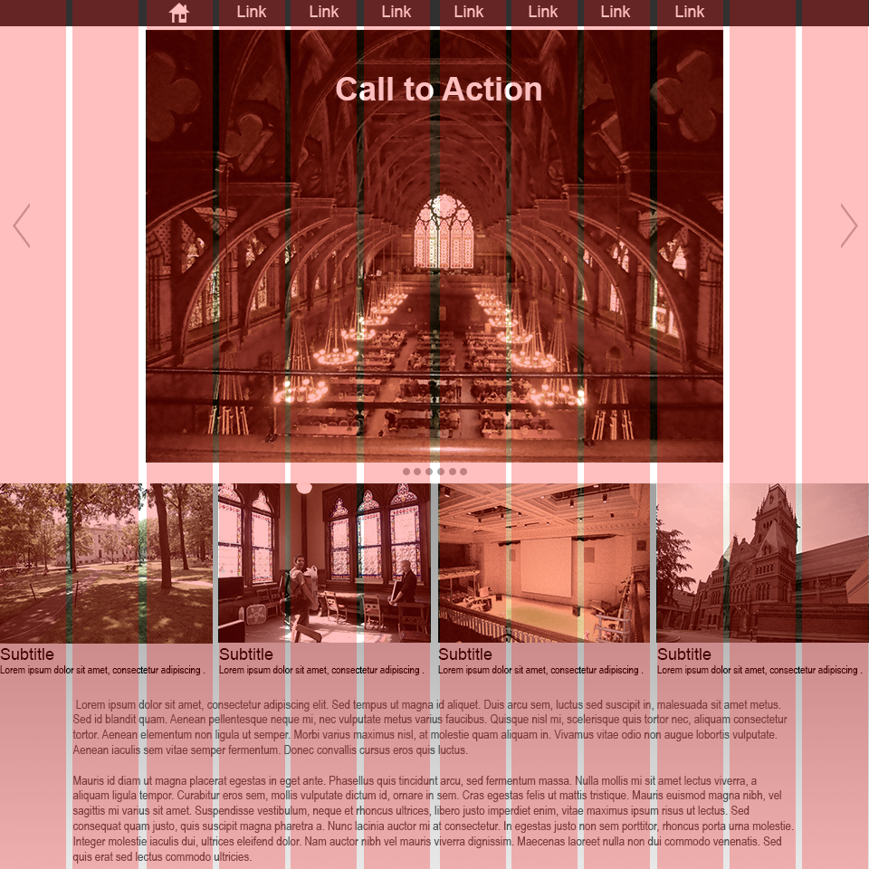
The left is a typical website layout. In the example on the right you can see how each section is highlighted to show how the elements are organzied in groups.
- Hierarchy
- Some information has more importance and some has less. You must make sure to place emphasis in the most important areas and less on secondary areas.
typical layout
title
figure caption about the image above.
subtitle
Lorem ipsum dolor sit amet, consectetur adipiscing elit. Vestibulum blandit nisl sed vehicula malesuada. Curabitur sapien tellus, molestie et metus eu, blandit commodo justo. Aliquam ornare ornare eros.
subtitle
Nam lacinia quam ac tincidunt sodales. Pellentesque placerat, augue nec gravida consectetur, elit urna faucibus nisl, et lacinia purus mauris non risus. Cras eget velit eu urna vulputate pretium at quis lectus. Morbi finibus fermentum congue.
subtitle
Praesent ac facilisis nulla, nec bibendum arcu. Mauris libero turpis, dignissim vel volutpat ac, lobortis non quam. Aenean in pretium ex, nec facilisis quam. Maecenas sagittis vitae risus ac vulputate.
highlighted sections
title
large text is read second
images are viewed first
figure caption about the image above.
text associated with images are read earlier
subtitle
sub-headings have moderate attraction
Lorem ipsum dolor sit amet, consectetur adipiscing elit. Vestibulum blandit nisl sed vehicula malesuada. Curabitur sapien tellus, molestie et metus eu, blandit commodo justo. Aliquam ornare ornare eros.
subtitle
Nam lacinia quam ac tincidunt sodales. Pellentesque placerat, augue nec gravida consectetur, elit urna faucibus nisl, et lacinia purus mauris non risus. Cras eget velit eu urna vulputate pretium at quis lectus. Morbi finibus fermentum congue.
bodies of text are read last
subtitle
smaller images are noticed after large text
Praesent ac facilisis nulla, nec bibendum arcu. Mauris libero turpis, dignissim vel volutpat ac, lobortis non quam. Aenean in pretium ex, nec facilisis quam. Maecenas sagittis vitae risus ac vulputate.
Again, a typical layout on the right. The left highlights what stands out to the user first. Images, then color, then larger text is view in that order.
Unity vs. Variety:
A composition must balance these two principles. Unity makes a page cohesive and easy to read. Variety creates contrast and makes the page visually interesting. In the crummy example above you can see that it is cohesive but not visually interesting.
Style:
The overall style of the page can create a cohesive composition. If you apply a different styles to different elements they will stick out and feel out of place. This is distracting and hard to read. Maintaining a style harmonizes the page.
Alignment:
Alignment helps blocks of elements and the page as a whole appear more cohesive. For example when you have multiple paragraphs they might be different blocks of text but if they share a left alignment it helps them feel together.
White Space:
White space is the negative space of the page. It is the empty area throughout the page. White space is extremely crucial. White space gives the eyes the ability to rest and produces a nice clean look overall. The more white space around an element the more significant the element appears.
Color:
Color creates emphasis on elements. Your eye is naturally drawn to areas of saturation. You should limit your use of color to two or three colors when possible or your page will look busy and the color will lose its strength.
Size:
Larger objects will be perceived as more important. You will notice that the call to action banner at the top of webpages are the largest elements on a site. This is what the page wants you to click on and what the creator is trying to display most.
Images:
Images draw more attention then text and simple shapes. They are more visually interesting. Be sure to apply images where you want to draw attention. A major reason I draw so many cones on my site is because text alone becomes very boring. This site used to be a lot more dull.
Examples of Grids in Websites:
A large portion of the web designer’s job is to layout the pages to best display the client’s content. For this reason, there are many templates that have been developed based of the grid.
In this example slideshow from 960.gs you can see how these sites employ grids to organize their content.
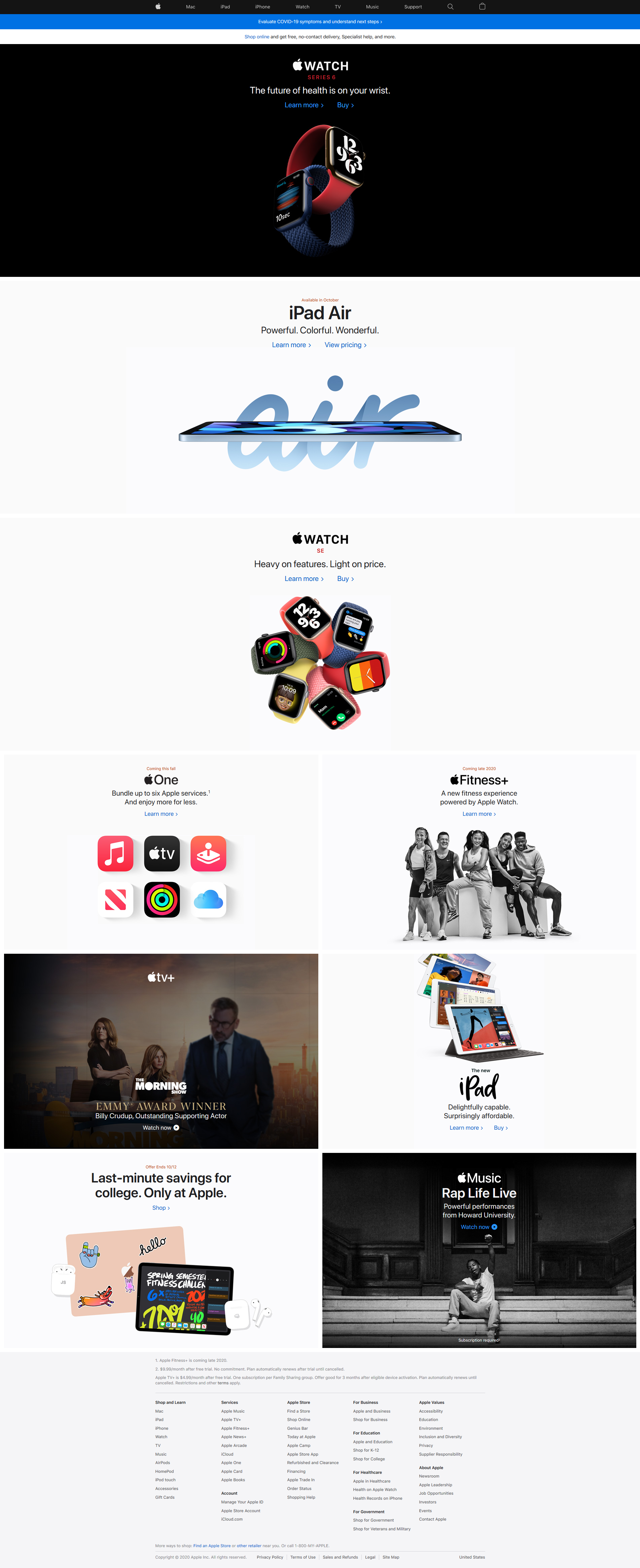
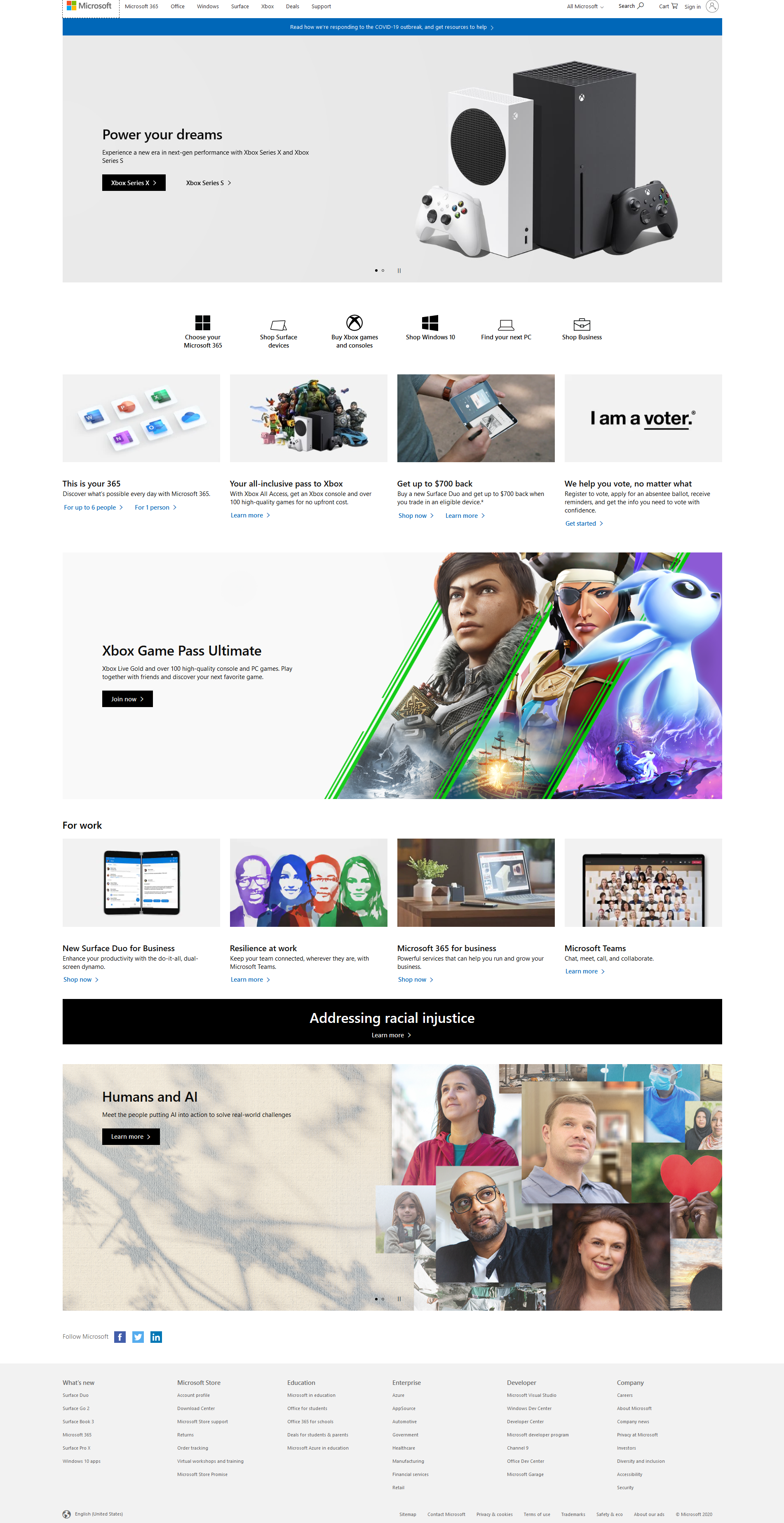
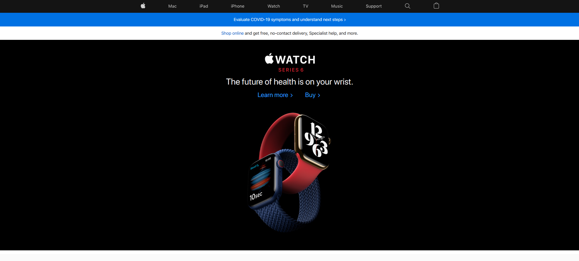
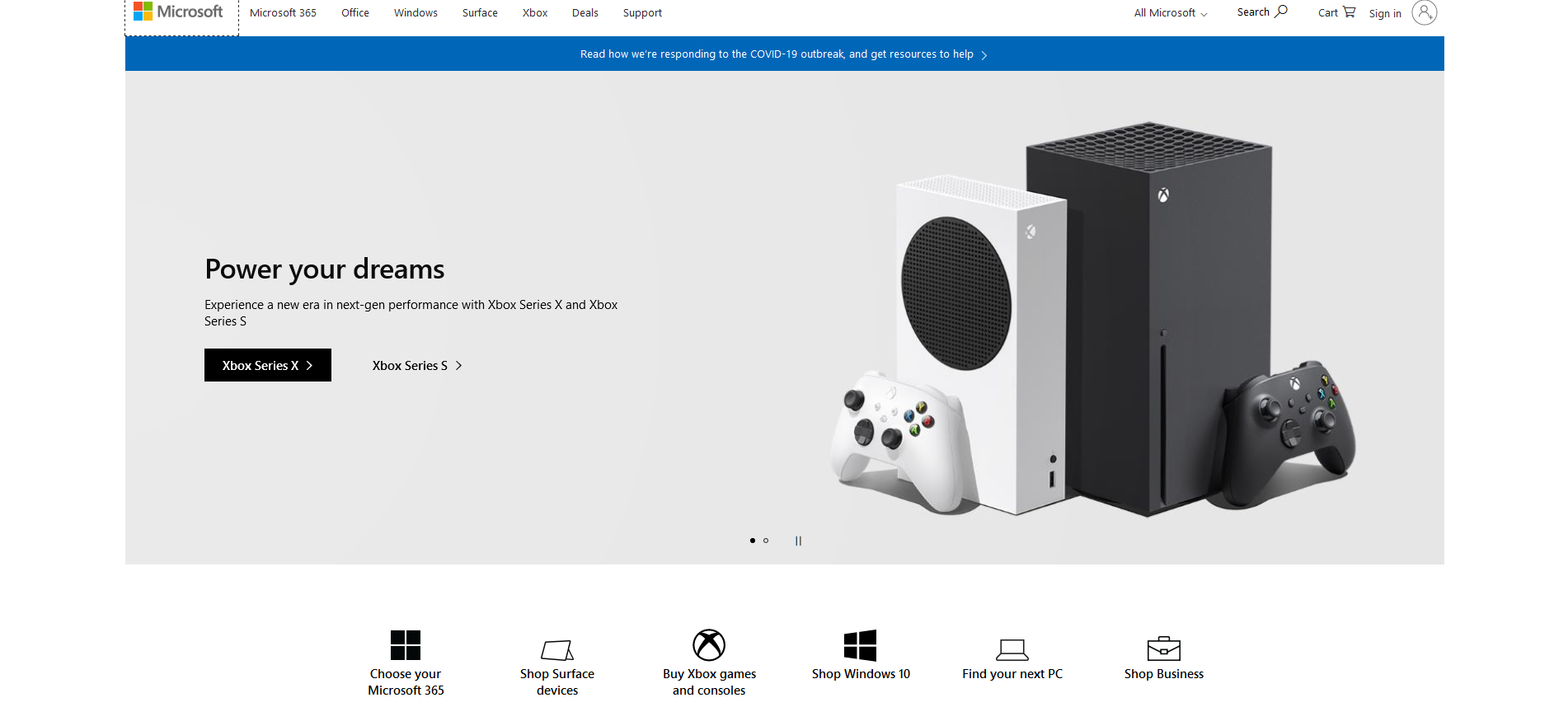
Above you can see to screen captures of the websites from Microsoft.com and Apple.com. Notice how similar they are and how they are clearly utilizing a grid.
Below you can see the headings of both Microsoft and Apple. Both have navbars that are similar and have ‘call to actions’ (big image, often a slider, that is advertising something they want you to click on).
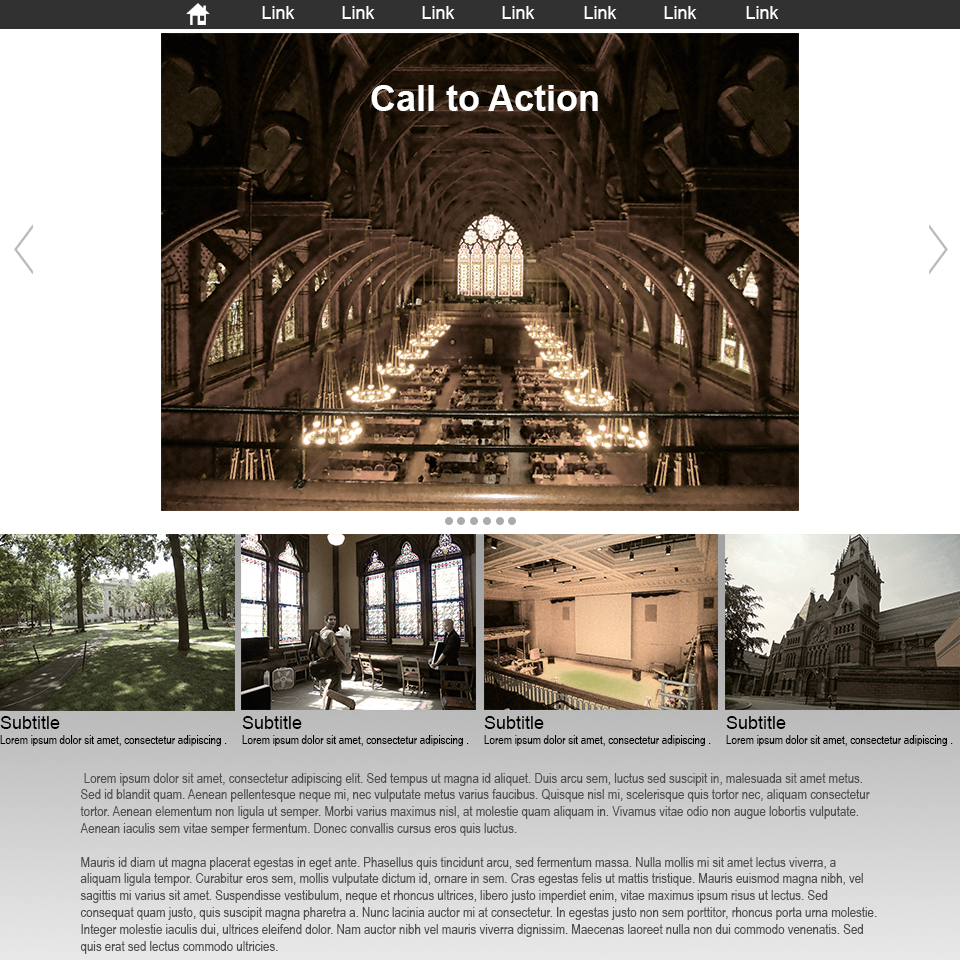
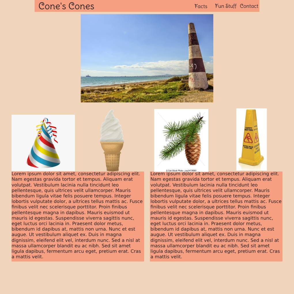
Here is a generic example that I made this is very close to both the Apple and Microsoft sites. Notice everything fits nicely into a grid.
This is how the next lab series and project will be developed.
Week 06 Responsive Site (wireframe mockup) Lab
Responsive Site (wireframe mockup) Lab
The second lab series is to develop a responsive site. In the first assignment of this project you will develop a wireframe mockup of the site you will create. We will use the 960.gs template as a starting point to block out the sections of the site. Two typefaces will be chosen to produce mock text-boxes with lorem ipsum. Placeholder images will be placed in the grid. All elements will utilize a color scheme.The final product will have a strong pleasing style that mimics what the final product will look like.

You will be graded on the following:
- Grid:
- Utilize the grid template provided.
- Create the boxes for sections properly.
- Content:
- Mock content is produced (text, images).
- At least two custom fonts utilized with font names included.
- Color:
- A basic color scheme is incorporated.
- Colors are labeled by either rgb, hex, or hsl.
- Aesthetic:
- Interesting and appealing design.
- Quality craftsmanship.
Resources:
- Assignment Video Tutorials
- You may watch any of the videos from the previous labs
- Assignment Lab Materials
- You may download the lab materials here: wd1_week06LabMaterials.
Assignment Tutorial Slideshow
This tutorial will guide you through lab. You may download the lab materials used: WD1_week06LabMaterials.
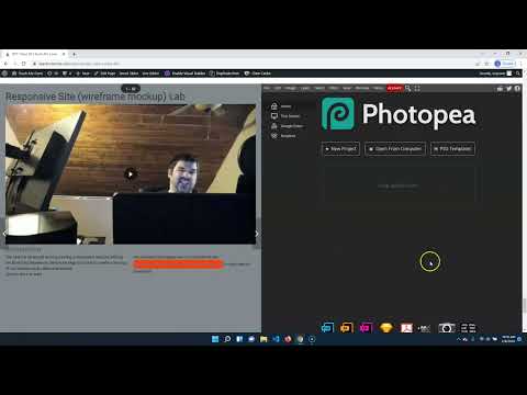
The next lab series will involve creating a responsive website utilizing the Bootstrap framework. Before we begin it is best to create a mockup of our desired result called a wireframe.
Click on the > to start
You will need the images here to complete the lab:
Responsive Site (wireframe mockup) Lab Materials (
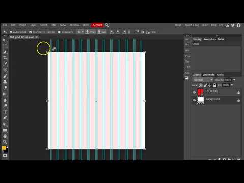
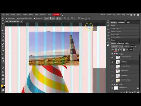
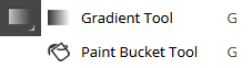
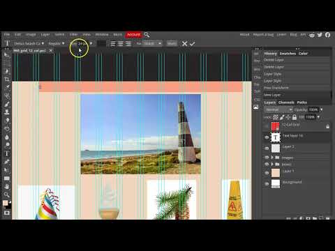
- Most (maybe all) responsive frameworks utilize a row/column system. Therefore we must design the wireframe with this in mind. Luckily there are image templates.
- First navigate to PhotoPea (link here) and open the 960_grid_12_col.psd file. (it is included in the lab materials in the previous slide or you can download it here).
- Import the images for the lab by selecting File>Open & Place.... Select the images in the lab materials to import them (you can also download them here, here,here,here, here, & here).
- Turn off the layer visibility on the images you just imported until you need them later.


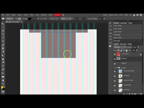
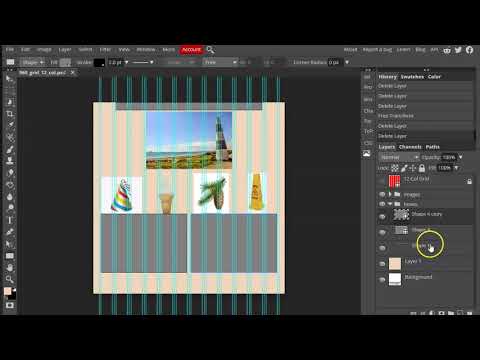
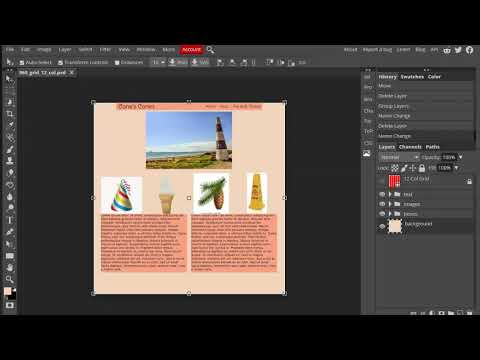
This is what you should have at the end of the video (without guides)
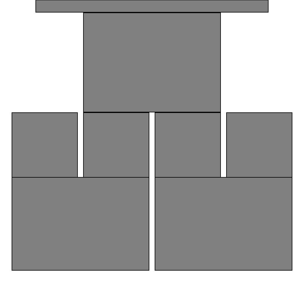
- The easiest way to block out the grid is to draw out rectangles.
- Select the Rectangle Tool
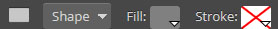
 . Change the Fill to a mid-gray, the Stroke to 2.0 pt black
 .
. - Draw out boxes for each area of the site, snapping to the column grid and maintaining heights across rows.
- When you are done it should look like the example below-right.
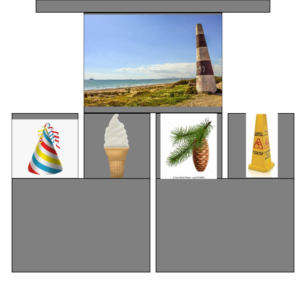
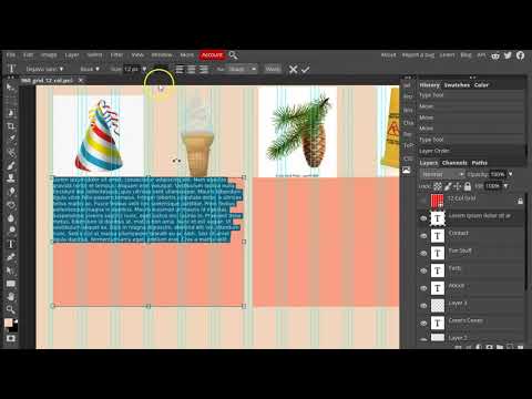
You should fit the images to the boxes (roughly)
- Next you should lay out the images.
- Turn the layer visibility back on for each image.
- Select the Move Tool
 . Check on Auto-Select and Transform controls
  .
. - Select each image, move, and scale them to fit the boxes you drew earlier. These will be our placeholder images.
- You may use Images>Adjustments>etc. to make value, hue, contrast, etc. changes to the images. You want them to feel more cohesive.
- When you are done it should look like the example below-right.
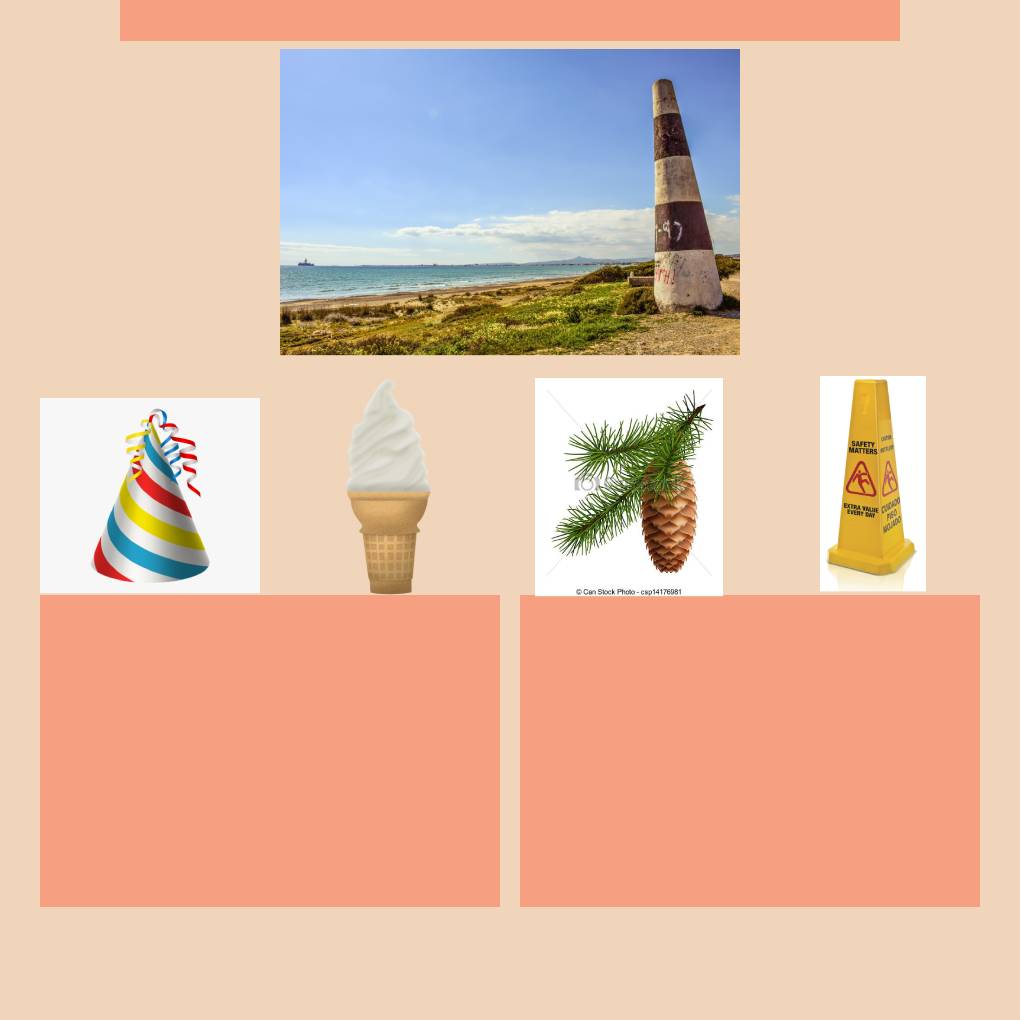
You should just have a background color. Feel free to use your own color scheme
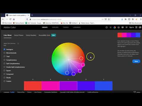
- Now let's adjust the color. Typically you want to limit your colors. They should also harmonize. Color theory is both very simple and very complicated. Lucky for us there are some cheats.
- Visit Adobe Color. Use the interface to select three colors for your site.
- Select the Paint Bucket Tool
 by pressing on Gradient Tool to reveal it "underneath".
 - Change the color it will create by using the the Color Picker
 at the bottom of the toolbar on the bottom left. Click on it. Copy the hex code of your color from Adobe Color and paste it in the Hex: text box.
 - Select the Background layer and click on it in the actual image to paint bucket the color on the layer.
- When you are done it should look like the example below-left.
Apply colors to the boxes and remove the unnecessary ones
- Continuing on with color, let's change some of the box colors
- Select the Rectangle Tool then select a layer with one of drawn rectangles in the Layers panel at the bottom-right.
- Change the Fill and Stroke colors. The Fill color should be copied from one of the Adobe Color colors you chose earlier and the Stroke should be set to None
 .
. - Repeat this step for each rectangle you wish to color.
- You will want to just delete some of the rectangles where you do not wish to have a background color.

Apply text to the heading and menu sections
- Your page consists mostly of three elements; images, color, and text. Time to apply the text. First you should choose your font. Generally speaking you want an interesting heading font that draw the user in and a legible easy to read font for body text.
- Select the Type Tool
 Change the setting to your desired heading font
  .
. - Click where you would like to place your headings and type them.
- Complete all the headings.
Use dummy text (lorem ipsum) to fill in your body
- For the body text we will just use placeholders.
- Visit lipsum.com to generate lorem ipsum. This dummy text can be used as our placeholder. After you generate the text press ctrl + c (cmd + c) to copy.
- With the Type Tool still selected change the setting to your desired body font .
- This time click and drag a box where you would like to place body text. Press ctrl + v (cmd + v) to paste the lorem ipsum text you copied earlier. That should fill the box.
- Complete the same steps for the remaining body text.
Your results may very some. Feel free to make it your own. Just follow the general steps and rules.
- Before you submit you should make any adjustments to the wireframe mockup image you would like.
- Once you are happy with the image you should save your image by pressing File>Save as PSD.... Enter yourLastName.psd and press save.
- Now, log into Blackboard (Here) and click on this course. Inside the course, select Week 06, then the Week 06: Responsive Site (wireframe mockup) Lab folder, then the assignment with the same name. Finally, Attach the zipped file.
This week we created a wireframe mockup image that we will use in the creation of our site for the rest of the lab. This step isn't necessarily required but it is a great way of rapidly creating the design and giving it to a client for review.
If you run into any issues please do not hesitate to contact me:
- jcone@cecil.edu
- (240) 466-1996

Wait! Before you go!
Did you remember to?
- Read through this webpage
- Watch the videos
- Submit the Week 06 Responsive Site (wireframe mockup) Lab on Blackboard
