
Digital Imaging I
Class 03: Non-Destructive Editing and Art Elements & Design PrinciplesTopics
- Digital Camera Basics
- Non-Destructive Editing
- Text
- Art Elements & Design Principles
- Assignment 03

Welcome to Class 03! It will be just right.
Digital Camera Basics
This is not a photography class
However, it may be helpful to know a little about cameras.
Digital vs. Analog:
In the past, analog systems were used for media, including cameras. Analog uses a variable signal that consists of frequency and amplitude.
Digital systems use a discrete discontinuous signal. Digital is generally not as high fidelity but it is less susceptible to noise and wear.
Old school film cameras are considered analog. DSLR’s, point & shoot, mirrorless, and other electronic devices (like your phone) are digital.

The curve on the bottom represents an analog wave. You can see the resolution of the digital copy (number of steps) determines how closely it represents the original analog wave.
Point & Shoot vs. SLR (Single-Lens Reflex):
Point & Shoot cameras display a live view of what the camera lens is seeing. Often the embedded lens is somewhat lacking and configurations are limited. There is a certain amount of disparity between what you see and what you capture.
An SLR or single-lens reflex camera uses a single lens that flips up when you take the shot. SLRs also have much more manual control and more advanced lens support. What you see is what you get.

DSLR (Digital Single Lense Reflex) Camera (back)

Point & Shoot Camera

DSLR (Digital Single Lense Reflex) Camera (front)
Lens:
This focuses the picture using a compound lens.
Focal length and aperture are the two main features of a lens
Focal length is the distance from the surface of a lens to its focal point (ccd sensor)
There are a ton of different lenses available, generally:
- Normal lens:
- Angle of view is 50 deg. and a focal length equal to image diagonally.
- Wide-angle lens:
- Angle of view wider than 60 deg. and focal length shorter than normal.
- Telephoto lens:
- Narrower angle of view and long focal length.
This can easily be the most expensive piece of equipment. Never touch the lens, you will scratch it!

Aperature:
The aperture controls the diameter of the lens. It is expressed as F-stop. The smaller the F-stop number (f/value) the larger the lens opening.
You need to use a larger aperture for low-light and to capture fast actions (faster shutter speeds necessary).
Here is a nice page on aperture on Wikipedia
The opening sequence of James Bond looks much like an aperature. I am pretty sure this is what it looked like.
Depth of Field
Depth of Field is portion of a scene that appears sharp. If you want to have a larger depth of field (everything it focus, like a landscape), use a small aperture. If you want a smaller depth of field (one subject in focus, like a portrait), use a large aperture.
Shutter Speed:
Shutter speed is basically how long the shutter is open, exposing the film or sensor.
The longer the shutter is open the lighter the photograph will be.
Use this in combination with aperture to affect the lightness and darkness of your capture.
Here is a nice page on shutter speed on Wikipedia
ISO:
ISO refers to the speed of your film, or in our case, the sensitivity of the sensor.
The lower the number the slower the speed (daylight). The higher the number the faster the speed (night).
The photo on the left has a slow ISO and the right has a fast ISO. Notice how much more grain there is on the right. Moral of the story is only use a higher ISO as a last resort.
Non-Destructive Editing
Non-Destructive Editing:
A non-destructive workflow involves using tools and functions that procedurally affects and manipulates pixels but does not directly permanently change them. This allows you to make any changes at any time to your image without losing work.
Common Non-Destructive Tools:
- Smart Objects
- Smart objects allow you to apply transformations & select filters while always maintaining the original pixel data.
- Adjustment Layers
- Adjustment layers are created in the same stack as other layers in Photoshop and affect all image layers below them.
- Masks
- The use of layers and masks allow you to apply adjustments to specific areas.
- Layer Blending Modes
- “Mixes” layers together using math to either darken, lighten, color, or a variety of other effects.
- Layer Styles
- Applies an effect onto the layer such as drop shadow, stroke, bevel, etc.
Adjustment Layers:
- Solid Color
- Produces a color filling the whole layer.
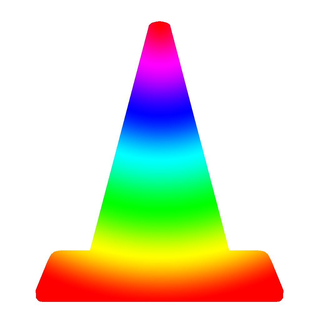
- Gradient
- Produces a gradient across the whole layer.
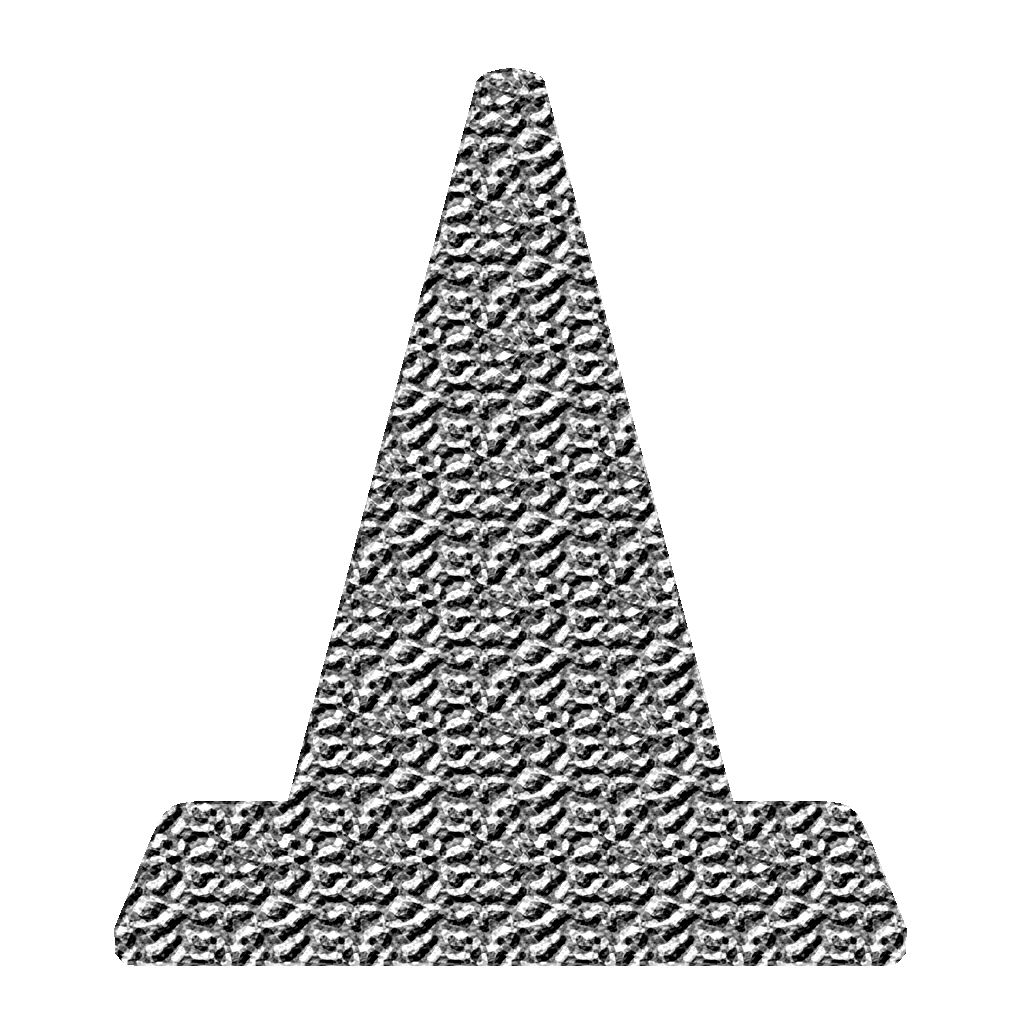
- Pattern
- Produces a repreating pattern over the whole layer.
- Brightness/Contrast
- Increases or decreases the luminosity (brightens) and also adjusts the extreme values of the image (contrast).
- Levels
- Adjusts the highlights, midtones, and shadows value (lightness darkness).
- Curves
- Similar to Levels but adds a vertical dimension to the adjustments.
- Exposure
- Brightens or darkens the image based on exposure value.
- Vibrance
- Sort of like adding saturation to the image but more controlled.
- Hue/Saturation
- Allows for shifting the color and the amount of color.
- Color Balance
- Shift the hue of shadows, midtones, and highlights.
- Black & White
- Converts the image to achromatic or monochromatic but let’s the user adjust how each color is represented.
- Photo Filter
- Applies a colored tint over the image.
- Channel Mixer
- Allows to adjust the RBG channels representation.
- Color Lookup
- Applies a sort of color effect to the image based on presets.
- Invert
- Reverses color and value in the image.
- Posterize
- Limits the number of colors present.
- Threshold
- Converts image to pure black and pure white.
- Gradient Map
- Applies a gradient to the value information of the image.
- Selective Color
- Shifts the color information of specific colors and values using CMYK values.
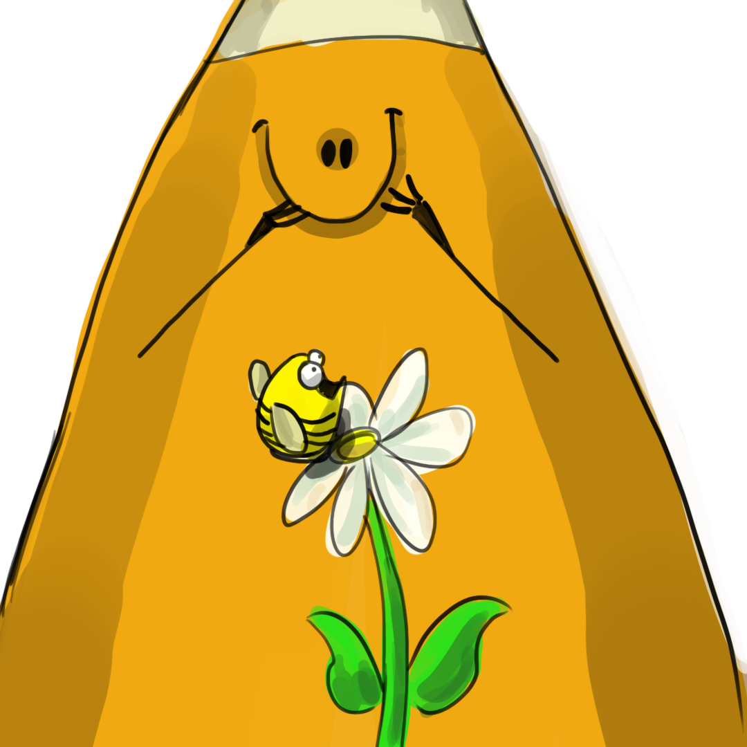
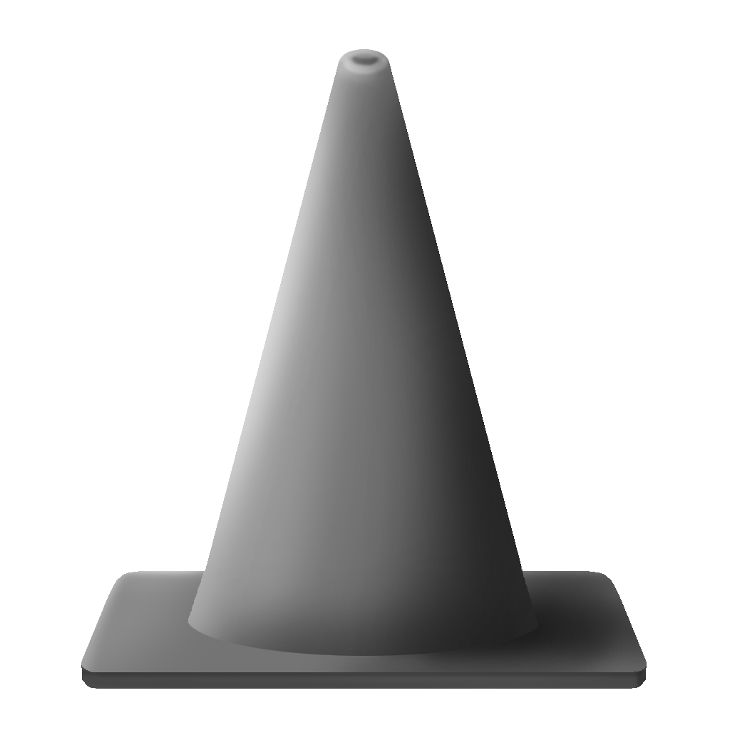
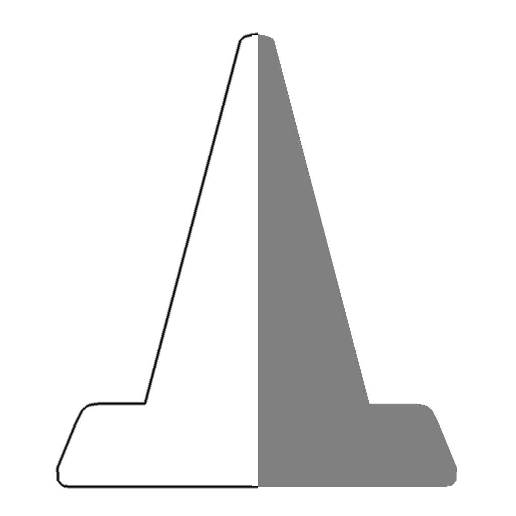
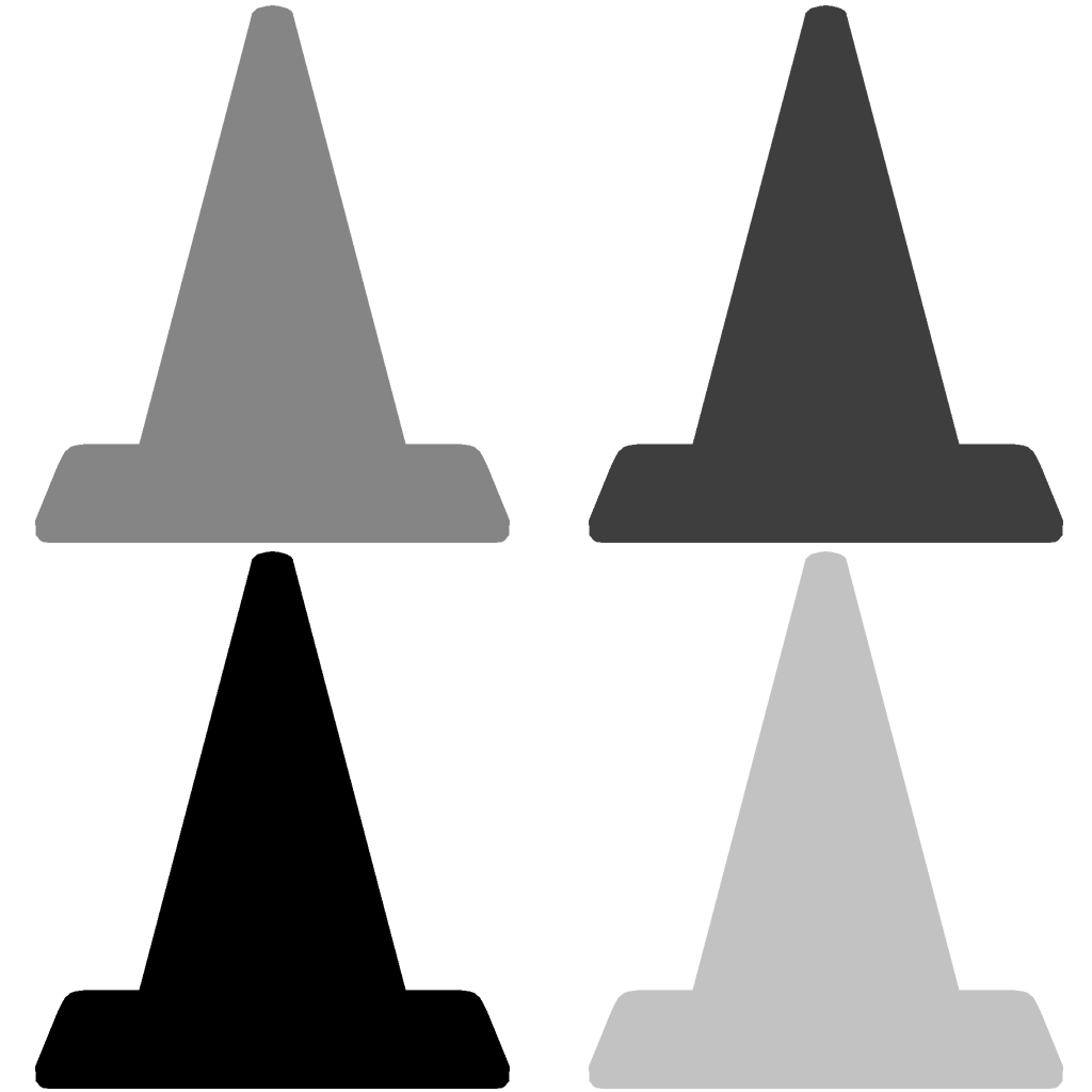
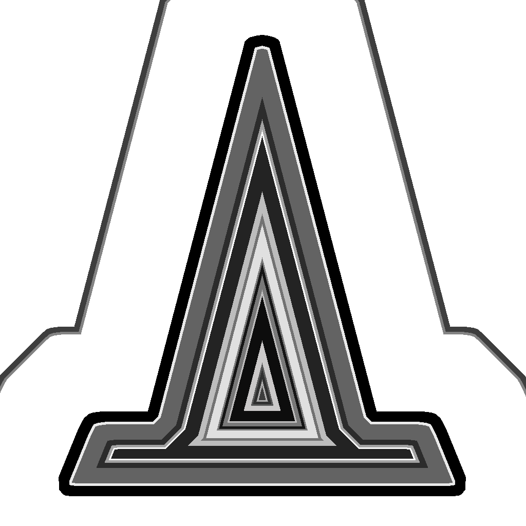
Illustration of cone with the solid color adjustment layer applied.
Layer Blending Modes:
You can choose how each layer interacts with each other. By default (normal mode) all layers are simply “on top” of each other with only the transparent parts display what is “underneath.”
You can see a list of the layer blend modes here.
Text
Typography:
Typography is the study of typefaces. It involves the appreciation, creation, and/ or application of type. This is a crucial skill in a graphic designer’s arsenal. Graphic design students at four year institutions would be required to take this as a whole course by itself. As such it is a topic beyond this course but we will cover a brief amount.
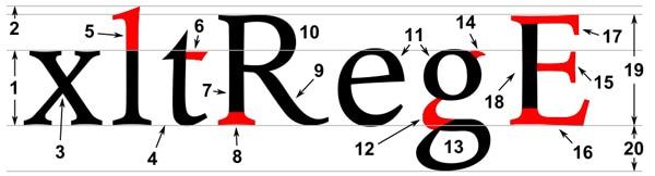
Letterform:
Letterform is the description of the glyph that represents the letters in a typeface. Type can be described by its anatomy. You might be surprised by how in depth it goes.
Type Classification:
Type can be broken down into major categories based on their letterforms and uses. There is some differing information here but this is how I would break it down.
Monospace
Monospace was developed out of necessity. In the days of typewriters it was the only type available. Monospace fonts have all glyphs with the same width. Courier is the most widely used. This has particular use for programming and script-writing.
Script
Script, also described as Handwriting or Cursive, is meant to basically mimic text written by hand. This means not just cursive, but anything that looks like someone’s handwriting. Comic sans and Lucida are probably the most common fonts in this category.
Serif
Serif fonts have extra bits on the end of its strokes. You often see this used on the printed page when large amounts of text are used. A common serif is Times New Roman.
Sans-Serif
Probably the “cleanest” typefaces. These contain the most bare minimum of details which results in probably the best legibility. They are appropriate for small text.
Display
Display, Decorative, or Fantasy fonts are the super interesting fonts with lots of bells and whistles. They are probably the most interesting to look at but generally the hardest to read. These are best used in small amounts for things like titles or logos. A good example might be the ransom or blood fonts.
Applying Type:
Words have explicit meaning but the way they are written can produce implicit meaning. Most of the time you are trying to further push the meaning of the text.
Try different typefaces and place the type in different ways. Experiment.
Text Tools:
The options are pretty much the same you would have in Microsoft word. To have access to the Character and Paragraph panels press Window>Character/Paragraph. This will give you more options.


Art Elements & Design Principles
Art Elements and Design Principles:
The language we use to describe art. Generally these rules are used to describe fine art but they can also be applied to new media such as photography, graphic design, animation, and others.
In a four year art or graphic program you would be required to to 2D Comp or something similar. We will cover them here.

Art Elements:
Form
Form is the illusion of three-dimensional shape. This usually involves the utilization of linear and aerial perspective.
Line
A line is the path between two or more points. This can be either explicit or implicit.
Color
Color is specific temperature of light reflected off the piece of work. Different colors have different psychological effects.

Value
The amount of lightness and darkness ranging from pure white to pure black.

Space
Space represents a general area. Generally speaking you can define a piece of artwork in positive and negative space.
Texture
This is the physical property of how the surface would feel if touched. I would say that is more about how an area is broken up.
Design Principles:

Balance
The visual weight of the artwork that may be symmetrical or asymmetrical.
Contrast
The extreme difference in an image between elements.
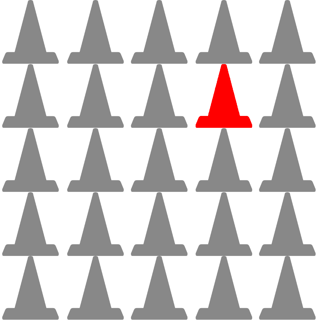
Emphasis
When one element of a piece of artwork draws more attention than others.

Movement
To give the illusion of motion in a two dimensional space.
Pattern
Repeating elements in an image.
Rhythm
Much like music this is the application of varied pattern.

Unity
Unity is the coherence of the elements in a piece that make is appear as a whole.
Assignment 03
Abstract and Text-Based Image:
Often new artists will focus too much on a subject and not enough on composition. This assignment is meant to force you to focus on your entire image. You will produce two images; an abstract photo, and a text-based graphic.
- Abstract Photo: Take any camera you have (DSLR, point & shoot, phone, etc.) and shoot the world around you. You are look for interesting compositions not interesting subjects. Look for textures, patterns, appealing compositional lines.Try different angles; canted, birds’ eye, worm’s eye, etc. Once completed choose your best one and adjust it. You may also combine abstract photos if you find that a single photo is boring.
- Text-Based Image: First you should think of a message. This can be one word, a quote, really anything, but it should have meaning to you. Then you will choose your typeface, color scheme, and layout an interesting composition. You may even use some of your abstract images to help with this assignment if you would like.
Exploration and experimentation is highly encourage in this assignment. Once you complete your two images save them and submit them to Blackboard.
You will submit this digitally on Blackboard. All assignments will also include the project cover sheet. You can grab it here. Just answer the questions in the document.
Be sure to post your images on the Discussion Board for critique.
You will be graded on the following:
- Project Cover Sheet
- Thoroughly completed and thoughtfully written with little or no grammatical errors.
- Basic Requirements
- Two 6 x 9, 300 ppi, PSD images (enhance abstract, exaggerated creative abstract) placed in a folder and zipped (winzip) submitted both digitally as well as printed.
- Abstract Image
- Interesting composition and excellent use of Photoshop to enhance it.
- Text-Based Image
- Excellent use of text, color, and Photoshop to deliver a clear message.
Resources:
- Project Cover Sheet
- You may download the project cover sheet here.
- Assignment Video Tutorials
- You may watch the tutorial videos below to help you complete your assignment.
Assignment Video Tutorials
You may download the images used in the tutorials here.
Wait! Before you go!
Did you remember to?
- Read through this webpage
- Submit Week 03 Abstract and Text-Based Image Assignment on Blackboard
- abstract image, text-based image, and project cover sheet
