
Web Design II
Class 02: Responsive CodeTopics
- Manual Responsive Code
- Class 02 Single Page Site (responsive) Lab

Welcome to class two!
Manual Responsive Code
Responsive Design:
Originally web pages were designed for computer screens specifically using a fixed-width static design. As tablets and phones have become more common to browse the internet those layouts do not transfer well. Enter responsive web design. A responsive layout will automatically change it’s styling to match the device it is viewed on.
Bootstrap:
Bootstrap is a framework written in CSS and JavaScript that web designers may use to incorporate a responsive grid into their web pages. There are many responsive templates out there but Bootstrap has become the standard given its popularity and ease of use.

Basic Responsive Code Lecture
Basic Responsive Code:
Responsive tag:
This sized the viewport to the device dimensions and resets the zoom value.
- <meta>
- Viewport element that gives browser instructions.
- width=device-width
- Sets the page with to the width of the device.
- initial-scale=1.0
- Resets the scale value of zoom.
Column CSS:
like Bootstrap we will define 12 column classes.
- .col-1 { }
- You need to make 12 column classes (.col-1, .col-2, .col-3, etc.).
- width: 8.33%;
- To have 12 equal columns you take 100% divided by 12 and get 8.33%. Add that to each subsequent column for different sizes. For example, 8.33% * 8 = 66.66% for an column 8 and 8.33% * 5 = 41.66% for column 5.
- float: left;
- The columns should float to the left.
Row CSS:
Also like Bootstrap we need to create rows that will clear at the end so that a new row may start on a new line.
- .row::after { }
- Create a row class that selects the area after it using the ::after pseudo selector.
- content: “”;
- Inserts basically nothing into the space.
- clear: both;
- Doesn’t allow elements to on the left and right of the space.
- display: table;
- Allows the element to behave like a table element.
Other CSS
This CSS should be added so everything fits appropriately.
- box-sizing: border-box
- Attempts to fit elements’ height and width to the actual dimensions despite padding and border. Padding and border may add on top of the box dimensions causing them to be larger than what you wrote.
this is the title

Hello There!
I’m ridiculously subtitle
This is so much content I can’t stand it
I am another subtitle
How does he do it? It’s some sort of black magic for sure!
Variable Column Sizing Lecture
Variable Column Sizing:
Media Query:
The media query will allow you to create CSS rules based on browser screen dimensions.
- @media
- Used to query the media type (size of the device).
- only
- Keyword that prevents older browsers that don’t support @media from from reading the subsequent CSS. There is also a not keyword that does the opposite of what the media query does as well as and that combines multiple features.
- screen
- Applying to the actual screen.
- (max-width: 600px)
- Size of window.
Column CSS:
We need column settings for different dimension (phone, tablet, desktop/laptop). Remove the old column classes (.col-1 … col-12) and replace with these:
- Extra Small Screen (less than 600px)
- The default sizing should be full width for the small screen.
- .col-1-s, .col-2-s, .col-3-s, .col-4-s, .col-5-s, .col-6-s, .col-7-s, .col-8-s, .col-9-s, .col-10-s, .col-11-s, .col-12-s {width: 100%;}
- Small Screen (greater than 600px)
- @media only screen and (min-width: 600px)
- { .col-1-s {width: 8.33%;} .col-2-s {width: 16.66%;} .col-3-s {width: 25%;} .col-4-s {width: 33.33%;} .col-5-s {width: 41.66%;} .col-6-s {width: 50%;} .col-7-s {width: 58.33%;} .col-8-s {width: 66.66%;} .col-9-s {width: 75%;} .col-10-s {width: 83.33%;} .col-11-s {width: 91.66%;} .col-12-s {width: 100%;} }
- Medium Screen (greater than 768px)
- @media only screen and (min-width: 768px)
- { .col-1-m {width: 8.33%;} .col-2-m {width: 16.66%;} .col-3-m {width: 25%;} .col-4-m {width: 33.33%;} .col-5-m {width: 41.66%;} .col-6-m {width: 50%;} .col-7-m {width: 58.33%;} .col-8-m {width: 66.66%;} .col-9-m {width: 75%;} .col-10-m {width: 83.33%;} .col-11-m {width: 91.66%;} .col-12-m {width: 100%;} }
- Larger Screen (greater than 992px)
- @media only screen and (min-width: 992px)
- { .col-1-l {width: 8.33%;} .col-2-l {width: 16.66%;} .col-3-l {width: 25%;} .col-4-l {width: 33.33%;} .col-5-l {width: 41.66%;} .col-6-l {width: 50%;} .col-7-l {width: 58.33%;} .col-8-l {width: 66.66%;} .col-9-l {width: 75%;} .col-10-l {width: 83.33%;} .col-11-l {width: 91.66%;} .col-12-l {width: 100%;} }
- Other CSS
-
- [class*=”col-“] {float: left;}
- This applies “float:left” to all classes that start with “col-“.
Other CSS:
Keep the rest of the CSS
- .row::after {content: “”; clear: both; display: table;}
- Keep the row clearing CSS rule.
- box-sizing: border-box
- Keep the the box-sizing border box rule so the elements fit properly.
this is the title
Hello There!
I’m ridiculously subtitle
This is so much content I can’t stand it
I am another subtitle
How does he do it? It’s some sort of black magic for sure!
this is the title
Hello There!
I’m ridiculously subtitle
This is so much content I can’t stand it
I am another subtitle
How does he do it? It’s some sort of black magic for sure!
Responsive Elements:
Responsive Text:
You may want to adjust text size depending on the screen size.
- @media only screen and (max-width:600px){}
- Tests against screen size and apply CSS if the condition is true.
- .responsive-h {}
- Make whatever class name you’d like to target what elements it applies to.
- font-size: .5em;
- Adjusts the size of the type.
Responsive Images:
You may want the image to adjust size based on the screen so it is not too large or small.
- .responsive-img {}
- This could be anything but you need to create a class selector to affect only the images you want.
- max-width: 100%;
- This will scale the image according the containing element but not beyond its source resolution.
- height: auto;
- Will automatically scale the height proportionally to the width.
Responsive Background Image:
If using a background image you will probably want it to scale to the screen size.
- body {}
- Typically you apply the background image to the body if you want it to span the entire page.
- width: 100%;
- Making the width span across the screen.
- height: auto;
- Set the height to match the width proportionally.
- background-image: url(‘images/backgroundImage.png’);
- Attach an image.
- background-size: cover;
- This will allow the background to scale but will crop as opposed to stretching the image.
- background-repeat: no-repeat;
- You may want to have the background repeat but most of the time it isn’t advisable.
Hide Elements:
You may want certain elements to only be visible at certain resolutions. In this example I have a detailed logo for a large screen and a basic thumbnail logo for a smaller screen.
- @media only screen and (max-width: 600px)
- Keep the row clearing CSS rule.
- .logoLarge {}
- Create a selector to target the larger logo element.
- display: none;
- Make the element disappear.
- @media only screen and (min-width: 600px)
- Keep the row clearing CSS rule.
- .logoSmall {}
- Create a selector to target the smaller logo element.
- display: none;
- Make the element disappear.
this is the title
Hello There!
I’m ridiculously subtitle
This is so much content I can’t stand it
I am another subtitle
How does he do it? It’s some sort of black magic for sure!
this is the title

Hello There!
I’m ridiculously subtitle
This is so much content I can’t stand it
I am another subtitle
How does he do it? It’s some sort of black magic for sure!
Class 02 Single Page Site (responsive) Lab
Single Page Site (responsive) Lab:
In web design I you learned to develop a responsive website utilizing Bootstrap. Although this is the most commonly used framework and you should continue to use it, there is power in the ability to create your own custom responsive CSS. In this lab you will convert the previous fixed-width document into a responsive one by writing your own CSS. We may also take the opportunity to rework the page and add more elements.
You will be graded on the following:
- Basic Document & File Structure:
- Master folder created with correct sub folders.
- All files named and placed correctly.
- Basic HTML and CSS structure produced.
- Responsive Column Layout:
- Sections are broken down into rows and columns
- At least three levels of columns are produced (sm, md, lg)
- Responsive Elements:
- Images are responsive
- Text is responsive
- Aesthetics:
- Interesting and appealing design.
- Descriptive and well-written text
Resources:
- Assignment Video Tutorials
- You may watch these tutorial videos below to help you complete your assignment.
- Assignment Lab Materials
- You may download the images used in lab here: webWeek01LabMaterials.
Lab Tutorial Slideshow
This tutorial will review the HTML and CSS that was covered in Web Design I.

The last lab was more about reviewing basic HTML and CSS. This week we will build on this and incorporate more complex CSS with supportive HTML. We are going to create our own responsive framework similar to Bootstrap.
If you run into any issues please do not hesitate to contact me:
jcone@cecil.edu
(240) 466-1996
Click on the > to start
You may use what you prodcued in the last class or start with the zip folder below
One Page Site (responsive) Lab Materials (

- You may use what you created in the last lab or use the provided one here: One Page Site (responsive) Lab Materials (all required materials are included).
- If you choose to work from what you created last lab you will need to download additional images here: One Page Site (responsive) Lab Images and paste them into the images folder of your site.
- Once you have the lab materials or images inserted in your site you should open up the index.html file in Visual Studio Code.

<!DOCTYPE html>
<html>
<head>
<title>About Cone</title>
<style>
.col-1 {
width: 8.33%;
float: left;}
.col-2 {
width: 16.66%;
float: left;}
.col-3 {
width: 25%;
float: left;}
.col-4 {
width: 33.33%;
float: left;}
.col-5 {
width: 41.66%;
float: left;}
.col-6 {
width: 50%;
float: left;}
.col-7 {
width: 58.33%;
float: left;}
.col-8 {
width: 66.66%;
float: left;}
.col-9 {
width: 75%;
float: left;}
.col-10 {
width: 83.33%;
float: left;}
.col-11 {
width: 91.66%;
float: left;}
.col-12 {
width: 100%;
float: left;}
.row::after {
content: "";
clear: both;
display: table;}
* {
box-sizing: border-box;}
body {
background-color: rgb(56, 89, 149);
color: black;
font-family: Arial, Helvetica, sans-serif;
margin: 0px;
padding: 0px;
width: 960px;}
h1 {
font-size: 54px;
text-align: right;
position: absolute;
top: 125px;
left: 0px;
transform: rotate(-90deg);}
figure {
position: relative;
left: 250px;}
.content {
background-color: rgb(165, 111, 40);
display: inline-block;
margin: 10px;
padding: 10px;}
.paragraph {
width: 400px;
display: inline-block;
vertical-align: top;}
</style>
</head>
<body>
<div class="header">
<h1>About Cone</h1>
<figure>
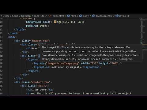
<img src="images/coneImage.png" width="233" height="300" />
<figcaption>Look upon my majesty</figcaption>
</figure>
</div>
<div class="content">
<div class="paragraph">
<h2>I am Cone</h2>
<p>Yup that is all you need to know. I am a sentient primitive object used to direct the public away. In this case I am used as an example.</p>
</div>
<div class="paragraph">
<h2>I am so much more</h2>
<p>This is actually not true. I was just trying to draw you into the next paragraph and it worked! Sucker.</p>
</div>
</div>
</body>
</html>
- Responsive sites rely on a row/column grid system. This may be achieved by creating CSS rules that force sections into specific widths.
- In order for the page to be prepared for scaling you have to set the initial scale to the device. Enter: <meta name="viewport" content="width=device-width, initial-scale=1.0"> in the <head> of the page under the <title> element.
- Create the column system for each column size. Inside the <style> enter:
.col-1 {
width: 8.33%;
float: left;}
.col-2 {
width: 16.66%;
float: left;}
col-3 {
width: 25%;
float: left;}
.col-4 {
width: 33.33%;
float: left;}
.col-5 {
width: 41.66%;
float: left;}
.col-6 {
width: 50%;
float: left;}
.col-7 {
width: 58.33%;
float: left;}
.col-8 {
width: 66.66%;
float: left;}
.col-9 {
width: 75%;
float: left;}
.col-10 {
width: 83.33%;
float: left;}
.col-11 {
width: 91.66%;
float: left;}
.col-12 {
width: 100%;
float: left;} - This code creates column widths but not a row system. For that enter:
.row::after {
content: "";
clear: both;
display: table;}
This will clear the end of the columns so the next set can start on a new line. - Lastly enter:
* {
box-sizing: border-box;}
This will ensure that any padding or border are included in the overall size so the total column does not go beyond the size in the earlier rules.

<!DOCTYPE html>
<html>
<head>
    <title>About Cone</title>
    <meta name=“viewport” content=“width=device-width, initial-scale=1.0”>
    <style>
        .col-1 {
            width: 8.33%;
            float: left;}
        .col-2 {
            width: 16.66%;
            float: left;}
        .col-3 {
            width: 25%;
            float: left;}
        .col-4 {
            width: 33.33%;
            float: left;}
        .col-5 {
            width: 41.66%;
            float: left;}
        .col-6 {
            width: 50%;
            float: left;}
        .col-7 {
            width: 58.33%;
            float: left;}
        .col-8 {
            width: 66.66%;
            float: left;}
        .col-9 {
            width: 75%;
            float: left;}
        .col-10 {
            width: 83.33%;
            float: left;}
        .col-11 {
            width: 91.66%;
            float: left;}
        .col-12 {
            width: 100%;
            float: left;}

        .row::after {
            content: "";
            clear: both;
            display: table;}

        * {
            box-sizing: border-box;}


        body {
            background-color: rgb(56, 89, 149);
            color: black;
            font-family: Arial, Helvetica, sans-serif;
            margin: 0px;
            padding: 0px;}
        h1 {
            font-size: 3.5em;
            text-align: right;
            position: relative;
            top: 2.75em;
            left: 0px;
            transform: rotate(-90deg);}
        figure {
            }
        .content {
            background-color: rgb(165, 111, 40);
            padding: 10px;}
    </style>
</head>
<body>
    <div class="row header">
        <div class="col-4">
            <h1>About Cone</h1>
        </div>
        <div class="col-8">
            <figure>
                <img src="images/coneImage.png" width="233" height="300" />
                <figcaption>Look upon my majesty</figcaption>
            </figure>
        </div>
    </div>
    <div class="row content">
        <div class="col-6">
            <h2>I am Cone</h2>
            <p>Yup that is all you need to know. I am a sentient primitive object used to direct the public away. In this case I am used as an example.</p>
        </div>
        <div class="col-6">
            <h2>I am so much more</h2>
            <p>This is actually not true. I was just trying to draw you into the next paragraph and it worked! Sucker.</p>
        </div>
    </div>
</body>
</html>
- If you preview your page you will notice nothing changes. That is because none of the HTML is utilizing the CSS classes we have created. Row and columns must be added. You must also add a meta tag to prepare for responsiveness.
- In the head of the document add:
<meta name=“viewport” content=“width=device-width, initial-scale=1.0”>
This will set the initial scale of the page so that the code can adjust appropriately. - Add the row class to the header and content divs.
- Wrap the <h1> and <figure> elements with <div class="col-4"> and <div class="col-8"> div elements.
- Remove the paragraph class from the two divs inside the content div and replace them with col-6.
- If you save and preview you will see that the general layout is correct but it is not shifting. That is because there is some leftover CSS that works well for fixed-width but it is interfering with our responsive layout.
- Remove width: 960px; from the body CSS rule.
- In the h1 rule change the position from absolute to relative. The px sizing should be changed to em to be more responsive. Make font-size to 3.5em and top to 2.75em.
- Remove position: relative; and left: 250px; from the figure CSS rule. There will be no CSS under it but we will add some later.
- In the .content CSS rule remove display: inline-block and margin: 10px;.
- Remove the .paragraph CSS rule altogether.
- Preview the page and see what you have. You will see that the page is at least fluid/text wraps now.

<!DOCTYPE html>
<html>
<head>
    <title>About Cone</title>
    <meta name=“viewport” content=“width=device-width, initial-scale=1.0”>
    <style>
        .col-1-s, .col-2-s, .col-3-s, .col-4-s, .col-5-s, .col-6-s, .col-7-s, .col-8-s, .col-9-s, .col-10-s, .col-11-s, .col-12-s {
            width: 100%;}

        @media only screen and (min-width: 600px)
        {
            .col-1-s {width: 8.33%;}
            .col-2-s {width: 16.66%;}
            .col-3-s {width: 25%;}
            .col-4-s {width: 33.33%;}
            .col-5-s {width: 41.66%;}
            .col-6-s {width: 50%;}
            .col-7-s {width: 58.33%;}
            .col-8-s {width: 66.66%;}
            .col-9-s {width: 75%;}
            .col-10-s {width: 83.33%;}
            .col-11-s {width: 91.66%;}
            .col-12-s {width: 100%;}
        }

        @media only screen and (min-width: 768px)
        {
            .col-1-m {width: 8.33%;}
            .col-2-m {width: 16.66%;}
            .col-3-m {width: 25%;}
            .col-4-m {width: 33.33%;}
            .col-5-m {width: 41.66%;}
            .col-6-m {width: 50%;}
            .col-7-m {width: 58.33%;}
            .col-8-m {width: 66.66%;}
            .col-9-m {width: 75%;}
            .col-10-m {width: 83.33%;}
            .col-11-m {width: 91.66%;}
            .col-12-m {width: 100%;}
        }

        @media only screen and (min-width: 992px)
        {
            .col-1-l {width: 8.33%;}
            .col-2-l {width: 16.66%;}
            .col-3-l {width: 25%;}
            .col-4-l {width: 33.33%;}
            .col-5-l {width: 41.66%;}
            .col-6-l {width: 50%;}
            .col-7-l {width: 58.33%;}
            .col-8-l {width: 66.66%;}
            .col-9-l {width: 75%;}
            .col-10-l {width: 83.33%;}
            .col-11-l {width: 91.66%;}
            .col-12-l {width: 100%;}
        }

         [class*="col-"] {
            float: left;
            padding: 0px 10px 0px 10px;}

        .row::after {
            content: "";
            clear: both;
            display: table;}

        * {
            box-sizing: border-box;}

        body {
            background-color: rgb(56, 89, 149);
            color: black;
            font-family: Arial, Helvetica, sans-serif;
            margin: 0px;
            padding: 0px;}
        h1 {
            font-size: 3.5em;
            text-align: right;
            position: relative;
            top: 2.75em;
            left: 0px;
            transform: rotate(-90deg);}
        figure {
            }
        .content {
            background-color: rgb(165, 111, 40);
            padding: 10px;}
    </style>
</head>
<body>
    <div class="row header">
        <div class="col-4">
            <h1>About Cone</h1>
        </div>
        <div class="col-8">
            <figure>
                <img src="images/coneImage.png" width="233" height="300" />
                <figcaption>Look upon my majesty</figcaption>
            </figure>
        </div>
    </div>
    <div class="row content">
        <div class="col-6">
            <h2>I am Cone</h2>
            <p>Yup that is all you need to know. I am a sentient primitive object used to direct the public away. In this case I am used as an example.</p>
        </div>
        <div class="col-6">
            <h2>I am so much more</h2>
            <p>This is actually not true. I was just trying to draw you into the next paragraph and it worked! Sucker.</p>
        </div>
    </div>
</body>
</html>
- Currently the page uses a grid but the elements do not shift around. The design is not really responsive to scaling. In order to achieve this we must create column sized for different viewport widths.
- First let's create full-width columns. These are pretty simple. Type:
.col-1-s, .col-2-s, .col-3-s, .col-4-s, .col-5-s, .col-6-s, .col-7-s, .col-8-s, .col-9-s, .col-10-s, .col-11-s, .col-12-s {
width: 100%;}
This will make all columns full-width by default. - The next step is to create column widths for different browser widths. This is done with the @media query. You can use what you already made with some modification.
- Remove the float: left; from all of the column rules (col-1 to col-12). We will add this to all columns in another way to make it shorter and easier to read/write.
- Change the .col-1 through .col-12 targets to .col-1-s to .col-12-s to represent the small browser width columns.
- Wrap all the column rules with @media only screen and (min-width: 600px) { }. This will force the CSS rules to apply only when the screen is above 600px.
- Now you can just copy and paste this bit of code for the other screen widths. Duplicate it twice. Change their names to
@media only screen and (min-width: 768px)
@media only screen and (min-width: 992px)
for the medium and large screen widths. - Change the .col-1-s through .col-12-s to .col-1-m and .col-1-l to .col-12-m and .col-12-l in the respective sections.
- Add the CSS rule:
[class*="col-"] {
float: left;
padding: 0px 10px 0px 10px;}
This will apply float:left; and padding: 0px 10px 0px 10px; to all classes that start witha col-. The padding is important to create our gutters between columns.
<!DOCTYPE html>
<html>
<head>
    <title>About Cone</title>
    <meta name=“viewport” content=“width=device-width, initial-scale=1.0”>
    <style>
        .col-1-s, .col-2-s, .col-3-s, .col-4-s, .col-5-s, .col-6-s, .col-7-s, .col-8-s, .col-9-s, .col-10-s, .col-11-s, .col-12-s {
            width: 100%;}

        @media only screen and (min-width: 600px)
        {
            .col-1-s {width: 8.33%;}
            .col-2-s {width: 16.66%;}
            .col-3-s {width: 25%;}
            .col-4-s {width: 33.33%;}
            .col-5-s {width: 41.66%;}
            .col-6-s {width: 50%;}
            .col-7-s {width: 58.33%;}
            .col-8-s {width: 66.66%;}
            .col-9-s {width: 75%;}
            .col-10-s {width: 83.33%;}
            .col-11-s {width: 91.66%;}
            .col-12-s {width: 100%;}
        }

        @media only screen and (min-width: 768px)
        {
            .col-1-m {width: 8.33%;}
            .col-2-m {width: 16.66%;}
            .col-3-m {width: 25%;}
            .col-4-m {width: 33.33%;}
            .col-5-m {width: 41.66%;}
            .col-6-m {width: 50%;}
            .col-7-m {width: 58.33%;}
            .col-8-m {width: 66.66%;}
            .col-9-m {width: 75%;}
            .col-10-m {width: 83.33%;}
            .col-11-m {width: 91.66%;}
            .col-12-m {width: 100%;}
        }

        @media only screen and (min-width: 992px)
        {
            .col-1-l {width: 8.33%;}
            .col-2-l {width: 16.66%;}
            .col-3-l {width: 25%;}
            .col-4-l {width: 33.33%;}
            .col-5-l {width: 41.66%;}
            .col-6-l {width: 50%;}
            .col-7-l {width: 58.33%;}
            .col-8-l {width: 66.66%;}
            .col-9-l {width: 75%;}
            .col-10-l {width: 83.33%;}
            .col-11-l {width: 91.66%;}
            .col-12-l {width: 100%;}
        }

        [class*="col-"] {
            float: left;
            padding: 0px 10px 0px 10px;}

        .row::after {
            content: "";
            clear: both;
            display: table;}

        * {
            box-sizing: border-box;}

        body {
            background-color: rgb(56, 89, 149);
            color: black;
            font-family: Arial, Helvetica, sans-serif;
            margin: 0px;
            padding: 0px;}
        h1 {
            font-size: 3.5em;
            text-align: right;
            position: relative;
            top: 2.75em;
            left: 0px;
            transform: rotate(-90deg);}
        figure {
            }
        .content {
            background-color: rgb(165, 111, 40);
            padding: 10px;}
    </style>
</head>
<body>
    <div class="row header">
        <div class="col-8-s col-6-m col-4-l">
            <h1>About Cone</h1>
        </div>
        <div class="col-4-s col-6-m col-8-l">
            <figure>
                <img src="images/coneImage.png" width="233" height="300" />
                <figcaption>Look upon my majesty</figcaption>
            </figure>
        </div>
    </div>
    <div class="row content">
        <div class="col-4-s col-6-m col-8-l">
            <h2>I am Cone</h2>
            <p>Yup that is all you need to know. I am a sentient primitive object used to direct the public away. In this case I am used as an example.</p>
        </div>
        <div class="col-8-s col-6-m col-4-l">
            <h2>I am so much more</h2>
            <p>This is actually not true. I was just trying to draw you into the next paragraph and it worked! Sucker.</p>
        </div>
    </div>
</body>
</html>
- If you save and preview your page all columns will become full-width. That is because that is the default and the classes attached to the div in the body do not align with the new CSS rules.
- Change the div, <div class="col-4"> around the h1 element to <div class="col-8-s col-6-m col-4-l">
- Change the div, <div class="col-8"> around the figure element to <div class="col-4-s col-6-m col-8-l">
- Change the div, <div class="col-6"> around the first paragraph section to <div class="col-4-s col-6-m col-8-l">
- Change the div, <div class="col-6"> around the second paragraph section to <div class="col-8-s col-6-m col-4-l">
- The elements should now shift around based on the browser width.
<!DOCTYPE html>
<html>
<head>
    <title>About Cone</title>
    <meta name=“viewport” content=“width=device-width, initial-scale=1.0”>
    <style>
        .col-1-s, .col-2-s, .col-3-s, .col-4-s, .col-5-s, .col-6-s, .col-7-s, .col-8-s, .col-9-s, .col-10-s, .col-11-s, .col-12-s {
            width: 100%;}

        @media only screen and (min-width: 600px)
        {
            .col-1-s {width: 8.33%;}
            .col-2-s {width: 16.66%;}
            .col-3-s {width: 25%;}
            .col-4-s {width: 33.33%;}
            .col-5-s {width: 41.66%;}
            .col-6-s {width: 50%;}
            .col-7-s {width: 58.33%;}
            .col-8-s {width: 66.66%;}
            .col-9-s {width: 75%;}
            .col-10-s {width: 83.33%;}
            .col-11-s {width: 91.66%;}
            .col-12-s {width: 100%;}
        }

        @media only screen and (min-width: 768px)
        {
            .col-1-m {width: 8.33%;}
            .col-2-m {width: 16.66%;}
            .col-3-m {width: 25%;}
            .col-4-m {width: 33.33%;}
            .col-5-m {width: 41.66%;}
            .col-6-m {width: 50%;}
            .col-7-m {width: 58.33%;}
            .col-8-m {width: 66.66%;}
            .col-9-m {width: 75%;}
            .col-10-m {width: 83.33%;}
            .col-11-m {width: 91.66%;}
            .col-12-m {width: 100%;}
        }

        @media only screen and (min-width: 992px)
        {
            .col-1-l {width: 8.33%;}
            .col-2-l {width: 16.66%;}
            .col-3-l {width: 25%;}
            .col-4-l {width: 33.33%;}
            .col-5-l {width: 41.66%;}
            .col-6-l {width: 50%;}
            .col-7-l {width: 58.33%;}
            .col-8-l {width: 66.66%;}
            .col-9-l {width: 75%;}
            .col-10-l {width: 83.33%;}
            .col-11-l {width: 91.66%;}
            .col-12-l {width: 100%;}
        }

        [class*="col-"] {
            float: left;
            padding: 0px 10px 0px 10px;}

        .row::after {
            content: "";
            clear: both;
            display: table;}

        * {
            box-sizing: border-box;}

        .responsive-img {
            max-width:100%;
            height: auto;}

        body {
            background-color: rgb(56, 89, 149);
            color: black;
            font-family: Arial, Helvetica, sans-serif;
            margin: 0px;
            padding: 0px;
            width: 100%;
            background-image: url('images/backgroundImage.png');
            background-size: cover;
            background-repeat: no-repeat;}
        h1 {
            font-size: 3.5em;
            text-align: right;
            position: relative;
            top: 2.75em;
            left: 0px;
            transform: rotate(-90deg);}
        figure {
            }
        .content {
            background-color: rgb(165, 111, 40);
            padding: 10px;}
    </style>
</head>
<body>
    <div class="row header">
        <div class="col-8-s col-6-m col-4-l">
            <h1>About Cone</h1>
        </div>
        <div class="col-4-s col-6-m col-8-l">
            <figure>
                <img class="responsive-img" src="images/coneImage.png" width="233" height="300" />
                <figcaption>Look upon my majesty</figcaption>
            </figure>
        </div>
    </div>
    <div class="row content">
        <div class="col-4-s col-6-m col-8-l">
            <h2>I am Cone</h2>
            <p>Yup that is all you need to know. I am a sentient primitive object used to direct the public away. In this case I am used as an example.</p>
        </div>
        <div class="col-8-s col-6-m col-4-l">
            <h2>I am so much more</h2>
            <p>This is actually not true. I was just trying to draw you into the next paragraph and it worked! Sucker.</p>
        </div>
    </div>
</body>
</html>
- Another feature of responsive sites are scaling and responsive images.
- First let's add a scaling background image. Add:
width: 100%;
background-image: url('images/backgroundImage.png');
background-size: cover;
background-repeat: no-repeat;}
to the body CSS rule. - Making an image scale is not too difficult. Create a new CSS class and rule:
.responsive-img {
max-width:100%;
height: auto;} - Add the responsive-img class to the <img> element.
- If you save and preview the site you will see the background and image scale dynamically with the browser size.

<!DOCTYPE html>
<html>
<head>
    <title>About Cone</title>
    <meta name=“viewport” content=“width=device-width, initial-scale=1.0”>
    <style>
        .col-1-s, .col-2-s, .col-3-s, .col-4-s, .col-5-s, .col-6-s, .col-7-s, .col-8-s, .col-9-s, .col-10-s, .col-11-s, .col-12-s {
            width: 100%;}

        @media only screen and (min-width: 600px)
        {
            .col-1-s {width: 8.33%;}
            .col-2-s {width: 16.66%;}
            .col-3-s {width: 25%;}
            .col-4-s {width: 33.33%;}
            .col-5-s {width: 41.66%;}
            .col-6-s {width: 50%;}
            .col-7-s {width: 58.33%;}
            .col-8-s {width: 66.66%;}
            .col-9-s {width: 75%;}
            .col-10-s {width: 83.33%;}
            .col-11-s {width: 91.66%;}
            .col-12-s {width: 100%;}
        }

        @media only screen and (min-width: 768px)
        {
            .col-1-m {width: 8.33%;}
            .col-2-m {width: 16.66%;}
            .col-3-m {width: 25%;}
            .col-4-m {width: 33.33%;}
            .col-5-m {width: 41.66%;}
            .col-6-m {width: 50%;}
            .col-7-m {width: 58.33%;}
            .col-8-m {width: 66.66%;}
            .col-9-m {width: 75%;}
            .col-10-m {width: 83.33%;}
            .col-11-m {width: 91.66%;}
            .col-12-m {width: 100%;}
        }

        @media only screen and (min-width: 992px)
        {
            .col-1-l {width: 8.33%;}
            .col-2-l {width: 16.66%;}
            .col-3-l {width: 25%;}
            .col-4-l {width: 33.33%;}
            .col-5-l {width: 41.66%;}
            .col-6-l {width: 50%;}
            .col-7-l {width: 58.33%;}
            .col-8-l {width: 66.66%;}
            .col-9-l {width: 75%;}
            .col-10-l {width: 83.33%;}
            .col-11-l {width: 91.66%;}
            .col-12-l {width: 100%;}
        }

        [class*="col-"] {
            float: left;
            padding: 0px 10px 0px 10px;}

        .row::after {
            content: "";
            clear: both;
            display: table;}

        * {
            box-sizing: border-box;}

        .responsive-img {
            max-width:100%;
            height: auto;}

        @media only screen and (max-width: 600px)
        {
            .responsive-h {
                font-size: 2em;
                text-align: left;
                position: relative;
                top: 0em;
                left: 0px;
                transform: rotate(0deg);}
        }
        @media only screen and (max-width: 600px)
        {
            .logoLarge {
                display: none;}
        }
        @media only screen and (min-width: 600px)
        {
            .logoSmall {
                display: none;}
        }

        body {
            background-color: rgb(56, 89, 149);
            color: black;
            font-family: Arial, Helvetica, sans-serif;
            margin: 0px;
            padding: 0px;
            width: 100%;
            background-image: url('images/backgroundImage.png');
            background-size: cover;
            background-repeat: no-repeat;}
        h1 {
            font-size: 3.5em;
            text-align: right;
            position: relative;
            top: 2.75em;
            left: 0px;
            transform: rotate(-90deg);}
        figure {
            }
        .content {
            background-color: rgb(165, 111, 40);
            padding: 10px;}
    </style>
</head>
<body>
    <div class="row header">
        <div class="col-8-s col-6-m col-4-l">
            <h1 class="responsive-h">About Cone</h1>
        </div>
        <div class="col-4-s col-6-m col-8-l">
            <figure>
                <img class="responsive-img logoLarge" src="images/coneLogoLarge.png" />
                <img class="responsive-img logoSmall" src="images/coneLogoSmall.png" />
                <figcaption>Look upon my majesty</figcaption>
            </figure>
        </div>
    </div>
    <div class="row content">
        <div class="col-4-s col-6-m col-8-l">
            <h2>I am Cone</h2>
            <p>Yup that is all you need to know. I am a sentient primitive object used to direct the public away. In this case I am used as an example.</p>
        </div>
        <div class="col-8-s col-6-m col-4-l">
            <h2>I am so much more</h2>
            <p>This is actually not true. I was just trying to draw you into the next paragraph and it worked! Sucker.</p>
        </div>
    </div>
</body>
</html>
- A common method for controlling the look of the site is to show and hide elements based on screen width. This can be utilized in all sorts of ways.
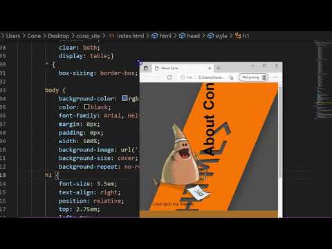
- We created an interesting rotated heading that runs vertical to the image. It works well in a large format but not when the screen scales down. Let's have the text rotate back to horizontal and scale down slightly.
- Type:
@media only screen and (max-width: 600px)
{
.responsive-h {
font-size: 2em;
text-align: left;
position: relative;
top: 0em;
left: 0px;
transform: rotate(0deg);}
} - Add the responsive-h class to the <h1> element. The text will now flip back to horizontal and scale down when the viewport width become small.
- Some images that work well in a large space do not work as well in a smaller area. Let's swap logos.
- Type:
@media only screen and (max-width: 600px)
{
.logoLarge {
display: none;}
}
@media only screen and (min-width: 600px)
{
.logoSmall {
display: none;}} - Replace the <img> element with:
<img class="responsive-img logoLarge" src="images/coneLogoLarge.png" />
<img class="responsive-img logoSmall" src="images/coneLogoSmall.png" />
The normal logo will be visible until the screen size becomes small then it is replaced with a simpler logo that reads better small.

- Some of the elements could read a bit better. Let's just add a little code to help.
- Add
color:white;
text-shadow: 2px 2px black;
to the h1 and figure CSS rules. - From this point you may add any other CSS you think might help the overall look.
- It is best to have your CSS responsive framework in an external stylesheet since you may want to use it on multiple pages.
- Select all of the CSS rules inside the <style> and press ctrl + x (or cmd + x on mac) to cut your text. Delete the <style> element.
- Select File>New File in the Visual Studio top menu.
- In the new file press ctrl + v (or cmd + v on mac) to paste your code. Select File>Save, navigate to the css folder in your website root folder. Type style.css as your file name and save.
- Now the file must be connected to your index.html file. In the <head> enter:
<link rel="stylesheet" href="css/style.css"> - When you save and preview you will see the page looks mostly correct but it is missing the background image. That is because the URL used in the CSS is relative and the file position of the CSS has changed.
- Open the style.css file. In the document change the background-image URL from images/backgroundImage.png to ../images/backgroundImage.png. This will redirect it to the correct location of the background image.
<!DOCTYPE html>
<html>
<head>
    <title>About Cone</title>
    <meta name=“viewport” content=“width=device-width, initial-scale=1.0”>
    <link rel="stylesheet" href="css/style.css">
</head>
<body>
    <div class="row header">
        <div class="col-8-s col-6-m col-4-l">
            <h1 class="responsive-h">About Cone</h1>
        </div>
        <div class="col-4-s col-6-m col-8-l">
            <figure>
                <img class="responsive-img logoLarge" src="images/coneLogoLarge.png" />
                <img class="responsive-img logoSmall" src="images/coneLogoSmall.png" />
                <figcaption>Look upon my majesty</figcaption>
            </figure>
        </div>
    </div>
    <div class="row content">
        <div class="col-4-s col-6-m col-8-l">
            <h2>I am Cone</h2>
            <p>Yup that is all you need to know. I am a sentient primitive object used to direct the public away. In this case I am used as an example.</p>
        </div>
        <div class="col-8-s col-6-m col-4-l">
            <h2>I am so much more</h2>
            <p>This is actually not true. I was just trying to draw you into the next paragraph and it worked! Sucker.</p>
        </div>
    </div>
</body>
</html>
.col-1-s, .col-2-s, .col-3-s, .col-4-s, .col-5-s, .col-6-s, .col-7-s, .col-8-s, .col-9-s, .col-10-s, .col-11-s, .col-12-s {
    width: 100%;}

@media only screen and (min-width: 600px)
{
    .col-1-s {width: 8.33%;}
    .col-2-s {width: 16.66%;}
    .col-3-s {width: 25%;}
    .col-4-s {width: 33.33%;}
    .col-5-s {width: 41.66%;}
    .col-6-s {width: 50%;}
    .col-7-s {width: 58.33%;}
    .col-8-s {width: 66.66%;}
    .col-9-s {width: 75%;}
    .col-10-s {width: 83.33%;}
    .col-11-s {width: 91.66%;}
    .col-12-s {width: 100%;}
}

@media only screen and (min-width: 768px)
{
    .col-1-m {width: 8.33%;}
    .col-2-m {width: 16.66%;}
    .col-3-m {width: 25%;}
    .col-4-m {width: 33.33%;}
    .col-5-m {width: 41.66%;}
    .col-6-m {width: 50%;}
    .col-7-m {width: 58.33%;}
    .col-8-m {width: 66.66%;}
    .col-9-m {width: 75%;}
    .col-10-m {width: 83.33%;}
    .col-11-m {width: 91.66%;}
    .col-12-m {width: 100%;}
}

@media only screen and (min-width: 992px)
{
    .col-1-l {width: 8.33%;}
    .col-2-l {width: 16.66%;}
    .col-3-l {width: 25%;}
    .col-4-l {width: 33.33%;}
    .col-5-l {width: 41.66%;}
    .col-6-l {width: 50%;}
    .col-7-l {width: 58.33%;}
    .col-8-l {width: 66.66%;}
    .col-9-l {width: 75%;}
    .col-10-l {width: 83.33%;}
    .col-11-l {width: 91.66%;}
    .col-12-l {width: 100%;}
}

[class*="col-"] {
    float: left;
    padding: 0px 10px 0px 10px;}

.row::after {
    content: "";
    clear: both;
    display: table;}

* {
    box-sizing: border-box;}

.responsive-img {
    max-width:100%;
    height: auto;}

@media only screen and (max-width: 600px)
{
    .responsive-h {
        font-size: 2em;
        text-align: left;
        position: relative;
        top: 0em;
        left: 0px;
        transform: rotate(0deg);}
}
@media only screen and (max-width: 600px)
{
    .logoLarge {
        display: none;}
}
@media only screen and (min-width: 600px)
{
    .logoSmall {
        display: none;}
}

body {
    background-color: rgb(56, 89, 149);
    color: black;
    font-family: Arial, Helvetica, sans-serif;
    margin: 0px;
    padding: 0px;
    width: 100%;
    background-image: url('../images/backgroundImage.png');
    background-size: cover;
    background-repeat: no-repeat;}
h1 {
    font-size: 3.5em;
    text-align: right;
    position: relative;
    top: 2.75em;
    left: 0px;
    transform: rotate(-90deg);
    color:white;
    text-shadow: 2px 2px black;}
figure {
    color:white;
    text-shadow: 2px 2px black;}
.content {
    background-color: rgb(165, 111, 40);
    padding: 10px;}

- Before you submit you should review your code and Save your file (File > Save), navigate to your file on your Desktop, and double-click it to open and preview it in your browser.
- Look for any errors. If there are any, look through your code and fix them. When you are happy, proceed
- Remember your site is not just the single HTML document you have created but the root folder and all contents therein. You MUST submit the ENTIRE folder
- You cannot submit folders on Blackboard. Instead we can zip the folder and submit that. Navigate to the location of your site folder. Right-click over top of it and select Send to > Compressed (zipped) folder on Windows and Compress on MacOS. A new zipped file will be created
- Lastly, log into Blackboard (Here) and click on this course. Inside the course, select Week 01, then the Week 02: Single Page Site (responsive) Lab folder, then the assignment with the same name. Finally, Attach the zipped file.
About Cone
I am Cone
Yup that is all you need to know. I am a sentient primitive object used to direct the public away. In this case I am used as an example.
I am so much more
This is actually not true. I was just trying to draw you into the next paragraph and it worked! Sucker.
Unfortunately the responsive elements of the image and title changing based on side does not function in this preview.

You have made your very own responsive framework! It might be like a bit of work for something you could get for free using Bootstrap or other template. However, by creating one yourself you can manipulate and bend it to do whatever custom function you want. The options are endless.
If you run into any issues please do not hesitate to contact me:
- jcone@cecil.edu
- (240) 466-1996

Wait! Before you go!
Did you remember to?
- Read through this webpage
- Watch the videos
- Submit Class 02 Single Page Site (responsive) Lab on Blackboard
