

Now that the layout of the homepage is complete it needs content. In this lab we will apply the content of the site. Text, images, Bootstrap components, and embedded technologies will be utilized.
Click on the > to start
There are no lab materials necessary to complete this week's lab.


Notice that the images are all scaled the same and adjusted to be more cohesive in color and style.
- Images are the first thing the user sees and the elements that draw the viewer in. As such they must be properly formatted. You may use any photo editor you'd like but I will use Photopea in this tutorial since it is free. You can download the images used here.
- Images in slideshows or that are in a row should be the same width and height. This can be done with code but should really be done to the images themselves.
- Open all images that are either in the same carousel or row. Find the lowest common denominator (the smallest image width or height). Scale and crop the other images to the same resolution.
- You will also want your images to match aesthetically. This means they should share common characteristics. This can be color, effect, style (graphic, flat, texture, etc.), common elements (patterns, logo, white background), or anything really that helps produce unity between them. Apply a similar process to each of the photos to make them cohesive.

<!DOCTYPE html>
<html>
<head>
<title>Homepage Layout Lab</title>
<meta charset="utf-8">
<meta name="viewport" content="width=device-width, initial-scale=1">
<link href="https://cdn.jsdelivr.net/npm/bootstrap@5.0.0-beta2/dist/css/bootstrap.min.css" rel="stylesheet" integrity="sha384-BmbxuPwQa2lc/FVzBcNJ7UAyJxM6wuqIj61tLrc4wSX0szH/Ev+nYRRuWlolflfl" crossorigin="anonymous">
<link type="text/css" rel="stylesheet" href="css/style.css"/>
</head>
<body>
<div class="container-fluid">
  <div class="row">
    <div class="col-12">

      <nav class="navbar navbar-expand-lg navbar-light bg-light">
        <div class="container-fluid">
          <a class="navbar-brand" href="#">Navbar</a>
          <button class="navbar-toggler" type="button" data-bs-toggle="collapse" data-bs-target="#navbarNavDropdown" aria-controls="navbarNavDropdown" aria-expanded="false" aria-label="Toggle navigation">
            <span class="navbar-toggler-icon"></span>
          </button>
          <div class="collapse navbar-collapse" id="navbarNavDropdown">
            <ul class="navbar-nav">
              <li class="nav-item">
                <a class="nav-link active" aria-current="page" href="#">Home</a>
              </li>
              <li class="nav-item">
                <a class="nav-link" href="#">Features</a>
              </li>
              <li class="nav-item">
                <a class="nav-link" href="#">Pricing</a>
              </li>
              <li class="nav-item dropdown">
                <a class="nav-link dropdown-toggle" href="#" id="navbarDropdownMenuLink" role="button" data-bs-toggle="dropdown" aria-expanded="false">
                  Dropdown link
                </a>
                <ul class="dropdown-menu" aria-labelledby="navbarDropdownMenuLink">
                  <li><a class="dropdown-item" href="#">Action</a></li>
                  <li><a class="dropdown-item" href="#">Another action</a></li>
                  <li><a class="dropdown-item" href="#">Something else here</a></li>
                </ul>
              </li>
            </ul>
          </div>
        </div>
      </nav>

    </div>
  </div>

  <div class="row">
    <div class="offset-lg-2 col-lg-8 ">

      <div id="carouselExampleCaptions" class="carousel slide" data-bs-ride="carousel">
        <div class="carousel-indicators">
          <button type="button" data-bs-target="#carouselExampleCaptions" data-bs-slide-to="0" class="active" aria-current="true" aria-label="Slide 1"></button>
          <button type="button" data-bs-target="#carouselExampleCaptions" data-bs-slide-to="1" aria-label="Slide 2"></button>
          <button type="button" data-bs-target="#carouselExampleCaptions" data-bs-slide-to="2" aria-label="Slide 3"></button>
        </div>
        <div class="carousel-inner">
          <div class="carousel-item active">
            <img class="img-fluid d-block w-100" src="https://teachmecone.com/wp-content/uploads/2021/02/coneLandscape.jpg" />
            <div class="carousel-caption d-none d-md-block">
              <h5>First slide label</h5>
              <p>Some representative placeholder content for the first slide.</p>
            </div>
          </div>
          <div class="carousel-item">
            <img class="img-fluid d-block w-100" src="https://teachmecone.com/wp-content/uploads/2021/02/coneLandscape.jpg" />
            <div class="carousel-caption d-none d-md-block">
              <h5>Second slide label</h5>
              <p>Some representative placeholder content for the second slide.</p>
            </div>
          </div>
          <div class="carousel-item">
            <img class="img-fluid d-block w-100" src="https://teachmecone.com/wp-content/uploads/2021/02/coneLandscape.jpg" />
            <div class="carousel-caption d-none d-md-block">
              <h5>Third slide label</h5>
              <p>Some representative placeholder content for the third slide.</p>
            </div>
          </div>
        </div>
        <button class="carousel-control-prev" type="button" data-bs-target="#carouselExampleCaptions"  data-bs-slide="prev">
          <span class="carousel-control-prev-icon" aria-hidden="true"></span>
          <span class="visually-hidden">Previous</span>
        </button>
        <button class="carousel-control-next" type="button" data-bs-target="#carouselExampleCaptions"  data-bs-slide="next">
          <span class="carousel-control-next-icon" aria-hidden="true"></span>
          <span class="visually-hidden">Next</span>
        </button>
      </div>

    </div>
  </div>
</div>

<div class="container">
  <div class="row rowImagesFix">
    <div class="col-sm-6 col-lg-3 ">
      <div class="card" style="width: 18rem;">
        <img src="https://teachmecone.com/wp-content/uploads/2021/03/coneHat.png"  class="card-img-top" alt="...">
        <div class="card-body">
          <h5 class="card-title">Cone Heads</h5>
          <p class="card-text">Some quick example text to build on the card title and make up the bulk of the card's content.</p>
          <a href="#" class="btn btn-primary">Let's Go</a>
        </div>
      </div>
    </div>
    <div class="col-sm-6 col-lg-3 ">
      <div class="card" style="width: 18rem;">
        <img src="https://teachmecone.com/wp-content/uploads/2021/03/iceCreamCone.jpg"  class="card-img-top" alt="...">
        <div class="card-body">
          <h5 class="card-title">Ice Cream Cones</h5>
          <p class="card-text">Some quick example text to build on the card title and make up the bulk of the card's content.</p>
          <a href="#" class="btn btn-primary">Let's Go</a>
        </div>
      </div>
    </div>
    <div class="col-sm-6 col-lg-3 ">
      <div class="card" style="width: 18rem;">
        <img src="https://teachmecone.com/wp-content/uploads/2021/03/pineCone.jpg"  class="card-img-top" alt="...">
        <div class="card-body">
          <h5 class="card-title">Pine Cones</h5>
          <p class="card-text">Some quick example text to build on the card title and make up the bulk of the card's content.</p>
          <a href="#" class="btn btn-primary">Let's Go</a>
        </div>
      </div>
    </div>
    <div class="col-sm-6 col-lg-3 ">
      <div class="card" style="width: 18rem;">
        <img src="https://teachmecone.com/wp-content/uploads/2021/03/maintenanceCone.jpg"  class="card-img-top" alt="...">
        <div class="card-body">
          <h5 class="card-title">Maintenance Cones</h5>
          <p class="card-text">Some quick example text to build on the card title and make up the bulk of the card's content.</p>
          <a href="#" class="btn btn-primary">Let's Go</a>
        </div>
      </div>
    </div>
  </div>

  <div class="row">
    <div class="col-md-6 ">
      <h3>Hello There!</h3>
      <p>Lorem ipsum dolor sit amet, consectetur adipisicing elit, sed do eiusmod tempor incididunt ut labore et dolore magna aliqua. Ut enim ad minim veniam, quis nostrud exercitation ullamco laboris nisi ut aliquip ex ea commodo consequat. Duis aute irure dolor in reprehenderit in voluptate velit esse cillum dolore eu fugiat nulla pariatur. Excepteur sint occaecat cupidatat non proident, sunt in culpa qui officia deserunt mollit anim id est laborum.</p>
    </div>
    <div class="col-md-6 ">
      <h3>News</h3>
      <p>Lorem ipsum dolor sit amet, consectetur adipisicing elit, sed do eiusmod tempor incididunt ut labore et dolore magna aliqua. Ut enim ad minim veniam, quis nostrud exercitation ullamco laboris nisi ut aliquip ex ea commodo consequat. Duis aute irure dolor in reprehenderit in voluptate velit esse cillum dolore eu fugiat nulla pariatur. Excepteur sint occaecat cupidatat non proident, sunt in culpa qui officia deserunt mollit anim id est laborum.</p>
    </div>
  </div>
</div>

<script src="https://cdn.jsdelivr.net/npm/bootstrap@5.0.0-beta2/dist/js/bootstrap.bundle.min.js" integrity="sha384-b5kHyXgcpbZJO/tY9Ul7kGkf1S0CWuKcCD38l8YkeH8z8QjE0GmW1gYU5S9FOnJ0" crossorigin="anonymous"></script>
<script type="text/javascript" src="js/script.js"></script>
</body>
</html>- The Bootsrap navbar and carousel have already been included but some other components may be included. We will make some minor adjustments and apply some new components. You may use what you created last week or download it here.
- Visit GetBootstrap.com to locate the code you need to insert.
- First let's change the upper area of the page (navbar and carousel) to a fluid-container by wrapping them in:
<div class="container-fluid"> </div>
This will stretch the content to the very edge of the browser window. Be sure the remaining elements are wrapped in the <div class="container"> </div>. - The four images below the carousel would be better served as Bootstrap cards. Remove the images and text and replace each with:
<div class="card" style="width: 18rem;"> <img src="..." class="card-img-top" alt="...">
<div class="card-body">
<h5 class="card-title">Card title</h5>
<p class="card-text">Some quick example text to build on the card title and make up the bulk of the card's content.</p>
<a href="#" class="btn btn-primary">Go somewhere</a>
</div>
</div> - Replace the conent with the appropriate text and images.
- Remove the internal CSS we wrote to create boxes for each section (<style></style> code) as well as the classes on the elements(wireBlock).

<!DOCTYPE html>
<html>
<head>
<title>Homepage Layout Lab</title>
<meta charset="utf-8">
<meta name="viewport" content="width=device-width, initial-scale=1">
<link href="https://cdn.jsdelivr.net/npm/bootstrap@5.0.0-beta2/dist/css/bootstrap.min.css" rel="stylesheet" integrity="sha384-BmbxuPwQa2lc/FVzBcNJ7UAyJxM6wuqIj61tLrc4wSX0szH/Ev+nYRRuWlolflfl" crossorigin="anonymous">
<link type="text/css" rel="stylesheet" href="css/style.css"/>
<link rel="preconnect" href="https://fonts.gstatic.com">
<link href="https://fonts.googleapis.com/css2?family=McLaren&family=Source+Sans+Pro&display=swap" rel="stylesheet">
</head>
<body>
<div class="container-fluid">
  <div class="row">
    <div class="col-12 wireBlock">

      <nav class="navbar navbar-expand-lg navbar-light bg-light">
        <div class="container-fluid">
          <a class="navbar-brand" href="#">Navbar</a>
          <button class="navbar-toggler" type="button" data-bs-toggle="collapse" data-bs-target="#navbarNavDropdown" aria-controls="navbarNavDropdown" aria-expanded="false" aria-label="Toggle navigation">
            <span class="navbar-toggler-icon"></span>
          </button>
          <div class="collapse navbar-collapse" id="navbarNavDropdown">
            <ul class="navbar-nav">
              <li class="nav-item">
                <a class="nav-link active" aria-current="page" href="#">Home</a>
              </li>
              <li class="nav-item">
                <a class="nav-link" href="#">Features</a>
              </li>
              <li class="nav-item">
                <a class="nav-link" href="#">Pricing</a>
              </li>
              <li class="nav-item dropdown">
                <a class="nav-link dropdown-toggle" href="#" id="navbarDropdownMenuLink" role="button" data-bs-toggle="dropdown" aria-expanded="false">
                  Dropdown link
                </a>
                <ul class="dropdown-menu" aria-labelledby="navbarDropdownMenuLink">
                  <li><a class="dropdown-item" href="#">Action</a></li>
                  <li><a class="dropdown-item" href="#">Another action</a></li>
                  <li><a class="dropdown-item" href="#">Something else here</a></li>
                </ul>
              </li>
            </ul>
          </div>
        </div>
      </nav>

    </div>
  </div>

  <div class="row">
    <div class="offset-lg-2 col-lg-8">

      <div id="carouselExampleCaptions" class="carousel slide" data-bs-ride="carousel">
        <div class="carousel-indicators">
          <button type="button" data-bs-target="#carouselExampleCaptions" data-bs-slide-to="0" class="active" aria-current="true" aria-label="Slide 1"></button>
          <button type="button" data-bs-target="#carouselExampleCaptions" data-bs-slide-to="1" aria-label="Slide 2"></button>
          <button type="button" data-bs-target="#carouselExampleCaptions" data-bs-slide-to="2" aria-label="Slide 3"></button>
        </div>
        <div class="carousel-inner">
          <div class="carousel-item active">
            <img class="img-fluid d-block w-100" src="https://teachmecone.com/wp-content/uploads/2021/02/coneLandscape.jpg" />
            <div class="carousel-caption d-none d-md-block">
              <h5>First slide label</h5>
              <p>Some representative placeholder content for the first slide.</p>
            </div>
          </div>
          <div class="carousel-item">
            <img class="img-fluid d-block w-100" src="https://teachmecone.com/wp-content/uploads/2021/02/coneLandscape.jpg" />
            <div class="carousel-caption d-none d-md-block">
              <h5>Second slide label</h5>
              <p>Some representative placeholder content for the second slide.</p>
            </div>
          </div>
          <div class="carousel-item">
            <img class="img-fluid d-block w-100" src="https://teachmecone.com/wp-content/uploads/2021/02/coneLandscape.jpg" />
            <div class="carousel-caption d-none d-md-block">
              <h5>Third slide label</h5>
              <p>Some representative placeholder content for the third slide.</p>
            </div>
          </div>
        </div>
        <button class="carousel-control-prev" type="button" data-bs-target="#carouselExampleCaptions"  data-bs-slide="prev">
          <span class="carousel-control-prev-icon" aria-hidden="true"></span>
          <span class="visually-hidden">Previous</span>
        </button>
        <button class="carousel-control-next" type="button" data-bs-target="#carouselExampleCaptions"  data-bs-slide="next">
          <span class="carousel-control-next-icon" aria-hidden="true"></span>
          <span class="visually-hidden">Next</span>
        </button>
      </div>

    </div>
  </div>
</div>

<div class="container">
  <div class="row ">
    <div class="col-sm-6 col-lg-3">
      <div class="card" style="width: 18rem;">
        <img src="https://teachmecone.com/wp-content/uploads/2021/03/coneHat.png"  class="card-img-top" alt="...">
        <div class="card-body">
          <h5 class="card-title">Cone Heads</h5>
          <p class="card-text">Some quick example text to build on the card title and make up the bulk of the card's content.</p>
          <a href="#" class="btn btn-primary">Let's Go</a>
        </div>
      </div>
    </div>
    <div class="col-sm-6 col-lg-3">
      <div class="card" style="width: 18rem;">
        <img src="https://teachmecone.com/wp-content/uploads/2021/03/iceCreamCone.jpg"  class="card-img-top" alt="...">
        <div class="card-body">
          <h5 class="card-title">Ice Cream Cones</h5>
          <p class="card-text">Some quick example text to build on the card title and make up the bulk of the card's content.</p>
          <a href="#" class="btn btn-primary">Let's Go</a>
        </div>
      </div>
    </div>
    <div class="col-sm-6 col-lg-3">
      <div class="card" style="width: 18rem;">
        <img src="https://teachmecone.com/wp-content/uploads/2021/03/pineCone.jpg"  class="card-img-top" alt="...">
        <div class="card-body">
          <h5 class="card-title">Pine Cones</h5>
          <p class="card-text">Some quick example text to build on the card title and make up the bulk of the card's content.</p>
          <a href="#" class="btn btn-primary">Let's Go</a>
        </div>
      </div>
    </div>
    <div class="col-sm-6 col-lg-3">
      <div class="card" style="width: 18rem;">
        <img src="https://teachmecone.com/wp-content/uploads/2021/03/maintenanceCone.jpg"  class="card-img-top" alt="...">
        <div class="card-body">
          <h5 class="card-title">Maintenance Cones</h5>
          <p class="card-text">Some quick example text to build on the card title and make up the bulk of the card's content.</p>
          <a href="#" class="btn btn-primary">Let's Go</a>
        </div>
      </div>
    </div>
  </div>

  <div class="row">
    <div class="col-md-6">
      <h3>Hello There!</h3>
      <p>Lorem ipsum dolor sit amet, consectetur adipisicing elit, sed do eiusmod tempor incididunt ut labore et dolore magna aliqua. Ut enim ad minim veniam, quis nostrud exercitation ullamco laboris nisi ut aliquip ex ea commodo consequat. Duis aute irure dolor in reprehenderit in voluptate velit esse cillum dolore eu fugiat nulla pariatur. Excepteur sint occaecat cupidatat non proident, sunt in culpa qui officia deserunt mollit anim id est laborum.</p>
    </div>
    <div class="col-md-6">
      <h3>News</h3>
      <p>Lorem ipsum dolor sit amet, consectetur adipisicing elit, sed do eiusmod tempor incididunt ut labore et dolore magna aliqua. Ut enim ad minim veniam, quis nostrud exercitation ullamco laboris nisi ut aliquip ex ea commodo consequat. Duis aute irure dolor in reprehenderit in voluptate velit esse cillum dolore eu fugiat nulla pariatur. Excepteur sint occaecat cupidatat non proident, sunt in culpa qui officia deserunt mollit anim id est laborum.</p>
    </div>
  </div>
</div>

<script src="https://cdn.jsdelivr.net/npm/bootstrap@5.0.0-beta2/dist/js/bootstrap.bundle.min.js" integrity="sha384-b5kHyXgcpbZJO/tY9Ul7kGkf1S0CWuKcCD38l8YkeH8z8QjE0GmW1gYU5S9FOnJ0" crossorigin="anonymous"></script>
<script type="text/javascript" src="js/script.js"></script>
</body>
</html>- Bootstrap comes with a default styling which includes a typeface. There are multiple ways to include other typefaces. Most are either limiting or have legal issues. Lucky us there is Google Fonts. This will allow us to attach their fonts to our pages via a CSS link.
- Visit Fonts.Google.com to gain access to Google's typeface resource.
- Generally speaking you want two typefaces for your design. One for the heading or headings that is appealing and draws the viewer it. Then you should choose a body text that is easy to read and matches the design of your page. I like to use the Categories option to turn off undesired font-families (most of the time you want just Display) to find my heading font.
- Select a font from the options for your heading and click on it. Click on Select this style from the resulting page. You should see a panel popup to the right with linking information.
- You may scroll down while on the font you selected page and you will find matching fonts. Select a font by pressing the + next to it.
- In the panel on the right copy the code in the <link>. Paste the first code block in the heading of your page. Paste the second code pieces to and target them with CSS. It should looks something like the code examples.
h1, h2, h3, h4, h5, h6 {
   font-family: 'McLaren', cursive;}
body, p, q {
   font-family: 'Source Sans Pro', sans-serif;}
<!DOCTYPE html>
<html>
<head>
<title>Homepage Layout Lab</title>
<meta charset="utf-8">
<meta name="viewport" content="width=device-width, initial-scale=1">
<link href="https://cdn.jsdelivr.net/npm/bootstrap@5.0.0-beta2/dist/css/bootstrap.min.css" rel="stylesheet" integrity="sha384-BmbxuPwQa2lc/FVzBcNJ7UAyJxM6wuqIj61tLrc4wSX0szH/Ev+nYRRuWlolflfl" crossorigin="anonymous">
<link type="text/css" rel="stylesheet" href="css/style.css"/>
<link rel="preconnect" href="https://fonts.gstatic.com">
<link href="https://fonts.googleapis.com/css2?family=McLaren&family=Source+Sans+Pro&display=swap" rel="stylesheet">
<link rel="stylesheet" href="https://cdnjs.cloudflare.com/ajax/libs/font-awesome/4.7.0/css/font-awesome.min.css">
</head>
<body>
<div class="container-fluid">
  <div class="row">
    <div class="col-12">

      <nav class="navbar navbar-expand-lg navbar-light bg-light">
        <div class="container-fluid">
          <a class="navbar-brand" href="#"><i class="fa fa-home fa-2x"></i></a>
          <button class="navbar-toggler" type="button" data-bs-toggle="collapse" data-bs-target="#navbarNavDropdown" aria-controls="navbarNavDropdown" aria-expanded="false" aria-label="Toggle navigation">
            <span class="navbar-toggler-icon"></span>
          </button>
          <div class="collapse navbar-collapse" id="navbarNavDropdown">
            <ul class="navbar-nav">
              <li class="nav-item">
                <a class="nav-link active" aria-current="page" href="#">Home</a>
              </li>
              <li class="nav-item">
                <a class="nav-link" href="#">Features</a>
              </li>
              <li class="nav-item">
                <a class="nav-link" href="#">Pricing</a>
              </li>
              <li class="nav-item dropdown">
                <a class="nav-link dropdown-toggle" href="#" id="navbarDropdownMenuLink" role="button" data-bs-toggle="dropdown" aria-expanded="false">
                  Dropdown link
                </a>
                <ul class="dropdown-menu" aria-labelledby="navbarDropdownMenuLink">
                  <li><a class="dropdown-item" href="#">Action</a></li>
                  <li><a class="dropdown-item" href="#">Another action</a></li>
                  <li><a class="dropdown-item" href="#">Something else here</a></li>
                </ul>
              </li>
            </ul>
          </div>
        </div>
      </nav>

    </div>
  </div>

  <div class="row">
    <div class="offset-lg-2 col-lg-8">

      <div id="carouselExampleCaptions" class="carousel slide" data-bs-ride="carousel">
        <div class="carousel-indicators">
          <button type="button" data-bs-target="#carouselExampleCaptions" data-bs-slide-to="0" class="active" aria-current="true" aria-label="Slide 1"></button>
          <button type="button" data-bs-target="#carouselExampleCaptions" data-bs-slide-to="1" aria-label="Slide 2"></button>
          <button type="button" data-bs-target="#carouselExampleCaptions" data-bs-slide-to="2" aria-label="Slide 3"></button>
        </div>
        <div class="carousel-inner">
          <div class="carousel-item active">
            <img class="img-fluid d-block w-100" src="https://teachmecone.com/wp-content/uploads/2021/02/coneLandscape.jpg" />
            <div class="carousel-caption d-none d-md-block">
              <h5>First slide label</h5>
              <p>Some representative placeholder content for the first slide.</p>
            </div>
          </div>
          <div class="carousel-item">
            <img class="img-fluid d-block w-100" src="https://teachmecone.com/wp-content/uploads/2021/02/coneLandscape.jpg" />
            <div class="carousel-caption d-none d-md-block">
              <h5>Second slide label</h5>
              <p>Some representative placeholder content for the second slide.</p>
            </div>
          </div>
          <div class="carousel-item">
            <img class="img-fluid d-block w-100" src="https://teachmecone.com/wp-content/uploads/2021/02/coneLandscape.jpg" />
            <div class="carousel-caption d-none d-md-block">
              <h5>Third slide label</h5>
              <p>Some representative placeholder content for the third slide.</p>
            </div>
          </div>
        </div>
        <button class="carousel-control-prev" type="button" data-bs-target="#carouselExampleCaptions"  data-bs-slide="prev">
          <span class="carousel-control-prev-icon" aria-hidden="true"></span>
          <span class="visually-hidden">Previous</span>
        </button>
        <button class="carousel-control-next" type="button" data-bs-target="#carouselExampleCaptions"  data-bs-slide="next">
          <span class="carousel-control-next-icon" aria-hidden="true"></span>
          <span class="visually-hidden">Next</span>
        </button>
      </div>

    </div>
  </div>
</div>

<div class="container">
  <div class="row">
    <div class="col-sm-6 col-lg-3 wireBlock">
      <div class="card" style="width: 18rem;">
        <img src="https://teachmecone.com/wp-content/uploads/2021/03/coneHat.png"  class="card-img-top" alt="...">
        <div class="card-body">
          <h5 class="card-title">Cone Heads</h5>
          <p class="card-text">Some quick example text to build on the card title and make up the bulk of the card's content.</p>
          <a href="#" class="btn btn-primary">Let's Go</a>
        </div>
      </div>
    </div>
    <div class="col-sm-6 col-lg-3 wireBlock">
      <div class="card" style="width: 18rem;">
        <img src="https://teachmecone.com/wp-content/uploads/2021/03/iceCreamCone.jpg"  class="card-img-top" alt="...">
        <div class="card-body">
          <h5 class="card-title">Ice Cream Cones</h5>
          <p class="card-text">Some quick example text to build on the card title and make up the bulk of the card's content.</p>
          <a href="#" class="btn btn-primary">Let's Go</a>
        </div>
      </div>
    </div>
    <div class="col-sm-6 col-lg-3">
      <div class="card" style="width: 18rem;">
        <img src="https://teachmecone.com/wp-content/uploads/2021/03/pineCone.jpg"  class="card-img-top" alt="...">
        <div class="card-body">
          <h5 class="card-title">Pine Cones</h5>
          <p class="card-text">Some quick example text to build on the card title and make up the bulk of the card's content.</p>
          <a href="#" class="btn btn-primary">Let's Go</a>
        </div>
      </div>
    </div>
    <div class="col-sm-6 col-lg-3">
      <div class="card" style="width: 18rem;">
        <img src="https://teachmecone.com/wp-content/uploads/2021/03/maintenanceCone.jpg"  class="card-img-top" alt="...">
        <div class="card-body">
          <h5 class="card-title">Maintenance Cones</h5>
          <p class="card-text">Some quick example text to build on the card title and make up the bulk of the card's content.</p>
          <a href="#" class="btn btn-primary">Let's Go</a>
        </div>
      </div>
    </div>
  </div>

  <div class="row">
    <div class="col-md-6">
      <h3>Hello There!</h3>
      <p>Lorem ipsum dolor sit amet, consectetur adipisicing elit, sed do eiusmod tempor incididunt ut labore et dolore magna aliqua. Ut enim ad minim veniam, quis nostrud exercitation ullamco laboris nisi ut aliquip ex ea commodo consequat. Duis aute irure dolor in reprehenderit in voluptate velit esse cillum dolore eu fugiat nulla pariatur. Excepteur sint occaecat cupidatat non proident, sunt in culpa qui officia deserunt mollit anim id est laborum.</p>
    </div>
    <div class="col-md-6">
      <h3>News</h3>
      <p>Lorem ipsum dolor sit amet, consectetur adipisicing elit, sed do eiusmod tempor incididunt ut labore et dolore magna aliqua. Ut enim ad minim veniam, quis nostrud exercitation ullamco laboris nisi ut aliquip ex ea commodo consequat. Duis aute irure dolor in reprehenderit in voluptate velit esse cillum dolore eu fugiat nulla pariatur. Excepteur sint occaecat cupidatat non proident, sunt in culpa qui officia deserunt mollit anim id est laborum.</p>
    </div>
  </div>
</div>

<script src="https://cdn.jsdelivr.net/npm/bootstrap@5.0.0-beta2/dist/js/bootstrap.bundle.min.js" integrity="sha384-b5kHyXgcpbZJO/tY9Ul7kGkf1S0CWuKcCD38l8YkeH8z8QjE0GmW1gYU5S9FOnJ0" crossorigin="anonymous"></script>
<script type="text/javascript" src="js/script.js"></script>
</body>
</html>- You have probably seen that many websites use the same icons for menus, social media, and other elements. There are various options for linking libraries of icons. Bootstrap, Google, and Font Awesome all offer this service.
- You may visit:
Bootstrap Icons
Google Materials
Font Awesome
For direct information on how to incorporate each. - For our purposes visit W3schools Icons Tutorial. This has all the options shown. It is also easiest to utilize them from here.
- Select and copy the <link rel="stylesheet" href="https://cdnjs.cloudflare.com/ajax/libs/font-awesome/4.7.0/css/font-awesome.min.css"> code from the Font Awesome 4 Icons section. Paste this into your <head> section of your page.
- In the vertical menu on the left you will see a section for Font Awesome 4. The icons are divided up into categories below it. You may search for your desired icon here and place it anywhere on your site such as:
<i class="fa fa-home fa-2x"></i>
Use as many as you like. You may also try the other options.
<!DOCTYPE html>
<html>
<head>
<title>Homepage Layout Lab</title>
<meta charset="utf-8">
<meta name="viewport" content="width=device-width, initial-scale=1">
<link href="https://cdn.jsdelivr.net/npm/bootstrap@5.0.0-beta2/dist/css/bootstrap.min.css" rel="stylesheet" integrity="sha384-BmbxuPwQa2lc/FVzBcNJ7UAyJxM6wuqIj61tLrc4wSX0szH/Ev+nYRRuWlolflfl" crossorigin="anonymous">
<link type="text/css" rel="stylesheet" href="css/style.css"/>
<link rel="preconnect" href="https://fonts.gstatic.com">
<link href="https://fonts.googleapis.com/css2?family=McLaren&family=Source+Sans+Pro&display=swap" rel="stylesheet">
<link rel="stylesheet" href="https://cdnjs.cloudflare.com/ajax/libs/font-awesome/4.7.0/css/font-awesome.min.css">
<link type="text/css" rel="stylesheet" href="css/style.css"/>
</head>
<body>
<div class="container-fluid">
  <div class="row">
    <div class="col-12">
      <nav class="navbar navbar-expand-lg navbar-light bg-light">
        <div class="container-fluid">
          <a class="navbar-brand" href="#"><i class="fa fa-home fa-2x"></i></a>
          <button class="navbar-toggler" type="button" data-bs-toggle="collapse" data-bs-target="#navbarNavDropdown" aria-controls="navbarNavDropdown" aria-expanded="false" aria-label="Toggle navigation">
            <span class="navbar-toggler-icon"></span>
          </button>
          <div class="collapse navbar-collapse" id="navbarNavDropdown">
            <ul class="navbar-nav">
              <li class="nav-item">
                <a class="nav-link active" aria-current="page" href="#">Home</a>
              </li>
              <li class="nav-item">
                <a class="nav-link" href="#">Features</a>
              </li>
              <li class="nav-item">
                <a class="nav-link" href="#">Pricing</a>
              </li>
              <li class="nav-item dropdown">
                <a class="nav-link dropdown-toggle" href="#" id="navbarDropdownMenuLink" role="button" data-bs-toggle="dropdown" aria-expanded="false">
                  Dropdown link
                </a>
                <ul class="dropdown-menu" aria-labelledby="navbarDropdownMenuLink">
                  <li><a class="dropdown-item" href="#">Action</a></li>
                  <li><a class="dropdown-item" href="#">Another action</a></li>
                  <li><a class="dropdown-item" href="#">Something else here</a></li>
                </ul>
              </li>
            </ul>
          </div>
        </div>
      </nav>
    </div>
  </div>

  <div class="row">
    <div class="offset-lg-2 col-lg-8">
      <div id="carouselExampleCaptions" class="carousel slide" data-bs-ride="carousel">
        <div class="carousel-indicators">
          <button type="button" data-bs-target="#carouselExampleCaptions" data-bs-slide-to="0" class="active" aria-current="true" aria-label="Slide 1"></button>
          <button type="button" data-bs-target="#carouselExampleCaptions" data-bs-slide-to="1" aria-label="Slide 2"></button>
          <button type="button" data-bs-target="#carouselExampleCaptions" data-bs-slide-to="2" aria-label="Slide 3"></button>
        </div>
        <div class="carousel-inner">
          <div class="carousel-item active">
            <img class="img-fluid d-block w-100" src="https://teachmecone.com/wp-content/uploads/2021/02/coneLandscape.jpg" />
            <div class="carousel-caption d-none d-md-block">
              <h5>First slide label</h5>
              <p>Some representative placeholder content for the first slide.</p>
            </div>
          </div>
          <div class="carousel-item">
            <img class="img-fluid d-block w-100" src="https://teachmecone.com/wp-content/uploads/2021/02/coneLandscape.jpg" />
            <div class="carousel-caption d-none d-md-block">
              <h5>Second slide label</h5>
              <p>Some representative placeholder content for the second slide.</p>
            </div>
          </div>
          <div class="carousel-item">
            <img class="img-fluid d-block w-100" src="https://teachmecone.com/wp-content/uploads/2021/02/coneLandscape.jpg" />
            <div class="carousel-caption d-none d-md-block">
              <h5>Third slide label</h5>
              <p>Some representative placeholder content for the third slide.</p>
            </div>
          </div>
        </div>
        <button class="carousel-control-prev" type="button" data-bs-target="#carouselExampleCaptions"  data-bs-slide="prev">
          <span class="carousel-control-prev-icon" aria-hidden="true"></span>
          <span class="visually-hidden">Previous</span>
        </button>
        <button class="carousel-control-next" type="button" data-bs-target="#carouselExampleCaptions"  data-bs-slide="next">
          <span class="carousel-control-next-icon" aria-hidden="true"></span>
          <span class="visually-hidden">Next</span>
        </button>
      </div>
    </div>
  </div>
</div>

<div class="container">
  <div class="row">
    <div class="col-sm-6 col-lg-3 wireBlock">
      <div class="card" style="width: 18rem;">
        <img src="https://teachmecone.com/wp-content/uploads/2021/03/coneHat.png"  class="card-img-top" alt="...">
        <div class="card-body">
          <h5 class="card-title">Cone Heads</h5>
          <p class="card-text">Some quick example text to build on the card title and make up the bulk of the card's content.</p>
          <a href="#" class="btn btn-primary">Let's Go</a>
        </div>
      </div>
    </div>
    <div class="col-sm-6 col-lg-3 wireBlock">
      <div class="card" style="width: 18rem;">
        <img src="https://teachmecone.com/wp-content/uploads/2021/03/iceCreamCone.jpg"  class="card-img-top" alt="...">
        <div class="card-body">
          <h5 class="card-title">Ice Cream Cones</h5>
          <p class="card-text">Some quick example text to build on the card title and make up the bulk of the card's content.</p>
          <a href="#" class="btn btn-primary">Let's Go</a>
        </div>
      </div>
    </div>
    <div class="col-sm-6 col-lg-3">
      <div class="card" style="width: 18rem;">
        <img src="https://teachmecone.com/wp-content/uploads/2021/03/pineCone.jpg"  class="card-img-top" alt="...">
        <div class="card-body">
          <h5 class="card-title">Pine Cones</h5>
          <p class="card-text">Some quick example text to build on the card title and make up the bulk of the card's content.</p>
          <a href="#" class="btn btn-primary">Let's Go</a>
        </div>
      </div>
    </div>
    <div class="col-sm-6 col-lg-3">
      <div class="card" style="width: 18rem;">
        <img src="https://teachmecone.com/wp-content/uploads/2021/03/maintenanceCone.jpg"  class="card-img-top" alt="...">
        <div class="card-body">
          <h5 class="card-title">Maintenance Cones</h5>
          <p class="card-text">Some quick example text to build on the card title and make up the bulk of the card's content.</p>
          <a href="#" class="btn btn-primary">Let's Go</a>
        </div>
      </div>
    </div>
  </div>
  <div class="row">
    <div class="col-md-6">
      <h3>Hello There!</h3>
      <iframe width="560" height="315" src="https://www.youtube.com/embed/dQw4w9WgXcQ" frameborder="0" allow="accelerometer; autoplay; clipboard-write; encrypted-media; gyroscope; picture-in-picture" allowfullscreen></iframe>
    </div>
    <div class="col-md-6">
      <h3>Location</h3>
      <iframe src="https://www.google.com/maps/embed?pb=!1m18!1m12!1m3!1d3072.38517222529!2d-75.95864658490774!3d39.64104531037175!2 m3!1f0!2f0!3f0!3 m2!1i1024!2i768!4f13.1!3 m3!1 m2!1s0x89c7b0f18aa99d97%3A0x74ed98b7680af868!2s1%20Seahawk%20 Dr%2C%20North%20East%2C%20MD%2021901!5e0!3 m2!1sen!2sus!4v1614782699101!5 m2!1sen!2sus" width="600" height="450" style="border:0;" allowfullscreen="" loading="lazy"></iframe>
    </div>
  </div>
</div>

<script src="https://cdn.jsdelivr.net/npm/bootstrap@5.0.0-beta2/dist/js/bootstrap.bundle.min.js" integrity="sha384-b5kHyXgcpbZJO/tY9Ul7kGkf1S0CWuKcCD38l8YkeH8z8QjE0GmW1gYU5S9FOnJ0" crossorigin="anonymous"></script>
<script type="text/javascript" src="js/script.js"></script>
<script type="text/javascript" src="js/script.js"></script>
</body>
</html>
- There are loads of other technologies you can embed into your site. We will highlight just two common ones now, Youtube videos, and Google maps.
- Visit Youtube. Find a video you would like to embed Share button. Choose the Embed option. Click COPY or just manually copy the <iframe> code.
- Select the area you wish to place it and past (ctrl + v or cmd + v). You may change the <iframe> code to make it fit or adjust it. Pretty easy.
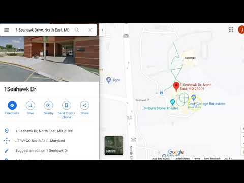
- Visit Google Maps. Enter the address you would like to center the map on. A panel to the left should pop up, select Share. Choose the Embed a map option. Click COPY HTML or just manually copy the <iframe> code.
- Select the area you wish to place it and past (ctrl + v or cmd + v). You may change the <iframe> code to make it fit or adjust it. That is it.
- You may find a lot of other content you can embed. These are some of the most popular but feel free to research other option.

- Before you submit you should review your code and visual preview.
- Look for any errors. If there are any, fix them. When you are happy, proceed .
- In Liveweave click on Download (top center of window). This is the entire site zipped that you can just submit to Blackboard.
- Lastly, log into Blackboard (Here) and click on this course. Inside the course, select Week 08, then the Week 08: Responsive Site (homepage content) Lab folder, then the assignment with the same name. Finally, Attach the zipped file.
Homepage Layout Lab

First slide label
Some representative placeholder content for the first slide.
Second slide label
Some representative placeholder content for the second slide.
Third slide label
Some representative placeholder content for the third slide.
Cone Heads

Ice Cream Cones

Pine Cones

Maintenance Cones

Hello There!
Location

Now the site has more finalized content. You can see there are loads of resources online that can help build out your site. Things from frameworks like Bootstrap to libraries of typefaces like Google Fonts. There are more than these that you should explore.
If you run into any issues please do not hesitate to contact me:
- jcone@cecil.edu
- (240) 466-1996