
Digital Imaging II
Class 09: Vector GraphicsTopics
- Color Design
- Vector Graphics
- Stationary Design
- Assignment 02

Class 7, 8, 9!
Color Design
Color Theory:
Just as the type of font you use in a design contains subliminal meaning, so does the color. Different colors may imply different meanings and emotions in a composition.

Color Definitions:
Warm Colors:
Warm colors feel “warm.” These are colors we associate with higher temps and energy. These ascend in a composition.
Cool Colors:
Cool colors are the opoosite of warm. These are very stoic, stable, strong and cold.
Tints:
Tints are the resulting colors by adding white. The most famous tint would be pink (from red obviously).
Shades:
Adding black to a color produces shades.
Pure Hue:
A pure hue is simply a color with not mixed into it. Generally brilliant.
Tones:
Like tints and shade but instead adding gray resulting in a less pure color.
Color Schemes:
Most artwork (good ones) utilize a color scheme. This is the process of choosing colors based on rules understanding what works together. Below are the most commonly used schemes.
Achromatic:
Without color, black and white.

Monochromatic:
Variation of one color with the value adjusted, adding black (shade) or adding white (tint).

Analogous:
Colors that contain a common hue (colors next to each other in the color wheel). Adjoining colors naturally blend

Complimentary:
Opposite colors that produce strong contrast. Generally create the strongest emphasis in a design.

Warm/Cool:
Produces a sense of warmth or coolness. Warm ascend, cool descends. Warm is inviting, cool is not.


Color Tips:
Below are some tips for choosing your colors in your compositions. Color is a huge topic and I highly suggest researching it for yourself and above all experiment.
Tones:
Avoid similar tones (overall deepness of colors).

Saturation:
Avoid too many elements with heavy saturation or warm hues.

Analogous:
Analogous color scheme is good for seasonal projects (bright greens: Spring, cool blues: Winter, oranges & browns: Fall, hot reds & yellows: Summer).


Cliches:
To avoid cliché colors use tints and shades or try warms and cools.


Image:
If using an image you may want to sample colors from it to produce an analogous harmonious scheme, or use complementary colors

Warms/Cools:
Use warm colors to ascend important elements and cool to recede others.

Accent:
Use touches of color. Accent like in interior design
Color Number:
Limit colors (this is both for design purposes but also for printing).

Color Tools:
Some are particularly sensitive to color and can more naturally make color choices. I am not one of these people and you may not be either. Lucky you color theory is based on math and there are tools out there to help.
Adobe Color
Vector Graphics
Vector Graphics
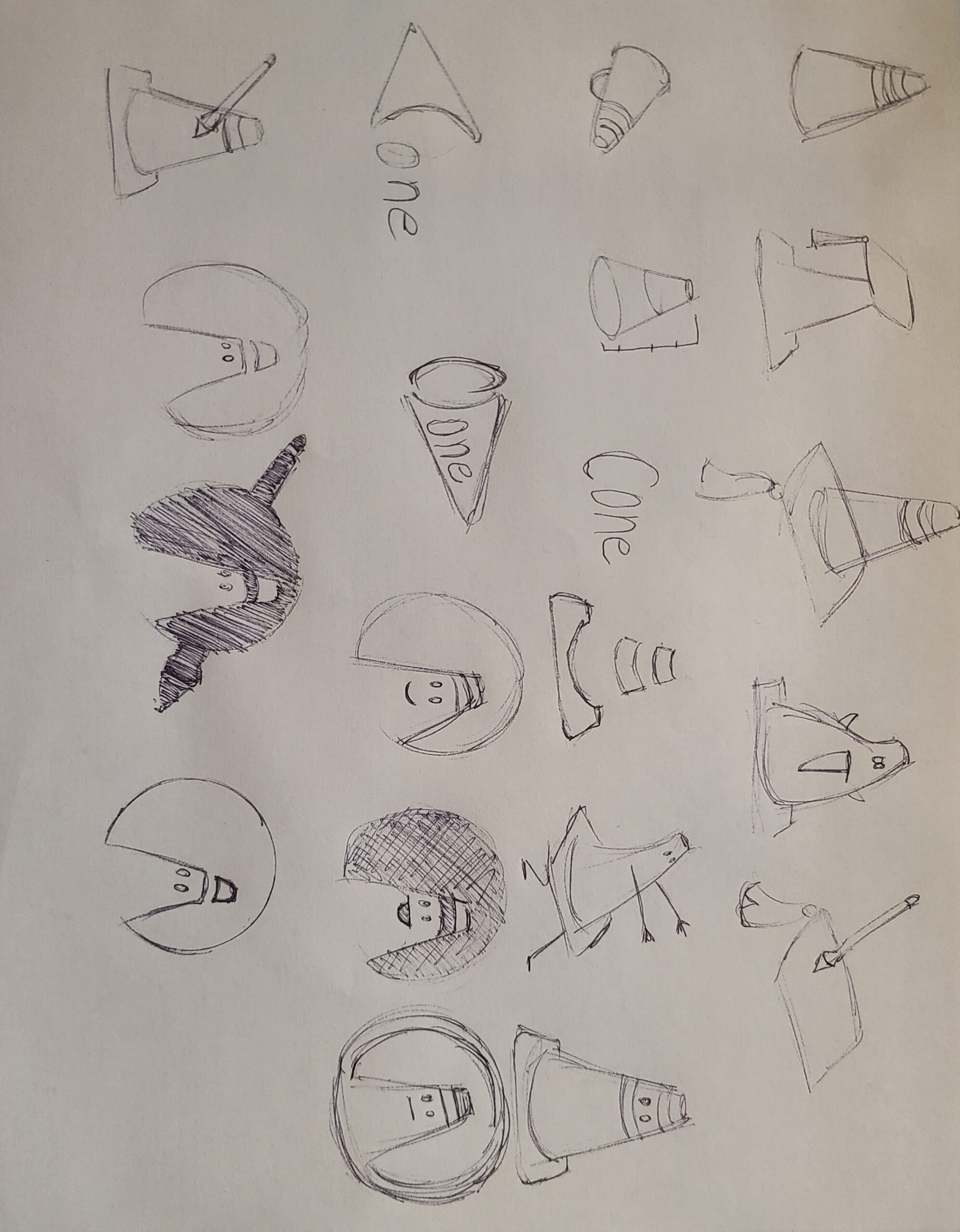
Vector graphics are digital imagery drawn on the computer using points, lines, and shapes using mathematics.onal media.
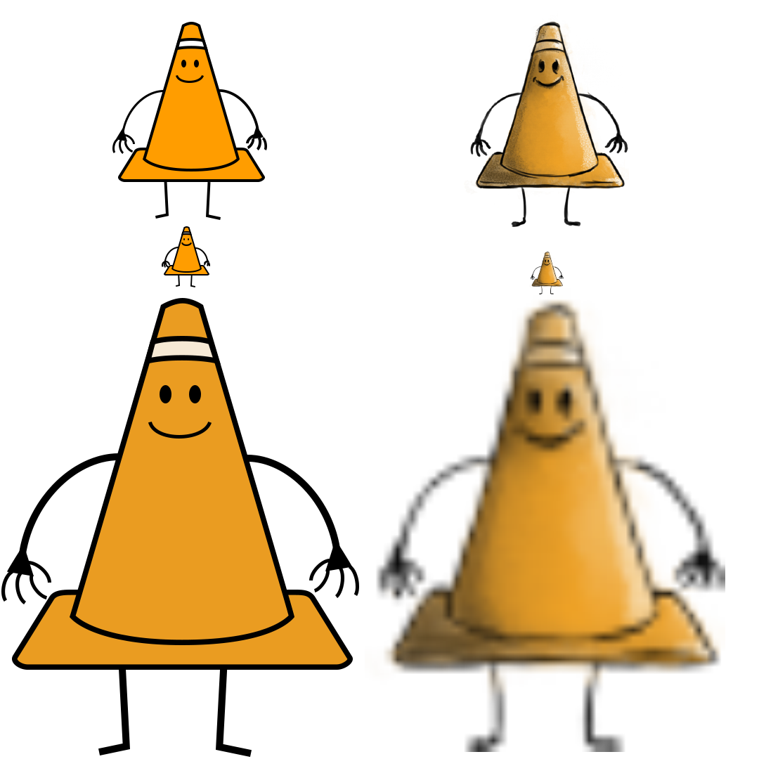
Most logos are created as vector graphics. The fact the image is drawn through math means that it can be scaled large to small without worrying about resolution or fidelity. The vector on the left stays perfect but the raster image on the right becomes pixelated at higher resolutions.

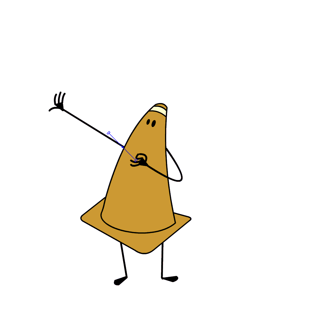
You can see here that a vector graphic is made of points with lines connecting them (bezier curve). The outside line is called stroke and the colored enclosed area is called fill. You can manipulate the points to deform the shape.
Bezier Curve:
The standard algorithm used in vector graphics. The parametric curve, pronounced BEH-zee-ay, uses handles that you drag to extend and control curvature. Honestly it is a bit tricky to get used to but is very powerful. This is what adobe products, including Photoshop, utilizes.
The above “game” may help you get used to using bezier curves. If you feel even more ambitious you may try the one below as well.
Vector Graphic Tutorials
Below you can follow some tutorial videos on creating vector graphics. They are not part of this week’s assignments but it is still information you should know.

Vector Tools:
- Pen Tool
-
- Settings
-
- Tool Mode
- This controls what this tool creates. Shape mode produces a vector graphic. Path mode creates a path. Pixel is not an option.
-
- Fill
- Controls the color of the interior of a closed shape.
-
- Stroke
- Controls the color of the outline of the shape drawn.
-
- Stroke Width
- Controls the width of the stroke.
- Stroke Type
- Controls the look of the stroke.
- Hotkeys
-
- p
- Activates the pen tool.
-
- shift
- Snaps bezier handles to 45 degree increments.
-
- alt
- Produces a broken tangent.
- Other Pen Tools
-
- Freeform Pen Tool
- Draws a path like using brush instead of creating points.
-
- Add Anchor Point Tool
- Adds another point on an already drawn vector line.
-
- Delete Anchor Point Tool
- Removes a point on an already drawn vector line.
- Convert Point Tool
- Clicking will change a point to linear. Click and dragging will allow you to drag the bezier handles.

- Path Selection Tool
-
- Settings
-
- Select
- Determines if all layers or only the currently selected layer may have their elements selectable.
-
- Fill
- Controls the color of the interior of a closed shape selected.
-
- Stroke
- Controls the color of the outline of the shape selected.
-
- Stroke Width
- Controls the width of the stroke selected.
- Stroke Type
- Controls the look of the stroke selected.
- Hotkeys
-
- a
- Activates the path selection tool.
-
- shift
- Enables snapping.
-
- ctrl/cmd
- Toggles the direct selection tool.
- Other Path Selection Tools
-
- Direct Selection Tool
- Selects individual points instead of the entire path.
- Rectangle Tool
-
- Settings
-
- Tool Mode
- This controls what this tool creates. Shape mode produces a vector graphic. Path mode creates a path. Pixel generates a raster shape.
-
- Fill
- Controls the color of the interior of a closed shape.
-
- Stroke
- Controls the color of the outline of the shape drawn.
-
- Stroke Width
- Controls the width of the stroke.
- Stroke Type
- Controls the look of the stroke.
- Hotkeys
-
- r
- Activates the rectangle tool.
-
- shift
- Creates a proportional shape
-
- alt
- Draws the shape from the center of where you click.
- Other Rectangle Tools
-
- Rounded Rectangle Tool
- Draws a rounded rectangle.
-
- Ellipse Tool
- Creates an ellipse.
-
- Polygon Tool
- Produce a polygon with the selected number of points.
- Line Tool
- Draws a straight line.
- Custom Shape Tool
- Creates a selected shape.

Stationary Design
Rules:
- Repetition
- Consistency
- Font Size
- Don’t use Times, Arial, Helvetica, or Sand.
- Don’t center but use strong right or left alignment.
- Don’t write phone, fax, e-mail, website, etc., you can tell what they are by their formatting.
- Don’t use dashes. Use periods, bullets, blank spaces between your phone number.
- Don’t use abbreviations, hyphens, and/or commas if possible, they add clutter.
Business Cards:
- Horizontal: 3.5” x 2” or Vertical: 2” x 3.5”
- Don’t use 12pt font. Use 7pt-10pt font.
- Allow space. You don’t need to fill the corners.

Letterhead & Envelopes:
- #10 Envelope: 9 1/2” x 4 1/8”
- Create a single focal point.
- Avoid center alignment
- Think about reproduction (it may be faxed, copied, printed, etc.)

Assignment 02
Logo and Header:
Branding is an important aspect of any company. For some it is the main driver of sales (think Apple, Nike, Mercedes, etc.). In this assignment you will produce a logo and header for a company. This may be redesign of an existing company, a fictious company, or maybe something for yourself. You should create a logo that is appropriate for a variety of outputs (business cards, letterhead, billboard, labels, etc.). This means it must be made as a vector graphic. Once completed you will find text that compliments the imagery and produce a basic header. Your image should be 6 by 9 inches with 300 ppi. Once completed name your file “yourLastName_assignment09.psd”.
You will be graded on the following:
- Project Cover Sheet
-
Thoroughly completed and thoughtfully written with little or no grammatical errors.
-
- Assignment Specific Requirements
-
Single Photoshop Document at 6″ x 9″, 300 ppi
- Vector logo graphic
- Complimentary text
-
-
Craftsmanship
-
Clean high-quality work
-
-
Creativity
-
Interesting and novel.
-
Resources:
- Project Cover Sheet
- You may download the project cover sheet here.
- Assignment Video Tutorials
- You may watch the tutorial videos below to help you complete your assignment.
- Tutorial Lab Materials
- You can find the materials used in the tutorial video here: di_week09_labMaterials.
Assignment Video Tutorials
Wait! Before you go!
Did you remember to?
- Read through this webpage
- Submit Week 02 Logo and Header Assignment on Blackboard
- Zipped InDesign package, exported interactive PDF, and project cover sheet
- Post your finished images and description on the Week 02 Interactive Portfolio Assignment Critique Discussion Board
- … and reply to at least two of your peers’ work on the Discussion Board
