

Using the mockup wireframe image we created in the last lab we will create an actual web document utilizing Bootstrap. Bootstrap is a responsive framework that we will use in order to create a flexible grid that will work on both desktop and mobile devices. This can get a little tricky so do your best to follow the code exactly.
Click on the > to start
There are no lab materials necessary to complete this week's lab.
<!DOCTYPE html>
<html>
<head>
<title>Homepage Layout Lab</title>
<meta charset="utf-8">
<meta name="viewport" content="width=device-width, initial-scale=1">
<link href="https://cdn.jsdelivr.net/npm/bootstrap@5.0.0-beta2/dist/css/bootstrap.min.css" rel="stylesheet" integrity="sha384-BmbxuPwQa2lc/FVzBcNJ7UAyJxM6wuqIj61tLrc4wSX0szH/Ev+nYRRuWlolflfl" crossorigin="anonymous">
</head>
<body>


<script src="https://cdn.jsdelivr.net/npm/bootstrap@5.0.0-beta2/dist/js/bootstrap.bundle.min.js" integrity="sha384-b5kHyXgcpbZJO/tY9Ul7kGkf1S0CWuKcCD38l8YkeH8z8QjE0GmW1gYU5S9FOnJ0" crossorigin="anonymous"></script>
</body>
</html>
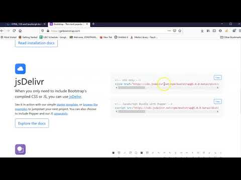
- Before Bootstrap can be used it must be connected. It may be downloaded and inserted into your file/folder structure but you may also just connect it to an online host. This makes sure it is up to date and makes the page quicker to load.
- Visit GetBootstrap.com to locate the code you need to insert.
- Copy and paste the CSS code link from the site and paste in the <head>.
- Copy and paste the JavaScript code link from the site and paste at the bottom of the HTML document before the closing </body>.
- You must enter:
<meta charset="utf-8">
<meta name="viewport" content="width=device-width, initial-scale=1">
In the <head> of the document for the responsive elements to work correctly. - Bootstrap is now connected and ready to use.
Cone Delivery Network
<!DOCTYPE html>
<html>
<head>
<title>Homepage Layout Lab</title>
<meta charset="utf-8">
<meta name="viewport" content="width=device-width, initial-scale=1">
<link href="https://cdn.jsdelivr.net/npm/bootstrap@5.0.0-beta2/dist/css/bootstrap.min.css" rel="stylesheet" integrity="sha384-BmbxuPwQa2lc/FVzBcNJ7UAyJxM6wuqIj61tLrc4wSX0szH/Ev+nYRRuWlolflfl" crossorigin="anonymous">

<style>
  .wireBlock {
      background-color: gray;
      border-color: darkgray;
      border-style: solid;
      border-width:2px;}
</style>

</head>
<body>
<div class="container">

  <div class="row">
    <div class="col-12 wireBlock">
      <h3>navbar</h3>
    </div>
  </div>

  <div class="row">
    <div class="offset-2 col-8 wireBlock">
      <h3>carousel</h3>
    </div>
  </div>

  <div class="row">
    <div class="col-3 wireBlock">
      <h3>item 01</h3>
    </div>
    <div class="col-3 wireBlock">
      <h3>item 02</h3>
    </div>
    <div class="col-3 wireBlock">
      <h3>item 03</h3>
    </div>
    <div class="col-3 wireBlock">
      <h3>item 04</h3>
    </div>
  </div>

  <div class="row">
    <div class="col-6 wireBlock">
      <h3>paragraph 01</h3>
    </div>
    <div class="col-6 wireBlock">
      <h3>paragraph 02</h3>
    </div>
  </div>

</div>
<script src="https://cdn.jsdelivr.net/npm/bootstrap@5.0.0-beta2/dist/js/bootstrap.bundle.min.js" integrity="sha384-b5kHyXgcpbZJO/tY9Ul7kGkf1S0CWuKcCD38l8YkeH8z8QjE0GmW1gYU5S9FOnJ0" crossorigin="anonymous"></script>
</body>
</html>
- The next step is to create our grid using Bootstrap's row and column classes.
- First you must create a div with the container class like:
<div class="container">
</div">
All of the Bootstrap component must be placed inside these. - Each row must be written as:
<div class="row">
</div> - Inside each row you create divs to contain your content. These div's are given column width classes with the total in a row equaling 12. For example:
<div class="row">
<div class="col-6">
<!--content such as h1, p, img, etc.-->
</div>
<div class="col-6">
<!--content such as h1, p, img, etc.-->
</div>
</div> - It is hard to see what your wireframe looks like since the final content is not applied. You can apply some CSS while you work just so you can see what you are doing. Inside the <head> add:
<style>
.wireBlock {
background-color: gray;
border-color: darkgray;
border-style: solid;
border-width:2px;}
</style>
<!DOCTYPE html>
<html>
<head>
<title>Homepage Layout Lab</title>
<meta charset="utf-8">
<meta name="viewport" content="width=device-width, initial-scale=1">
<link href="https://cdn.jsdelivr.net/npm/bootstrap@5.0.0-beta2/dist/css/bootstrap.min.css" rel="stylesheet" integrity="sha384-BmbxuPwQa2lc/FVzBcNJ7UAyJxM6wuqIj61tLrc4wSX0szH/Ev+nYRRuWlolflfl" crossorigin="anonymous">

<style>
  .wireBlock {
      background-color: gray;
      border-color: darkgray;
      border-style: solid;
      border-width:2px;}
</style>

</head>
<body>
<div class="container">

  <div class="row">
    <div class="col-sm-12 wireBlock">
      <h3>navbar</h3>
    </div>
  </div>

  <div class="row">
    <div class="offset-lg-2 col-lg-8 wireBlock">
      <h3>carousel</h3>
    </div>
  </div>

  <div class="row">
    <div class="col-sm-6 col-lg-3 wireBlock">
      <h3>item 01</h3>
    </div>
    <div class="col-sm-6 col-lg-3 wireBlock">
      <h3>item 02</h3>
    </div>
    <div class="col-sm-6 col-lg-3 wireBlock">
      <h3>item 03</h3>
    </div>
    <div class="col-sm-6 col-lg-3 wireBlock">
      <h3>item 04</h3>
    </div>
  </div>

  <div class="row">
    <div class="col-md-6 wireBlock">
      <h3>paragraph 01</h3>
    </div>
    <div class="col-md-6 wireBlock">
      <h3>paragraph 02</h3>
    </div>
  </div>

</div>
<script src="https://cdn.jsdelivr.net/npm/bootstrap@5.0.0-beta2/dist/js/bootstrap.bundle.min.js" integrity="sha384-b5kHyXgcpbZJO/tY9Ul7kGkf1S0CWuKcCD38l8YkeH8z8QjE0GmW1gYU5S9FOnJ0" crossorigin="anonymous"></script>
</body>
</html>
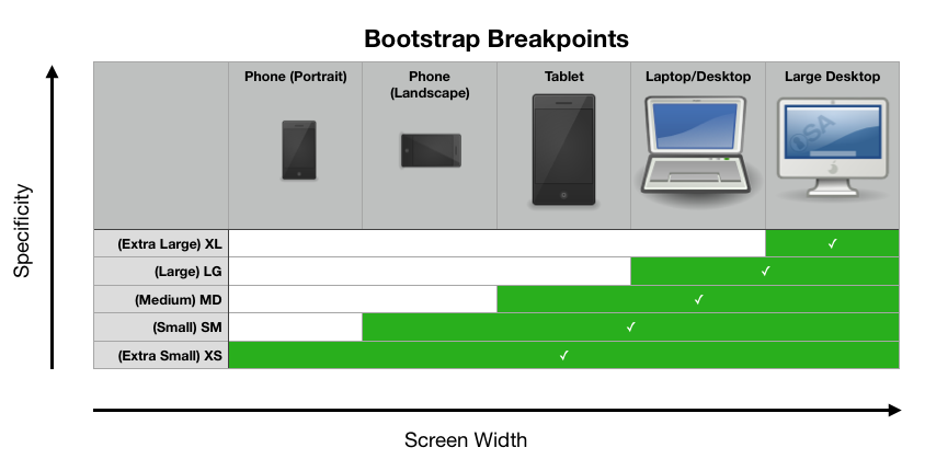
- Currently the layout is complete by not very dynamic. One of the strengths of Bootstrap is that is allows us to decide how each section is viewed based on the size of the browser window.
- The column breakpoints are: xs:0, sm:576px, md:768px, lg:992px, xl:1200px, xxl:1400px. You can decide how many columns a div section is by adding multiple classes for sizes. For example:
<div class="col-sm-6 col-lg-3">
<!--content-->
</div>
This will span 6 columns (half the screen) when browser width is small and 3 columns (quarter of the screen) when the width is large. - You should create column-width classes like the example below-left.
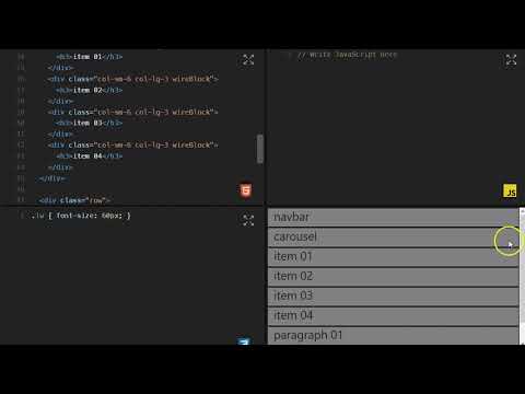
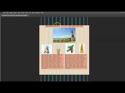
- You may have probably noticed that you can preview your site as you are working on it in Liveweave. This is one of the advantages of a browser based web text editor.
- The interface in Liveweave can be manipulated by dragging the borders of the panelss or expanding a section by click on the maximize bottom at the bottom right of each panel. Try expanding the preview panel to see what you have thus far.
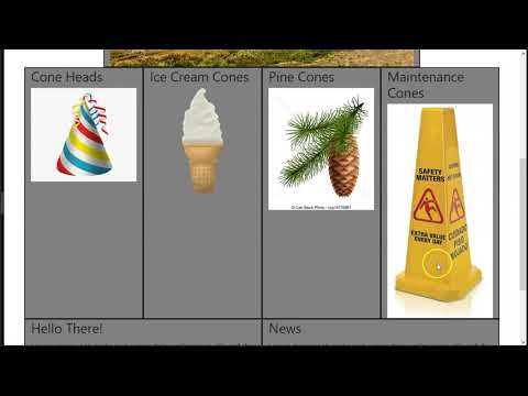
- It should look something like below.
Homepage Layout Lab
navbar
carousel
item 01
item 02
item 03
item 04
paragraph 01
paragraph 02
<!DOCTYPE html>
<html>
<head>
<title>Homepage Layout Lab</title>
<meta charset="utf-8">
<meta name="viewport" content="width=device-width, initial-scale=1">
<link href="https://cdn.jsdelivr.net/npm/bootstrap@5.0.0-beta2/dist/css/bootstrap.min.css" rel="stylesheet" integrity="sha384-BmbxuPwQa2lc/FVzBcNJ7UAyJxM6wuqIj61tLrc4wSX0szH/Ev+nYRRuWlolflfl" crossorigin="anonymous">

<style>
  .wireBlock {
      background-color: gray;
      border-color: darkgray;
      border-style: solid;
      border-width:2px;
  border-collapse: collapse;Lorem ipsum dolor sit amet, consectetur adipisicing elit, sed do eiusmod tempor incididunt ut labore et dolore magna aliqua. Ut enim ad minim veniam, quis nostrud exercitation ullamco laboris nisi ut aliquip ex ea commodo consequat. Duis aute irure dolor in reprehenderit in voluptate velit esse cillum dolore eu fugiat nulla pariatur. Excepteur sint occaecat cupidatat non proident, sunt in culpa qui officia deserunt mollit anim id est laborum.}
</style>

</head>
<body>
<div class="container">

  <div class="row">
    <div class="col-sm-12 wireBlock">
      <h3>navbar</h3>
    </div>
  </div>

  <div class="row">
    <div class="offset-lg-2 col-lg-8 wireBlock">
      <h3>carousel</h3>
    </div>
  </div>

  <div class="row">
    <div class="col-sm-6 col-lg-3 wireBlock">
       <h3>Cone Heads</h3>
    </div>
    <div class="col-sm-6 col-lg-3 wireBlock">
       <h3>Ice Cream Cones</h3>
    </div>
    <div class="col-sm-6 col-lg-3 wireBlock">
       <h3>Pine Cones</h3>
    </div>
    <div class="col-sm-6 col-lg-3 wireBlock">
       <h3>Maintenance Cones</h3>
    </div>
  </div>

  <div class="row">
    <div class="col-md-6 wireBlock">
       <h3>Hello There!</h3>
      <p>Lorem ipsum dolor sit amet, consectetur adipisicing elit, sed do eiusmod tempor incididunt ut labore et dolore magna aliqua. Ut enim ad minim veniam, quis nostrud exercitation ullamco laboris nisi ut aliquip ex ea commodo consequat. Duis aute irure dolor in reprehenderit in voluptate velit esse cillum dolore eu fugiat nulla pariatur. Excepteur sint occaecat cupidatat non proident, sunt in culpa qui officia deserunt mollit anim id est laborum.</p>
    </div>
    <div class="col-md-6 wireBlock">
       <h3>News</h3>
      <p>Lorem ipsum dolor sit amet, consectetur adipisicing elit, sed do eiusmod tempor incididunt ut labore et dolore magna aliqua. Ut enim ad minim veniam, quis nostrud exercitation ullamco laboris nisi ut aliquip ex ea commodo consequat. Duis aute irure dolor in reprehenderit in voluptate velit esse cillum dolore eu fugiat nulla pariatur. Excepteur sint occaecat cupidatat non proident, sunt in culpa qui officia deserunt mollit anim id est laborum.</p>
    </div>
  </div>

</div>
<script src="https://cdn.jsdelivr.net/npm/bootstrap@5.0.0-beta2/dist/js/bootstrap.bundle.min.js" integrity="sha384-b5kHyXgcpbZJO/tY9Ul7kGkf1S0CWuKcCD38l8YkeH8z8QjE0GmW1gYU5S9FOnJ0" crossorigin="anonymous"></script>
</body>
</html>
- The general layout is complete now it just needs dummy content. For the text we will use lorem ipsum again. You may visit lipsum.com to generate lorem ipsum and copy the paragraphs or you can do it in Liveweave like below.
- Enter the opening and closing <p> & </p> tags. Place your cursor inside the tags and, in Liveweave, press Tools>Placeholder>Insert "Lorem ipsum..." at cursor location. This should be completed in the two paragraph sections at the bottom of the page.
- Create the appropriate headings for the sections as well.
<!DOCTYPE html>
<html>
<head>
<title>Homepage Layout Lab</title>
<meta charset="utf-8">
<meta name="viewport" content="width=device-width, initial-scale=1">
<link href="https://cdn.jsdelivr.net/npm/bootstrap@5.0.0-beta2/dist/css/bootstrap.min.css" rel="stylesheet" integrity="sha384-BmbxuPwQa2lc/FVzBcNJ7UAyJxM6wuqIj61tLrc4wSX0szH/Ev+nYRRuWlolflfl" crossorigin="anonymous">
<style>
.wireBlock {
background-color: gray;
border-color: darkgray;
border-style: solid;
border-width:2px;}
.rowImagesFix img {
height: 250px;}
</style>
</head>
<body>
<div class="container">
<div class="row">
<div class="col-sm-12 wireBlock">
<h3>navbar</h3>
</div>
</div>
<div class="row">
<div class="offset-lg-2 col-lg-8 wireBlock">
<img src="https://teachmecone.com/wp-content/uploads/2021/02/coneLandscape.jpg" class="img-fluid"/>
</div>
</div>
<div class="row rowImagesFix">
<div class="col-sm-6 col-lg-3 wireBlock">
<h3>Cone Heads</h3>
<img src="https://teachmecone.com/wp-content/uploads/2021/02/coneHat.png" class="img-fluid"/>
</div>
<div class="col-sm-6 col-lg-3 wireBlock">
<h3>Ice Cream Cones</h3>
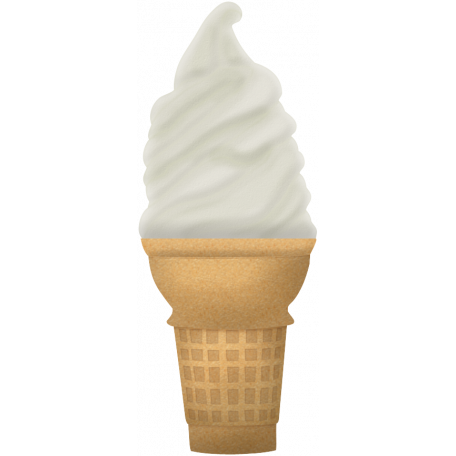
<img src="https://teachmecone.com/wp-content/uploads/2021/02/coneIceCream.png" class="img-fluid"/>
</div>
<div class="col-sm-6 col-lg-3 wireBlock">
<h3>Pine Cones</h3>
<img src="https://teachmecone.com/wp-content/uploads/2021/02/conePine.jpg" class="img-fluid"/>
</div>
<div class="col-sm-6 col-lg-3 wireBlock">
<h3>Maintenance Cones</h3>
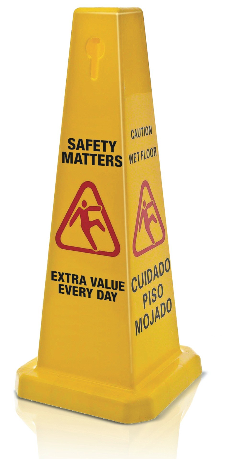
<img src="https://teachmecone.com/wp-content/uploads/2021/02/coneFloorSign.jpg" class="img-fluid"/>
</div>
</div>
<div class="row">
<div class="col-md-6 wireBlock">
<h3>Hello There!</h3>
<p>Lorem ipsum dolor sit amet, consectetur adipisicing elit, sed do eiusmod tempor incididunt ut labore et dolore magna aliqua. Ut enim ad minim veniam, quis nostrud exercitation ullamco laboris nisi ut aliquip ex ea commodo consequat. Duis aute irure dolor in reprehenderit in voluptate velit esse cillum dolore eu fugiat nulla pariatur. Excepteur sint occaecat cupidatat non proident, sunt in culpa qui officia deserunt mollit anim id est laborum.</p>
</div>
<div class="col-md-6 wireBlock">
<h3>News</h3>
<p>Lorem ipsum dolor sit amet, consectetur adipisicing elit, sed do eiusmod tempor incididunt ut labore et dolore magna aliqua. Ut enim ad minim veniam, quis nostrud exercitation ullamco laboris nisi ut aliquip ex ea commodo consequat. Duis aute irure dolor in reprehenderit in voluptate velit esse cillum dolore eu fugiat nulla pariatur. Excepteur sint occaecat cupidatat non proident, sunt in culpa qui officia deserunt mollit anim id est laborum.</p>
</div>
</div>
</div>
<script src="https://cdn.jsdelivr.net/npm/bootstrap@5.0.0-beta2/dist/js/bootstrap.bundle.min.js" integrity="sha384-b5kHyXgcpbZJO/tY9Ul7kGkf1S0CWuKcCD38l8YkeH8z8QjE0GmW1gYU5S9FOnJ0" crossorigin="anonymous"></script>
</body>
</html>
- In Liveweave we must connect images that are on the internet and can be connected with an absolute URL.
- I uploaded the images needed on my site. Right-click on the images (bottom left) and select Copy Image Location or whatever your browser says to copy the image path.
- Enter the appropriate code using the path copied from this slide.
- The img-fluid class should also be applied to stretch the image to scale according to the scale of the encapsulating div. For example:
<img src="https://teachmecone.com/wp-content/uploads/2021/02/coneLandscape.jpg" class="img-fluid"/> - The placeholder images are all different sizes and will result in odd formatting. You should scale each to the same proportions in the source photos but in this case we will just cheat it for now but scaling the row with CSS. You should add a class to target the row such as rowImagesFix. The following should be added to the CSS in the heading:
.rowImagesFix img {
height: 250px;}


<!DOCTYPE html>
<html>
<head>
<title>Homepage Layout Lab</title>
<meta charset="utf-8">
<meta name="viewport" content="width=device-width, initial-scale=1">
<link href="https://cdn.jsdelivr.net/npm/bootstrap@5.0.0-beta2/dist/css/bootstrap.min.css" rel="stylesheet" integrity="sha384-BmbxuPwQa2lc/FVzBcNJ7UAyJxM6wuqIj61tLrc4wSX0szH/Ev+nYRRuWlolflfl" crossorigin="anonymous">
<style>
.wireBlock {
background-color: gray;
border-color: darkgray;
border-style: solid;
border-width:2px;}
.rowImagesFix img {
height: 250px;}
</style>
</head>
<body>
<div class="container">
<div class="row">
<div class="col-sm-12 wireBlock">
<nav class="navbar navbar-expand-lg navbar-light bg-light">
<div class="container-fluid">
<a class="navbar-brand" href="#">Navbar</a>
<button class="navbar-toggler" type="button" data-bs-toggle="collapse" data-bs-target="#navbarNavDropdown" aria-controls="navbarNavDropdown" aria-expanded="false" aria-label="Toggle navigation">
<span class="navbar-toggler-icon"></span>
</button>
<div class="collapse navbar-collapse" id="navbarNavDropdown">
<ul class="navbar-nav">
<li class="nav-item">
<a class="nav-link active" aria-current="page" href="#">Home</a>
</li>
<li class="nav-item">
<a class="nav-link" href="#">Features</a>
</li>
<li class="nav-item">
<a class="nav-link" href="#">Pricing</a>
</li>
<li class="nav-item dropdown">
<a class="nav-link dropdown-toggle" href="#" id="navbarDropdownMenuLink" role="button" data-bs-toggle="dropdown" aria-expanded="false">
Dropdown link
</a>
<ul class="dropdown-menu" aria-labelledby="navbarDropdownMenuLink">
<li><a class="dropdown-item" href="#">Action</a></li>
<li><a class="dropdown-item" href="#">Another action</a></li>
<li><a class="dropdown-item" href="#">Something else here</a></li>
</ul>
</li>
</ul>
</div>
</div>
</nav>
</div>
</div>
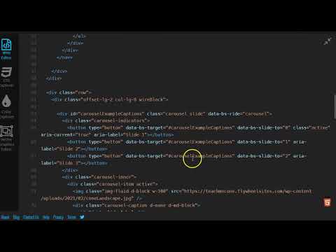
<div class="row">
<div class="offset-lg-2 col-lg-8 wireBlock">
<div id="carouselExampleCaptions" class="carousel slide" data-bs-ride="carousel">
<div class="carousel-indicators">
<button type="button" data-bs-target="#carouselExampleCaptions" data-bs-slide-to="0" class="active" aria-current="true" aria-label="Slide 1"></button>
<button type="button" data-bs-target="#carouselExampleCaptions" data-bs-slide-to="1" aria-label="Slide 2"></button>
<button type="button" data-bs-target="#carouselExampleCaptions" data-bs-slide-to="2" aria-label="Slide 3"></button>
</div>
<div class="carousel-inner">
<div class="carousel-item active">
<img src="https://teachmecone.com/wp-content/uploads/2021/02/coneLandscape.jpg" class="img-fluid"/>
<div class="carousel-caption d-none d-md-block">
<h5>First slide label</h5>
<p>Some representative placeholder content for the first slide.</p>
</div>
</div>
<div class="carousel-item">
<img src="https://teachmecone.com/wp-content/uploads/2021/02/coneLandscape.jpg" class="img-fluid"/>
<div class="carousel-caption d-none d-md-block">
<h5>Second slide label</h5>
<p>Some representative placeholder content for the second slide.</p>
</div>
</div>
<div class="carousel-item">
<img src="https://teachmecone.com/wp-content/uploads/2021/02/coneLandscape.jpg" class="img-fluid"/>
<div class="carousel-caption d-none d-md-block">
<h5>Third slide label</h5>
<p>Some representative placeholder content for the third slide.</p>
</div>
</div>
</div>
<button class="carousel-control-prev" type="button" data-bs-target="#carouselExampleCaptions" data-bs-slide="prev">
<span class="carousel-control-prev-icon" aria-hidden="true"></span>
<span class="visually-hidden">Previous</span>
</button>
<button class="carousel-control-next" type="button" data-bs-target="#carouselExampleCaptions" data-bs-slide="next">
<span class="carousel-control-next-icon" aria-hidden="true"></span>
<span class="visually-hidden">Next</span>
</button>
</div>
</div>
</div>
<div class="row rowImagesFix">
<div class="col-sm-6 col-lg-3 wireBlock">
<h3>Cone Heads</h3>
<img src="https://teachmecone.com/wp-content/uploads/2021/02/coneHat.png" class="img-fluid"/>
</div>
<div class="col-sm-6 col-lg-3 wireBlock">
<h3>Ice Cream Cones</h3>
<img src="https://teachmecone.com/wp-content/uploads/2021/02/coneIceCream.png" class="img-fluid"/>
</div>
<div class="col-sm-6 col-lg-3 wireBlock">
<h3>Pine Cones</h3>
<img src="https://teachmecone.com/wp-content/uploads/2021/02/conePine.jpg" class="img-fluid"/>
</div>
<div class="col-sm-6 col-lg-3 wireBlock">
<h3>Maintenance Cones</h3>
<img src="https://teachmecone.com/wp-content/uploads/2021/02/coneFloorSign.jpg" class="img-fluid"/>
</div>
</div>
<div class="row">
<div class="col-md-6 wireBlock">
<h3>Hello There!</h3>
<p>Lorem ipsum dolor sit amet, consectetur adipisicing elit, sed do eiusmod tempor incididunt ut labore et dolore magna aliqua. Ut enim ad minim veniam, quis nostrud exercitation ullamco laboris nisi ut aliquip ex ea commodo consequat. Duis aute irure dolor in reprehenderit in voluptate velit esse cillum dolore eu fugiat nulla pariatur. Excepteur sint occaecat cupidatat non proident, sunt in culpa qui officia deserunt mollit anim id est laborum.</p>
</div>
<div class="col-md-6 wireBlock">
<h3>News</h3>
<p>Lorem ipsum dolor sit amet, consectetur adipisicing elit, sed do eiusmod tempor incididunt ut labore et dolore magna aliqua. Ut enim ad minim veniam, quis nostrud exercitation ullamco laboris nisi ut aliquip ex ea commodo consequat. Duis aute irure dolor in reprehenderit in voluptate velit esse cillum dolore eu fugiat nulla pariatur. Excepteur sint occaecat cupidatat non proident, sunt in culpa qui officia deserunt mollit anim id est laborum.</p>
</div>
</div>
</div>
<script src="https://cdn.jsdelivr.net/npm/bootstrap@5.0.0-beta2/dist/js/bootstrap.bundle.min.js" integrity="sha384-b5kHyXgcpbZJO/tY9Ul7kGkf1S0CWuKcCD38l8YkeH8z8QjE0GmW1gYU5S9FOnJ0" crossorigin="anonymous"></script>
</body>
</html>
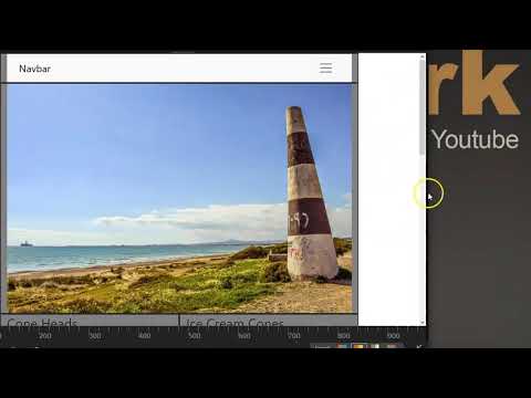
- Bootstrap has built-in components. These range from carousels to jumbotrons and add functionality that would be difficult to code manually. We will add a navbar and carousel.
- First let's add a navbar. Visit Bootstrap Navbar. Scroll to find a navbar to copy. Remove the <h3>navbar</h3> and paste the copied navbar from Bootstrap.
- Now let's insert a carousel. Again visit Bootstrap Carousel and copy a carousel. Remove the large center image and paste the copied carousel from Bootstrap.
- The images of the carousel are currently empty. Replace them with the image that was in that section before. There are captions and other options but that is good enough for now.
- Before you submit you should review your code and visual preview.
- Look for any errors. If there are any, fix them. When you are happy, proceed .
- In Liveweave click on Download (top center of window). This is the entire site zipped that you can just submit to Blackboard.
- Lastly, log into Blackboard (Here) and click on this course. Inside the course, select Week 07, then the Week 07: Responsive Site (homepage layout) Lab folder, then the assignment with the same name. Finally, Attach the zipped file.
Homepage Layout Lab

First slide label
Some representative placeholder content for the first slide.
Second slide label
Some representative placeholder content for the second slide.
Third slide label
Some representative placeholder content for the third slide.
Cone Heads

Ice Cream Cones

Pine Cones

Maintenance Cones

Hello There!
Lorem ipsum dolor sit amet, consectetur adipisicing elit, sed do eiusmod tempor incididunt ut labore et dolore magna aliqua. Ut enim ad minim veniam, quis nostrud exercitation ullamco laboris nisi ut aliquip ex ea commodo consequat. Duis aute irure dolor in reprehenderit in voluptate velit esse cillum dolore eu fugiat nulla pariatur. Excepteur sint occaecat cupidatat non proident, sunt in culpa qui officia deserunt mollit anim id est laborum.
News
Lorem ipsum dolor sit amet, consectetur adipisicing elit, sed do eiusmod tempor incididunt ut labore et dolore magna aliqua. Ut enim ad minim veniam, quis nostrud exercitation ullamco laboris nisi ut aliquip ex ea commodo consequat. Duis aute irure dolor in reprehenderit in voluptate velit esse cillum dolore eu fugiat nulla pariatur. Excepteur sint occaecat cupidatat non proident, sunt in culpa qui officia deserunt mollit anim id est laborum.

Bootstrap can be a little confusing but the basic principles are actually straightforward once you get a grasp of it. If you are struggling with it you will find documentation and examples on the GetBootstrap site. There are more options on there that you can explore as well. Feel free to explore.
If you run into any issues please do not hesitate to contact me:
- jcone@cecil.edu
- (240) 466-1996