
Digital Imaging II
Class 08: Introduction to Digital Imaging IITopics
- Course Overview
- Art Elements & Design Principles
- Abstract Photography
- Type
- Assignment 01

Class 08 incoming!
Course Overview
Same Class. New Name
This class runs almost exactly as the prerequisite, VCP 116 Digital Imaging I. For that reason I am going to skip it in class but here is the information if you need it.
Hi There!
I'm Jon Cone
I am one of the full-time faculty in Cecil’s Visual Communication Program. I am mostly responsible for the game design and web design programs. I am also a freelance animator typically working on visualizations.
- Office Hours
- Tues 10:00am - 1:50pm
- Wed 1:00pm - 6:20pm
- Honestly just e-mail me. I will make time when it works for you.
- Contact Information: jcone@cecil.edu (prefered)
- (240) 466-1996 (personal)
- 410-287-6060 X 1470
This is an actual picture of me.
Demo Reel (a short collection of work)
- Name:
- What’s your name? What do you go by?
- Why you are here:
- Is this required for your major? Are you taking this course as an elective? Personal Enrichment?
- Experience:
- Do you have any history with graphic arts or arts in general? Any experience with Adobe or other graphics software?
Alright here is an actual picture of me.

Assignments:
Each week a new assignment will be given. All assignments will be submitted before class on Blackboard.
Exam:
There will be a final exam given on the last week of the course. You will be tasked with creating an image based on specific criteria.
| Weekly Assignments | 6 | 80% |
| Final Exam | 1 | 20% |
Canvas:
We will using Canvas pretty significantly throughout the course. Although most materials can be found here you will need to submit assignments via Canvas. This is also where you will find your grades.
Click the image to the right to go to Cecil’s Canvas login page.

Art Elements & Design Principles
Art Elements and Design Principles:
The language we use to describe art. Generally these rules are used to describe fine art but they can also be applied to new media such as photography, graphic design, animation, and others.
In a four year art or graphic program you would be required to to 2D Comp or something similar. We will cover them here.

Art Elements:
Form
Form is the illusion of three-dimensional shape. This usually involves the utilization of linear and aerial perspective.
Line
A line is the path between two or more points. This can be either explicit or implicit.
Color
Color is specific temperature of light reflected off the piece of work. Different colors have different psychological effects.

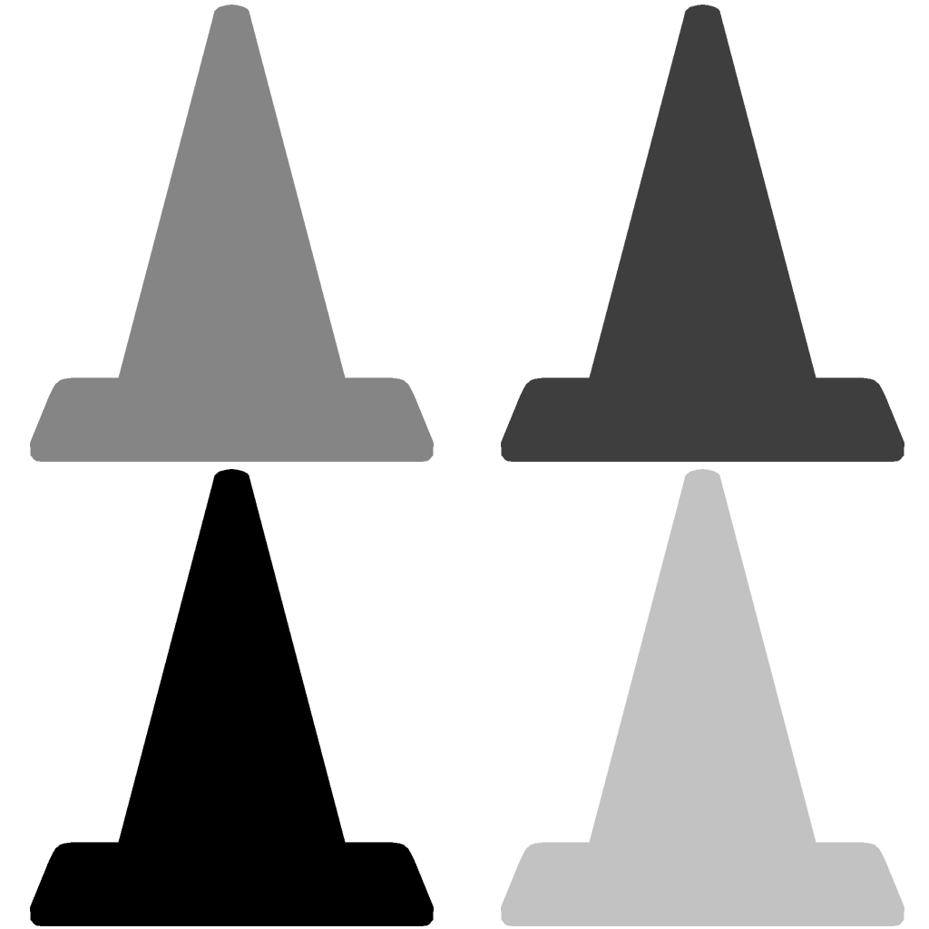
Value
The amount of lightness and darkness ranging from pure white to pure black.
Space
Space represents a general area. Generally speaking you can define a piece of artwork in positive and negative space.
Texture
This is the physical property of how the surface would feel if touched. I would say that is more about how an area is broken up.
Design Principles:
Balance
The visual weight of the artwork that may be symmetrical or asymmetrical.
Contrast
The extreme difference in an image between elements.
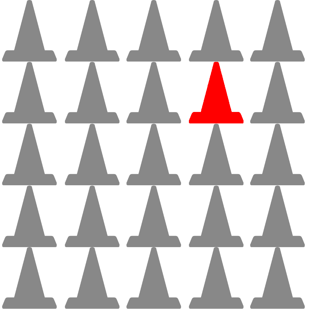
Emphasis
When one element of a piece of artwork draws more attention than others.

Movement
To give the illusion of motion in a two dimensional space.
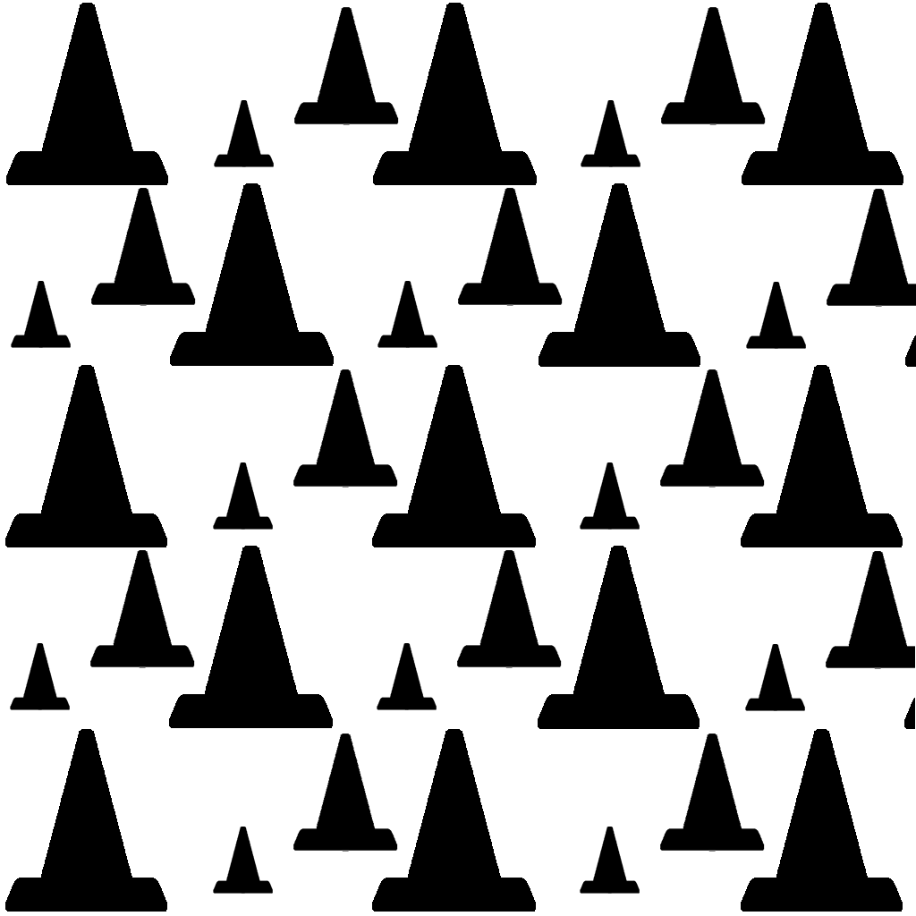
Pattern
Repeating elements in an image.
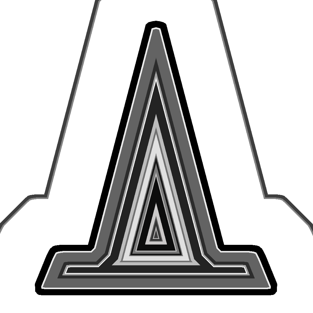
Rhythm
Much like music this is the application of varied pattern.

Unity
Unity is the coherence of the elements in a piece that make is appear as a whole.
Abstract Photography
Abstract Photography:
Abstract Photography is functionally the same as other forms of abstract art. Generally it is not about subject, and is instead about the composition of the piece and how it employs the principles of art to create an appealing (or unappealing) image.
A good photographer takes photos of things. A great photographer takes photos of compositions.
Tips:
- Scale
- Take photos closer or farther away than usually viewed
- Perspective
- Take photos from a different angle than usual. Bird’s eye, worm’s eye, canted/dutch angle, etc.
- Crop
- In post you can cut into an area of interest. You may also play with rotating/flipping the image.
- Pattern
- Look for interesting patterns, rhythm, textures, etc.
- Color
- Color itself can be a strong visually appealing principle.
- Novelty
- Think outside the box.
Article on Abstract Photography (click image)
Type
Typography:
Typography is the study of typefaces. It involves the appreciation, creation, and/ or application of type. This is a crucial skill in a graphic designer’s arsenal. Graphic design students at four year institutions would be required to take this as a whole course by itself. As such it is a topic beyond this course but we will cover a brief amount.
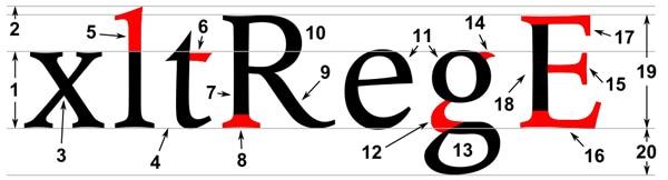
Letterform:
Letterform is the description of the glyph that represents the letters in a typeface. Type can be described by its anatomy. You might be surprised by how in depth it goes.
Type Classification:
Type can be broken down into major categories based on their letterforms and uses. There is some differing information here but this is how I would break it down.
Monospace
Monospace was developed out of necessity. In the days of typewriters it was the only type available. Monospace fonts have all glyphs with the same width. Courier is the most widely used. This has particular use for programming and script-writing.
Script
Script, also described as Handwriting or Cursive, is meant to basically mimic text written by hand. This means not just cursive, but anything that looks like someone’s handwriting. Comic sans and Lucida are probably the most common fonts in this category.
Serif
Serif fonts have extra bits on the end of its strokes. You often see this used on the printed page when large amounts of text are used. A common serif is Times New Roman.
Sans-Serif
Probably the “cleanest” typefaces. These contain the most bare minimum of details which results in probably the best legibility. They are appropriate for small text.
Display
Display, Decorative, or Fantasy fonts are the super interesting fonts with lots of bells and whistles. They are probably the most interesting to look at but generally the hardest to read. These are best used in small amounts for things like titles or logos. A good example might be the ransom or blood fonts.
Applying Type:
Words have explicit meaning but the way they are written can produce implicit meaning. Most of the time you are trying to further push the meaning of the text.
Try different typefaces and place the type in different ways. Experiment.
Text Tools:
The options are pretty much the same you would have in Microsoft word. To have access to the Character and Paragraph panels press Window>Character/Paragraph. This will give you more options.


Layer Styles:
- Bevel and Emboss
- These apply a 3D affect the makes the object on the layer appear to be upraised or lowered.
- Stroke
- A line will be drawn around the outside edge of the object.
- Inner Shadow
- Creates a shadow inside of the object in the layer.
- Inner Glow
- A gradient glowing like color will seap inside the element of the layer.
- Satin
- Gives the object a sheen like surface.
- Color Overlay
- Will apply a color overtop of the layer to change its hue without actually changing the pixels.
- Gradient Overlay
- A transition of one color to another (gradient) is laid overtop of the object of the layer.
- Pattern Overlay
- A pattern is placed over the object.
- Outer Glow
- A feathered glowing style color will ementate from the outer edge of the shape on the layer.
- Drop Shadow
- Produces a shadow that appears underneath the object based on its alpha.


link to article about various type tools

Pinterest is a good resource to inspire you (don’t steal though)
Assignment 01
Inspirational Posters:
There is no greater tool for a graphic designer than text. Typography is the study of type faces, their anatomy, usage, and creation. This is often a whole course by itself. In the first assignment of Digital Imaging II you will create an inspirational poster with a focus on type.
First you will take abstract photos. These are photos that emphasize the art elements, principles of design, and are not subject based. It is about the composition as a whole. A great photoghrapher does not take photos of “things” they take photos of compositions. You will choose one of your photos as your background for your poster.
Next you will apply text. You must choose a message. It may be whatever you like (for example, “Cone is an amazing teacher”, is a great message). You should experiment with different typefaces (dafont.com is a great resource), adjustments (size, tracking, bold, etc.), and placement. Remember that text exudes two messages, the explicit meaning of the words and the implicit styling of the type. Play with it.
Your image should be 6 by 9 inches with 300 ppi. Once completed name your file “yourLastName_assignment08.psd”.

You will be graded on the following:
- Project Cover Sheet
-
Thoroughly completed and thoughtfully written with little or no grammatical errors.
-
- Assignment Specific Requirements
-
Single Photoshop Document at 6″ x 9″, 300 ppi
- Abstract photography
- Text and typeface usage
-
-
Craftsmanship
-
Clean high-quality work
-
-
Creativity
-
Interesting and novel.
-
Resources:
- Project Cover Sheet
- You may download the project cover sheet here.
- Assignment Video Tutorials
- You may watch the tutorial videos below to help you complete your assignment.
- Tutorial Lab Materials
- You can find the materials used in the tutorial video here: di_week08_labMaterials.
Assignment Video Tutorials
Wait! Before you go!
Did you remember to?
- Read through this webpage
- Submit Week 01 Inspirational Poster on Blackboard
- Post your finished images and description on the Week 01 Magazine Advertisement Assignment Critique Discussion Board
- … and reply to at least two of your peers’ work on the Discussion Board
