
Web Design I
Class 09: Formatting BootstrapTopics
- Formatting Bootstrap Components
- Multi-Page Site
- Week 09 Responsive Site (subpages) Lab

7 8 9


Formatting Bootstrap Components
The Navbar:
The default navbar is robust but also very generic. You must customize it if you want to stand out.
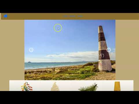
browser view
Multi-Page Site
Multi-Page Site Setup:
The easiest way to start your subpages is to utilize what you have already created.
Externalize CSS
Internal embedded CSS is appropriate for a single page site but is not beneficial for multiple pages.
You must:
- Create a new folder named CSS (if it does not already exist) in your root site folder
- create a new document and save it as style.css in the CSS folder
- copy your internal CSS rules and paste it into the your new CSS document
- Delete any remaining tags (<style>) and link the external CSS style sheet.
<!–external CSS document example–>
<link href=”css/styles.css” type=”text/css” rel=”stylesheet” />
Duplicate HTML
Since most sites have generally the same backgrounds and menus in all pages it makes sense to simply duplicate the homepage as a starter template for the remaining sub-pages.
You must:
- Copy (ctrl + c or cmd + c) and Paste (ctrl + v or cmd + v) index.html (homepage)
- Rename the subpages appropriately (ex. about.html, contactUs.html, etc.)
- Delete the main content of the documents while leaving the menu and other elements that should remain the same.
root
(site name)
index.html
(homepage)
about.html
(subpage)
contactUs.html
(subpage)
css
js
images
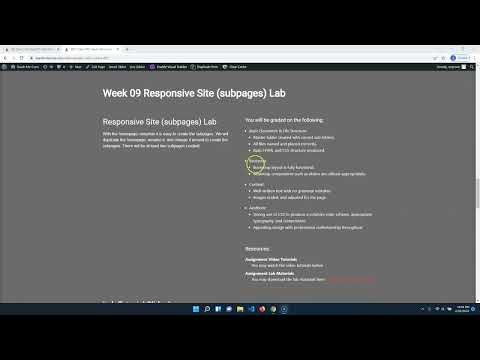
Week 09 Responsive Site (subpages) Lab
Responsive Site (subpages) Lab
With the homepage complete it is easy to create the subpages. We will duplicate the homepage, rename it, and change it around to create the subpages. There will be at least two subpages created.
You will be graded on the following:
- Basic Document & File Structure:
- Master folder created with correct sub folders.
- All files named and placed correctly.
- Basic HTML and CSS structure produced.
- Bootstrap
- Bootstrap layout is fully functional.
- Bootstrap components such as sliders are utilized appropriately.
- Content:
- Well-written text with no grammar mistakes.
- Images scaled, and adjusted for the page.
- Aesthetic:
- Strong use of CSS to produce a cohesive color scheme, appropriate typography, and composition.
- Appealing design with professional craftsmanship throughout.
Resources:
- Assignment Video Tutorials
- You may watch the video tutorials below
- Assignment Lab Materials
- You may download the lab materials here: wd1_week09_labMaterials.
Lab Tutorial Slideshow
This tutorial will review WordPress as well as setup a site to apply our future custom theme to.

Bootstrap was used broadly in the last lab but it has a very generic appearance. Although it is nice that it has default formatting you want to make it look unique. In this lab we will apply CSS to the Bootstrap components we used as well as make subpages for the site.
Click on the > to start
You may use what you created in the last lab or download the one from the last lab here.
/*Color Scheme
background-color:#BECBFF (pale blueGray)
primary color:#8A93B8 (mid blueGray)
accent color:#4D536B (dark blueGray)
text color:#242424 (light black)
*/- We will be continue to build on what we created in the last lab. You may use what you created or start from mine, here.
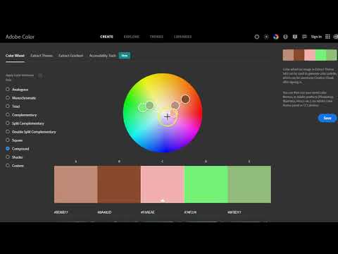
- When creating a design you want to maintain a cohesive color scheme. Before you begin formatting the Bootstrap components and other elements of your site it is a good idea to nail down the colors. You may visit Adobe Color for help in creating a color scheme.
- After figuring out your color selections it is not a bad idea to write them down at the top of the CSS sheet in a comment so you may copy them to the rules below as you need them. It may look something like:
/*Color Scheme
background-color:#BECBFF (pale blueGray)
primary color:#8A93B8 (mid blueGray)
accent color:#4D536B (dark blueGray)
text color:#242424 (light black)
*/
<!DOCTYPE html>
<html>
<head>
<title>Homepage Layout Lab</title>
<meta charset="utf-8">
<meta name="viewport" content="width=device-width, initial-scale=1">
<link href="https://cdn.jsdelivr.net/npm/bootstrap@5.0.0-beta2/dist/css/bootstrap.min.css" rel="stylesheet" integrity="sha384-BmbxuPwQa2lc/FVzBcNJ7UAyJxM6wuqIj61tLrc4wSX0szH/Ev+nYRRuWlolflfl" crossorigin="anonymous">
<link type="text/css" rel="stylesheet" href="css/style.css"/>
<link rel="preconnect" href="https://fonts.gstatic.com">
<link href="https://fonts.googleapis.com/css2?family=McLaren&family=Source+Sans+Pro&display=swap" rel="stylesheet">
<link rel="stylesheet" href="https://cdnjs.cloudflare.com/ajax/libs/font-awesome/4.7.0/css/font-awesome.min.css">
<link type="text/css" rel="stylesheet" href="css/style.css"/>
</head>
<body>
<div class="container-fluid">
<div class="row">
<div class="col-12">
<nav class="navbar navbar-expand-lg">
<div class="container-fluid">
<a class="navbar-brand" href="#"><i class="fa fa-home fa-2x"></i></a>
<button class="navbar-toggler" type="button" data-bs-toggle="collapse" data-bs-target="#navbarNavDropdown" aria-controls="navbarNavDropdown" aria-expanded="false" aria-label="Toggle navigation">
<i class="fa fa-bars fa-2x"></i>
</button>
<div class="collapse navbar-collapse" id="navbarNavDropdown">
<ul class="navbar-nav">
<li class="nav-item">
<a class="nav-link" href="#">Home</a>
</li>
<li class="nav-item">
<a class="nav-link" href="#">Features</a>
</li>
<li class="nav-item">
<a class="nav-link" href="#">Pricing</a>
</li>
</ul>
</div>
</div>
</nav>
</div>
</div>
<div class="row">
<div class="offset-lg-2 col-lg-8">
<div id="carouselExampleCaptions" class="carousel slide" data-bs-ride="carousel">
<div class="carousel-indicators">
<button type="button" data-bs-target="#carouselExampleCaptions" data-bs-slide-to="0" class="active" aria-current="true" aria-label="Slide 1"></button>
<button type="button" data-bs-target="#carouselExampleCaptions" data-bs-slide-to="1" aria-label="Slide 2"></button>
<button type="button" data-bs-target="#carouselExampleCaptions" data-bs-slide-to="2" aria-label="Slide 3"></button>
</div>
<div class="carousel-inner">
<div class="carousel-item active">
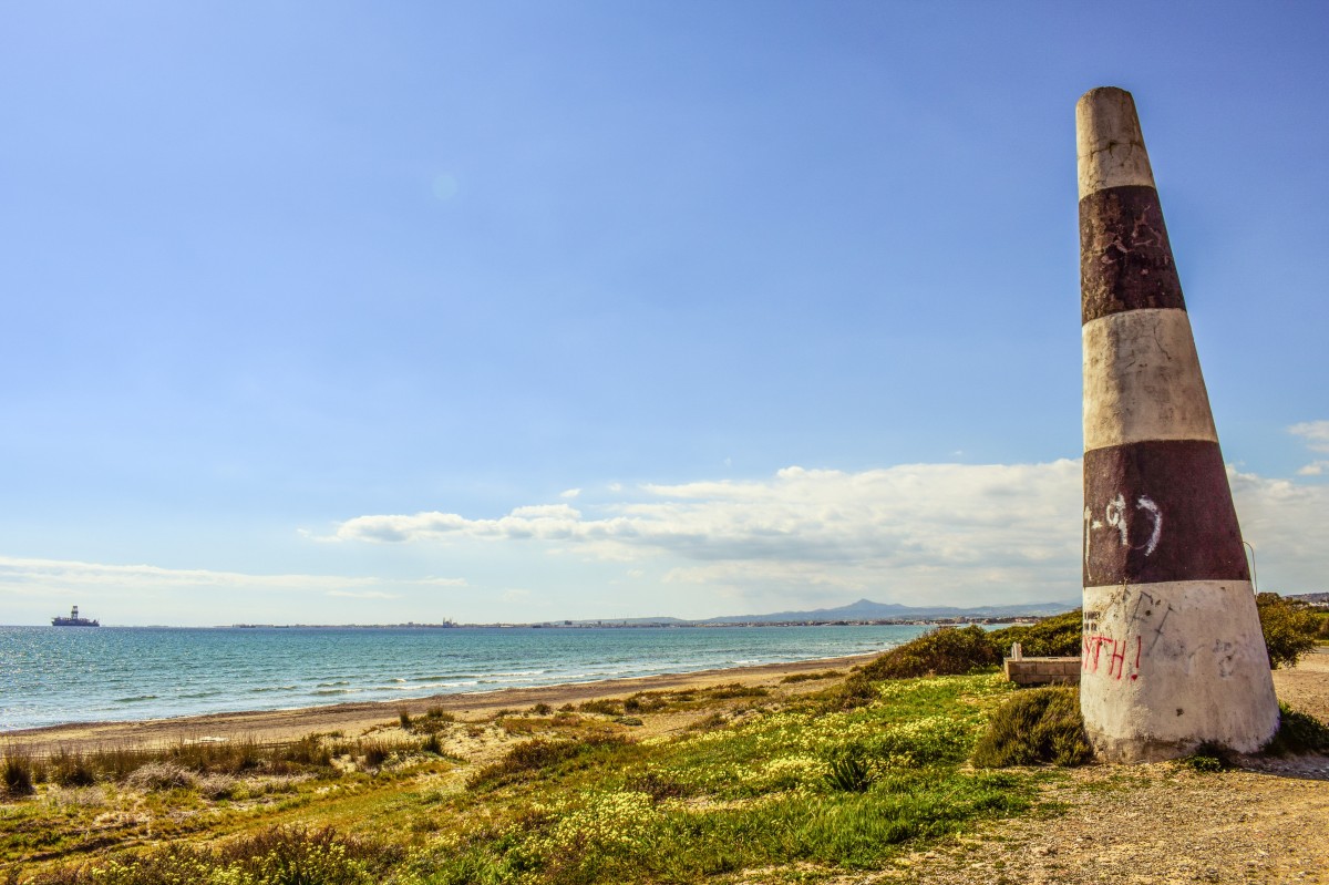
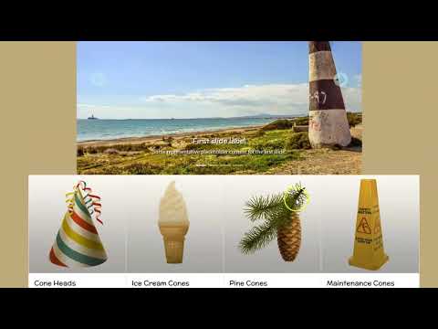
<img class="img-fluid d-block w-100" src="https://teachmecone.com/wp-content/uploads/2021/02/coneLandscape.jpg" />
<div class="carousel-caption d-none d-md-block">
<h5>First slide label</h5>
<p>Some representative placeholder content for the first slide.</p>
</div>
</div>
<div class="carousel-item">
<img class="img-fluid d-block w-100" src="https://teachmecone.com/wp-content/uploads/2021/02/coneLandscape.jpg" />
<div class="carousel-caption d-none d-md-block">
<h5>Second slide label</h5>
<p>Some representative placeholder content for the second slide.</p>
</div>
</div>
<div class="carousel-item">
<img class="img-fluid d-block w-100" src="https://teachmecone.com/wp-content/uploads/2021/02/coneLandscape.jpg" />
<div class="carousel-caption d-none d-md-block">
<h5>Third slide label</h5>
<p>Some representative placeholder content for the third slide.</p>
</div>
</div>
</div>
<button class="carousel-control-prev" type="button" data-bs-target="#carouselExampleCaptions" data-bs-slide="prev">
<span class="carousel-control-prev-icon" aria-hidden="true"></span>
<span class="visually-hidden">Previous</span>
</button>
<button class="carousel-control-next" type="button" data-bs-target="#carouselExampleCaptions" data-bs-slide="next">
<span class="carousel-control-next-icon" aria-hidden="true"></span>
<span class="visually-hidden">Next</span>
</button>
</div>
</div>
</div>
</div>
<div class="container">
<div class="row">
<div class="col-sm-6 col-lg-3 wireBlock">
<div class="card" style="width: 18rem;">
<img src="https://teachmecone.com/wp-content/uploads/2021/03/coneHat.png" class="card-img-top" alt="...">
<div class="card-body">
<h5 class="card-title">Cone Heads</h5>
<p class="card-text">Some quick example text to build on the card title and make up the bulk of the card's content.</p>
<a href="#" class="btn btn-primary">Let's Go</a>
</div>
</div>
</div>
<div class="col-sm-6 col-lg-3 wireBlock">
<div class="card" style="width: 18rem;">
<img src="https://teachmecone.com/wp-content/uploads/2021/03/iceCreamCone.jpg" class="card-img-top" alt="...">
<div class="card-body">
<h5 class="card-title">Ice Cream Cones</h5>
<p class="card-text">Some quick example text to build on the card title and make up the bulk of the card's content.</p>
<a href="#" class="btn btn-primary">Let's Go</a>
</div>
</div>
</div>
<div class="col-sm-6 col-lg-3">
<div class="card" style="width: 18rem;">
<img src="https://teachmecone.com/wp-content/uploads/2021/03/pineCone.jpg" class="card-img-top" alt="...">
<div class="card-body">
<h5 class="card-title">Pine Cones</h5>
<p class="card-text">Some quick example text to build on the card title and make up the bulk of the card's content.</p>
<a href="#" class="btn btn-primary">Let's Go</a>
</div>
</div>
</div>
<div class="col-sm-6 col-lg-3">
<div class="card" style="width: 18rem;">
<img src="https://teachmecone.com/wp-content/uploads/2021/03/maintenanceCone.jpg" class="card-img-top" alt="...">
<div class="card-body">
<h5 class="card-title">Maintenance Cones</h5>
<p class="card-text">Some quick example text to build on the card title and make up the bulk of the card's content.</p>
<a href="#" class="btn btn-primary">Let's Go</a>
</div>
</div>
</div>
</div>
<div class="row">
<div class="col-md-6">
<h3>Hello There!</h3>
<iframe width="560" height="315" src="https://www.youtube.com/embed/dQw4w9WgXcQ" frameborder="0" allow="accelerometer; autoplay; clipboard-write; encrypted-media; gyroscope; picture-in-picture" allowfullscreen></iframe>
</div>
<div class="col-md-6">
<h3>Location</h3>
<iframe src="https://www.google.com/maps/embed?pb=!1m18!1m12!1 m3!1d3072.38517222529!2d-75.95864658490774!3d39.64104531037175!2m3!1f0!2f0!3f0!3m2!1i1024!2i768!4f13.1!3m 3!1m2!1s0x89c7b0f18aa99d97%3A0x74ed98b7680af868!2s1%20Seahawk%20Dr %2C%20North%20East%2C%20MD%2021901!5e0!3m2!1sen!2sus!4v1615212884577!5m2!1sen!2sus" width="600" height="450" style="border:0;" allowfullscreen="" loading="lazy"></iframe>
</div>
</div>
</div>
<script src="https://cdn.jsdelivr.net/npm/bootstrap@5.0.0-beta2/dist/js/bootstrap.bundle.min.js" integrity="sha384-b5kHyXgcpbZJO/tY9Ul7kGkf1S0CWuKcCD38l8YkeH8z8QjE0GmW1gYU5S9FOnJ0" crossorigin="anonymous"></script>
<script type="text/javascript" src="js/script.js"></script>
<script type="text/javascript" src="js/script.js"></script>
</body>
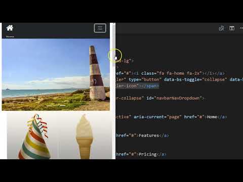
</html>- The navbar we paste from the Bootstrap website is somewhat generic and needs some custom formatting. Before adding CSS we will clean up the HTML. You can find documentation on all of the options on the Bootstrap navbar here.
- Remove navbar-light bg-light class from the <nav> element. This will make it easier to apply our own CSS.
- Remove the active classes as well.
- Remove the aria-current="page" from the Home link.
- Remove the entire <li class="nav-item dropdown"> section to remove the dropdown menu element.
- You may add or remove
<li class="nav-item">
<a class="nav-link" href="#">Features</a>
</li>
to add or remove menu items. Be sure change the names as well. - Replace the <span class="navbar-toggler-icon"></span> element with <i class="fa fa-bars fa-2x"></i>. This will make it easier to modify the menu "hamburger" icon.
<!DOCTYPE html>
<html>
<head>
<title>Homepage Layout Lab</title>
<meta charset="utf-8">
<meta name="viewport" content="width=device-width, initial-scale=1">
<link href="https://cdn.jsdelivr.net/npm/bootstrap@5.0.0-beta2/dist/css/bootstrap.min.css" rel="stylesheet" integrity="sha384-BmbxuPwQa2lc/FVzBcNJ7UAyJxM6wuqIj61tLrc4wSX0szH/Ev+nYRRuWlolflfl" crossorigin="anonymous">
<link type="text/css" rel="stylesheet" href="css/style.css"/>
<link rel="preconnect" href="https://fonts.gstatic.com">
<link href="https://fonts.googleapis.com/css2?family=McLaren&family=Source+Sans+Pro&display=swap" rel="stylesheet">
<link rel="stylesheet" href="https://cdnjs.cloudflare.com/ajax/libs/font-awesome/4.7.0/css/font-awesome.min.css">
<link type="text/css" rel="stylesheet" href="css/style.css"/>
</head>
<body>
<div class="container-fluid">
  <div class="row">
    <div class="col-12">
      <nav class="navbar navbar-expand-lg">
        <div class="container-fluid">
          <a class="navbar-brand" href="#"><i class="fa fa-home fa-2x"></i></a>
          <button class="navbar-toggler" type="button" data-bs-toggle="collapse" data-bs-target="#navbarNavDropdown" aria-controls="navbarNavDropdown" aria-expanded="false" aria-label="Toggle navigation">
            <i class="fa fa-bars fa-2x"></i>
          </button>
          <div class="collapse navbar-collapse" id="navbarNavDropdown">
            <ul class="navbar-nav">
              <li class="nav-item">
                <a class="nav-link" href="#">Home</a>
              </li>
              <li class="nav-item">
                <a class="nav-link" href="#">Features</a>
              </li>
              <li class="nav-item">
                <a class="nav-link" href="#">Pricing</a>
              </li>

            </ul>
          </div>
        </div>
      </nav>
    </div>
  </div>

  <div class="row">
    <div class="offset-lg-2 col-lg-8">
      <div id="carouselExampleCaptions" class="carousel slide" data-bs-ride="carousel">
        <div class="carousel-indicators">
          <button type="button" data-bs-target="#carouselExampleCaptions" data-bs-slide-to="0" class="active" aria-current="true" aria-label="Slide 1"></button>
          <button type="button" data-bs-target="#carouselExampleCaptions" data-bs-slide-to="1" aria-label="Slide 2"></button>
          <button type="button" data-bs-target="#carouselExampleCaptions" data-bs-slide-to="2" aria-label="Slide 3"></button>
          <button type="button" data-bs-target="#carouselExampleCaptions" data-bs-slide-to="3" aria-label="Slide 4"></button>
        </div>
        <div class="carousel-inner">

          <div class="carousel-item active">
            <img class="img-fluid d-block w-100" src="https://teachmecone.com/wp-content/uploads/2021/02/coneLandscape.jpg" />
            <div class="carousel-caption d-none d-md-block">
              <h5>First slide label</h5>
              <p>Some representative placeholder content for the first slide.</p>
            </div>
          </div>

          <div class="carousel-item">
            <img class="img-fluid d-block w-100" src="https://teachmecone.com/wp-content/uploads/2021/03/mountainCone.jpg" />
            <div class="carousel-caption d-none d-md-block">
              <h5>Second slide label</h5>
              <p>Some representative placeholder content for the second slide.</p>
            </div>
          </div>

          <div class="carousel-item">
            <img class="img-fluid d-block w-100" src="https://teachmecone.com/wp-content/uploads/2021/03/pineConeLandScape-1.jpg" />
            <div class="carousel-caption d-none d-md-block">
              <h5>Third slide label</h5>
              <p>Some representative placeholder content for the third slide.</p>
            </div>
          </div>

          <div class="carousel-item">
              <img class="img-fluid d-block w-100" src="https://teachmecone.com/wp-content/uploads/2021/02/coneLandscape.jpg" />
              <div class="carousel-caption d-none d-md-block">
                <h5>Third slide label</h5>
                <p>Some representative placeholder content for the third slide.</p>
              </div>
          </div>

        </div>
        <button class="carousel-control-prev" type="button" data-bs-target="#carouselExampleCaptions"  data-bs-slide="prev">
          <i class="fa fa-chevron-circle-left fa-3x"></i>
          <span class="visually-hidden">Previous</span>
        </button>
        <button class="carousel-control-next" type="button" data-bs-target="#carouselExampleCaptions"  data-bs-slide="next">
          <i class="fa fa-chevron-circle-right fa-3x"></i>
          <span class="visually-hidden">Next</span>
        </button>
      </div>
    </div>
  </div>
</div>

<div class="container">
  <div class="row">
    <div class="col-sm-6 col-lg-3">
      <div class="card" style="width: 18rem;">
        <img src="https://teachmecone.com/wp-content/uploads/2021/03/coneHat.png"  class="card-img-top" alt="...">
        <div class="card-body">
          <h5 class="card-title">Cone Heads</h5>
          <p class="card-text">Some quick example text to build on the card title and make up the bulk of the card's content.</p>
          <a href="#" class="btn btn-primary">Let's Go</a>
        </div>
      </div>
    </div>
    <div class="col-sm-6 col-lg-3">
      <div class="card" style="width: 18rem;">
        <img src="https://teachmecone.com/wp-content/uploads/2021/03/iceCreamCone.jpg"  class="card-img-top" alt="...">
        <div class="card-body">
          <h5 class="card-title">Ice Cream Cones</h5>
          <p class="card-text">Some quick example text to build on the card title and make up the bulk of the card's content.</p>
          <a href="#" class="btn btn-primary">Let's Go</a>
        </div>
      </div>
    </div>
    <div class="col-sm-6 col-lg-3">
      <div class="card" style="width: 18rem;">
        <img src="https://teachmecone.com/wp-content/uploads/2021/03/pineCone.jpg"  class="card-img-top" alt="...">
        <div class="card-body">
          <h5 class="card-title">Pine Cones</h5>
          <p class="card-text">Some quick example text to build on the card title and make up the bulk of the card's content.</p>
          <a href="#" class="btn btn-primary">Let's Go</a>
        </div>
      </div>
    </div>
    <div class="col-sm-6 col-lg-3">
      <div class="card" style="width: 18rem;">
        <img src="https://teachmecone.com/wp-content/uploads/2021/03/maintenanceCone.jpg"  class="card-img-top" alt="...">
        <div class="card-body">
          <h5 class="card-title">Maintenance Cones</h5>
          <p class="card-text">Some quick example text to build on the card title and make up the bulk of the card's content.</p>
          <a href="#" class="btn btn-primary">Let's Go</a>
        </div>
      </div>
    </div>
  </div>
  <div class="row">
    <div class="col-md-6">
      <h3>Hello There!</h3>
      <iframe width="560" height="315" src="https://www.youtube.com/embed/dQw4w9WgXcQ" frameborder="0" allow="accelerometer; autoplay; clipboard-write; encrypted-media; gyroscope; picture-in-picture" allowfullscreen></iframe>
    </div>
    <div class="col-md-6">
      <h3>Location</h3>
      <iframe src="https://www.google.com/maps/embed?pb=!1m18!1m12!1
m3!1d3072.38517222529!2d-75.95864658490774!3d39.64104531037175!2
m3!1f0!2f0!3f0!3m2!1i1024!2i768!4f13.1!3m
3!1m2!1s0x89c7b0f18aa99d97%3A0x74ed98b7680af868!2s1%20Seahawk%20Dr%2C%20North%20East%2C%20MD%2021901!5e0!3
m2!1sen!2sus!4v1615212884577!5m2!1sen!2sus" width="600" height="450" style="border:0;" allowfullscreen="" loading="lazy"></iframe>
    </div>
  </div>
</div>

<script src="https://cdn.jsdelivr.net/npm/bootstrap@5.0.0-beta2/dist/js/bootstrap.bundle.min.js" integrity="sha384-b5kHyXgcpbZJO/tY9Ul7kGkf1S0CWuKcCD38l8YkeH8z8QjE0GmW1gYU5S9FOnJ0" crossorigin="anonymous"></script>
<script type="text/javascript" src="js/script.js"></script>
<script type="text/javascript" src="js/script.js"></script>
</body>
</html>
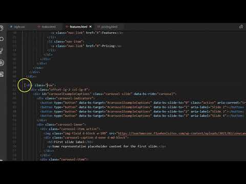
- The navbar HTML as been formatted. Let's complete the carousel.
- You may add or remove carousel items by copying and pasting
<div class="carousel-item">
<img class="img-fluid d-block w-100" src="images/yourImage.jpg" />
<div class="carousel-caption d-none d-md-block">
<h5>Second slide label</h5>
<p>Some representative placeholder content for the second slide.</p>
</div>
</div> - For each carousel item removed or added the
<button type="button" data-bs-target="#carouselExampleCaptions" data-bs-slide-to="2" aria-label="Slide 3"></button>
a button indicator must be removed or added and adjusted. - We can change the previous and next chevron buttons by removing <span class="carousel-control-prev-icon" aria-hidden="true"></span> and replacing it with an icon like <i class="fa fa-chevron-circle-right fa-3x"></i>. You may use whatever icons you like.
/*Color Scheme
background-color:#BECBFF (pale blueGray)
primary color:#8A93B8 (mid blueGray)
accent color:#4D536B (dark blueGray)
text color:#242424 (light black)
*/

h1, h2, h3, h4, h5, h6 {
    font-family: 'McLaren', cursive;
    color:#242424;}
 body, p, q {
    font-family: 'Source Sans Pro', sans-serif;
    color:#242424;}
body {
    background-color:#BECBFF;}

.navbar {
    background-color:#8A93B8;}
.navbar-nav {
    margin-left:auto;
    margin-right:auto;}
.nav-item .nav-link:link, .nav-item .nav-link:visited {
    color:#242424;
    font-family: 'McLaren', cursive;}
.nav-item .nav-link:hover {
    color:#ffffff;}
.navbar-brand:link, .navbar-brand:visited {
    color:#BECBFF;}
.navbar-brand:hover {
    color:#242424;}
.navbar-toggler {
color:#242424;}- The HTML is complete. Time for CSS.
- Type some general CSS rules to control the overall look:
h1, h2, h3, h4, h5, h6 {
font-family: 'McLaren', cursive;
color:#242424;}
body, p, q {
font-family: 'Source Sans Pro', sans-serif;
color:#242424;}
body {
background-color:#BECBFF;} - CSS must be added to control the navbar:
.navbar {
background-color:#8A93B8;}
.navbar-nav {
margin-left:auto;
margin-right:auto;}
.nav-item .nav-link:link, .nav-item .nav-link:visited {
color:#242424;
font-family: 'McLaren', cursive;}
.nav-item .nav-link:hover {
color:#ffffff;}
.navbar-brand:link, .navbar-brand:visited {
color:#BECBFF;}
.navbar-brand:hover {
color:#242424;}
.navbar-toggler {
color:#242424;}
/*Color Scheme
background-color:#BECBFF (pale blueGray)
primary color:#8A93B8 (mid blueGray)
accent color:#4D536B (dark blueGray)
text color:#242424 (light black)
*/

h1, h2, h3, h4, h5, h6 {
    font-family: 'McLaren', cursive;
    color:#242424;}
 body, p, q {
    font-family: 'Source Sans Pro', sans-serif;
    color:#242424;}
body {
    background-color:#BECBFF;}

.navbar {
    background-color:#8A93B8;}
.navbar-nav {
    margin-left:auto;
    margin-right:auto;}
.nav-item .nav-link:link, .nav-item .nav-link:visited {
    color:#242424;
    font-family: 'McLaren', cursive;}
.nav-item .nav-link:hover {
    color:#ffffff;}
.navbar-brand:link, .navbar-brand:visited {
    color:#BECBFF;}
.navbar-brand:hover {
    color:#242424;}
.navbar-toggler {
    color:#242424;}

.btn-primary:link, .btn-primary:visited {
    background-color: #8A93B8;}
.btn-primary:hover {
    background-color: #4D536B;}

.carousel-caption h5, .carousel-caption p {
    color:rgb(255, 255, 255);
    text-shadow: 2px 2px black;
    border-color: #242424;}
.fa-chevron-circle-left, .fa-chevron-circle-right {
color:#BECBFF;}- The navbar is complete (ish). The rest of the page needs to have CSS applied.
- Add CSS to apply design to the cards:
.btn-primary:link, .btn-primary:visited {
background-color: #8A93B8;}
.btn-primary:hover {
background-color: #4D536B;} - Add
.carousel-caption h5, .carousel-caption p {
color:rgb(255, 255, 255);
text-shadow: 2px 2px black;}
.fa-chevron-circle-left, .fa-chevron-circle-right {
color:#BECBFF;}
to format the caption and previous and next arrows of the carousel.
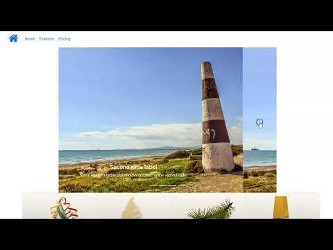
- You have written enough now to preview your work in the browser.
- First save your file (File > Save)
- Navigate to your file on your Desktop. It should appear as a web document. Double-click it to open
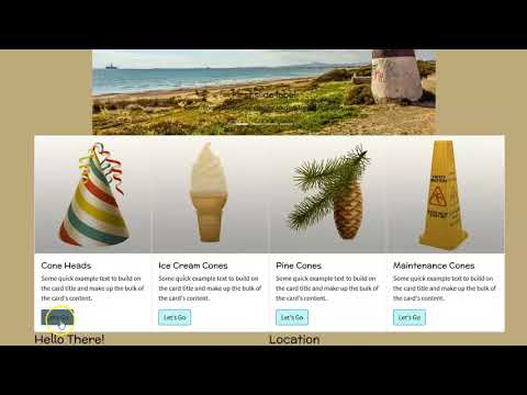
Homepage Layout Lab
First slide label
Some representative placeholder content for the first slide.

Second slide label
Some representative placeholder content for the second slide.
Third slide label
Some representative placeholder content for the third slide.
Third slide label
Some representative placeholder content for the third slide.

Cone Heads
Some quick example text to build on the card title and make up the bulk of the card's content.
Let's Go
Ice Cream Cones
Some quick example text to build on the card title and make up the bulk of the card's content.
Let's Go
Pine Cones
Some quick example text to build on the card title and make up the bulk of the card's content.
Let's Go
Maintenance Cones
Some quick example text to build on the card title and make up the bulk of the card's content.
Let's GoHello There!
Location
<!DOCTYPE html>
<html>
<head>

<title>Cone Features</title>
<meta charset="utf-8">
<meta name="viewport" content="width=device-width, initial-scale=1">
<link href="https://cdn.jsdelivr.net/npm/bootstrap@5.0.0-beta2/dist/css/bootstrap.min.css" rel="stylesheet" integrity="sha384-BmbxuPwQa2lc/FVzBcNJ7UAyJxM6wuqIj61tLrc4wSX0szH/Ev+nYRRuWlolflfl" crossorigin="anonymous">
<link type="text/css" rel="stylesheet" href="css/style.css"/>
<link rel="preconnect" href="https://fonts.gstatic.com">
<link href="https://fonts.googleapis.com/css2?family=McLaren&family=Source+Sans+Pro&display=swap" rel="stylesheet">
<link rel="stylesheet" href="https://cdnjs.cloudflare.com/ajax/libs/font-awesome/4.7.0/css/font-awesome.min.css">
<link type="text/css" rel="stylesheet" href="css/style.css"/>
</head>
<body>
<div class="container-fluid">
  <div class="row">
    <div class="col-12">
      <nav class="navbar navbar-expand-lg">
        <div class="container-fluid">
          <a class="navbar-brand" href="#"><i class="fa fa-home fa-2x"></i></a>
          <button class="navbar-toggler" type="button" data-bs-toggle="collapse" data-bs-target="#navbarNavDropdown" aria-controls="navbarNavDropdown" aria-expanded="false" aria-label="Toggle navigation">
            <i class="fa fa-bars fa-2x"></i>
          </button>
          <div class="collapse navbar-collapse" id="navbarNavDropdown">
            <ul class="navbar-nav">
              <li class="nav-item">
                <a class="nav-link" href="#">Home</a>
              </li>
              <li class="nav-item">
                <a class="nav-link" href="#">Features</a>
              </li>
              <li class="nav-item">
                <a class="nav-link" href="#">Pricing</a>
              </li>

            </ul>
          </div>
        </div>
      </nav>
    </div>
  </div>
</div>


<div class="container">
  <!--page specific content goes here-->
  <!--for example-->
  <div class="row">
    <div class="col-12">
      <h1>Cone Features</h1>
    </div>
  </div>
</div>

<script src="https://cdn.jsdelivr.net/npm/bootstrap@5.0.0-beta2/dist/js/bootstrap.bundle.min.js" integrity="sha384-b5kHyXgcpbZJO/tY9Ul7kGkf1S0CWuKcCD38l8YkeH8z8QjE0GmW1gYU5S9FOnJ0" crossorigin="anonymous"></script>
<script type="text/javascript" src="js/script.js"></script>
<script type="text/javascript" src="js/script.js"></script>
</body>
</html>- The homepage is complete but it is not a full site really without subpages. Let's create two simple subpages.
- In your file browser select the index.html file you have been working on. Press ctrl + c (cmd + c) then ctrl + v (cmd + v) to copy and paste it. Do this twice. You should have the original index.html file and two copies.
- Rename the copies the correct subpage names. In our case, features.html and pricing.html.
- Open each. Remove the "content" of the pages, leaving behind the <head>, navbar, <script>, and overall Bootstrap layout elements.
- Inside each you may put the appropriate content using the HTML you already know as well as other Bootstrap components. Save them.
<!DOCTYPE html>
<html>
<head>
<title>Homepage Layout Lab</title>
<meta charset="utf-8">
<meta name="viewport" content="width=device-width, initial-scale=1">
<link href="https://cdn.jsdelivr.net/npm/bootstrap@5.0.0-beta2/dist/css/bootstrap.min.css" rel="stylesheet" integrity="sha384-BmbxuPwQa2lc/FVzBcNJ7UAyJxM6wuqIj61tLrc4wSX0szH/Ev+nYRRuWlolflfl" crossorigin="anonymous">
<link type="text/css" rel="stylesheet" href="css/style.css"/>
<link rel="preconnect" href="https://fonts.gstatic.com">
<link href="https://fonts.googleapis.com/css2?family=McLaren&family=Source+Sans+Pro&display=swap" rel="stylesheet">
<link rel="stylesheet" href="https://cdnjs.cloudflare.com/ajax/libs/font-awesome/4.7.0/css/font-awesome.min.css">
<link type="text/css" rel="stylesheet" href="css/style.css"/>
</head>
<body>
<div class="container-fluid">
<div class="row">
<div class="col-12">
<nav class="navbar navbar-expand-lg">
<div class="container-fluid">
<a class="navbar-brand" href="index.html"><i class="fa fa-home fa-2x"></i></a>
<button class="navbar-toggler" type="button" data-bs-toggle="collapse" data-bs-target="#navbarNavDropdown" aria-controls="navbarNavDropdown" aria-expanded="false" aria-label="Toggle navigation">
<i class="fa fa-bars fa-2x"></i>
</button>
<div class="collapse navbar-collapse" id="navbarNavDropdown">
<ul class="navbar-nav">
<li class="nav-item">
<a class="nav-link" href="index.html">Home</a>
</li>
<li class="nav-item">
<a class="nav-link" href="features.html">Features</a>
</li>
<li class="nav-item">
<a class="nav-link" href="pricing.html">Pricing</a>
</li>
</ul>
</div>
</div>
</nav>
</div>
</div>
<div class="row">
<div class="offset-lg-2 col-lg-8">
<div id="carouselExampleCaptions" class="carousel slide" data-bs-ride="carousel">
<div class="carousel-indicators">
<button type="button" data-bs-target="#carouselExampleCaptions" data-bs-slide-to="0" class="active" aria-current="true" aria-label="Slide 1"></button>
<button type="button" data-bs-target="#carouselExampleCaptions" data-bs-slide-to="1" aria-label="Slide 2"></button>
<button type="button" data-bs-target="#carouselExampleCaptions" data-bs-slide-to="2" aria-label="Slide 3"></button>
<button type="button" data-bs-target="#carouselExampleCaptions" data-bs-slide-to="3" aria-label="Slide 4"></button>
</div>
<div class="carousel-inner">
<div class="carousel-item active">
<img class="img-fluid d-block w-100" src="https://teachmecone.com/wp-content/uploads/2021/02/coneLandscape.jpg" />
<div class="carousel-caption d-none d-md-block">
<h5>First slide label</h5>
<p>Some representative placeholder content for the first slide.</p>
</div>
</div>
<div class="carousel-item">
<img class="img-fluid d-block w-100" src="https://teachmecone.com/wp-content/uploads/2021/03/mountainCone.jpg" />
<div class="carousel-caption d-none d-md-block">
<h5>Second slide label</h5>
<p>Some representative placeholder content for the second slide.</p>
</div>
</div>
<div class="carousel-item">
<img class="img-fluid d-block w-100" src="https://teachmecone.com/wp-content/uploads/2021/03/pineConeLandScape-1.jpg" />
<div class="carousel-caption d-none d-md-block">
<h5>Third slide label</h5>
<p>Some representative placeholder content for the third slide.</p>
</div>
</div>
<div class="carousel-item">
<img class="img-fluid d-block w-100" src="https://teachmecone.com/wp-content/uploads/2021/02/coneLandscape.jpg" />
<div class="carousel-caption d-none d-md-block">
<h5>Third slide label</h5>
<p>Some representative placeholder content for the third slide.</p>
</div>
</div>
</div>
<button class="carousel-control-prev" type="button" data-bs-target="#carouselExampleCaptions" data-bs-slide="prev">
<i class="fa fa-chevron-circle-left fa-3x"></i>
<span class="visually-hidden">Previous</span>
</button>
<button class="carousel-control-next" type="button" data-bs-target="#carouselExampleCaptions" data-bs-slide="next">
<i class="fa fa-chevron-circle-right fa-3x"></i>
<span class="visually-hidden">Next</span>
</button>
</div>
</div>
</div>
</div>
<div class="container">
<div class="row">
<div class="col-sm-6 col-lg-3">
<div class="card">
<img src="https://teachmecone.com/wp-content/uploads/2021/03/coneHat.png" class="card-img-top" alt="...">
<div class="card-body">
<h5 class="card-title">Cone Heads</h5>
<p class="card-text">Some quick example text to build on the card title and make up the bulk of the card's content.</p>
<a href="#" class="btn btn-primary">Let's Go</a>
</div>
</div>
</div>
<div class="col-sm-6 col-lg-3">
<div class="card" >
<img src="https://teachmecone.com/wp-content/uploads/2021/03/iceCreamCone.jpg" class="card-img-top" alt="...">
<div class="card-body">
<h5 class="card-title">Ice Cream Cones</h5>
<p class="card-text">Some quick example text to build on the card title and make up the bulk of the card's content.</p>
<a href="#" class="btn btn-primary">Let's Go</a>
</div>
</div>
</div>
<div class="col-sm-6 col-lg-3">
<div class="card" >
<img src="https://teachmecone.com/wp-content/uploads/2021/03/pineCone.jpg" class="card-img-top" alt="...">
<div class="card-body">
<h5 class="card-title">Pine Cones</h5>
<p class="card-text">Some quick example text to build on the card title and make up the bulk of the card's content.</p>
<a href="#" class="btn btn-primary">Let's Go</a>
</div>
</div>
</div>
<div class="col-sm-6 col-lg-3">
<div class="card" >
<img src="https://teachmecone.com/wp-content/uploads/2021/03/maintenanceCone.jpg" class="card-img-top" alt="...">
<div class="card-body">
<h5 class="card-title">Maintenance Cones</h5>
<p class="card-text">Some quick example text to build on the card title and make up the bulk of the card's content.</p>
<a href="#" class="btn btn-primary">Let's Go</a>
</div>
</div>
</div>
</div>
<div class="row">
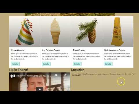
<div class="col-md-6">
<h3>Hello There!</h3>
<iframe width="480" height="260" src="https://www.youtube.com/embed/dQw4w9WgXcQ" frameborder="0" allow="accelerometer; autoplay; clipboard-write; encrypted-media; gyroscope; picture-in-picture" allowfullscreen></iframe>
</div>
<div class="col-md-6">
<h3>Location</h3>
<iframe src="https://www.google.com/maps/embed?pb=!1 m18!1m12!1m3!1d3072.38517222529!2d-75.95864658490774!3d39.64104531037175!2m3!1f0!2f0!3f0!3 m2!1i1024!2i768!4f13.1!3 m3!1m2!1s0x89c7b0f18aa99d97%3A0x74ed98b7680af868!2s1%20Seahawk%20Dr%2C%20 North%20East%2C%20MD%2021901!5e0!3 m2!1sen!2sus!4v1615212884577!5 m2!1sen!2sus" width="480" height="480" style="border:0;" allowfullscreen="" loading="lazy"></iframe>
</div>
</div>
</div>
<script src="https://cdn.jsdelivr.net/npm/bootstrap@5.0.0-beta2/dist/js/bootstrap.bundle.min.js" integrity="sha384-b5kHyXgcpbZJO/tY9Ul7kGkf1S0CWuKcCD38l8YkeH8z8QjE0GmW1gYU5S9FOnJ0" crossorigin="anonymous"></script>
<script type="text/javascript" src="js/script.js"></script>
<script type="text/javascript" src="js/script.js"></script>
</body>
</html>;- The home page and subpages are created but not actually connected through code.
- In each HTML document change the menu links to direct towards the appropriate page such as
<a class="nav-link" href="#">Home</a>
to
<a class="nav-link" href="index.html">Home</a>
(don't forget to change the navbar brand button link as well). - Now the links should direct the user to each page appropriately.
Homepage Layout Lab

The site now appears more unique and has working links. Hopefully you can see how you can just use the built-in classes of Bootstrap to target the elements. Feel free to further explore apply CSS and other Bootstrap components. Next week you will be given your next project, a responsive business site. Think about what you want to make.
If you run into any issues please do not hesitate to contact me:
- jcone@cecil.edu
- (240) 466-1996

Wait! Before you go!
Did you remember to?
- Read through this webpage
- Watch the videos
- Submit the Week 09 Responsive Site (subpages) Lab on Blackboard
