Web Design I
Class 06: WireframeTopics
- Week 06 Responsive Site (wireframe) Lab
- Branding
- Graphic Creation
- Wireframe
06 Responsive Site (wireframe) Lab
06 Responsive Site (wireframe) Lab:
In the second lab series you will develop a responsive site. In the first assignment of this series you will develop a wireframe mockup of the site you will create as well as a vector graphic. We will use the 960.gs template as a starting point to block out the sections of the site. Two typefaces will be chosen to produce mock text-boxes with lorem ipsum. Placeholder images will be placed in the grid. All elements will utilize a color scheme. The final product will have a strong pleasing style that mimics what the final product will look like.
You will be graded on the following:
- File/Folder & Document Structure
- Master folder created with correct sub folders.
- All files named and placed correctly.
- Basic HTML and CSS structure produced.
- Code is formatted properly (indents, spacing, caps, etc.).
- Lab Specific Requirements
- Wireframe layout using grid
- Placeholder text and image content
- Color scheme and typeface selection
- Custom vector graphic
-
Craftsmanship
-
Clean, professional quality work.
- Descriptive and well-written informative text.
- Properly formatted images incorporated.
-
-
Creativity
-
Appealing, interesting and novel.
- Text is captivating.
- Images draw attention.
-
Branding
Branding
The brand represents the reputation of a particular company, product, or service. This subjective “feeling” about a company results in objective success. One could argue that it may be the most valuable aspect of any business. Although there are many products that are superior many purchase them because of the prestige they come with.
In order to cultivate a postive and rewarding brand companies must use marketing techniques that implement a logo, strapline, and unique selling proposition.
What is Branding?
Understanding Its Importance in 2024
Nice article about branding
Logo Design
A logo is a graphic representation of a brand used on products and marketing. A logo may contain functional symbols, text, or be entirely abstract. It is important that they are easily legible, unique, and draw attention.
Process
Process generates consistency, quality, quantity, and timeliness.
- Research
- Before you begin any project you should do your research. In this case you want to look at the competition. Identify their strengths and weaknesses and see where you can improve upon them.
- Concepting
- You do not come up with a single idea. You must come up with as many possibilities as possible. Give yourself and your client sketches to choose from. The first idea is rarely the best.
- Refinement
- Once some ideas are decided on you will further develop them. You may hone in on a single concept or choose to build on a couple to see where they lead. Eventually a single design is chosen and cleaned up.

The logo design process: a guide to professional logo development
Nice article on the logo design process
Graphic Creation
Graphics
Broadly you can break the image styles into two categories, pictures and graphics. Graphic images are visual art incorporating shapes, lines, and lettering, often resulting in a flat design. Logos, banners, signage, etc. are great examples of graphic images.


Both are images of Cone
The image on the left is a graphic. Flat with a limited color pallete that is appropriate for a logo
The image on the right is a picture. It has a lot of color depth, texture, and is unfortunately realisitic
Vector Graphics
All of the images you have used thus far have been raster. Raster images consist of a grid of pixels that contain RGB values. Vector graphics are produce by the placement of points (anchor points) with lines (stroke) drawn between them and if desired, a filled shaped inside (fill). The resulting image produced by vectors are typically gaphic in nature (though with a lot of work something realistic can be produced). The strength of vector graphics is their infinite resolution. Since vectors are based on math they can be scaled as large or small as desired.
You can see how this svg is scaleable without loss of quality


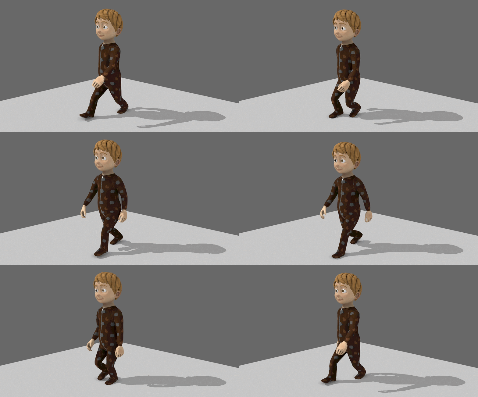
You can see that it is difficult to create an accurate and realistic “real” image with vectors
<svg viewBox="65.1613 110.5237 327.4219 314.1638" width="327.4219" height="314.1638" xmlns="http://www.w3.org/2000/svg">
  <rect x="77.297" y="370.111" width="281.137" height="82.094" style="stroke: rgb(0, 0, 0); fill: rgb(255, 150, 50); stroke-width: 2px; stroke-linejoin: round;" transform="matrix(1, 0, -0.563804030418396, 1, 242.81935119628906, -27.5174560546875)" rx="10.324" ry="10.324"/>
  <path d="M 336.132 357.617 C 309.535 417.128 144.082 414.063 130.857 357.617 C 130.857 357.617 153.949 275.704 169.84 236.651 C 192.653 180.587 220.118 117.396 220.118 117.396 C 221.346 107.059 261.522 109.487 262.872 117.396 C 270.427 161.642 284.296 232.524 294.618 256.3 C 322.531 284.618 340.725 347.483 336.132 357.617 Z" style="stroke: rgb(0, 0, 0); opacity: 1; stroke-width: 2px; fill: rgb(255, 150, 50);"/>
  <path style="stroke: rgb(0, 0, 0); fill: rgb(255, 255, 255);" d="M 251.159 137.104 C 237.295 135.782 223.645 136.204 211.989 137.846 C 214.942 130.968 217.247 125.633 218.653 122.385 C 234.163 121.32 249.839 121.855 263.787 123.651 C 264.655 128.65 265.593 133.933 266.588 139.404 C 262.025 138.432 256.87 137.648 251.159 137.104 Z"/>
  <ellipse style="stroke: rgb(0, 0, 0);" cx="218.095" cy="189.413" rx="5.778" ry="8.467" transform="matrix(1, 0, -0.16427600383758545, 1, 52.77609252929688, -13.101926803588867)"/>
  <ellipse style="stroke: rgb(0, 0, 0);" cx="218.095" cy="189.413" rx="5.349" ry="7.715" transform="matrix(1, 0, -0.16427600383758545, 1, 24.099458694458008, -15.193681716918945)"/>
  <path d="M 193.605 207.24 L 255.511 208.323 C 257.309 209.07 254.893 224.871 245.859 233.395 C 242.259 238.099 212.44 246.192 213.806 215.904 L 193.605 207.24 Z" style="stroke: rgb(0, 0, 0);"/>
</svg>
SVG’s are written as legible code. You may enter the code directly into your site like above or by using the <img> tag you have been using for raster images.
<img src="images/cone.svg" width="50%" alt="cone logo character" />Alternatives
If you plan on becoming a web design you may want to invest in the Adobe Creative Cloud which would give you to access to both Photoshop and Illustrator. That being said, there are a number of free alternatives. Personally I find these good enough for most tasks.
- VectorPea
- An Adobe Illustrator clone that runs directly in the web browser. If you are comfortable with Illustrator this may be a great alternative for you.
- Boxy SVG
- A browser-based vector illustration software that specializes in exporting out web safe formats including SVG’s.
Boxy SVG Overview
Instructions
Watch the video to the right for an overview of Boxy SVG
Vector Logo Creation
Instructions
Follow the video to the right for instructions on creating a vector logo.
Wireframe
Wireframe
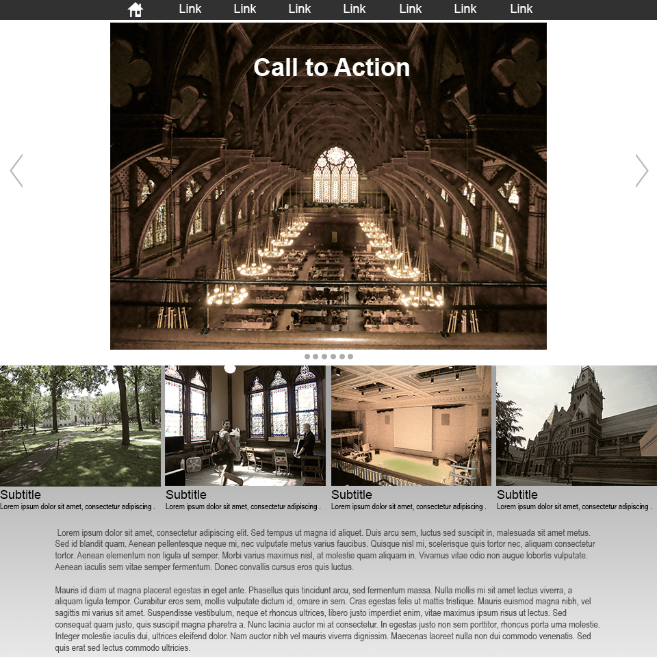
The wireframe is the sketch, hand-drawn or digital, that is used to layout the basics of a web design. These are typically pretty rough and don’t contain any content specific items just labelled rectangles.
wireframe
final site
Cone Productions
providing animation and interactive services
- home
- |
- services
- |
- work
- |
- courses
- |
- contact us
services
work
courses
contact
about us
Lorem ipsum dolor sit amet, consectetur adipiscing elit. Nulla tristique libero quam, rutrum vehicula ligula aliquet vitae. Etiam hendrerit et massa vitae mattis. In ut ex quam. Nam massa sapien, molestie volutpat ex et, sollicitudin tempor orci. Aliquam volutpat nulla eu sagittis volutpat. Praesent non est tortor.
news
Phasellus condimentum posuere pretium. Morbi et turpis bibendum, bibendum nunc feugiat, tincidunt libero. Curabitur in congue neque. Aliquam at tincidunt mi.
The Grid
When making page layouts graphic designers often employ a grid. The idea is that you produce an underlying grid of boxes to place the content of your page into. The setup of the grid determines how well your page works composition-ally.
Grid Benefits:
- Content is generally rectilinear (text blocks, images, media, etc.) so it fits well into a grid.
- Forces alignment which results in a more cohesive design.
- You can group elements that go together into nice blocks.
- The blocks of the grid can be expanded, shifted, and easily adjusted based on the size of the window.
Example Grids
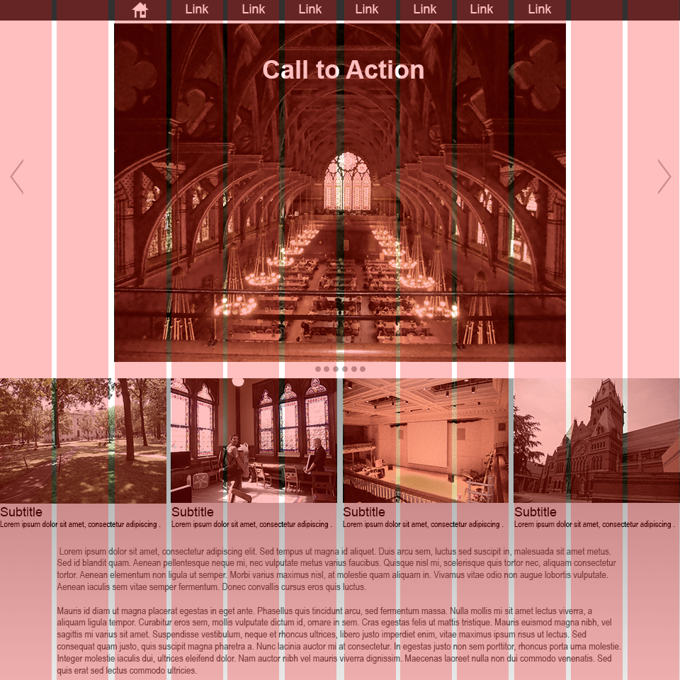
In this example from 960.gs you can see how these sites employ grids to organize their content.
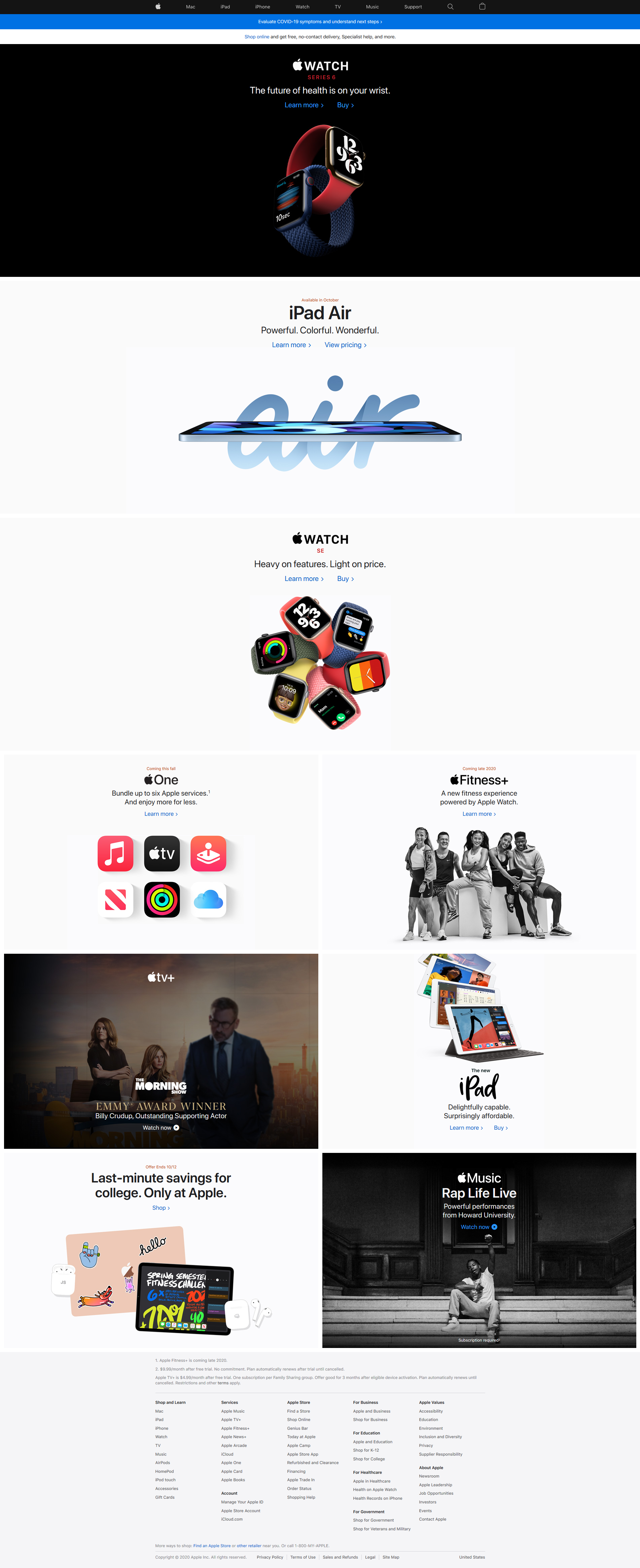
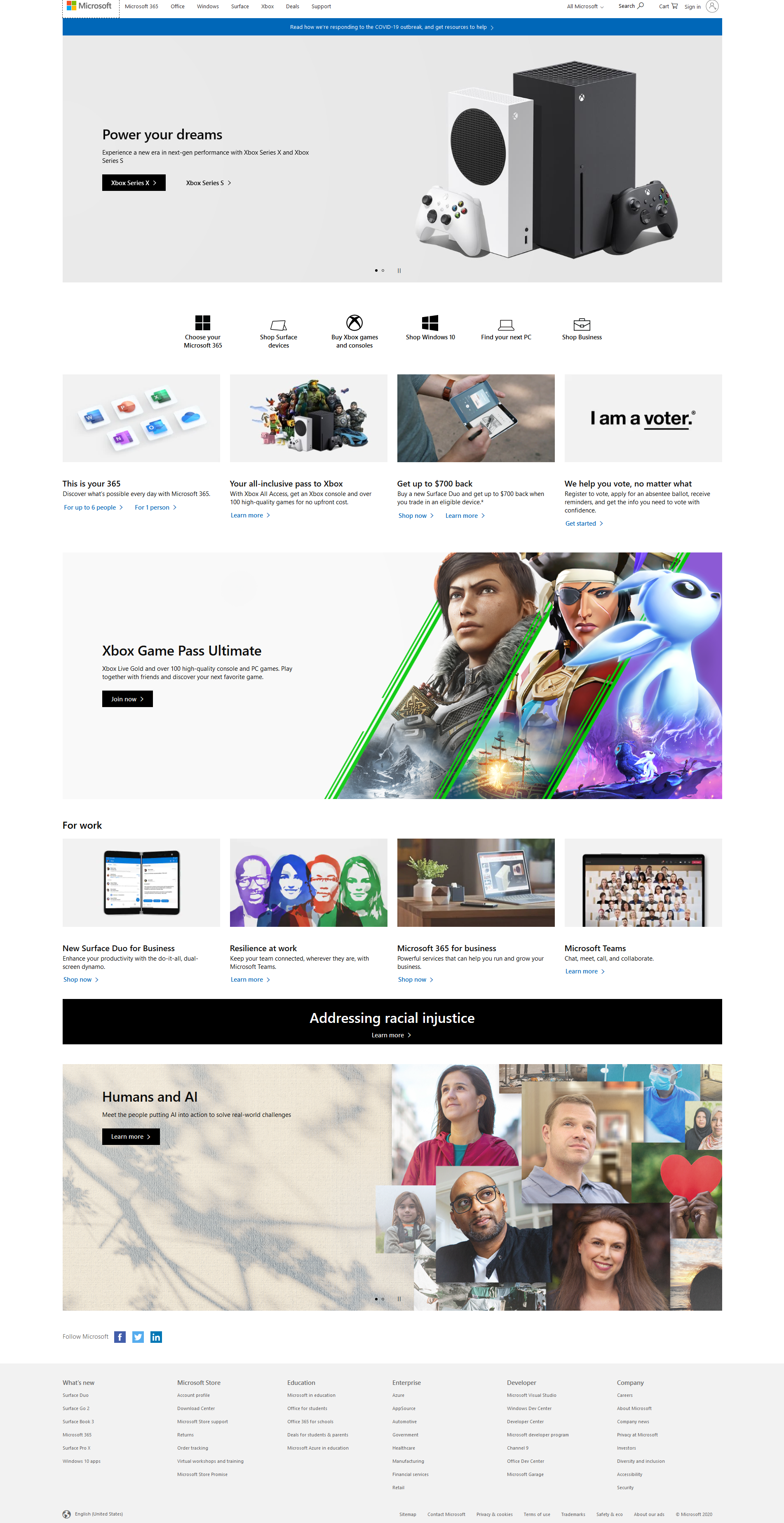
Above you can see to screen captures of the websites from Microsoft.com and Apple.com. Notice how similar they are and how they are clearly utilizing a grid.
Placeholder Content
When making page layouts graphic designers often employ a grid. The idea is that you produce an underlying grid of boxes to place the content of your page into. The setup of the grid determines how well your page works composition-ally.
The illustration below was generated by AI.
Prompt: make an image of a traffic cone teaching about computer graphics

Lorem Ipsum
Often you will not have your finalized text when you start designing a page. The content of the text is not your job. It is the editor or client’s job to give you the written content. Obviously you must have some text. That is where Lorem Ipsum and other generated text come in handy. These are generally nonsensical sentences, words, or both.
- Lipsum.com
- Website that details the history of Lorem Ipsum as well as generates it
- 30 awesome Lorem Ipsum alternatives – JustInMind.com
- Fun website with links to alternative dummy text generators
Stock Images
It is unlikely you will have all the images necessary when you begin work on a composition. This is where using placeholder stock images come in handy. If you find some free ones or purchase them you may even keep them in your final work.
- Unsplash.com
- High quality stock images that are copyright free, many free, some paid
- freeimages.com
- Large repository of free images ranging from photos to graphics
AI Text and Images
AI may be used to generate text and images for your wireframe. Although a useful tool it does have limitations as well copyright and quality issues.
You will see some options to the right. This is an ever evolving field and you will need to do your own research to determine what may work best for you.
- Copilot -bing.com
- Microsoft’s AI generator, Copilot is native on Windows but may be accessed using the search engine Bing. It is capable of both text and image creation
- ChatGPT -openAI.com
- Probably the most famous AI chatbot available
- Gemini -google.com
- Google AI capable of text and image creation
- stableDiffusion.com
- Image generator with decent results
Wireframe Creation
Mockup Creation
Instructions
Follow the video to the right for instructions on how to create a mockup from the wireframe you created in the last section
- Photopea
- Link to Photoshop browser clone used
- Lorem Ipsum
- Link to lipsum.com for dummy text used
- Unsplash
- Link to stock image used
- Copilot
- Link to AI image generator used
Lab assignment submission
Instructions:
The submission for this assignment will be different than the previous submission since you are submitting a single image.
Once you are satisfied with your wireframe you will save your file as a psd file. This format will store your image with all of its layers and other information. In Photopea, select File>Save as PSD.
Once your image is saved you can submit it on Canvas (Here). Inside the course, under module Week 06, select Week 06: Responsive Site (wireframe) Lab, then upload the file.
You’re Done
Did you remember to?
- Read through this webpage
- Complete and submit the 06 Responsive Site (wireframe) Lab on Canvas
