Web Design I
Class 04: NavigationTopics
- Week 04 Fixed-Width Page (layout) Lab
- External CSS
- CSS3
- Navigation
- Visual Hierarchy
- HTML 5
04 Fixed-Width Page (layout) Lab
Week 04 Fixed-Width Page (layout) Lab:
In the fourth and final lab of the fixed-width series we will “pizazz” up the page. Using the information covered in class you we will further develop the look of the page to make it more appealing and professional. CSS will be converted to external CSS. The layout will be adjusted to employ a stronger visual hierarchy and a true navbar will be implemented.
You will be graded on the following:
- File/Folder & Document Structure
- Master folder created with correct sub folders.
- All files named and placed correctly.
- Basic HTML and CSS structure produced.
- Code is formatted properly (indents, spacing, caps, etc.).
- Lab Specific Requirements
- External CSS.
- Navigation.
- Visual Hierarchy principles applied.
-
Craftsmanship
-
Clean, professional quality work.
- Descriptive and well-written informative text.
- Properly formatted images incorporated.
-
-
Creativity
-
Appealing, interesting and novel.
- Text is captivating.
- Images draw attention.
-
External CSS
External CSS:
This is best for multi-page websites.
All pages can use same style sheet so it is less coding and creates more consistency.
This is actually less loading time because the user just downloads the initial CSS sheet instead of one for each page.
This is generally considered best practice regardless of scenario.
- <link>
- May be used to tell the browser where the CSS file is
- href
- Specifies the path to the CSS file
- type
- Determines the type of file being linked, in this case text/css
- rel
- Specifies the relationship between the HTML page and the file it is linked to, in this case stylesheet
<link href="css/styles.css" type="text/css" rel="stylesheet" />
Creating External CSS
Instructions:
Previously you converted your inline CSS to internal CSS. Now you will convert your internal CSS to external CSS.
First you will need to create a new text file. In Microsoft Visual Studio Code, select File>New Text File. A new tab with a blank document will be created. Save this file, File>Save. In the popup window navigate to the css folder in the root folder of your site. Name the file styles.css and choose css as the file type. Press Save.
Now you can paste your CSS rules from the index.html document into the style.css document. In the html document, select all CSS rules in between the <style> tags. Press ctrl + x (on PC) or cmd + x (on Mac) to cut the rules. Select the <style> opening and closing tags that remain and delete them. In the style.css document press ctrl + v (on PC) or cmd + v (on Mac) to paste the rules. Select File>Save on both documents to save what you have done.
<!DOCTYPE html>
<html>
    <head>
        <title>Cone's Biography</title>
        <meta charset="UTF-8">
        <meta name="description" content="All about Jon Cone's life">
        <meta name="keywords" content="Handsome, Smart, Cool Guy">
        <meta name="author" content="Jonathan Cone">
        <meta name="viewport" content="width=device-width, initial-scale=1.0">

        <link href="css/styles.css" type="text/css" rel="stylesheet" />

    </head>
    <body>
        <div id="topSection">
            <div class="subsection" style="text-align: center;">
                <h1>Cone</h1>
                <img src="images/FullSizeR.jpg" alt="photograph of jonatha cone" />
                <br />
                <a href="https://teachmecone.com/nojcone/">Demo Reel</a>
                <p>The man, <em>the myth</em>, <strong class="orangeColor bolder">the primitive form</strong>.</p>
                <hr />
            </div>
            <div class="subsection">
                <h2>In the beginning...</h2>
                <p>He was born in <span class="bolder">Upstate NY</span>. Have you been there? No you haven't because it is drab.</p>
            </div>
            <div class="subsection">
                <h2>Presently coding this document</h2>
                <p>Right now he is teaching this <a href="https://teachmecone.com/web-design-i/wd-i-class-03/">class</a> and writing this crummy biography</p>
            </div>
            <div class="subsection">
                <h2>His future</h2>
                <p>He has <span id="strikethrough" class="orangeColor">none</span>.</p>
            </div>
        </div>
        <div id="bottomSection">
            <a href="https://teachmecone.com/"><img src="images/coneImage.png" alt="teachmecone logo" /></a>
            <h3>List of likes:</h3>
            <ol>
                <li>Puppies</li>
                <li>Animation</li>
                <li>Indian Food</li>
            </ol>
            <h3>List of dislikes:</h3>
            <ul>
                <li>Cats</li>
                <li>Vehicles that go Vroom</li>
                <li>Bug meat</li>
            </ul>
            <h3>Table of favorite video games</h3>
            <table>
                <tr> <th>Genre</th> <th>RPG</th> <th>RTS</th> <th>FPS</th> </tr>
                <tr> <th>Game</th> <td>Diablo</td> <td>StarCraft</td> <td>Halo</td> </tr>
            </table>
        </div>
    </body>
</html>body {
background-color: orange;
width: 960px;
font-family: Verdana, Geneva, Tahoma, sans-serif;
font-size: .85em;}
#topSection {
background-color: #ffffff;
margin: 20px;
padding: 20px;
border-right-style: solid;
border-bottom-style: solid;
border-color: #0000004c;
border-width: 5px;}
#bottomSection {
color: #ffffff;
width: 480px;
margin-left: 240px;
border: 3px dotted #000000;}
#strikethrough {
text-decoration: line-through;}
.subsection {
margin-bottom: 40px;}
.orangeColor {
color: #fa8e13;}
.bolder {
font-weight: 700;}
#topSection img {
width: 240px;}
#bottomSection img {
width: 180px;}
ul li {
list-style-type: square;}
ol li {
list-style-type: lower-alpha;}browser view
In the beginning…
He was born in Upstate NY. Have you been there? No you haven’t because it is drab.
Presently coding this document
Right now he is teaching this class and writing this crummy biography
His future
He has none.

List of likes:
- Puppies
- Animation
- Indian Food
List of dislikes:
- Cats
- Vehicles that go Vroom
- Bug meat
Table of favorite video games
| Genre | RPG | RTS | FPS |
|---|---|---|---|
| Game | Diablo | StarCraft | Halo |
CSS 3
CSS3
CSS3 is the latest version of CSS. It adds a number of new modules that allow for more advanced design elements, Interface elements, and the ability to add basic animation.
References
There are many CSS properties. More than we can really cover in this class. It is useful to know many of them and you may certainly run into them when researching how to complete certain tasks in your future career. W3schools has excellent resources you may want to check out and refer to in the future.
- CSS Tutorials
- An excellent guide that explains the details of CSS properties as well as how to produce them
- CSS Reference
- An exhaustive list of all CSS properties

CSS3 Properties
Here is a list of useful CSS3 properties. There are more (as mentioned earlier) but these are some of the most common you may find useful in your own projects.
- border-radius
- The shorthand code for specifying all four corner curves of an element.
- border-image
- The shorthand code for setting up a custom border using an image. Please note that the border property must be set as well for this to work.
- text-shadow
- This adds a drop shadow to a text element.
- box-shadow
- This adds a drop shadow to a block-level element.
- transform
- This property will animate an element on one of its animate-able transforms.
- transition
- This property will animate an element’s property based on a starting value, ending value, and length of time. You may also specify the ease, delay, or use transform in conjunction with this property.
- animation
- This property animates element properties and allows for more specific control than the transition property.
browser view
#borderRadius {
	border-radius: 0px 10px 25px 50px}
#borderImage {
	border: 10px solid transparent;
	border-image: url('images/borderImage.png') 30 stretch;}
#textShadow {
	text-shadow: 2px 2px 5px blue;}
#boxShadow {
	box-shadow: 2px 2px 5px green;}
#transform {
	transform: rotate(45deg);
#transition {
	background-color: orange;
	transition: background-color 3s linear 0.5s, transform 1.5s;}
#transition:hover {
	background-color: blue;
	transform: rotate(45deg);}
#animation {
	background-color: orange;
	position: relative;
	animation: animEx 3s ease-in-out infinite alternate;}
@keyframes animEx {
	0% {background-color:orange; left:0px;}
	50% {background-color:green; left:50px;}
	100% {background-color: red;}}
Navigation
Navigation:
This could be called the defining feature of HTML and the internet. This is one area where there isn’t really as much room for invention. The user must know how to interact with your site. There are a variety of accepted canons when it comes to navigation.
Navigation Lists:
The navigation links are usually created as unordered lists. This is a very organized way of laying them out that even works if for some reason the CSS malfunctions.
Pseudo Classes
Act like an extra value for a class attribute. Written as selector:pseudo-class. These are particularly useful for formatting links. There are more available. You can see them here. Below are the most common and useful pseudo class.
- :link
- Sets the style for links that have not yet been visited.
- :visited
- Sets the style for links that have been visited.
- :hover
- Sets the style for elements that the user hovers over.
- :active
- Sets the style for elements the user activates.
- :focus
- Sets the style for elements the user is focused on. This happens when the browser determines you are ready to interact with the element.
a:link {
	color:blue;}
a:visited {
	color:orange;}
a:hover {
	color:green;}
a:active {
	color:red;}
a:focus {
	color:yellow;}
browser view
Display Properties:
- display
-
- inline
- causes a block level element to act like an inline-level element.
- block
- causes a inline element to act like a block-level element.
- inline-block
- causes a block-level element to flow like an inline element while retaining other block-level element features.
- none
- hides the element as though it does not exist.
- visibility
-
- hidden
- hides the element but leaves a space where it existed.
- visible
- visible – makes the element visible.
inline blocks…
li {
display: inline;}a {
display: block;}Top Horizontal Bar:
The top horizontal bar is obviously located at the top of the page. It is often near or attached to the site logo. The links are typically text, buttons, or tabs. This is by far the most common navigation method which makes it the most consistent and easily recognizable by your users. This is the preferred format.
- Advantages:
- Common and thus well recognized.
- Works on all devices.
- Negatives:
- There are a limited number of upper-level links possible.
ul {
	position: relative;
	top: 0px;
	list-style-type: none;
	margin: 0;
	padding: 0; }
li {
	display:inline;
	margin:0px;
	padding:0px;}
a:link, a:visited {
	font-weight: bold;
	color:hsla(0,0%,100%,1.00);
	background-color:hsla(0,0%,53%,1.00);
	width: 120px;
	text-align: center;
	margin:0px;
	padding: 4px;
	text-decoration: none;}
Vertical/Sidebar:
This may be placed at either the right or left side of the page but is typically on the left. You typically see many links since the height of the page is not fixed like the width. The links are usually text or buttons.
- Advantages:
- Allows for many links.
- Negatives:
- It is easy to place too many links which may be overwhelming for the user.
ul {
	position: relative;
	top: 0px;
	list-style-type: none;
	margin: 0;
	padding: 0; }
li {
	margin:10px;
	padding:0px;}
	a:link, a:visited {
	font-weight: bold;
	color:hsla(0,0%,100%,1.00);
	background-color:hsla(0,0%,53%,1.00);
	width: 120px;
	text-align: center;
	margin:0px;
	padding: 4px;
	text-decoration: none;}
Other Nav Menus:
Navigation may be organized in many other ways. Some are covered below. These are generally used in addition to the ones already discussed. They are not generally suggested as the main menu.
Breadcrumb:
The links are dynamic in that it leaves a “trail” back to where you started. Usually this is a horizontal list. Normally you will see this as text and occasionally as buttons.
- Advantages:
- Keeps the user oriented as to where they are in the site.
- Negatives:
- Not great for primary navigation or simple sites that do not have that many sub-pages.
browser view
Tags:
Usually these are a group of links in a cloud. Mostly seen as buttons and also text.
- Advantages:
- Directs user towards the most popular pages.
- Negatives:
- This does not work as a primary navigation style.
- This usually has to be generated by code.
- The design cannot be easily controlled.
Search:
Almost always located at the top of the page and is located on all sub-pages. It is obviously a text fill-in box.
- Advantages:
- Awesome for sites that have loads of information.
- Great for users that are searching for specific information.
- Negatives:
- This is not useful for primary navigation.
browser view
Fly-Out/Drop-Down Menu:
A drop-down is for horizontal menus. Fly-outs are for vertical menus. This allows for a multi-level navigation.
- Advantages:
- Good way to create sub-menus which prevents clutter.
- Negatives:
- Can be complicated/difficult to setup since it normally takes JavaScript.
- May not be explicitly obvious there are drop-down/fly-outs.
- Does not work well on mobile devices since it is normally based off of the hover feature of links.
browser view
Footer:
Almost as common as the top horizontal bar/header menu. Obviously located at the bottom of the page. Very commonly displayed as text.
- Advantages:
- A nice way to add links that don’t fit into the main menu.
- Negatives:
- Pretty much considered a secondary navigation.
- Mostly useful as a catch all for items that don’t make it into the main menu.
Creating a Navbar
Instructions:
We have produced some hyperlinks but not a proper navigation menu. Let’s build a basic horizontal navbar.
First we must create the HTML elements. After the <h1>Cone</h1> element enter:
<div=”navbar”>
<ul>
<li><a href=”#”>Link 01</a></li>
<li><a href=”#”>Link 02</a></li>
<li><a href=”#”>Link 03</a></li>
<li><a href=”#”>Link 04</a></li>
<li><a href=”#”>Link 05</a></li>
</ul>
</div>
With the HTML elements in place we can target them with CSS to format them properly. In the styles.css document enter:
nav ul {
position: relative;
top: 0px;
list-style-type: none;
margin: 0px;
padding: 0px;}
nav li {
display: inline;
margin: 0px;
padding: 0px;}
nav a:link, #navbar a:visited {
font-weight: bold;
color:#ffffff;
background-color: #fa8e13;
width: 120px;
text-align: center;
margin: 0px;
padding: 4px;
text-decoration: none;
border-radius: 5px;}
#navbar a:hover {
color: #b9b9b9;
background-color: #b46913;}
You should have a nice horizontal navbar. Please feel free to make it your own.
<!DOCTYPE html>
<html>
    <head>
        <title>Cone's Biography</title>
        <meta charset="UTF-8">
        <meta name="description" content="All about Jon Cone's life">
        <meta name="keywords" content="Handsome, Smart, Cool Guy">
        <meta name="author" content="Jonathan Cone">
        <meta name="viewport" content="width=device-width, initial-scale=1.0">

        <link href="css/styles.css" type="text/css" rel="stylesheet" />

    </head>
    <body>
        <div id="topSection">
            <div class="subsection" style="text-align: center;">
                <h1>Cone</h1>
                <div id="navbar">
                    <ul>
                        <li><a href="#">Link 01</a></li>
                        <li><a href="#">Link 02</a></li>
                        <li><a href="#">Link 03</a></li>
                        <li><a href="#">Link 04</a></li>
                        <li><a href="#">Link 05</a></li>
                    </ul>
                </div>
                <img src="images/FullSizeR.jpg" alt="photograph of jonatha cone" />
                <br />
                <a href="https://teachmecone.com/nojcone/">Demo Reel</a>
                <p>The man, <em>the myth</em>, <strong class="orangeColor bolder">the primitive form</strong>.</p>
                <hr />
            </div>
            <div class="subsection">
                <h2>In the beginning...</h2>
                <p>He was born in <span class="bolder">Upstate NY</span>. Have you been there? No you haven't because it is drab.</p>
            </div>
            <div class="subsection">
                <h2>Presently coding this document</h2>
                <p>Right now he is teaching this <a href="https://teachmecone.com/web-design-i/wd-i-class-03/">class</a> and writing this crummy biography</p>
            </div>
            <div class="subsection">
                <h2>His future</h2>
                <p>He has <span id="strikethrough" class="orangeColor">none</span>.</p>
            </div>
        </div>
        <div id="bottomSection">
            <a href="https://teachmecone.com/"><img src="images/coneImage.png" alt="teachmecone logo" /></a>
            <h3>List of likes:</h3>
            <ol>
                <li>Puppies</li>
                <li>Animation</li>
                <li>Indian Food</li>
            </ol>
            <h3>List of dislikes:</h3>
            <ul>
                <li>Cats</li>
                <li>Vehicles that go Vroom</li>
                <li>Bug meat</li>
            </ul>
            <h3>Table of favorite video games</h3>
            <table>
                <tr> <th>Genre</th> <th>RPG</th> <th>RTS</th> <th>FPS</th> </tr>
                <tr> <th>Game</th> <td>Diablo</td> <td>StarCraft</td> <td>Halo</td> </tr>
            </table>
        </div>
    </body>
</html>body {
background-color: orange;
width: 960px;
font-family: Verdana, Geneva, Tahoma, sans-serif;
font-size: .85em;}
#topSection {
background-color: #ffffff;
margin: 20px;
padding: 20px;
border-right-style: solid;
border-bottom-style: solid;
border-color: #0000004c;
border-width: 5px;}
#bottomSection {
color: #ffffff;
width: 480px;
margin-left: 240px;
border: 3px dotted #000000;}
#strikethrough {
text-decoration: line-through;}
.subsection {
margin-bottom: 40px;}
.orangeColor {
color: #fa8e13;}
.bolder {
font-weight: 700;}
#topSection img {
width: 240px;}
#bottomSection img {
width: 180px;}
ul li {
list-style-type: square;}
ol li {
list-style-type: lower-alpha;}
#navbar ul {
position: relative;
top: 0px;
list-style-type: none;
margin: 0px;
padding: 0px;}
#navbar li {
display: inline;
margin: 0px;
padding: 0px;}
#navbar a:link, #navbar a:visited {
font-weight: bold;
color:#ffffff;
background-color: #fa8e13;
width: 120px;
text-align: center;
margin: 0px;
padding: 4px;
text-decoration: none;
border-radius: 5px;}
#navbar a:hover {
color: #b9b9b9;
background-color: #b46913;}
browser view
In the beginning…
He was born in Upstate NY. Have you been there? No you haven’t because it is drab.
Presently coding this document
Right now he is teaching this class and writing this crummy biography
His future
He has none.

List of likes:
- Puppies
- Animation
- Indian Food
List of dislikes:
- Cats
- Vehicles that go Vroom
- Bug meat
Table of favorite video games
| Genre | RPG | RTS | FPS |
|---|---|---|---|
| Game | Diablo | StarCraft | Halo |
Visual Hierarchy
Visual Hierarchy
Visual hierarch refers to the layout of a composition using principles of design to direct a viewer’s visual flow, typically guiding them from the most to least significant elements. People are scanners, especially when web browsing, so it is important for them to be able to quickly glance at your page so that they may find the information they are looking for quickly.
Organization
The first thing you need to do is prepare content by organizing it. You want to take alike items and group them together. This produces association and makes it easier for your user to digest the information.
typical layout
title
figure caption about the image above.
subtitle
Lorem ipsum dolor sit amet, consectetur adipiscing elit. Vestibulum blandit nisl sed vehicula malesuada. Curabitur sapien tellus, molestie et metus eu, blandit commodo justo. Aliquam ornare ornare eros.
subtitle
Nam lacinia quam ac tincidunt sodales. Pellentesque placerat, augue nec gravida consectetur, elit urna faucibus nisl, et lacinia purus mauris non risus. Cras eget velit eu urna vulputate pretium at quis lectus. Morbi finibus fermentum congue.
subtitle
Praesent ac facilisis nulla, nec bibendum arcu. Mauris libero turpis, dignissim vel volutpat ac, lobortis non quam. Aenean in pretium ex, nec facilisis quam. Maecenas sagittis vitae risus ac vulputate.
You can see a sort of typical layout above.
highlighted sections
title
figure caption about the image above.
subtitle
Lorem ipsum dolor sit amet, consectetur adipiscing elit. Vestibulum blandit nisl sed vehicula malesuada. Curabitur sapien tellus, molestie et metus eu, blandit commodo justo. Aliquam ornare ornare eros.
subtitle
Nam lacinia quam ac tincidunt sodales. Pellentesque placerat, augue nec gravida consectetur, elit urna faucibus nisl, et lacinia purus mauris non risus. Cras eget velit eu urna vulputate pretium at quis lectus. Morbi finibus fermentum congue.
subtitle
Praesent ac facilisis nulla, nec bibendum arcu. Mauris libero turpis, dignissim vel volutpat ac, lobortis non quam. Aenean in pretium ex, nec facilisis quam. Maecenas sagittis vitae risus ac vulputate.
Here you can see how the content establishes connection by proximity and grouping. We have already been doing this using divs.
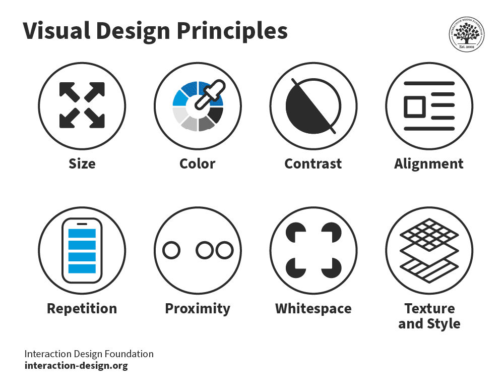
Page Design Principles
Using various design principles when placing the elements in your composition can affect visual flow. You can learn more about them by reading the desciptions below or clicking on the image to the right (link to article)
Style:
The overall style of the page can create a cohesive composition. If you apply a different styles to different elements they will stick out and feel out of place. This is distracting and hard to read. Maintaining a style harmonizes the page.
Alignment:
Alignment helps blocks of elements and the page as a whole appear more cohesive. For example when you have multiple paragraphs they might be different blocks of text but if they share a left alignment it helps them feel together.
White Space:
White space is the negative space of the page. It is the empty area throughout the page. White space is extremely crucial. White space gives the eyes the ability to rest and produces a nice clean look overall. The more white space around an element the more significant the element appears.
Color:
Color creates emphasis on elements. Your eye is naturally drawn to areas of saturation. You should limit your use of color to two or three colors when possible or your page will look busy and the color will lose its strength.
Size:
Larger objects will be perceived as more important. You will notice that the call to action banner at the top of webpages are the largest elements on a site. This is what the page wants you to click on and what the creator is trying to display most.
Images:
Images draw more attention then text and simple shapes. They are more visually interesting. Be sure to apply images where you want to draw attention. A major reason I draw so many cones on my site is because text alone becomes very boring. This site used to be a lot more dull.
typical layout
title
figure caption about the image above.
subtitle
Lorem ipsum dolor sit amet, consectetur adipiscing elit. Vestibulum blandit nisl sed vehicula malesuada. Curabitur sapien tellus, molestie et metus eu, blandit commodo justo. Aliquam ornare ornare eros.
subtitle
Nam lacinia quam ac tincidunt sodales. Pellentesque placerat, augue nec gravida consectetur, elit urna faucibus nisl, et lacinia purus mauris non risus. Cras eget velit eu urna vulputate pretium at quis lectus. Morbi finibus fermentum congue.
subtitle
Praesent ac facilisis nulla, nec bibendum arcu. Mauris libero turpis, dignissim vel volutpat ac, lobortis non quam. Aenean in pretium ex, nec facilisis quam. Maecenas sagittis vitae risus ac vulputate.
The example on the right is labeled to show you the predictive visual flow
labeled by priority
title
large text is read second
Large Images are read first
figure caption about the image above.
subtitlesubtitles are read fourth
Lorem ipsum dolor sit amet, consectetur adipiscing elit. Vestibulum blandit nisl sed vehicula malesuada. Curabitur sapien tellus, molestie et metus eu, blandit commodo justo. Aliquam ornare ornare eros. body text are read last
subtitlesubtitles are read fourth
Nam lacinia quam ac tincidunt sodales. Pellentesque placerat, augue nec gravida consectetur, elit urna faucibus nisl, et lacinia purus mauris non risus. Cras eget velit eu urna vulputate pretium at quis lectus. Morbi finibus fermentum congue.body text are read last
subtitlesubtitles are read fourth
smaller images are read third
Praesent ac facilisis nulla, nec bibendum arcu. Mauris libero turpis, dignissim vel volutpat ac, lobortis non quam. Aenean in pretium ex, nec facilisis quam. Maecenas sagittis vitae risus ac vulputate.body text are read last
HTML 5
HTML5:
Most of the elements discussed thus far were available in previous versions of HTML. HTML5 has added some new elements. Most of these are things that previously could only be used with third-party plugins such as Flash:
- vector graphic elements (<svg> and <canvas>)
- multimedia elements (<video> and <audio>)
- form control attributes (date, time, etc.)
- semantic elements (<header>, <footer>, etc.)

Semantic Grouping Elements:
Use these to group areas of your webpage semantically. <div> and <span> are not semantic since they have no meaning.
- <header>
- Represents the header of a webpage or section
- <nav>
- Used to group the navigation elements together.
- <main>
- Defines the primary content of the webpage.
- <section>
- Groups together a block of related elements.
- <article>
- Represents a self-contained block of related elements.
- <aside>
- Useful to group together elements that add information like a sidebar
- <footer>
- Used to define the footer of a section or whole webpage.
- <figure> & <figcaption>
- Used to create attach a caption to an image.
- <details> & <summary>
- Groups together elements that add information the user may hide or view.
- <mark>
- Highlights a specific section of text
- <time>
- Defines time and date. Nothing visual is apparent in browser.
browser view
<header>
<nav>
<main>
<section>
<article>
<article>
<article>
<section>
<article>
<aside>
<figure>
<img>
<figcaption>
<footer>
Applying semantic groups
Instructions:
Currently we are using divs to create our groups of elements. Although this is a useful tool it is better to use semantic HTML 5 elements. We will convert them over to tags that represent their position better.
Remove <div id=“topSection”> as well as its closing </div>. We no longer need this.
Remove the first <div class=“subsection”> and replace it with <header>. This will represent the very top area of the site that includes the title, engaging image, and navigation. Be sure to change the closing </div> to </header>.
Remove <div id=“navbar”> and its closing </div> and replace them with <nav> and </nav>. This represents the navigation obviously.
We can wrap our header image and captions with a figure element. Before the <img> enter <figure>. Enter </figure> after the next two elements (<a> & <p>). After the <img> and before the <a> enter <figcaption>. Enter the closing </figcaption> after the <p>. This will represent the caption to our image.
After the header comes the main section. This represent the primary content of the site. After the closing </header> and before the <div class=“subsection”> enter <main>. Enter the closing </main> after the closing </div> of the last <div class=“subsection”> and before <div id=“bottomSection”>.
We only have one section inside the main area of the site. After the <main>, enter <section>. Before the </main>, enter </section>.
Replace all <div class=“subsection”> and their closing </div> with <article> and </article>. Articles represents bits of related content, typically a heading, a paragraphs, and perhaps images.
Instead of <div id=“bottomSection”> we should be using <footer>. Replace the opening and closing <div> to define our most bottom section.
The last HTML tags we will add will be to create articles around the four areas of the footer section. Place a <article> and </article> around the <img> element. Place <article> and </article> around each <h3> and elements beneath them (<ol>, <ul>, <table>).
Now that we have removed all of the divs none of our CSS selectors will target our elements correctly. For each id and class selector your replace with an HTML 5 tag replace the selector to the tag type instead. For example, #navbar ul will become nav ul. Some ids and class selectors will remain that are targeting our span elements.
<!DOCTYPE html>
<html>
    <head>
        <title>Cone's Biography</title>
        <meta charset="UTF-8">
        <meta name="description" content="All about Jon Cone's life">
        <meta name="keywords" content="Handsome, Smart, Cool Guy">
        <meta name="author" content="Jonathan Cone">
        <meta name="viewport" content="width=device-width, initial-scale=1.0">

        <link href="css/styles.css" type="text/css" rel="stylesheet" />

    </head>
    <body>

        <header>
            <h1>Cone</h1>
            <nav>
                <ul>
                    <li><a href="#">Link 01</a></li>
                    <li><a href="#">Link 02</a></li>
                    <li><a href="#">Link 03</a></li>
                    <li><a href="#">Link 04</a></li>
                    <li><a href="#">Link 05</a></li>
                </ul>
            </nav>
            <figure>
                <img src="images/FullSizeR.jpg" alt="photograph of jonatha cone" />
                <figcaption>
                    <a href="https://teachmecone.com/nojcone/">Demo Reel</a>
                    <p>The man, <em>the myth</em>, <strong class="orangeColor bolder">the primitive form</strong>.</p>
                </figcaption>
            </figure>
            <hr />
        </header>

        <main>
            <section>
                <article>
                    <h2>In the beginning...</h2>
                    <p>He was born in <span class="bolder">Upstate NY</span>. Have you been there? No you haven't because it is drab.</p>
                </article>
                <article>
                    <h2>Presently coding this document</h2>
                    <p>Right now he is teaching this <a href="https://teachmecone.com/web-design-i/wd-i-class-03/">class</a> and writing this crummy biography</p>
                </article>
                <article>
                    <h2>His future</h2>
                    <p>He has <span id="strikethrough" class="orangeColor">none</span>.</p>
                </article>
            </section>
        </main>

        <footer>
            <section>
                <article>
                    <a href="https://teachmecone.com/"><img src="images/coneImage.png" alt="teachmecone logo" /></a>
                </article>
                <article>
                    <h3>List of likes:</h3>
                    <ol>
                        <li>Puppies</li>
                        <li>Animation</li>
                        <li>Indian Food</li>
                    </ol>
                </article>
                <article>
                   <h3>List of dislikes:</h3>
                    <ul>
                        <li>Cats</li>
                        <li>Vehicles that go Vroom</li>
                        <li>Bug meat</li>
                    </ul>
                </article>
                <article>
                    <h3>Table of favorite video games</h3>
                    <table>
                        <tr> <th>Genre</th> <th>RPG</th> <th>RTS</th> <th>FPS</th> </tr>
                        <tr> <th>Game</th> <td>Diablo</td> <td>StarCraft</td> <td>Halo</td> </tr>
                    </table>
                </article>

            </section>
        </footer>
    </body>
</html>body {
background-color: orange;
width: 960px;
font-family: Verdana, Geneva, Tahoma, sans-serif;
font-size: .85em;}
header {
background-color: #ffffff;
margin: 20px;
padding: 20px;
border-right-style: solid;
border-bottom-style: solid;
border-color: #0000004c;
border-width: 5px;
text-align: center;}
footer {
color: #ffffff;
width: 480px;
margin-left: 240px;
border: 3px dotted #000000;}
#strikethrough {
text-decoration: line-through;}
.subsection {
margin-bottom: 40px;}
.orangeColor {
color: #fa8e13;}
.bolder {
font-weight: 700;}
header img {
width: 240px;}
footer img {
width: 180px;}
ul li {
list-style-type: square;}
ol li {
list-style-type: lower-alpha;}
nav ul {
position: relative;
top: 0px;
list-style-type: none;
margin: 0px;
padding: 0px;}
nav li {
display: inline;
margin: 0px;
padding: 0px;}
nav a:link, #navbar a:visited {
font-weight: bold;
color:#ffffff;
background-color: #fa8e13;
width: 120px;
text-align: center;
margin: 0px;
padding: 4px;
text-decoration: none;
border-radius: 5px;}
#navbar a:hover {
color: #b9b9b9;
background-color: #b46913;}
browser view
In the beginning…
He was born in Upstate NY. Have you been there? No you haven’t because it is drab.
Presently coding this document
Right now he is teaching this class and writing this crummy biography
His future
He has none.

List of likes:
- Puppies
- Animation
- Indian Food
List of dislikes:
- Cats
- Vehicles that go Vroom
- Bug meat
Table of favorite video games
| Genre | RPG | RTS | FPS |
|---|---|---|---|
| Game | Diablo | StarCraft | Halo |
Normal Flow:
Thus far the layout of the pages you have created have been determined by the elements you use, inline or block-level. This default browser interpretation is called normal flow.
For better control you utilize containing, div and span, or parent, table, ul, etc., elements that we leverage with CSS box model and position properties.
Position Properties:
- position
- Controls the positioning of the selected element.
-
- static
- Produces normal flow.
- relative
- Makes the position of the element relative to normal flow.
- absolute
- Positions the element in an exact position regardless of normal flow
- fixed
- Like absolute the element is positioned in an exact position but is based on the browser window. This is how you make a “sticky” header and footer.
- z-index
- Using a number from 0-? you may place elements in front or behind other elements
* {
	position:static;}
browser view
First Paragraph
Lorem ipsum dolor sit amet, consectetur adipiscing elit. Vestibulum at aliquam odio. Nullam posuere in ex id consequat. Integer placerat lacinia tortor in laoreet. Curabitur scelerisque mauris in lectus ullamcorper egestas. Fusce a bibendum magna, id malesuada felis. Pellentesque pretium enim odio, ut suscipit sapien suscipit eu. Vestibulum orci est, sodales vel nulla non, ornare facilisis ex.
Second Paragraph
Suspendisse vestibulum nibh ac tincidunt aliquet. Donec vel risus ac est posuere eleifend a vitae turpis. Vivamus accumsan molestie elit, at tristique nulla. Maecenas ultricies ex a odio dignissim, ut tempor nunc euismod. Donec elit purus, tristique non sem sed, rhoncus dignissim massa. Praesent nec faucibus magna. Integer vitae porta lorem. Sed vitae enim vitae felis tempor lobortis in ut justo.
Third Paragraph
Morbi velit est, blandit ac hendrerit ut, tincidunt sed magna. Quisque lacinia sollicitudin malesuada. Suspendisse iaculis metus dignissim nunc scelerisque, a fermentum libero pretium. Pellentesque sit amet dapibus risus. Nam a quam nec quam iaculis suscipit non in mi. Sed cursus euismod lorem eget consectetur. Vestibulum ante ipsum primis in faucibus orci luctus et ultrices posuere cubilia Curae; Vivamus ac sem ut ligula porta sodales ac ut urna. Vestibulum ante ipsum primis in faucibus orci luctus et ultrices posuere cubilia Curae; Sed ligula lorem, laoreet eget placerat sit amet, dapibus sed ipsum.
#relativeExample {
	top:50px;
	left:50px;
	position:relative;}
browser view
First Paragraph
Lorem ipsum dolor sit amet, consectetur adipiscing elit. Vestibulum at aliquam odio. Nullam posuere in ex id consequat. Integer placerat lacinia tortor in laoreet. Curabitur scelerisque mauris in lectus ullamcorper egestas. Fusce a bibendum magna, id malesuada felis. Pellentesque pretium enim odio, ut suscipit sapien suscipit eu. Vestibulum orci est, sodales vel nulla non, ornare facilisis ex.
Second Paragraph
Suspendisse vestibulum nibh ac tincidunt aliquet. Donec vel risus ac est posuere eleifend a vitae turpis. Vivamus accumsan molestie elit, at tristique nulla. Maecenas ultricies ex a odio dignissim, ut tempor nunc euismod. Donec elit purus, tristique non sem sed, rhoncus dignissim massa. Praesent nec faucibus magna. Integer vitae porta lorem. Sed vitae enim vitae felis tempor lobortis in ut justo.
Third Paragraph
Morbi velit est, blandit ac hendrerit ut, tincidunt sed magna. Quisque lacinia sollicitudin malesuada. Suspendisse iaculis metus dignissim nunc scelerisque, a fermentum libero pretium. Pellentesque sit amet dapibus risus. Nam a quam nec quam iaculis suscipit non in mi. Sed cursus euismod lorem eget consectetur. Vestibulum ante ipsum primis in faucibus orci luctus et ultrices posuere cubilia Curae; Vivamus ac sem ut ligula porta sodales ac ut urna. Vestibulum ante ipsum primis in faucibus orci luctus et ultrices posuere cubilia Curae; Sed ligula lorem, laoreet eget placerat sit amet, dapibus sed ipsum.
#absoluteExample {
	top:50px;
	left:50px;
	position:absolute;}
browser view
First Paragraph
Lorem ipsum dolor sit amet, consectetur adipiscing elit. Vestibulum at aliquam odio. Nullam posuere in ex id consequat. Integer placerat lacinia tortor in laoreet. Curabitur scelerisque mauris in lectus ullamcorper egestas. Fusce a bibendum magna, id malesuada felis. Pellentesque pretium enim odio, ut suscipit sapien suscipit eu. Vestibulum orci est, sodales vel nulla non, ornare facilisis ex.
Second Paragraph
Suspendisse vestibulum nibh ac tincidunt aliquet. Donec vel risus ac est posuere eleifend a vitae turpis. Vivamus accumsan molestie elit, at tristique nulla. Maecenas ultricies ex a odio dignissim, ut tempor nunc euismod. Donec elit purus, tristique non sem sed, rhoncus dignissim massa. Praesent nec faucibus magna. Integer vitae porta lorem. Sed vitae enim vitae felis tempor lobortis in ut justo.
Third Paragraph
Morbi velit est, blandit ac hendrerit ut, tincidunt sed magna. Quisque lacinia sollicitudin malesuada. Suspendisse iaculis metus dignissim nunc scelerisque, a fermentum libero pretium. Pellentesque sit amet dapibus risus. Nam a quam nec quam iaculis suscipit non in mi. Sed cursus euismod lorem eget consectetur. Vestibulum ante ipsum primis in faucibus orci luctus et ultrices posuere cubilia Curae; Vivamus ac sem ut ligula porta sodales ac ut urna. Vestibulum ante ipsum primis in faucibus orci luctus et ultrices posuere cubilia Curae; Sed ligula lorem, laoreet eget placerat sit amet, dapibus sed ipsum.
#fixedExample {
  top:0px;
  position:fixed;}
browser view
Positioning elements
Instructions:
Our design is completly reliant on regular flow. This means for the most part our elements stack one after another. It would be nice to create columns much like you see in a typical printed or online page.
To make three columns out of the three articles in the main section, add the following to the styles.css document:
main section article {
width: 275px;
height: 150px;
display: inline-block;
margin-left: 15px;
padding: 10px;
vertical-align: top;
background-color: #b46913;}
To create two columns stacked for the footer articles enter:
footer section article {
width: 190px;
height: 200px;
margin: 10px;
padding: 10px;
display: inline-block;
vertical-align: top;
background-color: #b46913;}
<!DOCTYPE html>
<html>
    <head>
        <title>Cone's Biography</title>
        <meta charset="UTF-8">
        <meta name="description" content="All about Jon Cone's life">
        <meta name="keywords" content="Handsome, Smart, Cool Guy">
        <meta name="author" content="Jonathan Cone">
        <meta name="viewport" content="width=device-width, initial-scale=1.0">

        <link href="css/styles.css" type="text/css" rel="stylesheet" />

    </head>
    <body>

        <header>
            <h1>Cone</h1>
            <nav>
                <ul>
                    <li><a href="#">Link 01</a></li>
                    <li><a href="#">Link 02</a></li>
                    <li><a href="#">Link 03</a></li>
                    <li><a href="#">Link 04</a></li>
                    <li><a href="#">Link 05</a></li>
                </ul>
            </nav>
            <figure>
                <img src="images/FullSizeR.jpg" alt="photograph of jonatha cone" />
                <figcaption>
                    <a href="https://teachmecone.com/nojcone/">Demo Reel</a>
                    <p>The man, <em>the myth</em>, <strong class="orangeColor bolder">the primitive form</strong>.</p>
                </figcaption>
            </figure>
            <hr />
        </header>

        <main>
            <section>
                <article>
                    <h2>In the beginning...</h2>
                    <p>He was born in <span class="bolder">Upstate NY</span>. Have you been there? No you haven't because it is drab.</p>
                </article>
                <article>
                    <h2>Presently coding this document</h2>
                    <p>Right now he is teaching this <a href="https://teachmecone.com/web-design-i/wd-i-class-03/">class</a> and writing this crummy biography</p>
                </article>
                <article>
                    <h2>His future</h2>
                    <p>He has <span id="strikethrough" class="orangeColor">none</span>.</p>
                </article>
            </section>
        </main>

        <footer>
            <section>
                <article>
                    <a href="https://teachmecone.com/"><img src="images/coneImage.png" alt="teachmecone logo" /></a>
                </article>
                <article>
                    <h3>List of likes:</h3>
                    <ol>
                        <li>Puppies</li>
                        <li>Animation</li>
                        <li>Indian Food</li>
                    </ol>
                </article>
                <article>
                   <h3>List of dislikes:</h3>
                    <ul>
                        <li>Cats</li>
                        <li>Vehicles that go Vroom</li>
                        <li>Bug meat</li>
                    </ul>
                </article>
                <article>
                    <h3>Table of favorite video games</h3>
                    <table>
                        <tr> <th>Genre</th> <th>RPG</th> <th>RTS</th> <th>FPS</th> </tr>
                        <tr> <th>Game</th> <td>Diablo</td> <td>StarCraft</td> <td>Halo</td> </tr>
                    </table>
                </article>

            </section>
        </footer>
    </body>
</html>body {
background-color: orange;
background-image: url('../images/wallPaper.gif');
background-attachment: fixed;
width: 960px;
font-family: Verdana, Geneva, Tahoma, sans-serif;
font-size: .85em;}
header {
background-color: #ffffff;
margin: 20px;
padding: 20px;
border-right-style: solid;
border-bottom-style: solid;
border-color: #0000004c;
border-width: 5px;
text-align: center;}
footer {
color: #ffffff;
width: 480px;
position: relative;
left: 240px;
border: 3px dotted #000000;}
#strikethrough {
text-decoration: line-through;}
.subsection {
margin-bottom: 40px;}
.orangeColor {
color: #fa8e13;}
.bolder {
font-weight: 700;}
header img {
width: 240px;}
footer img {
width: 180px;}
ul li {
list-style-type: square;}
ol li {
list-style-type: lower-alpha;}
nav ul {
position: relative;
top: 0px;
list-style-type: none;
margin: 0px;
padding: 0px;}
nav li {
display: inline;
margin: 0px;
padding: 0px;}
nav a:link, #navbar a:visited {
font-weight: bold;
color:#ffffff;
background-color: #fa8e13;
width: 120px;
text-align: center;
margin: 0px;
padding: 4px;
text-decoration: none;
border-radius: 5px;}
#navbar a:hover {
color: #b9b9b9;
background-color: #b46913;}
main section article {
width: 275px;
height: 150px;
display: inline-block;
margin-left: 15px;
padding: 10px;
vertical-align: top;
background-color: #b46913;}
footer section article {
width: 190px;
height: 200px;
margin: 10px;
padding: 10px;
display: inline-block;
vertical-align: top;
background-color: #b46913;}browser view
In the beginning…
He was born in Upstate NY. Have you been there? No you haven’t because it is drab.
Presently coding this document
Right now he is teaching this class and writing this crummy biography
His future
He has none.

List of likes:
- Puppies
- Animation
- Indian Food
List of dislikes:
- Cats
- Vehicles that go Vroom
- Bug meat
Table of favorite video games
| Genre | RPG | RTS | FPS |
|---|---|---|---|
| Game | Diablo | StarCraft | Halo |
Lab assignment submission
Instructions:
Before you submit you should review your code and Save your file (File > Save), navigate to your file on your Desktop, and double-click it to open
Look for any errors. If there are any, look through your code and fix them. When you are happy, proceed
Your site is not just the single HTML document you have created but the root folder and all contents therein. You MUST submit the ENTIRE folder
You cannot submit folders on Canvas. Instead we can zip the folder and submit that. Navigate to the location of your site folder. Right-click over top of it and select Compress to zip file on Windows and Compress on MacOS. A new zipped file will be created
Lastly, log into Canvas (Here) and click on this course. Inside the course, under module Week 04, select Week 04: Fixed-Width Page (layout) Lab, then upload the zipped file.
<!DOCTYPE html>
<html>
    <head>
        <title>Cone's Biography</title>
        <meta charset="UTF-8">
        <meta name="description" content="All about Jon Cone's life">
        <meta name="keywords" content="Handsome, Smart, Cool Guy">
        <meta name="author" content="Jonathan Cone">
        <meta name="viewport" content="width=device-width, initial-scale=1.0">

        <link href="css/styles.css" type="text/css" rel="stylesheet" />

    </head>
    <body>

        <header>
            <h1>Cone</h1>
            <nav>
                <ul>
                    <li><a href="#">Link 01</a></li>
                    <li><a href="#">Link 02</a></li>
                    <li><a href="#">Link 03</a></li>
                    <li><a href="#">Link 04</a></li>
                    <li><a href="#">Link 05</a></li>
                </ul>
            </nav>
            <figure>
                <img src="images/FullSizeR.jpg" alt="photograph of jonatha cone" />
                <figcaption>
                    <a href="https://teachmecone.com/nojcone/">Demo Reel</a>
                    <p>The man, <em>the myth</em>, <strong class="orangeColor bolder">the primitive form</strong>.</p>
                </figcaption>
            </figure>
            <hr />
        </header>

        <main>
            <section>
                <article>
                    <h2>In the beginning...</h2>
                    <p>He was born in <span class="bolder">Upstate NY</span>. Have you been there? No you haven't because it is drab.</p>
                </article>
                <article>
                    <h2>Presently coding this document</h2>
                    <p>Right now he is teaching this <a href="https://teachmecone.com/web-design-i/wd-i-class-03/">class</a> and writing this crummy biography</p>
                </article>
                <article>
                    <h2>His future</h2>
                    <p>He has <span id="strikethrough" class="orangeColor">none</span>.</p>
                </article>
            </section>
        </main>

        <footer>
            <section>
                <article>
                    <a href="https://teachmecone.com/"><img src="images/coneImage.png" alt="teachmecone logo" /></a>
                </article>
                <article>
                    <h3>List of likes:</h3>
                    <ol>
                        <li>Puppies</li>
                        <li>Animation</li>
                        <li>Indian Food</li>
                    </ol>
                </article>
                <article>
                   <h3>List of dislikes:</h3>
                    <ul>
                        <li>Cats</li>
                        <li>Vehicles that go Vroom</li>
                        <li>Bug meat</li>
                    </ul>
                </article>
                <article>
                    <h3>Table of favorite video games</h3>
                    <table>
                        <tr> <th>Genre</th> <th>RPG</th> <th>RTS</th> <th>FPS</th> </tr>
                        <tr> <th>Game</th> <td>Diablo</td> <td>StarCraft</td> <td>Halo</td> </tr>
                    </table>
                </article>

            </section>
        </footer>
    </body>
</html>body {
background-color: orange;
background-image: url('../images/wallPaper.gif');
background-attachment: fixed;
width: 960px;
font-family: Verdana, Geneva, Tahoma, sans-serif;
font-size: .85em;}
header {
background-color: #ffffff;
margin: 20px;
padding: 20px;
border-right-style: solid;
border-bottom-style: solid;
border-color: #0000004c;
border-width: 5px;
text-align: center;}
footer {
color: #ffffff;
width: 480px;
position: relative;
left: 240px;
border: 3px dotted #000000;}
#strikethrough {
text-decoration: line-through;}
.subsection {
margin-bottom: 40px;}
.orangeColor {
color: #fa8e13;}
.bolder {
font-weight: 700;}
header img {
width: 240px;}
footer img {
width: 180px;}
ul li {
list-style-type: square;}
ol li {
list-style-type: lower-alpha;}
nav ul {
position: relative;
top: 0px;
list-style-type: none;
margin: 0px;
padding: 0px;}
nav li {
display: inline;
margin: 0px;
padding: 0px;}
nav a:link, #navbar a:visited {
font-weight: bold;
color:#ffffff;
background-color: #fa8e13;
width: 120px;
text-align: center;
margin: 0px;
padding: 4px;
text-decoration: none;
border-radius: 5px;}
#navbar a:hover {
color: #b9b9b9;
background-color: #b46913;}
main section article {
width: 275px;
height: 150px;
display: inline-block;
margin-left: 15px;
padding: 10px;
vertical-align: top;
background-color: #b46913;}
footer section article {
width: 190px;
height: 200px;
margin: 10px;
padding: 10px;
display: inline-block;
vertical-align: top;
background-color: #b46913;}browser view
In the beginning…
He was born in Upstate NY. Have you been there? No you haven’t because it is drab.
Presently coding this document
Right now he is teaching this class and writing this crummy biography
His future
He has none.

List of likes:
- Puppies
- Animation
- Indian Food
List of dislikes:
- Cats
- Vehicles that go Vroom
- Bug meat
Table of favorite video games
| Genre | RPG | RTS | FPS |
|---|---|---|---|
| Game | Diablo | StarCraft | Halo |
You’re Done
Did you remember to?
- Read through this webpage
- Complete and submit the 04 Fixed-Width Page (layout) Lab on Canvas



.jpg)
