Web Design I
Class 12: Landing PageTopics
- Landing Page
- Customize
- Usability
- Week 12 CMS Site (homepage) Lab

Don’t skip out on class 12
Landing Page
Landing Page:
The landing page is where the user ends up when they click on a hyperlink from another site such as an advertisement. It is a page that works all by itself. This is usually a sites homepage.
Typically:
- Draws users into your site.
- Heavy use of imagery.
- Limited text.
Steps (in WordPress):
- Create page. Name it Homepage.
- Set homepage in Settings>Reading.
- In the Homepage page use a plug-in (Page Builder, Elementor, etc.) to create a unique page.
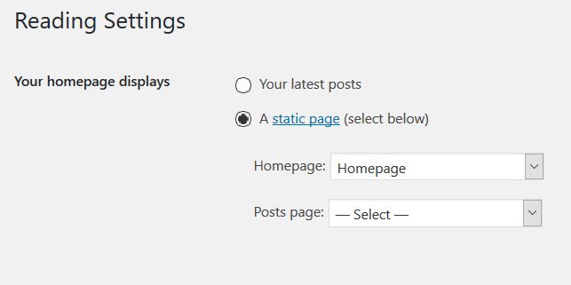
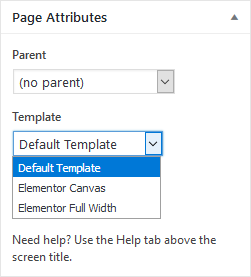
In your homepage at the bottom right you may need to change the template to one that does not include a side menu (usually full-width).
Customize
Customize
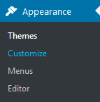
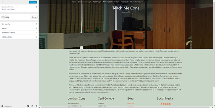
It is possible to make some design choices using the Customize feature in WordPress. Depending on the theme you have chosen this could have a very robust set of options or be very limited. It is however, pretty user friendly compared to other aspects of WordPress. I would suggest going through each option and see what possibilities there are.
Appearance > Customize
Usability
Usability:
- Printed Page Goal:
- Legibility: The ability of the page to be comprehended by the target audience.
- Web Page Goal:
- Usability: The experience of the user when interacting with your page.
Five Considerations:
- Learning
- User understands the content of the site and grasps concepts throughout
- Efficiency
- Navigation and structure is clear to the user
- Memorable
- The user is left with an experience that allows them to remember the site
- Errors
- The goal is to have a few as possible so the experience is not tarnished
- Satisfaction
- The overall appeal of the site.
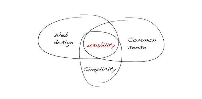
Click on the image above for a good explanation of usability design
Dimensions:
The site should not be smaller than the user’s screen.
You want the design to be no wider than the user’s browser (960px is a good rule).
The page should be simplify the amount of content so it can be viewed on small and large screens.
Content:
- Header (Masthead/logo)
- Navigation
- Links
- General Content (text/images)
- Login
- Forms
- Comments
- Legal Information
- Interactive images/content
- Video
- Audio
- Footer
Navigation
- Concise: Should be quick and easy to read.
- Clear: Should be able to decipher where a link leads.
- Selective: Should only contain links.
- Context: Should know where you currently are.
- Interactive: Should be large enough to use and respond to hover, press, visited, etc.
- Consistent: Primary navigation should remain the same throughout.

Your site should fit the device displayed on

…or you end up with the “Ring”
Week 12 CMS Site (homepage) Lab
CMS Site (homepage) Lab
In this lab you will build on the site you created in the last lab and complete the homepage. First you will adjust the theme and WordPress settings. Then the homepage of the site will be created. The general layout, and content will be applied.
You will be graded on the following:
- WordPress Setup:
- WordPress default settings set.
- Theme settings adjusted.
- Layout:
- Sections of content are organized.
- Strong grid design utilized.
- Basic Content:
- Well-written text with no grammar mistakes.
- Images scaled, and adjusted for the page.
- Interactive dynamic content included.
- Aesthetic:
- Appealing design with professional craftsmanship throughout.
Resources:
- Assignment Video Tutorials
- You may watch the video tutorials below
- Assignment Lab Materials
- You may download the lab materials here: wd1_week12_labMaterials
Lab Tutorial Slideshow
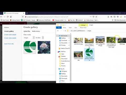
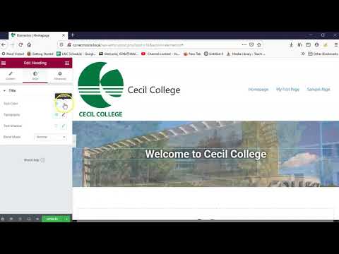
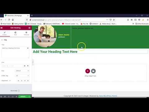
This tutorial will guide you through the process of creating a homepage in WordPress
Wait! Before you go!
Did you remember to?
- Read through this webpage
- Watch the videos
- Submit Week 12 CMS Site (homepage) Lab in Assignments section on Blackboard
