Digital Imaging IV
Class 04: Visual HierarchyTopics
- Visual Hierarchy
- Homepage
- Navigation
- Original App Design Project
Fore! Watch out for this class
Visual Hierarchy
Visual Hierarchy
Visual hierarchy is the principle of arranging elements to show their order of importance. Designers structure visual characteristics—e.g., menu icons—so users can understand information easily. By laying out elements logically and strategically, designers influence users’ perceptions and guide them to desired actions.
-interaction-design.org
Visual heirarchies saves us preprocessing by organizing and prioritizing content for us.
Visual heirarchy should follow three rules:
- The more important, the more prominent
- Things related logically should be related visually
- Things are “nested” visually to show what’s part of what
Avoid visual noise. Three kinds:
- Shouting: Where the items are screaming for attention. Not everything can be important or nothing is
- Disorganization: Things are all over the place. No use of grids.
- Clutter: There is just too much stuff
Links
Make choices obvious but if not possible give guidance:
- Brief: give the smallest amount of information that will help
- Timely: Placed so I encounter it exactly when I need it
- Unavoidable: Formatted in a way that ensures that I’ll notice.
Make it obvous what is clickable (a door handle tells us to push or pull)
Minimize Text
Format text to support scanning:
- Use plenty of headings. It is an informal outline. You want to use more than you think. Be sure level of headings is obvious, size change for example. Avoid floating headlines. They should be closer to the content they represent.
- Keep paragraphs short. users find them daunting. Doesn’t follow same rules as written type (doesn’t have to have same structure)
- Use bulleted lists. Anything that can be bulleted should. Be sure to have spaces between list items.
- Highlight key terms. Users are usually scanning for specific keywords, hightlight them to make it easier for them. Don’t do it too much or it loses effectiveness.
Reduce Text
Omit “extra” text.
- it reduces noise level of the page
- it makes the useful content more prominent
- it makes the page shorter, allowing users to see more of each page at a glance without scrolling.
Obviously some types of writing should be verbose like webmd or times
Avoid happy talk. Stuff that is small talk. Self-congratulatory. Contains no real content. Most user do not have time for small talk.
Avoid instructions. No one reads them (unless multiple muddling attempts fail).
You can avoid instructions by making everything self-explanatory
If instructions, cut them to bare minimum
.jpg)

Homepage
Homepage:
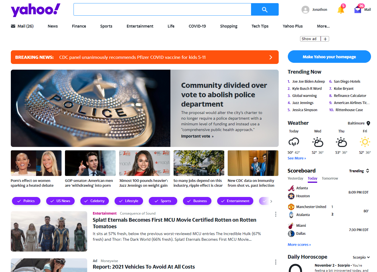
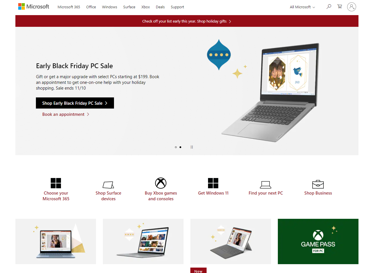
The homepage is the default page that users first see when they enter a website. It is often called a landing page (where you land). It acts as an introduction to the site and starting point. It should instruct the user how to progress.
Regardless of how they end up on the site (like going directly to a subpage) they very often return the homepage. Make it obvious where to start
Content:
A homepage may contain many different elements. Typically these include:
- Site identitiy and mission. The homepage should say what the site is and what it is for. If possible, why here and not somewhere else.
- Site Hieararchy. It should be an overview of what the site has to offer, content (what can I find here) and features (what can I do here)
- Search. Most sites use a prominent search box
- Teases. Entices the user with hints of good stuff
- Content Promos. Spotlight newest, best, or most popular content
- Feature Promos. Invite me to explore additional sections of the site or try out features
- Timely Content. The site requires people to come back often so you need to update the page. Shows signs of life. Helps SEO
- Deals. Space needs to be allocated for advertising
- Shortcuts. The most frequently requested pieces of content may deserve their own links
- Registration. If there are users need a place to register and sign in.
The Message:
Everyone wants a place on the homepage. It is like waterfront property. Small amount of it everyone wants. One thing you cannot lose on the homepage is conveying the big picture. What the site is.
How to get a message across:
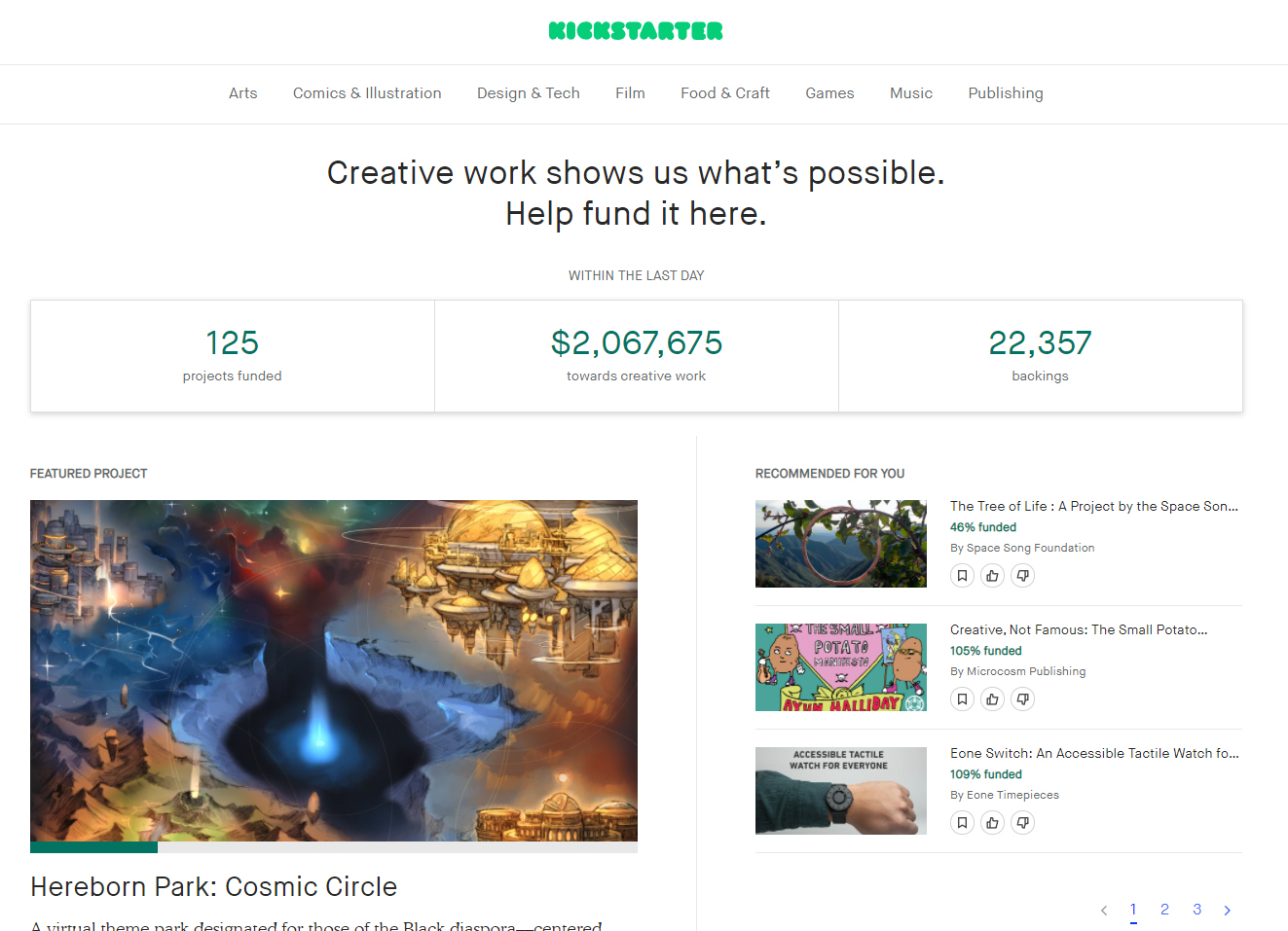
- Tagline. Most valuable space is next to site id. We generally read it as a description
- clear and informative.
- Just long enough but not too long (6-8 words)
- Convey differentiation. And clear benefit. How are you different
- Not generic
- If possible, personable, lively, and sometimes clever.
- Welcome Blurb. A brief description displayed in a prominent block. Should catch the eye. Don’t use a mission statement (they are long-winded, self-congratulatory, and no one will read them).
- Learn more. Often a short video explanation.
Navigation
Navigation
The menu system used to “travel” from page to page on a site. Navigation is extremely important. Not just a feature. It is often the primary functional component.
We call it web navigation and not store navigation or library navigation. It implies we have to “figure out where we are.”
Interaction
You user navigates a site like they navigate real-world counterparts. You are usually trying to “find” something.
Use a mall (or store) as an example. You see the stores name, then departments, then aisle, then product. If you can’t find you may ask a clerk.
You decide whether to ask first or browse first. (search-dominant or link-dominant users). You will make your way through the hierarchy, if you can’t find what you are looking for, you’ll leave (like a store).
It feels like moving through a store when you browse a site, except:
- No sense of scale. There is no way to really know how large the site is. A store you can physically see it. This makes it difficult to know if you have seen everything
- No sense of direction. There is no left, right, up/down. There is just “levels” of specificity. We teleport to areas and rely on conceptual hierarchies instead.
- No sense of location. We use the space to orient ourselves and remember where things are. Physical spaces have conventions. Road signs, page numbers, chapters, etc.
Purpose
The primary purpose of navigation is obviously to direct users to the pages they want but it should also:
- It tells us what’s here. By making it a hierarchy visible, it tells us what the site contains. Navigation reveals content.
- It tells us how to use the site. It should implicitly tell you where to begin. It is the instructions. People won’t use your website if they can’t find their way around it.
- It gives us confidence in the people who built it. You are constantly asking if these people who built it knew what they were doing. It creates a good impression.
Formatting
Clear, simple, and consistent (that is all).
- Basic navigation convention dictates site ID at most top left, sections below that (with you are here indicator), utilities at top right. Page name is usually in the middle top below the other items. Local navigation is typically left side. Footer navigation is at the most bottom of the page
- Persistent navigation or global navigation describes the navigation elements that exist on every page.
- Persistent navigation is not necessary on pages with forms (maybe a simplified version).
- It is necessary so that we know we are still on the right site.
- Site ID should be the highest most prominent element. This means either larger or use it to frame everything. It shouldn’t be the largest.
- Site ID should look like a site ID. That means it should contain branding
- Sections, sometimes called primary navigation. Sometimes there are subsections
- Utilities are links to things that are outside the main hierarchy. Usually sign in, search, contact, shopping cart, etc. Should be limited to 4-5
- Site ID and a home button should exist so that the user feels like they have a way back.
- Search should be included
Pages should have:
- Every page needs a name. It should be prominently displayed
- The name needs to be in the right place. Much like the site id it should frame the other elements.
- The name should be prominent. Should be obvious it is the heading for the entire page.
- The name needs to match what I clicked. Basically, be the same as in the navigation.
- You should include a “you are here” indicator in the navigation. Let’s the user know where they are. It is more important on the web since there are no physical indicators.
Ask these Questions
Should be able to answer:
- What site is this
- What page am I on
- What are the major sections of this site
- What are my options at this level
- Where am I in the scheme of things
- How can I search
From a distance should be able to see:
- Site id
- Page name
- Sections (primary navigation)
- Local navigation
- “you are here” indicators
- Search
XD Import/Export
Import:
So far we have imported raster images, vector graphics, and components from other XD projects. You may also import:
- Videos: You can import videos and set them to play automatically or interacted with. You can also export your work to after effects and make videos from XD
- Library: You can utilize the Adobe Cloud library that you create yourself or share with a team. This is a great way to collaborate.
- Photoshop or Illustrator: You may import Photoshop or Illustrator files in their native formats. What is even better is that you can create an entire design in these programs and bring them in as the starting point (maintains naming, folders, positioning, etc.).

Export
There is no proper way to export a final product from Adobe XD. It is meant to be used as a mockup tool. There are three methods of export:
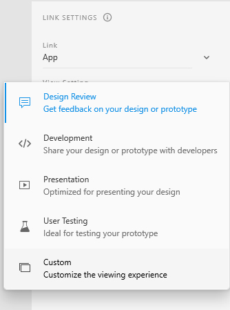
- Share: You can press the share button (after the design and prototype areas) to create a link that you may send others to view inside a browser.
- Export: You may export the artboards and graphics. This is the primary way of getting your design out. The purpose here is that you may send the mockup and the graphics to your developer make your project a reality.
- Plugin: There are various plugins that allow you to export the project. One for example will allow you to export your project as a webpage (HTML + CSS).
Original App Design Project
Original App Design Project
The app project will be to create an app mockup much like we produced in the last three labs. It should be an original idea, complete with your own content. Text and graphics will be highly criticized.
You will be graded on the following:
- Graphic Craftsmanship
- Images are proper size, resolution, and format.
- Images are clean, readable, and appropriate.
- An alpha channel (transparency) is present where appropriate.
- Graphic Aesthetics
- The design of the artwork is novel/innovative.
- The style has a unique appeal.
- Code
- Event handlers are attached and coded properly.
- Functions operate as intended.
- Usability
- Free of frustrating errors.
- The “feel” of the project is as expected and satisfying.
Resources:
- Assignment Video Tutorials
- You may watch the tutorial videos below to help you complete your assignment.
Assignment Video Introduction
Here are the instructions for the project
Wait! Before you go!
Did you remember to?
- Read through this webpage
- Watch the videos
- App Original App Design Lab on Blackboard
