Digital Imaging IV
Class 03: UsabilityTopics
- Intro to Usability
- App Design
- Intro to Adobe XD
- Week 03 App Page Design Lab

Third class is the best!
Intro to Usability
Usability
Usability refers to the quality of a user’s experience when interacting with products or systems, including websites, software, devices, or applications. Usability is about effectiveness, efficiency and the overall satisfaction of the user.
-usability.gov
Usability Includes:
-
- Intuitive
- Nearly effortless underestanding of the structure and navigation.
-
- Learnable:
- Quickly grasp how to operate basic tasks.
-
- Memorable:
- Repeat user can easily remember how to complete tasks.
-
- Error Tolerance:
- Frequency, recovery, and intensity of mistakes.
-
- Efficient:
- Users can complete operations quickly.
-
- Enjoyable:
- The experience is satisfying.
Make it Easy:
There are no fast and easy “rules,” just this: Make it easy.
Every time the user has to think adds up their cognitive workload. The larger the workload the more distracting from the task. People avoid thinking. (I think we all know this!)
You don’t want your user to have to think. Should you press exit or back?

Your goal is to make it as easy for your user to get from point A to Point B

Scanners
User’s scan. This means they will NOT read your content. We know most of the content is not relevant. We are effective scanners. They search for keywords. The first thing that vaguely fits they will click.
We do not care how something works. Just that it works.
Build for Scanners:
- Utilize conventions. These are shorthands that require little thought since they are already understood
- Produce effective visual heirarchies. Your content should be organized
- Break pages up into chunks. People consume in “chunks”
- Clickable elements should be obvious. Your link should be clear
- Remove anything distracting. Make it clear
- Format content for scanning. For example use bullets where possible.
Conventions:
Conventions are the accepted standard that the general public has implicitly accepted. For UI this means the user has learned and expect elements to be organized and function a certain way. It is a shortcut.
Users know:
- Where to find items. Primary navigation is at the most top for example.
- How elements function. They know how to use forms, search bars, accordians, etc.
- Iconography. Simplified, standardized visual representations.
Generally speaking conventions are good. I know you want to separate yourself but unless you add some value by doing it differently stick to conventions.

You ignore until you find what you are looking specifically for

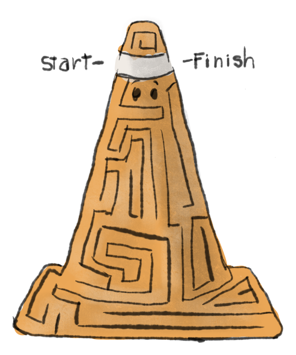
A convention of cones!
UX, UI Design
Usability design is most often refered to in two disciplines:
- UI:
- At the most basic level, the user interface (UI) is the series of screens, pages, and visual elements—like buttons and icons—that enable a person to interact with a product or service.
- -usertesting.com
- UX:
- User experience (UX), on the other hand, is the internal experience that a person has as they interact with every aspect of a company’s products and service
- -usertesting.com


UI Design produces a path for the user. UX is aware of the path the user actually takes
App Design
App Design:
App design refers to the ideation and construction of mobile applications. It utilizes the same skillset required in developing software for other systems. Interface, interactivity, user experience, and visual design are all important aspects to succesful app design.
App Creation:
The process of creating a mobile app boils down to two areas, graphics and programming.
Programming a software for a smartphone is pretty complicated an OS specific. Apple and android use different coding languages and thus make it difficult to build for both simultaneously.
In this course we are concentrating more on the usability and visual design of the app. Luckily there is a platform that allows you to produce mobile app mockup.
Introducing….

Introduction to Adobe XD
Adobe XD
Adobe XD is a fast & powerful UI/UX design solution for websites, apps & more. Design, wireframe, animate, prototype, collaborate & share — all in one place
-adobe.com
Figma
Figma is very similar to XD. It speciallizes in UI design and functions in much the same way. The difference is that it offers a free version to explore it. Try it out on your own here.
Photoshop
For now you will create a design in Adobe Photoshop that you will then import into XD for final production.
Week 03 App Page Design Lab
App Page Design Lab:
Mobile app creation can be cumbersome to design. It is typically a two part process, graphic creation and code application. Coding an application is a long and detailed process that would take many courses to learn. Luckily Adobe has developed a program that a graphic designer may use to mock up an app with their own graphics and user experience. Using Adobe XD you will develop a basic wireframe of an app. You will import what you produced in Photoshop as a starting point. From there you will design the remaining pages.
You will be graded on the following:
- Page Creation
-
Artboards are created for each page of the app with proper dimensions and settings.
-
- Content
-
Placeholder images and text are created or acquired. Graphics are standard. Typography is cohesive.
-
-
Interactive Elements
-
Interactive elements such as sliders, scrolling, or dropdowns are included.
-
-
Linkage
-
Pages and components are connnected in a logical and functional manner.
-
Resources:
- Assignment Video Tutorials
- You may watch these tutorial videos below to help you complete your assignment.
- Assignment Lab Materials
- You may download the lab materials here: N/A
Assignment Video Tutorials
Wait! Before you go!
Did you remember to?
- Read through this webpage
- Watch the videos
- Submit Week 03 App Page Design Lab on Blackboard

