Digital Imaging II
Class 10: Page DesignTopics
- Page Design
- Publishing
- Interactivity
- InDesign
- Assignment 03
Class 1-0!
Page Design
Proximity:
Similar items should be grouped so that they are viewed as a unit rather than separate ideas.

Proximity Articles:
White Space:
Don’t underestimate the power of white space as well… The more space between the less connected.

White Space Articles:
Eye Stops:
Limit the total number of eye stops. The fewer the better.
Things that are intellectually connected should be visually connected.

EyeStop/Visual Hierarchy Articles:
Visual Hierarchy:
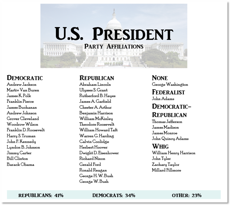
Use visual elements to show the relative importance to each of the eye stops on the page. Theoretically the audience looks at the most important element than next most important and so on. Avoid more than five stops if possible.
Visual Hierarchy Articles:
Contrast:
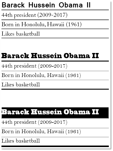
Shout and whisper items should be the same or very different (contrast vs conflict).
Alignment:
Every element should have a visual connection. Use this to guide you viewer from one eye stop to the next. Elements should be aligned to each other (right, left, centered, justified) and share baselines). This produces unity between the different groups you create through proximity. If using images use their strong lines for alignment. Avoid multiple alignment types if possible.

Weak centered alignment, Strong right alignment
Alignment/Proximity Articles:

Repetition:
Repeat elements such as white space, typeface, colors icons, textures, shapes, etc. for visual unity. Consistency.
Repitition/Rythm Articles:
Composition:
Use all of the rules above to illustrate your meaning and provide emphasis on you ideas. Page layout comes down to organization and interest (unity vs. variety).
Publishing
Printed Media
This was the primary output of digital work in the past. Although this has evolved over the years it is still very relevant. No matter what you are working on you should gather information about how it is going to be output first. There is always some differentation between what you see on screen versus when it is printed.
Things to consider:
- Medium (paper, vinyl, hard surface, etc.)
- Aspect Ratio (proportions)
- Resolution (large or small, bilboard/business cards)
- Print Method (inkjet, laser, plotter, etc.)
Digital Media
This is quickly becoming the most popular output digital production. Similar to printing, understanding what screens the work will be displayed on will greatly affect production. Screens have different sizes, resolution, color temperature, etc. A big topic in web design is producing mobile first designs that are responsive.
Things to consider:
- Screen (desktop, phone [iphone/android], television, etc.)
- Aspect Ratio (porportions)
- Resolution (HD, SD, etc.)
- Delivery (internet, disk, etc.)
Social Media Marketing:
This has become the primary tool of advertisement. You promote your product/service where the people are, and people are on their phones (you are on yours right now aren’t you. Stop!!!). The idea with social media marketing is leveraging social media to promote your brand, often attempting to become viral.
Things to consider:
- Ubiquitious (its huge)
- Target Audience (easy to target your demographic)
- Brand Equity (an opportunity to increase brand awareness and loyalty)
- Engagement (the algorithms of social media are based on customer interactions)
- Entertainment (you must constantly produce content for your followers)
Interactivity
Interactivity
It is possible to add simple interactive components in InDesign. What those interactive components can accomplish is based on your output (interactive PDF, EPUB [ebooks, etc.], and web).
You can:
- Navigate pages (previous, next, specific page)
- Open links (website, file)
- Play (video, audio)
- Other things (animation, hide, etc.)
How Interactivity Works
- A graphic object with different states (default, hover, click, visited)
- Event listener attached to said graphic object (listens for an event like click)
- Function that is run when event occurs (what happens)
Final Project Proposal:
Similar to Digital Imaging I, you will produce a final project for this course that utilizes the skills you have developed. Please have an idea prepared for next class.
This was made with Adobe Animate but you should get the idea. The button graphic has different states when you hover over it and when you click. The animation is run through a function when you click the button.
Adobe InDesign
Adobe InDesign:
Adobe InDesign is part of the Adobe Creative Cloud Suite. It is a digital publishing tool for producing page layouts appropriate for posters, magazines, books, interactive media, ebooks, and many others. InDesigns strengths are not generating content but rather linking and placing raster images, vector images, and text in a dynamic controlled manner.
Final Project Proposal:
Similar to Digital Imaging I, you will produce a final project for this course that utilizes the skills you have developed. Please have an idea prepared for next class.
Assignment 03
Social Media Advertisement:
Social media has become the primary form of advertisement for businesses. This is particularly benefinicial to small businesses since they can more easily target their local audiences. In this assignment you will utilize InDesign to produce an advertisment that would be appropriate for at least 3 social meda sites. This means you must design the same ad but with slight differences that allows it to function at different resolutions. You may use stock images, found images, or your own. You should submit three different images of the same ad. You can use this as a guide: https://adespresso.com/blog/social-media-image-sizes/. You should make an ad for a Facebook post (1200 x 600), an ad for a Instagram post (1080 x 1350), and an ad for X (Twitter) post (800 x 800). This way you will create an ad that is portrait, landscape, and square.
Once completed name your file “yourLastName”, package it, zip the package, and then submit here.
You will be graded on the following:
- Project Cover Sheet
-
Thoroughly completed and thoughtfully written with little or no grammatical errors.
-
- Assignment Specific Requirements
-
Three images exported as jpg at correct resolutions
- Advertisement that targets correct audience
- Solid image and text usage
-
-
Craftsmanship
-
Clean high-quality work
-
-
Creativity
-
Interesting and novel.
-
Resources:
- Project Cover Sheet
- You may download the project cover sheet here.
- Assignment Video Tutorials
- You may watch the tutorial videos below to help you complete your assignment.
- Tutorial Lab Materials
- You can find the materials used in the tutorial video here: di_week08_labMaterials.
Assignment Video Tutorials
Wait! Before you go!
Did you remember to?
- Read through this webpage
- Submit Assignment 03 Social Media Advertisement on Canvas
- Watermark Action, Neural Image, and Project Cover Sheet
- Post your finished images and description on the Assignment 03 Social Media Advertisement Critique Discussion Board
- … and reply to at least two of your peers’ work on the Discussion Board

