Digital Imaging II
Class 09: Interactive DesignTopics
- Color Design
- Stationary Design
- Interactivity
- Assignment 02
Class 7, 8, 9!
Color Design
Color Theory:
Just as the type of font you use in a design contains subliminal meaning, so does the color. Different colors may imply different meanings and emotions in a composition.
Color Definitions:
Warm Colors:
Warm colors feel “warm.” These are colors we associate with higher temps and energy. These ascend in a composition.
Cool Colors:
Cool colors are the opoosite of warm. These are very stoic, stable, strong and cold.
Tints:
Tints are the resulting colors by adding white. The most famous tint would be pink (from red obviously).
Shades:
Adding black to a color produces shades.
Pure Hue:
A pure hue is simply a color with not mixed into it. Generally brilliant.
Tones:
Like tints and shade but instead adding gray resulting in a less pure color.
Color Schemes:
Most artwork (good ones) utilize a color scheme. This is the process of choosing colors based on rules understanding what works together. Below are the most commonly used schemes.
Achromatic:
Without color, black and white.
Monochromatic:
Variation of one color with the value adjusted, adding black (shade) or adding white (tint).

Analogous:
Colors that contain a common hue (colors next to each other in the color wheel). Adjoining colors naturally blend
Complimentary:
Opposite colors that produce strong contrast. Generally create the strongest emphasis in a design.

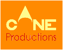
Warm/Cool:
Produces a sense of warmth or coolness. Warm ascend, cool descends. Warm is inviting, cool is not.

Color Tips:
Below are some tips for choosing your colors in your compositions. Color is a huge topic and I highly suggest researching it for yourself and above all experiment.
Tones:
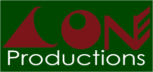
Avoid similar tones (overall deepness of colors).
Saturation:
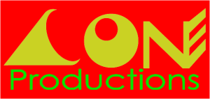
Avoid too many elements with heavy saturation or warm hues.
Analogous:
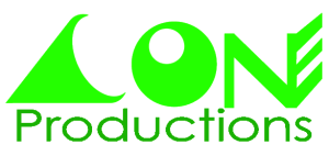
Analogous color scheme is good for seasonal projects (bright greens: Spring, cool blues: Winter, oranges & browns: Fall, hot reds & yellows: Summer).

Cliches:
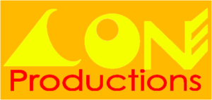
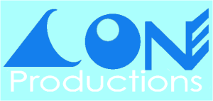
To avoid cliché colors use tints and shades or try warms and cools.
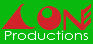
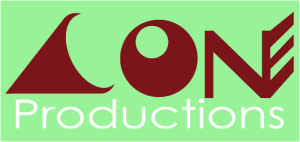
Image:
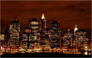
If using an image you may want to sample colors from it to produce an analogous harmonious scheme, or use complementary colors
Warms/Cools:
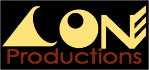
Use warm colors to ascend important elements and cool to recede others.

Accent:
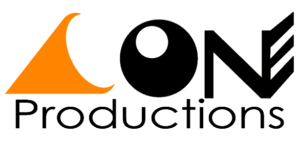
Use touches of color. Accent like in interior design
Color Number:
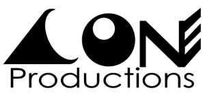
Limit colors (this is both for design purposes but also for printing).
Stationary Design
Rules:
- Repetition
- Consistency
- Font Size
- Don’t use Times, Arial, Helvetica, or Sand.
- Don’t center but use strong right or left alignment.
- Don’t write phone, fax, e-mail, website, etc., you can tell what they are by their formatting.
- Don’t use dashes. Use periods, bullets, blank spaces between your phone number.
- Don’t use abbreviations, hyphens, and/or commas if possible, they add clutter.
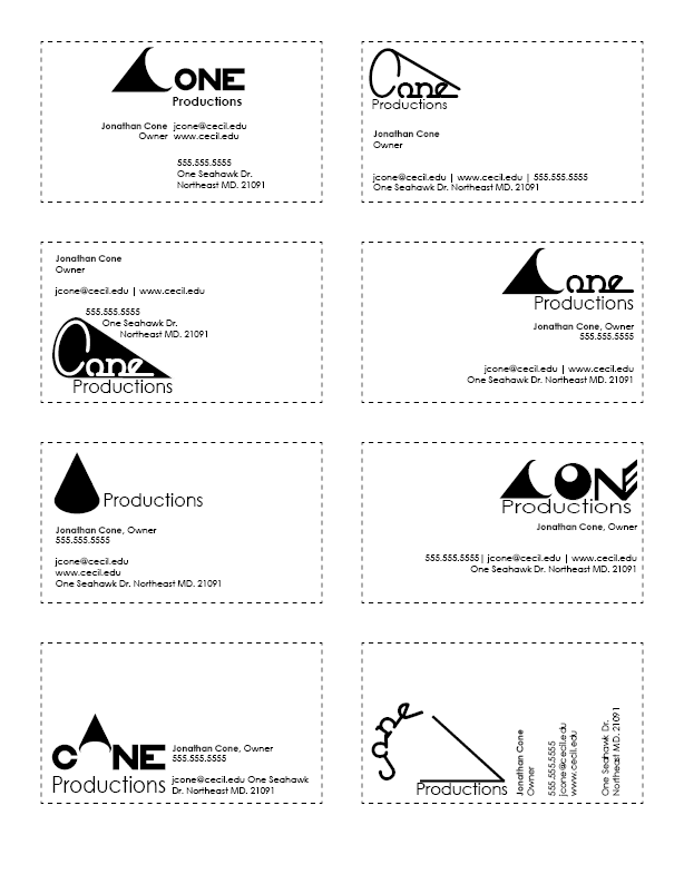
Business Cards:
- Horizontal: 3.5” x 2” or Vertical: 2” x 3.5”
- Don’t use 12pt font. Use 7pt-10pt font.
- Allow space. You don’t need to fill the corners.
Letterhead & Envelopes:
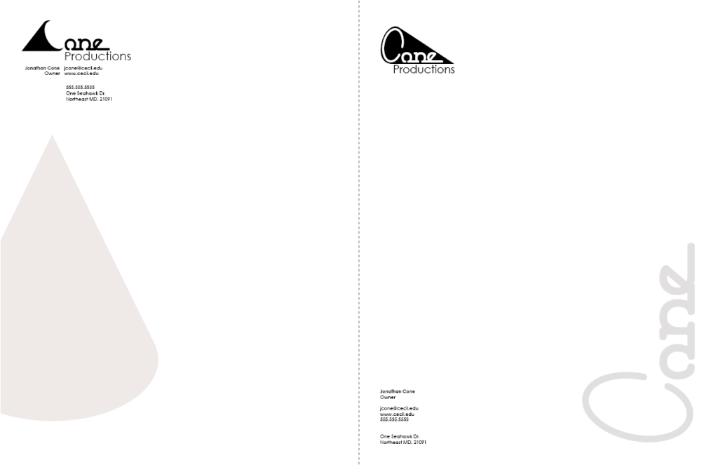
- #10 Envelope: 9 1/2” x 4 1/8”
- Create a single focal point.
- Avoid center alignment
- Think about reproduction (it may be faxed, copied, printed, etc.)
Interactivity
Interactivity
It is possible to add simple interactive components in InDesign. What those interactive components can accomplish is based on your output (interactive PDF, EPUB [ebooks, etc.], and web).
You can:
- Navigate pages (previous, next, specific page)
- Open links (website, file)
- Play (video, audio)
- Other things (animation, hide, etc.)
How Interactivity Works
- A graphic object with different states (default, hover, click, visited)
- Event listener attached to said graphic object (listens for an event like click)
- Function that is run when event occurs (what happens)
Final Project Proposal:
Similar to Digital Imaging I, you will produce a final project for this course that utilizes the skills you have developed. Please have an idea prepared for next class.
This was made with Adobe Animate but you should get the idea. The button graphic has different states when you hover over it and when you click. The animation is run through a function when you click the button.
Assignment 02
Interactive Portfolio:
You will produce an interactive portfolio utilizing Adobe InDesign. A logo (primarily text based), consistent and thoughtful typefaces, and appropriate grouping & alignment should be included.. You will package in InDesign, zip the folder, and submit this digitally.
You will be graded on the following:
- Project Cover Sheet
-
Thoroughly completed and thoughtfully written with little or no grammatical errors.
-
- Proximity & Alignment
-
Excellent use of proximity in all elements with consistent and thoughtful alignment.
-
-
Text Use
-
Excellent use of typography overall.
-
-
Logo Design
-
Very unique and interesting. Something very different from others.
-
Resources:
- Project Cover Sheet
- You may download the project cover sheet here.
- Assignment Video Tutorials
- You may watch the tutorial videos below to help you complete your assignment.
- Tutorial Lab Materials
- You can find the materials used in the tutorial video here: di_week08_labMaterials.
Assignment Video Tutorials
Wait! Before you go!
Did you remember to?
- Read through this webpage
- Submit Week 02 Interactive Portfolio Assignment on Blackboard
- Zipped InDesign package, exported interactive PDF, and project cover sheet
- Post your finished images and description on the Week 02 Interactive Portfolio Assignment Critique Discussion Board
- … and reply to at least two of your peers’ work on the Discussion Board

