Digital Imaging II
Class 08: Introduction to InDesignTopics
- Adobe InDesign
- Page Design
- Assignment 01

Class 08 incoming!
Adobe InDesign
Adobe InDesign:
Adobe InDesign is part of the Adobe Creative Cloud Suite. It is a digital publishing tool for producing page layouts appropriate for posters, magazines, books, interactive media, ebooks, and many others. InDesigns strengths are not generating content but rather linking and placing raster images, vector images, and text in a dynamic controlled manner.
Page Design
Proximity:
Similar items should be grouped so that they are viewed as a unit rather than separate ideas.

Proximity Articles:
White Space:
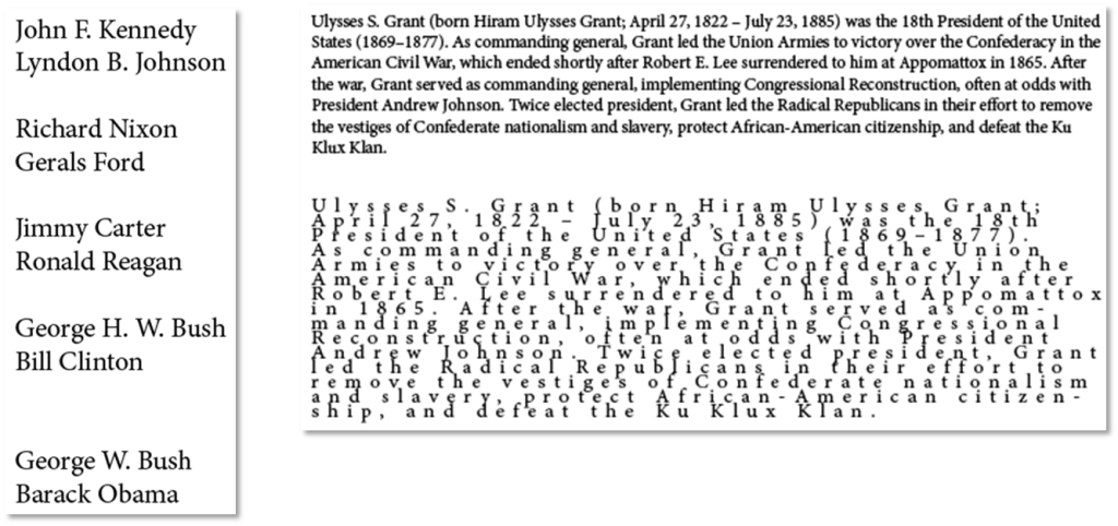
Don’t underestimate the power of white space as well… The more space between the less connected.
White Space Articles:
Eye Stops:
Limit the total number of eye stops. The fewer the better.
Things that are intellectually connected should be visually connected.

EyeStop/Visual Hierarchy Articles:
Visual Hierarchy:
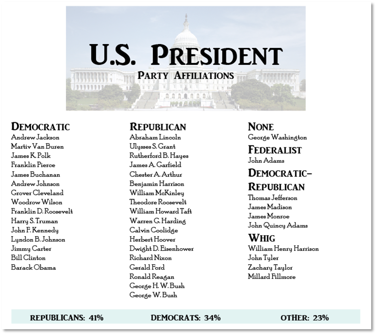
Use visual elements to show the relative importance to each of the eye stops on the page. Theoretically the audience looks at the most important element than next most important and so on. Avoid more than five stops if possible.
Visual Hierarchy Articles:
Contrast:
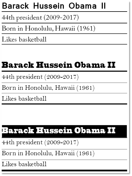
Shout and whisper items should be the same or very different (contrast vs conflict).
Alignment:
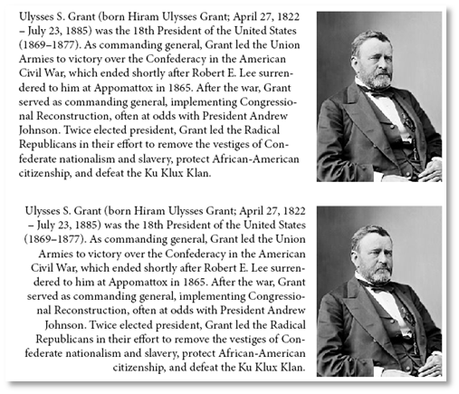
Every element should have a visual connection. Use this to guide you viewer from one eye stop to the next. Elements should be aligned to each other (right, left, centered, justified) and share baselines). This produces unity between the different groups you create through proximity. If using images use their strong lines for alignment. Avoid multiple alignment types if possible.

Weak centered alignment, Strong right alignment
Alignment/Proximity Articles:
Repetition:
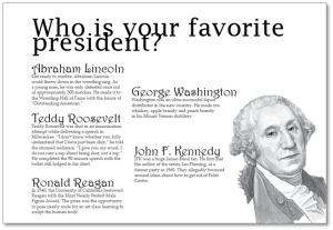
Repeat elements such as white space, typeface, colors icons, textures, shapes, etc. for visual unity. Consistency.
Repitition/Rythm Articles:
Composition:
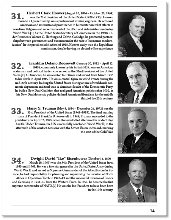
Use all of the rules above to illustrate your meaning and provide emphasis on you ideas. Page layout comes down to organization and interest (unity vs. variety).
Assignment 01
Magazine Advertisements:
Make two variations of a Magazine Ad using your own graphics and text. Insert and manipulate images as you choose. You will package these ads out of InDesign, zip the folder, and submit them digitally.
You will be graded on the following:
- Project Cover Sheet
-
Thoroughly completed and thoughtfully written with little or no grammatical errors.
-
- Graphic Use
-
Excellent image choices that work well with the entire composition.
-
-
Text Use
-
Excellent use of typography overall.
-
-
Craftsmanship & Creativity
-
Very unique and interesting. Something very different from others.
-
Resources:
- Project Cover Sheet
- You may download the project cover sheet here.
- Assignment Video Tutorials
- You may watch the tutorial videos below to help you complete your assignment.
- Tutorial Lab Materials
- You can find the materials used in the tutorial video here: di_week08_labMaterials.
Assignment Video Tutorials
Wait! Before you go!
Did you remember to?
- Read through this webpage
- Submit Week 01 Magazine Advertisements on Blackboard
- Zipped InDesign package and project cover sheet
- Post your finished images and description on the Week 01 Magazine Advertisement Assignment Critique Discussion Board
- … and reply to at least two of your peers’ work on the Discussion Board
